Book 2, Chapter 6: Results
Teo and Jet were eliminated with 0 points left. Sorry to see you go! Please stick around and continue to participate by voting, though; that'd be really appreciated! In addition to that, we may have a comeback round. (Details will be worked out soon!)
Anyway, the Character Status page has been updated (or will be right after this post goes up, so a little patience if it hasn't changed yet), if you'd just like to see the quick-'n-easy view of the new rankings. As there was a three-way tie for top favorite, each iconmaker will get 2 points.
Votes for favorites are on the top, followed by votes for least favorite, and finally general comments. The arrows indicate whether the iconmaker's points total went up or down.
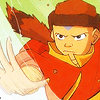
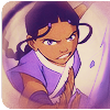
Icon #01
4+ 0- | ▲
[+] 01: The colors are so bright and vivid; it's a simple but exciting icon!
[+] 01: I really like the coloring
[+] 01: Lovely bright coloring.
[+] #01: I really like the coloring of this icon. It's nice and bright, and catches your eye.
Icon #02
4+ 0- | ▲
[+] 02: Good crop choices, I like the flow they create.
[+] 02: I like the coloring and the layout of the icon.
[+] 02: Very well done coloring in this one! I like how you worked out the coloring before the final desaturated overall look. Also I like the text use and the cropping.
[+] 2: The colors work well together, and I like how the text changes color with each bender.
[G] 02: I think the cropping and the coloring work nice here!
Icon #03
4+ 0- | ▲
[+] 03: The colors are smooth and work nicely together, and the dropshadow is a nice touch that adds to the feeling of the icon. The text in the background doesn't intrude on the foreground and is a great touch.
[+] 03: The cutout effect looks great with that crop. The text looks good too.
[+] 03: Nice, crisp, fully takes advantage of this challenge.
[+] #03: The idea of the icon is really interesting. It's simple without being too boring.
Icon #04
2+ 0- | ▬
[+] 04: I love the crop and the theme. The light and colors are very effective and the text just made me laugh.
[+] 4: I like the colors and how the pictures are arranged, and the text is really cute XD
Icon #05
4+ 1- | ▬
[+] 05: I think this is just very nice in its simplicity. No text, excellent coloring and crop. Well done!
[+] 05: Clean and simple coloring, I like the fact that you didn't over-saturated it.
[+] 05: Simple, and elegant. Beautiful sense of motion.
[+] 5: I love the crop on this. The crop makes it look more exciting and "in your face" if that makes any sense. The colors are nice too.
[-] 05: The coloring seems a bit flat, maybe it's a bit too dark. The crop placement could use a little work to cut off more confusing areas (like the right side) and emphasize others.
Icon #06
0+ 1- | ▬
[-] 06: The colour is too dark; the crop isn't interesting. There's too much blank space above, it might've gone better with some text on it.
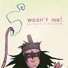
Icon #07
0+ 6- | ▼
[-] 07: The idea of the icon is nice, but the icon is far too dithered.
[-] 07: It's very pixel-ly.
[-] 07: This icon has a very cool concept but unfortunately the bad quality doesn't work at all for me in this icon. Also any coloring just get lost because of the bad quality of the gif, maybe it could have been done differently?
[-] 07: Great idea, but choppy and pixelated. ):
[-] #07: The idea behind it is good, but the execution is poor. The images are too pixely.
[-] 7: The pictures are too low quality. They're so pixelated that it doesn't make the icon look good.
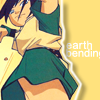
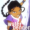
Icon #08
1+ 3- | ▼
[+] #08: The idea of the background is good, and the coloring compliments the image. A little critique though: it kind of looks pasted onto the background, so you could experiment with blending it better.
[-] 08: Toph's skin is a bit too pink/red, which clashes against the green of her clothes, and the black brushes used on the side are really distracting.
[-] 08: The image is pretty dark. The way the rocks on the right and left of the image are so dark makes the image seem grainy.
[-] 8: The black spots on either side of Toph don't work well with the rest of the icon. Also, Toph seems so dark that it makes her look a little pixelated at some points.
Icon #09
1+ 1- | ▬
[+] 09: The blur effect came out well. The soft colors go well with this.
[-] 09: The effect in this icon didn't worked out in the end, especially in the left-bottom corner where is just looks very strange compared to the rest. I think the icon it's a bit over-sharpened and the white bits to round the icon could have been better in all four corners not just one.
Icon #10
4+ 1- | ▬
[+] 10: The crop works nicely, and the text is cute and works well with the picture. (Plus, Yuu Yan archers are love! 8D) The tiny text should be a little smaller, though, as it looks a bit fuzzy right now, and it's halfway between readable and unreadable, making it distracting.
[+] 10: The cropping is very effective. The text is elegantly placed and, together with the lighting and the colour, it gives a very good effect.
[+] 10: It's a cute and simple icon. I like it.
[+] 10: The text and cropping is gorgeous and funny. Very well done, even if I find horrible weird the '.' after the '!' there.
[-] 10: Awkward cropping - cuts off his neck there. The text could have also been better. Bigger/more contrast with the background, different font.
Icon #11
0+ 3- | ▼
[-] 11: The text just doesn't go well with the rest of the icon - neither the font nor the colour work here. It's a shame, because the cropping and the colour of the base were nice.
[-] 11: The text placement seems awkward to me.
[-] #11: The text placement is awkward, and the font doesn't really match. The red spot doesn't really go with the picture either.
[G] 11: Text is a bit over-sharpened and overlaps a bit too much. Otherwise, great execution.
Please don't be discouraged if you got a lot of negative critiques; take them as a learning experience to improve, as that's the whole point of a LIMS :)
Comments to this entry are screened just so I can make sure that you're not accidentally giving away your identity. ^^ Your comment will stay screened if I feel that there is anything in it that may reveal your identity.
Meanwhile, I don't care if you reveal yourself as the author of a particular comment; comments are just kept anonymous so that no one feels like holding themselves back for fear of hurting someone else's feelings.
- hl
Anyway, the Character Status page has been updated (or will be right after this post goes up, so a little patience if it hasn't changed yet), if you'd just like to see the quick-'n-easy view of the new rankings. As there was a three-way tie for top favorite, each iconmaker will get 2 points.
Votes for favorites are on the top, followed by votes for least favorite, and finally general comments. The arrows indicate whether the iconmaker's points total went up or down.
Icon #01
4+ 0- | ▲
[+] 01: The colors are so bright and vivid; it's a simple but exciting icon!
[+] 01: I really like the coloring
[+] 01: Lovely bright coloring.
[+] #01: I really like the coloring of this icon. It's nice and bright, and catches your eye.
Icon #02
4+ 0- | ▲
[+] 02: Good crop choices, I like the flow they create.
[+] 02: I like the coloring and the layout of the icon.
[+] 02: Very well done coloring in this one! I like how you worked out the coloring before the final desaturated overall look. Also I like the text use and the cropping.
[+] 2: The colors work well together, and I like how the text changes color with each bender.
[G] 02: I think the cropping and the coloring work nice here!
Icon #03
4+ 0- | ▲
[+] 03: The colors are smooth and work nicely together, and the dropshadow is a nice touch that adds to the feeling of the icon. The text in the background doesn't intrude on the foreground and is a great touch.
[+] 03: The cutout effect looks great with that crop. The text looks good too.
[+] 03: Nice, crisp, fully takes advantage of this challenge.
[+] #03: The idea of the icon is really interesting. It's simple without being too boring.
Icon #04
2+ 0- | ▬
[+] 04: I love the crop and the theme. The light and colors are very effective and the text just made me laugh.
[+] 4: I like the colors and how the pictures are arranged, and the text is really cute XD
Icon #05
4+ 1- | ▬
[+] 05: I think this is just very nice in its simplicity. No text, excellent coloring and crop. Well done!
[+] 05: Clean and simple coloring, I like the fact that you didn't over-saturated it.
[+] 05: Simple, and elegant. Beautiful sense of motion.
[+] 5: I love the crop on this. The crop makes it look more exciting and "in your face" if that makes any sense. The colors are nice too.
[-] 05: The coloring seems a bit flat, maybe it's a bit too dark. The crop placement could use a little work to cut off more confusing areas (like the right side) and emphasize others.
Icon #06
0+ 1- | ▬
[-] 06: The colour is too dark; the crop isn't interesting. There's too much blank space above, it might've gone better with some text on it.
Icon #07
0+ 6- | ▼
[-] 07: The idea of the icon is nice, but the icon is far too dithered.
[-] 07: It's very pixel-ly.
[-] 07: This icon has a very cool concept but unfortunately the bad quality doesn't work at all for me in this icon. Also any coloring just get lost because of the bad quality of the gif, maybe it could have been done differently?
[-] 07: Great idea, but choppy and pixelated. ):
[-] #07: The idea behind it is good, but the execution is poor. The images are too pixely.
[-] 7: The pictures are too low quality. They're so pixelated that it doesn't make the icon look good.
Icon #08
1+ 3- | ▼
[+] #08: The idea of the background is good, and the coloring compliments the image. A little critique though: it kind of looks pasted onto the background, so you could experiment with blending it better.
[-] 08: Toph's skin is a bit too pink/red, which clashes against the green of her clothes, and the black brushes used on the side are really distracting.
[-] 08: The image is pretty dark. The way the rocks on the right and left of the image are so dark makes the image seem grainy.
[-] 8: The black spots on either side of Toph don't work well with the rest of the icon. Also, Toph seems so dark that it makes her look a little pixelated at some points.
Icon #09
1+ 1- | ▬
[+] 09: The blur effect came out well. The soft colors go well with this.
[-] 09: The effect in this icon didn't worked out in the end, especially in the left-bottom corner where is just looks very strange compared to the rest. I think the icon it's a bit over-sharpened and the white bits to round the icon could have been better in all four corners not just one.
Icon #10
4+ 1- | ▬
[+] 10: The crop works nicely, and the text is cute and works well with the picture. (Plus, Yuu Yan archers are love! 8D) The tiny text should be a little smaller, though, as it looks a bit fuzzy right now, and it's halfway between readable and unreadable, making it distracting.
[+] 10: The cropping is very effective. The text is elegantly placed and, together with the lighting and the colour, it gives a very good effect.
[+] 10: It's a cute and simple icon. I like it.
[+] 10: The text and cropping is gorgeous and funny. Very well done, even if I find horrible weird the '.' after the '!' there.
[-] 10: Awkward cropping - cuts off his neck there. The text could have also been better. Bigger/more contrast with the background, different font.
Icon #11
0+ 3- | ▼
[-] 11: The text just doesn't go well with the rest of the icon - neither the font nor the colour work here. It's a shame, because the cropping and the colour of the base were nice.
[-] 11: The text placement seems awkward to me.
[-] #11: The text placement is awkward, and the font doesn't really match. The red spot doesn't really go with the picture either.
[G] 11: Text is a bit over-sharpened and overlaps a bit too much. Otherwise, great execution.
Please don't be discouraged if you got a lot of negative critiques; take them as a learning experience to improve, as that's the whole point of a LIMS :)
Comments to this entry are screened just so I can make sure that you're not accidentally giving away your identity. ^^ Your comment will stay screened if I feel that there is anything in it that may reveal your identity.
Meanwhile, I don't care if you reveal yourself as the author of a particular comment; comments are just kept anonymous so that no one feels like holding themselves back for fear of hurting someone else's feelings.
- hl