Book 2, Chapter 6: Voting
We received 11 out of a possible 12 entries. No extension or grace period, as this post is already late by an hour and extended by a day.
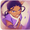
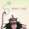
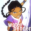
Here are the voting rules! This week's themes was lazy icons, meaning that they had to take the image provided and use only default Photoshop brushes and default Windows text (along with standard Photoshop functions) to make an icon.
You are not voting through a poll, but through a comment left to this entry. You are voting for three icons that you feel are the best and two icons of lesser quality. Label the ones that are your favorites with a plus sign (+) and the ones that are your least favorites with a minus sign (-). You may also make general comments on icons if you want; label those with a G. General comments are entirely optional.
Please include some kind of critique in your comment. LIMS are for iconbenders who want to improve ;) Therefore, it's very helpful to point out to them what you like and don't like about their icon so that they can improve in the future.
Your vote is screened, and you will remain anonymous. Your comments will appear on the results page because I'll be c&p-ing things and assembling them there, but your username will never be revealed.
Sample Vote:
[+] #20: The crop is very effective; I also like the text. Very tasteful use of light textures.
[+] #25: Very nice color scheme; everything works together to bring out the subject well.
[+] #42: Fantastic use of base textures and also of tiny text.
[-] #30: The icon is too dark. It's impossible to see the subject.
[-] #35: The crop isn't very good. In addition to that, the font you picked doesn't match the subject matter at all.
[G] #40: I really like your use of scan lines!
Of course, you can go into much more detail than that. :)
Mods reserve the right to null any vote that votes for an icon for petty reasons and not the actual quality for the icons themselves. Examples of petty reasons would be because your favorite/least favorite character is in the icon, because you hate tiny text and there's tiny text on there, because of personal preference or bias, etc. You should be voting on the overall craftsmanship of the icon itself. If a mod contacts you to change your vote in some way and you don't change it, your vote will turn into a general comment that doesn't affect the icon's point total.
Don't vote for yourself or get others to vote for you. Depending on the extent of your offense, you may be DQed from this week and banned.
If you would like more explanation and/or examples of good and bad votes, check out the Voting Tutorial at rockmusiclims. (Unlike rockmusiclims, however, we require an explanation for favorites, but it can be brief.)
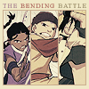
1
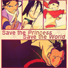
2
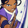
3
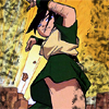
4


5
6
7
8


9
10
11
Voting Form
[+] ##: explanation
[+] ##: explanation
[+] ##: explanation
[-] ##: explanation
[-] ##: explanation
[G] ##: comments (optional)
Voting concludes 10PM PST on September 30. The shortened voting period is due to this challenge being extended, BUT I will extend voting if I feel that there is an insufficient number of votes. Feel free to invite other people to vote, as long as you don't introduce any bias to them (i.e.--ask them to vote for your icon, or to vote against a certain icon, etc.).
Good luck!
- hl
Here are the voting rules! This week's themes was lazy icons, meaning that they had to take the image provided and use only default Photoshop brushes and default Windows text (along with standard Photoshop functions) to make an icon.
You are not voting through a poll, but through a comment left to this entry. You are voting for three icons that you feel are the best and two icons of lesser quality. Label the ones that are your favorites with a plus sign (+) and the ones that are your least favorites with a minus sign (-). You may also make general comments on icons if you want; label those with a G. General comments are entirely optional.
Please include some kind of critique in your comment. LIMS are for iconbenders who want to improve ;) Therefore, it's very helpful to point out to them what you like and don't like about their icon so that they can improve in the future.
Your vote is screened, and you will remain anonymous. Your comments will appear on the results page because I'll be c&p-ing things and assembling them there, but your username will never be revealed.
Sample Vote:
[+] #20: The crop is very effective; I also like the text. Very tasteful use of light textures.
[+] #25: Very nice color scheme; everything works together to bring out the subject well.
[+] #42: Fantastic use of base textures and also of tiny text.
[-] #30: The icon is too dark. It's impossible to see the subject.
[-] #35: The crop isn't very good. In addition to that, the font you picked doesn't match the subject matter at all.
[G] #40: I really like your use of scan lines!
Of course, you can go into much more detail than that. :)
Mods reserve the right to null any vote that votes for an icon for petty reasons and not the actual quality for the icons themselves. Examples of petty reasons would be because your favorite/least favorite character is in the icon, because you hate tiny text and there's tiny text on there, because of personal preference or bias, etc. You should be voting on the overall craftsmanship of the icon itself. If a mod contacts you to change your vote in some way and you don't change it, your vote will turn into a general comment that doesn't affect the icon's point total.
Don't vote for yourself or get others to vote for you. Depending on the extent of your offense, you may be DQed from this week and banned.
If you would like more explanation and/or examples of good and bad votes, check out the Voting Tutorial at rockmusiclims. (Unlike rockmusiclims, however, we require an explanation for favorites, but it can be brief.)
1
2
3
4
5
6
7
8
9
10
11
Voting Form
[+] ##: explanation
[+] ##: explanation
[+] ##: explanation
[-] ##: explanation
[-] ##: explanation
[G] ##: comments (optional)
Voting concludes 10PM PST on September 30. The shortened voting period is due to this challenge being extended, BUT I will extend voting if I feel that there is an insufficient number of votes. Feel free to invite other people to vote, as long as you don't introduce any bias to them (i.e.--ask them to vote for your icon, or to vote against a certain icon, etc.).
Good luck!
- hl