Book 2, Chapter 1: Results
Sorry for the delay! I had problems with the HTML (a huge gap would keep showing up for some reason), and it's been a while since I've gathered so many crits XD I've forgotten how long this post takes to compile!
BSSU was saved, all thanks to your help! Those students are sedated now, and many are--could it be?!--napping in class! Well, at least the professors aren't dealing with any crazy zombies anymore.
It was Foofoocuddlypoops who saved the day! Foofoocuddlypoops charmed the zombies with his cuteness, apparently, and all were rendered helpless by his cutesy ways! (Who can say no to that cute face?!)
Toph also helped subdue the crowds; she sighed, rolled her eyes, put on a pretty dress, and played a cute girl for a day, and it apparently worked. (It's amazing how many of those Lit nerds came up to her and said, "Shall I compare thee to a summer's day?" and then proceeded to describe her and her eyes. Needless to say, Toph now detests reading even more.)
Following close behind were Sokka, Jet, and Mai. Deciding not to follow the nice route, they got together (overcoming their differences!) and managed to shoot down the zombies with tranquilizer darts. (Well, no one said they couldn't, after all...)
Unfortunately, there were a few casualties. Some zombies mistook Tui&La for lunch and tried to take a bite out of them, but they went super Saiyan on them unleashed their spirit power and managed to fend them off. Those aeronautics nerds somehow dragged Teo off of his flying wheelchair, eager to analyze its aerodynamics and figure out how it worked so well. As for Jin--well, let's just say that having a dozen or two math nerds coming up to you and saying, "Baby, I wish I were a derivative so I could lay tangent to your curves" doesn't do good for your mental health.
However, lengthy exposure to these kinds of crazy kids can do bad for your health. All nineteen fighters were dragged off by Rho Epsilon Alpha Delta, BSSU's toughest fraternity, made up of a number of students totally and utterly devoted to studying ancient literature. And being forced to sit there and read ancient lit for a couple hours... well, let's just say that it's caused everyone to get an eye injury! Oh no! I hope you have glasses or good luck :(
Well, that's it! Onto the results!
Voting seemed to be fairly spread out this round, and there were three ties that I absolutely couldn't break, even with their raw scores, because all three icons got four favorites and no vote-offs. So, all of them placed third and receive one point. Speaking of voting, thanks everyone for being so cooperative when I asked for vote revisions :D
Anyway, the Character Status page has been updated (or will be right after this post goes up, so a little patience if it hasn't changed yet), if you'd just like to see the quick-'n-easy view of the new rankings.
Votes for favorites are on the top, followed by votes for least favorite, and finally general comments. The arrows indicate whether the iconmaker's points total went up or down.
Icon #01 2+ 3- | ▬
[+] 01: Beautiful use of a light-texture and screencap-cleanup.
[+] 01: The use of light textures and coloring in this icon are just top notch.
[-] 1: Although I don't think this is a terrible icon, by a long shot, the coloring/light textures and even the scene choice don't really portray a sense of "happiness" (definitely not "tranquilness"). Although it is a relieving scene the dark colors and stark contrast don't really portray any sense of happiness or tranquility. And on a more technical note, the light textures really distract from the rather small Katara and Aang in the foreground of the icon. :/
[-] 01: The colors aren't very appealing and the red specks and light textures don't work well at all.
[-] 01: Aang and Katara got a little to washed out so it was difficult to figure out what was going on. Also, the black border and light textures seem distracting.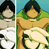
Icon #02 0+ 0- | ▬
[G] 02: The desaturated duplicate doesn’t really add much to the icon and actually makes the icon a little too crowded.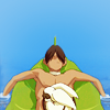
Icon #03 5+ 1- | ▲
[+] 03: The color is very smooth and crisp. It's simple, but the use of negative space is effective. Very nice.
[+] 03: I find the coloring bright and eye-catching, it's a good crop, and simple. Very clean.
[+] #03: The colors have been brought out really nicely without over doing it. The icon really does fell relaxing :)
[+] 3: The vibrant colors make it feel like a tropical vacation and the cropping helps emphasize the relaxed isolation by showing the calm, open water.
[+] 3: Great use of negative space, the icon is balanced quite well and demonstrates the iconist's technical ability without using textures or light brushes.
[-] 03: My problem with this one of the lack of an interesting crop, even if the coloring isn't bad in itself, it ruins the whole icon because it leaves a lot of empty space.
[G] 03: I'm fairly certain who made this icon. While it's beautiful (clean, crisp, well-cropped), you may want to branch out in style because the one of this icon is very recognizable.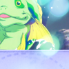
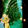
Icon #04 4+ 0- | ▲
[+] 04: It's just very nice and bright. The light texture is perfectly subtle, and the texture at the bottom accentuates the whole thing nicely.
[+] #04: I took me some time to figure out where this scene came from but the icon is really well done. The appropriate use of light texture with the frame in the bottom goes very well with the cropping.
[+] 04: Love the irony, the soft peaceful colors with the knowledge of what the smiling (happy) fish does to Sokka two seconds later.
[+] 04: The softness of this icon is perfect, showing that not all icons have to be oversharpened to look good. The light textures are a great touch, too. The bottom texture is nice, but the color could've matched the rest of the icon better.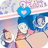
Icon #05 4+ 4- | ▬
[+] 05: The colors are very soothing and the top is very fun. It's an overall happy icon.
[+] 05: The slant that the image and pattern sits on adds a lot to the composition. The coloring and lighting looks nice.
[+] 05: I find the icon a bit washed out, but I really like the use of textures on the top, it doesn't clash and the heart stand out a lot. ♥~ Good job.
[+] 05: This icon is so adorable! The coloring is nice and soft, and I love the textures/brushes you used at the top.
[-] 5: I really think the desired effect/vision is great, from what I can tell of it from the icon, and the coloring is beautiful, but the composition itself seems rather haphazardly put together. The heart appears out of place and the white next to the rounded corners appears odd next to the colorful icon--perhaps actual transparency rather than "fake" transparency next time?
[-] #05: The icon is too busy, the pattern on the top with the line texture then the hearts and the rounded border and if I'm not mistaken there is a gradient texture set to screen. The last texture makes the icon too bright in one part and dark in another. If the coloring was balanced, the icon would have looked much better.
[-] 05: The cap is incompatible with the coloring & thematic aspects of the icon. The coloring is washed out, and it's difficult to make out the characters' expressions.
[-] 05: The coloring is very washed out and I'm not quite sure what the significance of the heart is. While not a bad icon by any means, it seems a little random and not very well thought-out.
[G] #5: I love the diagonal design, but the slant of the pattern, on top, and the slant of the characters in the picture is very different. It may help if they were at more of the same angle. And while the heart is nice, it interrupts the clean line between the pattern at the top and the image at the bottom rather awkwardly. I would either tilt it, slightly, to match the border it's on or move it out of the way, probably into the top left, somewhere.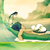
Icon #06 2+ 0- | ▬
[+] #6: Nice atmosphere, love the coloring. I love the angle of the crop!
[+] 6: Nice cropping with this icon - I like howthe circle brush brings focus in on the two characters instead of leaving the entire icon space open. The blue green coloring conveys the required sense of tranquility quite well.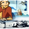
Icon #07 0+ 9- | ▼
[-] 07: This icon is very busy. While Aang is happy, there's just too much to look at for a calm/tranquil contest.
[-] 07: The image quality doesn't look that great, and the fact that you repeated it kind of accentuates it. It looks a little over sharpened and the duplicates make it look a little crowded and busy.
[-] 07: I think the concept wasn't bad, but the idea didn't came out very well. The three images doesn't blend and also it clashes a lot, especially the black and white at the bottom.
[-] #7: It feels a bit uneven - the top half is true color while the bottom has been made black and white. The outlines are a little thick, especially on the bottom. And it may help if you put the larger image in the bottom right because, as the element that attracts the most attention, it should get first priority of placement.
[-] 7: A nice choice of image but the duplicates take away from the icon; they vary too much in quality with the B&W image loosing most of it's definition. The large image of Aang also looks out of focus
[-] 7: While it was a neat idea to triple repeat the image, I don't think you executed it too well. The close-up of Aang looks very smudged, actually it almost looks like it was smaller and you resized it to a larger size. Also, having the bottom bit in a black-and-white/blue color is kinda distracting.
[-] 07: The repeated cropping is very jarring. It doesn't really have a focal point, so the icon seems to be competing for attention with itself. Not very tranquil.
[-] 7: I don't feel that this icon represents tranquility or anything similar to that - the blending is rough and the image placements appear to be randomly placed.
[-] 07: The duplication makes the icon far too busy, and the coloring made the lines in the picture too heavy; a lighter coloring may have thinned the lines and made things look a bit less busy.
Icon #08 1+ 4- | ▼
[+] 08: The coloring mixed with the scratch texture makes it unique while still portraying the theme of happiness and calm.
[-] 08: The mood of the icon is confused by the happy subject and heart brush with the heaviness of the grunge / scratch textures.
[-] 08: The black and white textures, especially the heart, are stark against the screencap and detract from the emotive feel of the icon.
[-] 8: This icon seems almost too heavy - the scratch texure and the darker lines aren't aesthetically pleasing.
[-] 08: The scratch textures and black gradient are really distracting and make the icon look too dark. Also, the heart is a bit gratuitous, and it's fuzzy compared to the sharpness of the rest of the icon.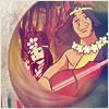
Icon #09 4+ 0- | ▲
[+] 09: The circular effect is very interesting and the blending is nicely done.
[+] 09: Excellent cropping. I especially like the, for lack of a better word, swooshy effects in the lower left of the circle.
[+] 9: Ireally like how the blurred texture is used in this icon -the sweeping blur conveys a real sense of calmness.
[+] 09: The subtle blur effect and use of the texture on the left are awesome and this is very well-done.
Icon #10 4+ 2- | ▬
[+] 10: Cute scene choice, I like the coloring although the crop is a little awkward (it looks like a difficult crop though).
[+] 10: Nice coloring and crop; effective use of both the red screen dot and scratch textures.
[+] #10: They all look very happy. The image is clean and crisp, and the color filter is simple but very effective. It suits the mood very nicely.
[+] 10: Great colors, and the textures work well with the picture.
[-] #10: The crop is awkward- the fact that the faces of the two boys at the side are cut off with their mouths half open makes the icon seem more garish than lighthearted. Also, the coloring is too dark and makes the icon look more dull.
[-] 10: The crop is somewhat uninteresting and the lighting is a bit awkward - there's a color blob above their heads yet nothing there to really be accentuated. The grunge brush on top doesn't add anything, it actually kind of flattens the image. The icon overall is a little dark.
Icon #11 3+ 0- | ▬
[+] #11: Excellent cropping, nice color balance, and nice mood.
[+] 11: The use of thirds is wonderful and is highlighted by the orange contrasted against the green.
[+] 11: This icon was the first to really catch my eye. I don't know if you enhanced the colors in the icon in anyway, or if it was just a great screenshot, but either way the colors are gorgeous. I love the simplicity.
[G] 11: I really liked the coloring, but found a lack of contrast between Aang and his background.
[G] #11: The coloring is absolutely wonderful. But the icon needs just a little bit of sharpened and it would have been perfect.
Icon #12 2+ 0- | ▬
[+] 12: I love the crop and appearance of the icon in general. The light colors work well.
[+] 12: Love the cropping and the soft coloring. I'm not too fond of the brushes (I think?) you used on Aang's arm, but other than that it's very nice.
Icon #13 0+ 0- | ▬
[G] 13: The light colors work nicely for this icon, but the crop is a bit awkward (it doesn’t seem to put much focus on anything in particular) and the white gradient on the side seems a bit gratuitous.
Icon #14 2+ 1- | ▬
[+] 14: The coloring and cropping choice of this icon is lovely. ♥
[+] 14: Good picture, and the colors are absolutely beautiful and help to convey the theme perfectly.
[-] 14: I have absolutely no idea what's going on in this icon. D: It's like it was maybe brightened too much or something. I also don't really care for the coloring.
[G] #14: Hard to make out the subject that the icon is focused on. You should make it clearer, edit colors, or even make the subject larger or smaller within the icon so that it's easier to identify.
Icon #15 1+ 3- | ▬
[+] #15: Love it! I love the expression on Aang's face, it's a very happy and exciting icon. Great job!
[-] 15: The crop is fairly interesting but there is so much negative space. A simple strip along the top with hints of the colors found in the image would add a lot, but there's a lot more than could be done with this.
[-] 15: too saturated causing the image to loose details on their faces and also appears pixelated and jagged.
[-] 15: The picture is overly sharpened, making the image look pixelated.
Icon #16 2+ 2- | ▬
[+] 16: The crop is amazing, as is the coloring.
[+] 16: The picture conveys the theme perfectly, and the colors and effects on the water work together nicely.
[-] 16: It just doesn't look like much was done with the image, so it looks a little bland and also a little blurry. Maybe try brightening it up or sharpening it?
[-] #16: Though the image does seem relaxing, the icon is very blurry. I can understand the concept behind keeping it blurry but in this case it just does not go with the icon coloring. The coloring is very dull/not bright enough. A little more contrast would have helped it a lot.
[G] 16: I have seen this scene iconned about three dozen times and I've never seen anyone do the reflection for the water - that's so original and creative. :D
Icon #17 1+ 5- | ▼
[+] 17: the coloring and negative space really work well with the image choice.
[-] #17: The dark, opaque coloring on the icon makes the image extremely hard to see.
[-] #17: The small size of the image makes it hard to see any detail, and it makes the icon very bottom-heavy. The top is very bland and could use some sort of pattern or texture, and the dark purplish-blue color seems to run through the entire icon, including the intended highlights, making the whole thing rather dark and kinda monotonous.
[-] 17: I see what you were going for, but there's too much empty space in the top left corner. The icon looks too bare.
[-] 17: The icon has just too much negative space. In a textless challenge, you have to make up for the lack of text with something else, but here it simply looks like you left a huge amount of blank space for no reason. The icon looks incomplete.
[-] 17: The icon is very plain, and the picture is too small. It's just too hard to see, and the background really has nothing to contribute to the icon.
[G] 17: I love the cropping and the overall look of this icon, but there is a lot of negative space. This icon probably would have been better in a non-hush contest.
[G] 17: Good job extracting the image! ♥~
Icon #18 10+ 0- | ▲
[+] #18: Original, funny, and awesome crop. Great job!
[+] 18: The cropping and angles along with the mellow colors makes this a very easygoing icon.
[+] 18: The color is gorgeous and has a light/airy feel about it. The texture on the side is the perfect accent.
[+] #18: The coloring and cropping is very well done. The subtle use of pattern border adds very nicely to the overall icon.
[+] 18: The extracting of the subject, plus the simple and fitting background and the coloring is very good.
[+] 18: The simplicity really works here. Love the texture-choice and the clean extraction of the subject from his screencap background.
[+] #18: Great image. Love the angle and the colors. Clean edit, great background.
[+] 18: Interesting crop and perspective; the soft pinks and warm palette fit well with the theme
[+] 18: Awesome cropping! The patterns used in the background were a nice touch - I love that you used the same shades of pink for the pattern that were in the chara's outfit.
[+] 18: I love the warm coloring, and the background texture fits perfectly! The crop is unique and nice, and everything's just so bright and cheery. :D
[G] #18: Your icon is made of win, seriously.
[G] 18: I absolutely love the cropping!
Icon #19 4+ 0- | ▲
[+] 19: The colors are very vibrant, and the icon has a nice crop- really nice flow.
[+] 19: Beautiful composition dealing with foreground/background action, and uses the textless challenge to its full potential.
[+] 19: Even though Aang and Katara are training in the background, the whole icon has a very relaxed feel to it. The light coming out from the background gives the whole icon a very soft feel to it. Very nice work!
[+] 19: The composition of this icon is just perfect--the circle in the back frames everything nicely, and there's a great balance between the foreground and the background. The symmetry of the icon gives it a great sense of balance, adding to the tranquil feel. The coloring could've been a little brighter, but that may just be because I like bright icons.
Please don't be discouraged if you got a lot of negative critiques; take them as a learning experience to improve, as that's the whole point of a LIMS :)
Comments to this entry are screened just so I can make sure that you're not accidentally giving away your identity. ^^ Your comment will stay screened if I feel that there is anything in it that may reveal your identity.
Meanwhile, I don't care if you reveal yourself as the author of a particular comment; comments are just kept anonymous so that no one feels like holding themselves back for fear of hurting someone else's feelings.
Plugs:
shounen_battle - A battle-style LIMS for shounen animanga series! Sign-ups are currently open!
- hl
BSSU was saved, all thanks to your help! Those students are sedated now, and many are--could it be?!--napping in class! Well, at least the professors aren't dealing with any crazy zombies anymore.
It was Foofoocuddlypoops who saved the day! Foofoocuddlypoops charmed the zombies with his cuteness, apparently, and all were rendered helpless by his cutesy ways! (Who can say no to that cute face?!)
Toph also helped subdue the crowds; she sighed, rolled her eyes, put on a pretty dress, and played a cute girl for a day, and it apparently worked. (It's amazing how many of those Lit nerds came up to her and said, "Shall I compare thee to a summer's day?" and then proceeded to describe her and her eyes. Needless to say, Toph now detests reading even more.)
Following close behind were Sokka, Jet, and Mai. Deciding not to follow the nice route, they got together (overcoming their differences!) and managed to shoot down the zombies with tranquilizer darts. (Well, no one said they couldn't, after all...)
Unfortunately, there were a few casualties. Some zombies mistook Tui&La for lunch and tried to take a bite out of them, but they went super Saiyan on them unleashed their spirit power and managed to fend them off. Those aeronautics nerds somehow dragged Teo off of his flying wheelchair, eager to analyze its aerodynamics and figure out how it worked so well. As for Jin--well, let's just say that having a dozen or two math nerds coming up to you and saying, "Baby, I wish I were a derivative so I could lay tangent to your curves" doesn't do good for your mental health.
However, lengthy exposure to these kinds of crazy kids can do bad for your health. All nineteen fighters were dragged off by Rho Epsilon Alpha Delta, BSSU's toughest fraternity, made up of a number of students totally and utterly devoted to studying ancient literature. And being forced to sit there and read ancient lit for a couple hours... well, let's just say that it's caused everyone to get an eye injury! Oh no! I hope you have glasses or good luck :(
Well, that's it! Onto the results!
Voting seemed to be fairly spread out this round, and there were three ties that I absolutely couldn't break, even with their raw scores, because all three icons got four favorites and no vote-offs. So, all of them placed third and receive one point. Speaking of voting, thanks everyone for being so cooperative when I asked for vote revisions :D
Anyway, the Character Status page has been updated (or will be right after this post goes up, so a little patience if it hasn't changed yet), if you'd just like to see the quick-'n-easy view of the new rankings.
Votes for favorites are on the top, followed by votes for least favorite, and finally general comments. The arrows indicate whether the iconmaker's points total went up or down.
Icon #01 2+ 3- | ▬
[+] 01: Beautiful use of a light-texture and screencap-cleanup.
[+] 01: The use of light textures and coloring in this icon are just top notch.
[-] 1: Although I don't think this is a terrible icon, by a long shot, the coloring/light textures and even the scene choice don't really portray a sense of "happiness" (definitely not "tranquilness"). Although it is a relieving scene the dark colors and stark contrast don't really portray any sense of happiness or tranquility. And on a more technical note, the light textures really distract from the rather small Katara and Aang in the foreground of the icon. :/
[-] 01: The colors aren't very appealing and the red specks and light textures don't work well at all.
[-] 01: Aang and Katara got a little to washed out so it was difficult to figure out what was going on. Also, the black border and light textures seem distracting.
Icon #02 0+ 0- | ▬
[G] 02: The desaturated duplicate doesn’t really add much to the icon and actually makes the icon a little too crowded.
Icon #03 5+ 1- | ▲
[+] 03: The color is very smooth and crisp. It's simple, but the use of negative space is effective. Very nice.
[+] 03: I find the coloring bright and eye-catching, it's a good crop, and simple. Very clean.
[+] #03: The colors have been brought out really nicely without over doing it. The icon really does fell relaxing :)
[+] 3: The vibrant colors make it feel like a tropical vacation and the cropping helps emphasize the relaxed isolation by showing the calm, open water.
[+] 3: Great use of negative space, the icon is balanced quite well and demonstrates the iconist's technical ability without using textures or light brushes.
[-] 03: My problem with this one of the lack of an interesting crop, even if the coloring isn't bad in itself, it ruins the whole icon because it leaves a lot of empty space.
[G] 03: I'm fairly certain who made this icon. While it's beautiful (clean, crisp, well-cropped), you may want to branch out in style because the one of this icon is very recognizable.
Icon #04 4+ 0- | ▲
[+] 04: It's just very nice and bright. The light texture is perfectly subtle, and the texture at the bottom accentuates the whole thing nicely.
[+] #04: I took me some time to figure out where this scene came from but the icon is really well done. The appropriate use of light texture with the frame in the bottom goes very well with the cropping.
[+] 04: Love the irony, the soft peaceful colors with the knowledge of what the smiling (happy) fish does to Sokka two seconds later.
[+] 04: The softness of this icon is perfect, showing that not all icons have to be oversharpened to look good. The light textures are a great touch, too. The bottom texture is nice, but the color could've matched the rest of the icon better.
Icon #05 4+ 4- | ▬
[+] 05: The colors are very soothing and the top is very fun. It's an overall happy icon.
[+] 05: The slant that the image and pattern sits on adds a lot to the composition. The coloring and lighting looks nice.
[+] 05: I find the icon a bit washed out, but I really like the use of textures on the top, it doesn't clash and the heart stand out a lot. ♥~ Good job.
[+] 05: This icon is so adorable! The coloring is nice and soft, and I love the textures/brushes you used at the top.
[-] 5: I really think the desired effect/vision is great, from what I can tell of it from the icon, and the coloring is beautiful, but the composition itself seems rather haphazardly put together. The heart appears out of place and the white next to the rounded corners appears odd next to the colorful icon--perhaps actual transparency rather than "fake" transparency next time?
[-] #05: The icon is too busy, the pattern on the top with the line texture then the hearts and the rounded border and if I'm not mistaken there is a gradient texture set to screen. The last texture makes the icon too bright in one part and dark in another. If the coloring was balanced, the icon would have looked much better.
[-] 05: The cap is incompatible with the coloring & thematic aspects of the icon. The coloring is washed out, and it's difficult to make out the characters' expressions.
[-] 05: The coloring is very washed out and I'm not quite sure what the significance of the heart is. While not a bad icon by any means, it seems a little random and not very well thought-out.
[G] #5: I love the diagonal design, but the slant of the pattern, on top, and the slant of the characters in the picture is very different. It may help if they were at more of the same angle. And while the heart is nice, it interrupts the clean line between the pattern at the top and the image at the bottom rather awkwardly. I would either tilt it, slightly, to match the border it's on or move it out of the way, probably into the top left, somewhere.
Icon #06 2+ 0- | ▬
[+] #6: Nice atmosphere, love the coloring. I love the angle of the crop!
[+] 6: Nice cropping with this icon - I like howthe circle brush brings focus in on the two characters instead of leaving the entire icon space open. The blue green coloring conveys the required sense of tranquility quite well.
Icon #07 0+ 9- | ▼
[-] 07: This icon is very busy. While Aang is happy, there's just too much to look at for a calm/tranquil contest.
[-] 07: The image quality doesn't look that great, and the fact that you repeated it kind of accentuates it. It looks a little over sharpened and the duplicates make it look a little crowded and busy.
[-] 07: I think the concept wasn't bad, but the idea didn't came out very well. The three images doesn't blend and also it clashes a lot, especially the black and white at the bottom.
[-] #7: It feels a bit uneven - the top half is true color while the bottom has been made black and white. The outlines are a little thick, especially on the bottom. And it may help if you put the larger image in the bottom right because, as the element that attracts the most attention, it should get first priority of placement.
[-] 7: A nice choice of image but the duplicates take away from the icon; they vary too much in quality with the B&W image loosing most of it's definition. The large image of Aang also looks out of focus
[-] 7: While it was a neat idea to triple repeat the image, I don't think you executed it too well. The close-up of Aang looks very smudged, actually it almost looks like it was smaller and you resized it to a larger size. Also, having the bottom bit in a black-and-white/blue color is kinda distracting.
[-] 07: The repeated cropping is very jarring. It doesn't really have a focal point, so the icon seems to be competing for attention with itself. Not very tranquil.
[-] 7: I don't feel that this icon represents tranquility or anything similar to that - the blending is rough and the image placements appear to be randomly placed.
[-] 07: The duplication makes the icon far too busy, and the coloring made the lines in the picture too heavy; a lighter coloring may have thinned the lines and made things look a bit less busy.
Icon #08 1+ 4- | ▼
[+] 08: The coloring mixed with the scratch texture makes it unique while still portraying the theme of happiness and calm.
[-] 08: The mood of the icon is confused by the happy subject and heart brush with the heaviness of the grunge / scratch textures.
[-] 08: The black and white textures, especially the heart, are stark against the screencap and detract from the emotive feel of the icon.
[-] 8: This icon seems almost too heavy - the scratch texure and the darker lines aren't aesthetically pleasing.
[-] 08: The scratch textures and black gradient are really distracting and make the icon look too dark. Also, the heart is a bit gratuitous, and it's fuzzy compared to the sharpness of the rest of the icon.
Icon #09 4+ 0- | ▲
[+] 09: The circular effect is very interesting and the blending is nicely done.
[+] 09: Excellent cropping. I especially like the, for lack of a better word, swooshy effects in the lower left of the circle.
[+] 9: Ireally like how the blurred texture is used in this icon -the sweeping blur conveys a real sense of calmness.
[+] 09: The subtle blur effect and use of the texture on the left are awesome and this is very well-done.
Icon #10 4+ 2- | ▬
[+] 10: Cute scene choice, I like the coloring although the crop is a little awkward (it looks like a difficult crop though).
[+] 10: Nice coloring and crop; effective use of both the red screen dot and scratch textures.
[+] #10: They all look very happy. The image is clean and crisp, and the color filter is simple but very effective. It suits the mood very nicely.
[+] 10: Great colors, and the textures work well with the picture.
[-] #10: The crop is awkward- the fact that the faces of the two boys at the side are cut off with their mouths half open makes the icon seem more garish than lighthearted. Also, the coloring is too dark and makes the icon look more dull.
[-] 10: The crop is somewhat uninteresting and the lighting is a bit awkward - there's a color blob above their heads yet nothing there to really be accentuated. The grunge brush on top doesn't add anything, it actually kind of flattens the image. The icon overall is a little dark.
Icon #11 3+ 0- | ▬
[+] #11: Excellent cropping, nice color balance, and nice mood.
[+] 11: The use of thirds is wonderful and is highlighted by the orange contrasted against the green.
[+] 11: This icon was the first to really catch my eye. I don't know if you enhanced the colors in the icon in anyway, or if it was just a great screenshot, but either way the colors are gorgeous. I love the simplicity.
[G] 11: I really liked the coloring, but found a lack of contrast between Aang and his background.
[G] #11: The coloring is absolutely wonderful. But the icon needs just a little bit of sharpened and it would have been perfect.
Icon #12 2+ 0- | ▬
[+] 12: I love the crop and appearance of the icon in general. The light colors work well.
[+] 12: Love the cropping and the soft coloring. I'm not too fond of the brushes (I think?) you used on Aang's arm, but other than that it's very nice.
Icon #13 0+ 0- | ▬
[G] 13: The light colors work nicely for this icon, but the crop is a bit awkward (it doesn’t seem to put much focus on anything in particular) and the white gradient on the side seems a bit gratuitous.
Icon #14 2+ 1- | ▬
[+] 14: The coloring and cropping choice of this icon is lovely. ♥
[+] 14: Good picture, and the colors are absolutely beautiful and help to convey the theme perfectly.
[-] 14: I have absolutely no idea what's going on in this icon. D: It's like it was maybe brightened too much or something. I also don't really care for the coloring.
[G] #14: Hard to make out the subject that the icon is focused on. You should make it clearer, edit colors, or even make the subject larger or smaller within the icon so that it's easier to identify.
Icon #15 1+ 3- | ▬
[+] #15: Love it! I love the expression on Aang's face, it's a very happy and exciting icon. Great job!
[-] 15: The crop is fairly interesting but there is so much negative space. A simple strip along the top with hints of the colors found in the image would add a lot, but there's a lot more than could be done with this.
[-] 15: too saturated causing the image to loose details on their faces and also appears pixelated and jagged.
[-] 15: The picture is overly sharpened, making the image look pixelated.
Icon #16 2+ 2- | ▬
[+] 16: The crop is amazing, as is the coloring.
[+] 16: The picture conveys the theme perfectly, and the colors and effects on the water work together nicely.
[-] 16: It just doesn't look like much was done with the image, so it looks a little bland and also a little blurry. Maybe try brightening it up or sharpening it?
[-] #16: Though the image does seem relaxing, the icon is very blurry. I can understand the concept behind keeping it blurry but in this case it just does not go with the icon coloring. The coloring is very dull/not bright enough. A little more contrast would have helped it a lot.
[G] 16: I have seen this scene iconned about three dozen times and I've never seen anyone do the reflection for the water - that's so original and creative. :D
Icon #17 1+ 5- | ▼
[+] 17: the coloring and negative space really work well with the image choice.
[-] #17: The dark, opaque coloring on the icon makes the image extremely hard to see.
[-] #17: The small size of the image makes it hard to see any detail, and it makes the icon very bottom-heavy. The top is very bland and could use some sort of pattern or texture, and the dark purplish-blue color seems to run through the entire icon, including the intended highlights, making the whole thing rather dark and kinda monotonous.
[-] 17: I see what you were going for, but there's too much empty space in the top left corner. The icon looks too bare.
[-] 17: The icon has just too much negative space. In a textless challenge, you have to make up for the lack of text with something else, but here it simply looks like you left a huge amount of blank space for no reason. The icon looks incomplete.
[-] 17: The icon is very plain, and the picture is too small. It's just too hard to see, and the background really has nothing to contribute to the icon.
[G] 17: I love the cropping and the overall look of this icon, but there is a lot of negative space. This icon probably would have been better in a non-hush contest.
[G] 17: Good job extracting the image! ♥~
Icon #18 10+ 0- | ▲
[+] #18: Original, funny, and awesome crop. Great job!
[+] 18: The cropping and angles along with the mellow colors makes this a very easygoing icon.
[+] 18: The color is gorgeous and has a light/airy feel about it. The texture on the side is the perfect accent.
[+] #18: The coloring and cropping is very well done. The subtle use of pattern border adds very nicely to the overall icon.
[+] 18: The extracting of the subject, plus the simple and fitting background and the coloring is very good.
[+] 18: The simplicity really works here. Love the texture-choice and the clean extraction of the subject from his screencap background.
[+] #18: Great image. Love the angle and the colors. Clean edit, great background.
[+] 18: Interesting crop and perspective; the soft pinks and warm palette fit well with the theme
[+] 18: Awesome cropping! The patterns used in the background were a nice touch - I love that you used the same shades of pink for the pattern that were in the chara's outfit.
[+] 18: I love the warm coloring, and the background texture fits perfectly! The crop is unique and nice, and everything's just so bright and cheery. :D
[G] #18: Your icon is made of win, seriously.
[G] 18: I absolutely love the cropping!
Icon #19 4+ 0- | ▲
[+] 19: The colors are very vibrant, and the icon has a nice crop- really nice flow.
[+] 19: Beautiful composition dealing with foreground/background action, and uses the textless challenge to its full potential.
[+] 19: Even though Aang and Katara are training in the background, the whole icon has a very relaxed feel to it. The light coming out from the background gives the whole icon a very soft feel to it. Very nice work!
[+] 19: The composition of this icon is just perfect--the circle in the back frames everything nicely, and there's a great balance between the foreground and the background. The symmetry of the icon gives it a great sense of balance, adding to the tranquil feel. The coloring could've been a little brighter, but that may just be because I like bright icons.
Please don't be discouraged if you got a lot of negative critiques; take them as a learning experience to improve, as that's the whole point of a LIMS :)
Comments to this entry are screened just so I can make sure that you're not accidentally giving away your identity. ^^ Your comment will stay screened if I feel that there is anything in it that may reveal your identity.
Meanwhile, I don't care if you reveal yourself as the author of a particular comment; comments are just kept anonymous so that no one feels like holding themselves back for fear of hurting someone else's feelings.
Plugs:
shounen_battle - A battle-style LIMS for shounen animanga series! Sign-ups are currently open!
- hl