FFXII Icons: All Hail Baschilles!!
So... instead of writing fics. I've joined the ff_eye_candy icontest instead. Because I could hardly resist when I saw the theme that week. Well, that, and I was on a icon making spree at the moment. I mean, seriously, first, I made a claim for Basch/Ashe at iconfiend100, then I went on to ffxii_arcana, and claimed XII: The Hanged Man Vossler for icon. A bit crazy on my part, don't you think?
At any rate, the icontest was quite fun as I won third place for my Basch-Beowulf icon (Go on, drool all you want, it's not everyday we get to see a naked Basch, you know!) :D And this Baschilles icon was requested for tutorial. I'm quite gleeful to be honest, as I haven't join any kind of contest for as long as I can remember (I'm not competitive by nature... Honest!! XD), let alone win something.
For now, I just want to share the three icons that I've made for the contest. Once I've made enough icons, I'm probably going to repost all the random icons that I've made along the way. Yeah, I even had Basch dressed up as a pharaoh, and Rasler as Medusa X3
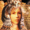
Ashe as Isis?
Mesopotamian
Basch as Achilles
Greek
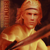
Basch as Beowulf
Anglo-Saxon
Basch as Beowulf
Anglo-Saxon

Also, combine this and this into
Step 1: Stare at both pictures for 30 minutes to 1 hour, and drool all over it :D ..... What?!! I needed the inspiration and so do the rest of you. Besides, there's no harm in gawking at two drop dead gorgeous looking men X3
Right! Forgive me for my insane fangirl moment and on to the actual tutorial :)
Real!Step 1: Start with this picture and remove Brat Pitt's Archilles face with an eraser. Once you are done, drag this layer over to your premade 100x100 px document and leave it there first.
(Tip: For other types of photo manip, I'll normally cut the head of the other character and paste it over the body, but since this one involves a helmet, it's better to do it the other way round. Also, erasing the face would be sufficient enough, don't ever get rid of the neck)
You should see something like this: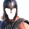
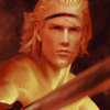
Step 2: Open this picture of Basch and flip the canvas horizontally (Image >> Rotate Canvas >> Flip Canvas Horizontal). As good-looking as he is, it's much too dark. To fix that, I duplicate four layers: Put the first three to Screen to lighten the image and it'll end up like this. To brighten the colours and make it less burry, I threw in another layer of Overlay, setting it at 50% opacity and 50% fill.
You should see something like this: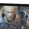
Step 3: Time to combine. Take Archilles helmet, and plunk it over Basch's head in the 100x100px document. Make some adjustments to both so that it fits perfectly together. And thus, Baschilles is born! XD
You should see something like this: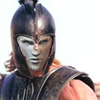
Step 4: Basch's face is too ghostly looking. To fix that, I used one Brightness/Contrast adjustment layer and a couple of Colour Filling and put them all in between the Basch (bottom) and the helmet (top) layers. This part involves a lot of test, trial and error, but this is how I did it X3 First, I put a Brightness/Contrast adjustment layer to darken the face, putting Brightness to -15.
You should see something like this: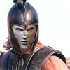
(Note: It doesn't seem any different here after I saved it, but it looked sharper when I worked on PS :3)
Step 5: Next, the Colour Filling galore (5 layers). To give Basch's face a reddish hue to suit Archilles' skin, I made two new layers and filled it with dark red (#790000), and set it to Screen, 50% opacity, 50% fill, and this turned up. Then, I needed some brown (#603913) to make it skin-like. The first two brown layers are Colour Dodge, 50% opacity, 50% fill. And because it seemed a little too bright for someone wearing a helm, I threw in Multiply, 50% opacity, 50% fill too.
You should see something like this: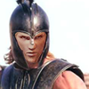
At this point, I'm done with fixing the Baschilles base, and merge all the layers to one (Ctrl-E). Next, I move on to texturing. I need some help in this section because I forgot one of the most important steps T___T
Step 6 (?): To make something grungy, I took a sunset layer by Diabolica Robotica, and darken it with curves (Ctrl-M). After that, I merged that layer with another texture. I don't remember which texture or what I did along the way (as I merge everything here). But the final outcome was a grungy orange texture. Well, there are similar ones out there that can be used for a replacement for this step.
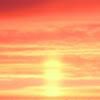
>>>>>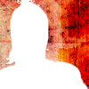
Step 7: You can choose to remove or keep the white background behind Basch, but I choose to remove it as I wanted to add text later. Then, I slap that modified grungy sunset layer over him, and erase the parts that covers Basch.
You should see something like this: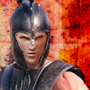
Step 8: Not quite happy yet, I threw the original sunset layer over him once again to even out everything. Again I erase everything that covers Basch and set it to Multiply.
You should see something like this: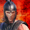
Step 9: Hmm... I wanted the armour to shine, so went back and I duplicate the layer with Basch only, and set it to Overlay, 50% opacity. Heee...! Shiny Baschilles XD
You should see something like this: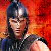
Step 10: Next, add text. Since I can't read nor write Greek. I went over to wikipedia and copied Achilles in old Greek and made it into a brush preset in a separate 100x100px document (Edit >> Define Brush Preset). I created a new layer below Basch's layer and added the text to it.
(Note: You can also just paste the name in a text layer, and put it below Basch's layer. I didn't think about it until I've done everything X3)
You should see something like this: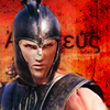
Step 11: Optional, really, but I duplicated the same text layer again. In the blending options, I set it to Stroke, 2px, and after that, I turn the opacity of the layer to 80%.
(Note: I don't why, but I like the effect better like this, instead of just doing the same for the original text layer X3)
You should see something like this: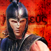
Step 12: Almost done! But in the end, I thought it was too... orange for my taste, and I wanted to give some kind of bluish, blurry effect to conform the theme better. Well, mythology being the theme, I feel that it ought to be a bit dreamy-like and less sharp. So, I create a new layer above all the layers, and filled it with dark blue (#0D004C), and set it to Lighten.
You should see something like this: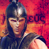
(Tip: When it comes to photo manip, I'll normally end everything by adding an extra colour fill layer to even out everything. It also solves most of my problems when I fail to match the colour of the head and body. That's what I did with the Baschwulf icon as well :D)
Step 13: And well, since I've nothing better to do. I added a border to it. Made a new layer and filled it with white, then, I set it to Multiply. In the blending options, I added Stroke, set it to black, 1px, change it to inside.
You should see something like this: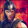
And concludes the tutorial! :D When I recheck my PSD, I realised that the one that I submitted was a little different from the one shown here. As this one seemed to have more noises and looks grungier :3 I suppose I ended up tweaking one of the layers with curve (Ctrl-M) to lessen it (most likely during Step 6). Still, I hope this tutorial is helpful to those that read it :) And for comparison sake:
Submitted icon:
PSD icon:
Well, something like that XD Not perfect but somewhat similar, and I did have fun doing this :P This is my first attempt at writing an icon tutorial, so I hope I didn't make too many glaring mistakes :3
At any rate, the icontest was quite fun as I won third place for my Basch-Beowulf icon (Go on, drool all you want, it's not everyday we get to see a naked Basch, you know!) :D And this Baschilles icon was requested for tutorial. I'm quite gleeful to be honest, as I haven't join any kind of contest for as long as I can remember (I'm not competitive by nature... Honest!! XD), let alone win something.
For now, I just want to share the three icons that I've made for the contest. Once I've made enough icons, I'm probably going to repost all the random icons that I've made along the way. Yeah, I even had Basch dressed up as a pharaoh, and Rasler as Medusa X3
Ashe as Isis?
Mesopotamian
Basch as Achilles
Greek
Basch as Beowulf
Anglo-Saxon
Basch as Beowulf
Anglo-Saxon
Also, combine this and this into
Step 1: Stare at both pictures for 30 minutes to 1 hour, and drool all over it :D ..... What?!! I needed the inspiration and so do the rest of you. Besides, there's no harm in gawking at two drop dead gorgeous looking men X3
Right! Forgive me for my insane fangirl moment and on to the actual tutorial :)
Real!Step 1: Start with this picture and remove Brat Pitt's Archilles face with an eraser. Once you are done, drag this layer over to your premade 100x100 px document and leave it there first.
(Tip: For other types of photo manip, I'll normally cut the head of the other character and paste it over the body, but since this one involves a helmet, it's better to do it the other way round. Also, erasing the face would be sufficient enough, don't ever get rid of the neck)
You should see something like this:

Step 2: Open this picture of Basch and flip the canvas horizontally (Image >> Rotate Canvas >> Flip Canvas Horizontal). As good-looking as he is, it's much too dark. To fix that, I duplicate four layers: Put the first three to Screen to lighten the image and it'll end up like this. To brighten the colours and make it less burry, I threw in another layer of Overlay, setting it at 50% opacity and 50% fill.
You should see something like this:

Step 3: Time to combine. Take Archilles helmet, and plunk it over Basch's head in the 100x100px document. Make some adjustments to both so that it fits perfectly together. And thus, Baschilles is born! XD
You should see something like this:

Step 4: Basch's face is too ghostly looking. To fix that, I used one Brightness/Contrast adjustment layer and a couple of Colour Filling and put them all in between the Basch (bottom) and the helmet (top) layers. This part involves a lot of test, trial and error, but this is how I did it X3 First, I put a Brightness/Contrast adjustment layer to darken the face, putting Brightness to -15.
You should see something like this:

(Note: It doesn't seem any different here after I saved it, but it looked sharper when I worked on PS :3)
Step 5: Next, the Colour Filling galore (5 layers). To give Basch's face a reddish hue to suit Archilles' skin, I made two new layers and filled it with dark red (#790000), and set it to Screen, 50% opacity, 50% fill, and this turned up. Then, I needed some brown (#603913) to make it skin-like. The first two brown layers are Colour Dodge, 50% opacity, 50% fill. And because it seemed a little too bright for someone wearing a helm, I threw in Multiply, 50% opacity, 50% fill too.
You should see something like this:

At this point, I'm done with fixing the Baschilles base, and merge all the layers to one (Ctrl-E). Next, I move on to texturing. I need some help in this section because I forgot one of the most important steps T___T
Step 6 (?): To make something grungy, I took a sunset layer by Diabolica Robotica, and darken it with curves (Ctrl-M). After that, I merged that layer with another texture. I don't remember which texture or what I did along the way (as I merge everything here). But the final outcome was a grungy orange texture. Well, there are similar ones out there that can be used for a replacement for this step.

>>>>>

Step 7: You can choose to remove or keep the white background behind Basch, but I choose to remove it as I wanted to add text later. Then, I slap that modified grungy sunset layer over him, and erase the parts that covers Basch.
You should see something like this:

Step 8: Not quite happy yet, I threw the original sunset layer over him once again to even out everything. Again I erase everything that covers Basch and set it to Multiply.
You should see something like this:

Step 9: Hmm... I wanted the armour to shine, so went back and I duplicate the layer with Basch only, and set it to Overlay, 50% opacity. Heee...! Shiny Baschilles XD
You should see something like this:

Step 10: Next, add text. Since I can't read nor write Greek. I went over to wikipedia and copied Achilles in old Greek and made it into a brush preset in a separate 100x100px document (Edit >> Define Brush Preset). I created a new layer below Basch's layer and added the text to it.
(Note: You can also just paste the name in a text layer, and put it below Basch's layer. I didn't think about it until I've done everything X3)
You should see something like this:

Step 11: Optional, really, but I duplicated the same text layer again. In the blending options, I set it to Stroke, 2px, and after that, I turn the opacity of the layer to 80%.
(Note: I don't why, but I like the effect better like this, instead of just doing the same for the original text layer X3)
You should see something like this:

Step 12: Almost done! But in the end, I thought it was too... orange for my taste, and I wanted to give some kind of bluish, blurry effect to conform the theme better. Well, mythology being the theme, I feel that it ought to be a bit dreamy-like and less sharp. So, I create a new layer above all the layers, and filled it with dark blue (#0D004C), and set it to Lighten.
You should see something like this:

(Tip: When it comes to photo manip, I'll normally end everything by adding an extra colour fill layer to even out everything. It also solves most of my problems when I fail to match the colour of the head and body. That's what I did with the Baschwulf icon as well :D)
Step 13: And well, since I've nothing better to do. I added a border to it. Made a new layer and filled it with white, then, I set it to Multiply. In the blending options, I added Stroke, set it to black, 1px, change it to inside.
You should see something like this:

And concludes the tutorial! :D When I recheck my PSD, I realised that the one that I submitted was a little different from the one shown here. As this one seemed to have more noises and looks grungier :3 I suppose I ended up tweaking one of the layers with curve (Ctrl-M) to lessen it (most likely during Step 6). Still, I hope this tutorial is helpful to those that read it :) And for comparison sake:
Submitted icon:
PSD icon:

Well, something like that XD Not perfect but somewhat similar, and I did have fun doing this :P This is my first attempt at writing an icon tutorial, so I hope I didn't make too many glaring mistakes :3