Results: Round 2 ; Challenge 2
RESULTS ; RD. 02 - Challenge 02
This one point gap is getting fucking ridiculous. First off I think it's hilarious how you guys can agree in the ugly but disagree in the pretty. I mean I don't blame you but lmao. I don't even. The tie breaker got broken, I would of left the poll open longer but ffs, I have to leave in a couple of minutes. Ffffsss I didn't even get to sleep. ;A; IF I MADE ANY MISTAKES TELL ME, I'LL GIVE YOU GUYS YOUR COMMENTS WHEN I GET BACK. :/ Thank you so much to all the people who participated & submitted, I sincerely appreciate all the extra help with the voting. Like always a huge thank you to all who voted. Without any further delay, here's Challenge 02's results. Congrats to the winners as well.
Skipping: ms_poptart, strawberries_85, coloredpastels
Eliminated/Defaults: skyships, whitelilies22, hamimifk, margyydoodle
Withdrawals: dashberlin
DOING IT RIGHTPeople's ChoiceMod's ChoicePeople's Choice
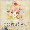
by: vincibility # (+14) ((+4 Tie Breaker))
Runner Up PC
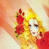
by: snm_queen # (+14) ((+3 Tie Breaker))Mod's Choice
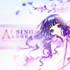
by: aentee #03
I love everything about this icon. It's just plain gorgeous. The coloring, the text, the use of the trend. Omg it's just gorgeous. &hearts
Mod's Choice
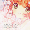
by: supafly #01
I find the coloring in this icon so beautiful & soft. It's just wonderful.DOING IT WRONGPeople's ChoiceMod's ChoicePeople's Choice
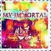
by: astrokittie #10 (+19)
Runner Up PC
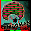
by: vincibility #05 (+17)
Mod's Choice
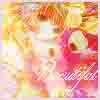
by: ryfee #15
The quality in this icon is just above amazing. It's such a quality icon, the colors are so beautiful.
Mod's Choice
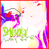
by: pikatic #19
Oh whoa, you drew on that!? The doodles look uber realistic & it's just impossible to tell if they were originally there or if you added them.TALLIES
Doing It Right:
#01 - (+03)~ #02 - (+08)~ #03 - (+05)!~
#04 - (+03)~ #05 - (+00)* #06 - (+00)*
#07 - (+04)~ #08 - (+03)~ #09 - (+08)~
#10 - (+06)~ #11 - (+08)~ #12 - (+14)!~
#13 - (+02)!~ #14 - (+00)* #15 - (+03)~
#16 - (+06)~ #17 - (+05)~ #18 - (+09)~
#19 - (+02)~ #20 - (+01)* #21 - (+00)*
#22 - (+02)~ #23 - (+02)~ #24 - (+01)*
#25 - (+14)~ #26 - (+11)! #27 - (+05)!
~ = comment left
! = extra comment / additional
* = n/a
VOTING TABLE FOR REFERENCETALLIES
Doing It Wrong:
#01 - (+02) #02 - (+09) #03 - (+01)
#04 - (+11) #05 - (+17) #06 - (+05)
#07 - (+01) #08 - (+07) #09 - (+02)
#10 - (+19) #11 - (+01) #12 - (+12)
#13 - (+03) #14 - (+03) #15 - (+08)
#16 - (+10) #17 - (+00) #18 - (+00)
#19 - (+11) #20 - (+00) #21 - (+03)
VOTING TABLE FOR REFERENCE
DOING IT WRONG COMMENTS SECTION.
You guys are seriously funny...
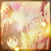
#01; by: supafly
→ If I were a gang leader, I would totally spend my time looking at fireflies too. It's like drawing fanart, only easier!
→ n/a
Optional/Additional Comments:
→ n/a
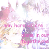
#02; by: minamoto
→ This icon is terrible! There aren't enough light textures on it. I don't know what the iconist was thinking when they only covered 90% of the icon in them.
→ n/a
→ This icon is perfectly contrasted... and the light textures are just awesome. Also, awesome font choice, of course. Comic Sans can never go wrong.
→ It's like lens flares and comic sans everywhere, lol.
→ n/a
→ n/a
→ Their love is so true they don't need any bleach to make the world fade. Awesome concept.
→ I am moved by the beauty of this clear text and its message with this delicate icon.
→ Yo shiny and what-text it is totally unmatching to the icon and makes this icon my choice in Ugly section~
Optional/Additional Comments:
→ n/a
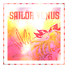
#03; by: kiokushitakaa
→ n/a
Optional/Additional Comments:
→ n/a
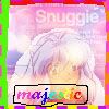
#04; by: moonstruckalice
→ I wish I had thought of using a snuggie ad as a texture! I feel so inferior now. /CRYINNNGGGGGG
→ n/a
→ n/a
→ What did you make this on... MS Paint? I bow down to your skills.
→ n/a
→ n/a
→ n/a
→ n/a
→ A+++ extraction skills you must tell me how you managed it! The beautiful rainbow gradient for the text, I never woulda thought to do this but now I wanna make all my fonts like this - it indeed makes the icon all the more 'majestic'. I love the different colours and style of the border as well, why stick to one when we can have them all!
→ Wow, the newest Snuggies have rainbow animu heads on them?? That's awesome! No wait, I mean, MAJESTIC.
→ n/a
Optional/Additional Comments:
→ Where can I find this majestic Snuggie texture?

#05; by: vincibility
→ I absolutely adore the border on this icon! The way the black blends in to the red and green is just so beautiful.
→ n/a
→ His hair looks awesome. I love the colors.
→ Best use of exclusion and afro I've ever seen.
→ n/a
→ THIS MUST BE UNICORN VOMIT. I CAN'T UNSEE THIS MAGICAL MESS.
→ n/a
→ n/a
→ n/a
→ n/a
→ n/a
→ Ditto quality A+
→ This icon is clearly in a coma.
→ Does he have a Christmas tree in his hair?
→ Mamma Mia! What have you done to that beautiful afro? Pepperonis go on pizza, not hair.
→ Sexiest icon I have ever laid eyes on. Trufax.
→ n/a
Optional/Additional Comments:
→
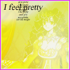
#06; by: elspeth_vimes
→ SO PRETTY INDEED! <3333 Basking in yellows and radiating beauty like the sun... Of course this icon is like the sun, because it's so dazzling that you can't actually see anything. Yes, even the beauty itself.
→ As pretty as skin diseases go...
→ "I feel pretty." Well of course. What icon wouldn't feel pretty completely washed out in yellow, with tiny text and a clashy hot pink border to boot? I feel pretty just LOOKING AT IT.
→ The yellow is so symbolic! I love how you took the classic monotone scheme and put a twist on it, very original. This icon is v. avant-garde~
→ n/a
Optional/Additional Comments:
→ the yellow bright colour is EPIC

#07; by: orijinaru
→ n/a
Optional/Additional Comments:
→ n/a
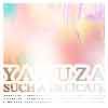
#08; by: nna_chan
→ I need sunglasses to view it, ha.
→ wow! The texture usage here is superb!
→ He's so boss, his awesome shines out of his icon
→ IDK what is going on here, but I know that I love it.
→ The delicate coloring of this image reinforces the text so well.
→ n/a
→ I think this is round 2's winner for "I can't tell what the shit is going on in this icon." GREAT JOB!
Optional/Additional Comments:
→ n/a
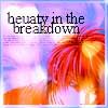
#09; by: snm_queen
→ n/a
→ The two-tone colouring. You are a genius. And black really goes with everything.
Optional/Additional Comments:
→ u r such a good speller! I can't spell beauty baeuty beuaty at all. I had to look at ur icon just to figure out how to spell it!

#10; by: astrokittie
→ n/a
→ LMAO EVANESCENCE I mean, this icon is totally awesome. Such immortal colors, indeed... you can never forget this kind of beauty.
→ One of the worst Alucard icons I've ever seen.
→ n/a
→ This reminds me of a fanfic by the same name. Perhaps you've heard of it?
→ n/a
→ n/a
→ n/a
→ n/a
→ Wow um...wow. What is that?
→ Oh god, the quality of this icon is just awesome.
→ Just breathtaking, your typography is so beautiful, the way the light textures obscures his face adds a mystery that gives this icon dimensions.
→ You are the most famous Harry Potter fanfic in icon form. I think I love you a little.
→ OMG that song was my biggest influence during my teenage years. Your icon makes me want my emo bangs back.
→ Is...is this a reference to that famous, wonderful, astounding piece of fanfiction? If so, it is every bit as gorgeous as that piece of crap art.
→ The rainbow colors totally represent the broad depth of the character! The text is just the icing on the cake, so appropriate!
→ n/a
→ n/a
→ ZOMG what is in this icon, immortal ?? YES THIS IS IMMORTALITY! HAIL UGLY ICON..the light texture so ridiculously pop out everywhere and don't have a constant colour is WIN.
Optional/Additional Comments:
→ This icon is incredible, it expresses my inner emotions. It understands me. The feelings I got from it were as incredible as the first time I listened to Marilyn Manson. I'm using this in my Vampire Freaks profle. I will never write another comment again, I promise. I just couldn't resist.

#11; by: discordous
→ n/a
Optional/Additional Comments:
→ Why is this in the 'Doing it Wrong' section! It's too pretty to even be in there!
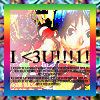
#12; by: pamparumpum
→ SO FKING CUTE@!!!1!
→ n/a
→ n/a
→ Idk I don't have any compliment good enough for this icon
→ n/a
→ n/a
→ This icon defines perfection, that border, the tiny text, the eye catching use of text ;A;<3 I wish I could have half your talents.
→ Whoa, mate. Cut down on the manga. It's bad for composition perception.
→ I almost feel like I'm on acid.
→ i <3 da rainbw brdr n da colors. So prty!1!
→I <3U 2, unrecognizable Bakuman character. I <3U 2.
→I said I LOVE THIS~ I don't know what's going on but I the rainbow borded makes me happy~~!v
Optional/Additional Comments:
→ n/a
#13; by: criminalqueen
→ n/a
→ This icon is as flawless as Regina George. Could use spellcheck though.
→ n/a
Optional/Additional Comments:
→ n/a
#14; by: aentee
→ I think it's great how you were all like "FUCK THA HATERS" and didn't constrain proportions when resizing your image. That shows real spirit and daring. The .jpeg compression and lack of anti-aliasing on your text is also especially exquisite!
→ n/a
→ I can feel the characters' despair just radiating from the icon! I would be in despair too, if my face was squished like that.
Optional/Additional Comments:
→ n/a

#15; by: ryfee
→ This looks like it was awesomely run through the blur filter about 50 times too many, haha.
→ n/a
→ THE PIXELS. THEY ARE GOING TO EAT ME.
→ n/a
→ n/a
→ This icon looks like it was drowned. Do not drink coffee in front of the computer. Never.
→ This icon is so mindblowing, I can't even tell what's going on.
→ Is that Sakura ?? because blurry icon = WIN and I never know what did you do to the icon because I can't even know how to make something like that
Optional/Additional Comments:
→ The level of .jpg compression on this is truly impressive. I didn't even think it was possible to go that far, and I spent like a half an hour trying to get the most compression possible on my bad icon. TEACH ME YOUR WAYS, SENSEI!
#16; by: flashily
→ The use of text in it is legendary.
→ I sent that bitch a smiley face. Bitches love smiley faces.
→ n/a
→ n/a
→ GRADIENT MAPS. BLAST FROM THE PAST.
→ Rainbow colors reminiscent of unicorns & Care Bears + profanity-laced, slangy caption = ABSOLUTE PERFECTION.
→ n/a
→ This THIS is the most brilliant doing for light texture~ slap it and ta-dah..and adding with those text and border makes it really 2006~
→ n/a
→ I don't know about you, but I got 99 problems and a bitch ain't one.
Optional/Additional Comments:
→ ...I know it's supposed to be doing it wrong,
but I can't help but think it looks really pretty. ; c;
#17; by: ce_lestic
n/a
Optional/Additional Comments:
→ My gosh, this shouldn't deserve to be in this section.
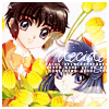
#18; by: twikami
n/a
Optional/Additional Comments:
→ lol This is still oh so pretty but you tried so...76 out of 100!

#19; by: pikatic
→ Homg. Best. Icon. EVER.
→ n/a
→ n/a
→ n/a
→ Your artistic modifications to the original image shows the creativity of a true artist.
→ n/a
→ I'm sure I would find this text compelling if I could read it.
→ Your handwritten caption is so deep man.
→ n/a
→ oh so shiny ugly icon which is rather jab my retina but ugly nonetheless..so beautifully done int he interpretation of the text, light texture, and border
→ n/a
Optional/Additional Comments:
n/a
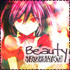
#20; by: vai_rin
n/a
Optional/Additional Comments:
n/a
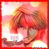
#21; by: lightrobber
→ n/a
→ A very clear message, heightened by the use of red.
→ n/a
Optional/Additional Comments:
n/a
Comment to this UNSCREENED post for your comments. State whether or not you'd like them SCREENED or UNSCREENED. If you'd like them screened, make sure you can receive e-mail notifications. If you'd like some other type of way of receiving them, say so.
By the by the "Hall of Awesome" had a complete make-over & looks better than before. Plus it's been updated.
Challenge Three has already been posted
This one point gap is getting fucking ridiculous. First off I think it's hilarious how you guys can agree in the ugly but disagree in the pretty. I mean I don't blame you but lmao. I don't even. The tie breaker got broken, I would of left the poll open longer but ffs, I have to leave in a couple of minutes. Ffffsss I didn't even get to sleep. ;A; IF I MADE ANY MISTAKES TELL ME, I'LL GIVE YOU GUYS YOUR COMMENTS WHEN I GET BACK. :/ Thank you so much to all the people who participated & submitted, I sincerely appreciate all the extra help with the voting. Like always a huge thank you to all who voted. Without any further delay, here's Challenge 02's results. Congrats to the winners as well.
Skipping: ms_poptart, strawberries_85, coloredpastels
Eliminated/Defaults: skyships, whitelilies22, hamimifk, margyydoodle
Withdrawals: dashberlin
DOING IT RIGHTPeople's ChoiceMod's ChoicePeople's Choice

by: vincibility # (+14) ((+4 Tie Breaker))
Runner Up PC

by: snm_queen # (+14) ((+3 Tie Breaker))Mod's Choice

by: aentee #03
I love everything about this icon. It's just plain gorgeous. The coloring, the text, the use of the trend. Omg it's just gorgeous. &hearts
Mod's Choice

by: supafly #01
I find the coloring in this icon so beautiful & soft. It's just wonderful.DOING IT WRONGPeople's ChoiceMod's ChoicePeople's Choice

by: astrokittie #10 (+19)
Runner Up PC

by: vincibility #05 (+17)
Mod's Choice

by: ryfee #15
The quality in this icon is just above amazing. It's such a quality icon, the colors are so beautiful.
Mod's Choice

by: pikatic #19
Oh whoa, you drew on that!? The doodles look uber realistic & it's just impossible to tell if they were originally there or if you added them.TALLIES
Doing It Right:
#01 - (+03)~ #02 - (+08)~ #03 - (+05)!~
#04 - (+03)~ #05 - (+00)* #06 - (+00)*
#07 - (+04)~ #08 - (+03)~ #09 - (+08)~
#10 - (+06)~ #11 - (+08)~ #12 - (+14)!~
#13 - (+02)!~ #14 - (+00)* #15 - (+03)~
#16 - (+06)~ #17 - (+05)~ #18 - (+09)~
#19 - (+02)~ #20 - (+01)* #21 - (+00)*
#22 - (+02)~ #23 - (+02)~ #24 - (+01)*
#25 - (+14)~ #26 - (+11)! #27 - (+05)!
~ = comment left
! = extra comment / additional
* = n/a
VOTING TABLE FOR REFERENCETALLIES
Doing It Wrong:
#01 - (+02) #02 - (+09) #03 - (+01)
#04 - (+11) #05 - (+17) #06 - (+05)
#07 - (+01) #08 - (+07) #09 - (+02)
#10 - (+19) #11 - (+01) #12 - (+12)
#13 - (+03) #14 - (+03) #15 - (+08)
#16 - (+10) #17 - (+00) #18 - (+00)
#19 - (+11) #20 - (+00) #21 - (+03)
VOTING TABLE FOR REFERENCE
DOING IT WRONG COMMENTS SECTION.
You guys are seriously funny...

#01; by: supafly
→ If I were a gang leader, I would totally spend my time looking at fireflies too. It's like drawing fanart, only easier!
→ n/a
Optional/Additional Comments:
→ n/a

#02; by: minamoto
→ This icon is terrible! There aren't enough light textures on it. I don't know what the iconist was thinking when they only covered 90% of the icon in them.
→ n/a
→ This icon is perfectly contrasted... and the light textures are just awesome. Also, awesome font choice, of course. Comic Sans can never go wrong.
→ It's like lens flares and comic sans everywhere, lol.
→ n/a
→ n/a
→ Their love is so true they don't need any bleach to make the world fade. Awesome concept.
→ I am moved by the beauty of this clear text and its message with this delicate icon.
→ Yo shiny and what-text it is totally unmatching to the icon and makes this icon my choice in Ugly section~
Optional/Additional Comments:
→ n/a

#03; by: kiokushitakaa
→ n/a
Optional/Additional Comments:
→ n/a

#04; by: moonstruckalice
→ I wish I had thought of using a snuggie ad as a texture! I feel so inferior now. /CRYINNNGGGGGG
→ n/a
→ n/a
→ What did you make this on... MS Paint? I bow down to your skills.
→ n/a
→ n/a
→ n/a
→ n/a
→ A+++ extraction skills you must tell me how you managed it! The beautiful rainbow gradient for the text, I never woulda thought to do this but now I wanna make all my fonts like this - it indeed makes the icon all the more 'majestic'. I love the different colours and style of the border as well, why stick to one when we can have them all!
→ Wow, the newest Snuggies have rainbow animu heads on them?? That's awesome! No wait, I mean, MAJESTIC.
→ n/a
Optional/Additional Comments:
→ Where can I find this majestic Snuggie texture?

#05; by: vincibility
→ I absolutely adore the border on this icon! The way the black blends in to the red and green is just so beautiful.
→ n/a
→ His hair looks awesome. I love the colors.
→ Best use of exclusion and afro I've ever seen.
→ n/a
→ THIS MUST BE UNICORN VOMIT. I CAN'T UNSEE THIS MAGICAL MESS.
→ n/a
→ n/a
→ n/a
→ n/a
→ n/a
→ Ditto quality A+
→ This icon is clearly in a coma.
→ Does he have a Christmas tree in his hair?
→ Mamma Mia! What have you done to that beautiful afro? Pepperonis go on pizza, not hair.
→ Sexiest icon I have ever laid eyes on. Trufax.
→ n/a
Optional/Additional Comments:
→

#06; by: elspeth_vimes
→ SO PRETTY INDEED! <3333 Basking in yellows and radiating beauty like the sun... Of course this icon is like the sun, because it's so dazzling that you can't actually see anything. Yes, even the beauty itself.
→ As pretty as skin diseases go...
→ "I feel pretty." Well of course. What icon wouldn't feel pretty completely washed out in yellow, with tiny text and a clashy hot pink border to boot? I feel pretty just LOOKING AT IT.
→ The yellow is so symbolic! I love how you took the classic monotone scheme and put a twist on it, very original. This icon is v. avant-garde~
→ n/a
Optional/Additional Comments:
→ the yellow bright colour is EPIC

#07; by: orijinaru
→ n/a
Optional/Additional Comments:
→ n/a

#08; by: nna_chan
→ I need sunglasses to view it, ha.
→ wow! The texture usage here is superb!
→ He's so boss, his awesome shines out of his icon
→ IDK what is going on here, but I know that I love it.
→ The delicate coloring of this image reinforces the text so well.
→ n/a
→ I think this is round 2's winner for "I can't tell what the shit is going on in this icon." GREAT JOB!
Optional/Additional Comments:
→ n/a

#09; by: snm_queen
→ n/a
→ The two-tone colouring. You are a genius. And black really goes with everything.
Optional/Additional Comments:
→ u r such a good speller! I can't spell beauty baeuty beuaty at all. I had to look at ur icon just to figure out how to spell it!

#10; by: astrokittie
→ n/a
→ LMAO EVANESCENCE I mean, this icon is totally awesome. Such immortal colors, indeed... you can never forget this kind of beauty.
→ One of the worst Alucard icons I've ever seen.
→ n/a
→ This reminds me of a fanfic by the same name. Perhaps you've heard of it?
→ n/a
→ n/a
→ n/a
→ n/a
→ Wow um...wow. What is that?
→ Oh god, the quality of this icon is just awesome.
→ Just breathtaking, your typography is so beautiful, the way the light textures obscures his face adds a mystery that gives this icon dimensions.
→ You are the most famous Harry Potter fanfic in icon form. I think I love you a little.
→ OMG that song was my biggest influence during my teenage years. Your icon makes me want my emo bangs back.
→ Is...is this a reference to that famous, wonderful, astounding piece of fanfiction? If so, it is every bit as gorgeous as that piece of crap art.
→ The rainbow colors totally represent the broad depth of the character! The text is just the icing on the cake, so appropriate!
→ n/a
→ n/a
→ ZOMG what is in this icon, immortal ?? YES THIS IS IMMORTALITY! HAIL UGLY ICON..the light texture so ridiculously pop out everywhere and don't have a constant colour is WIN.
Optional/Additional Comments:
→ This icon is incredible, it expresses my inner emotions. It understands me. The feelings I got from it were as incredible as the first time I listened to Marilyn Manson. I'm using this in my Vampire Freaks profle. I will never write another comment again, I promise. I just couldn't resist.

#11; by: discordous
→ n/a
Optional/Additional Comments:
→ Why is this in the 'Doing it Wrong' section! It's too pretty to even be in there!

#12; by: pamparumpum
→ SO FKING CUTE@!!!1!
→ n/a
→ n/a
→ Idk I don't have any compliment good enough for this icon
→ n/a
→ n/a
→ This icon defines perfection, that border, the tiny text, the eye catching use of text ;A;<3 I wish I could have half your talents.
→ Whoa, mate. Cut down on the manga. It's bad for composition perception.
→ I almost feel like I'm on acid.
→ i <3 da rainbw brdr n da colors. So prty!1!
→I <3U 2, unrecognizable Bakuman character. I <3U 2.
→I said I LOVE THIS~ I don't know what's going on but I the rainbow borded makes me happy~~!v
Optional/Additional Comments:
→ n/a

#13; by: criminalqueen
→ n/a
→ This icon is as flawless as Regina George. Could use spellcheck though.
→ n/a
Optional/Additional Comments:
→ n/a

#14; by: aentee
→ I think it's great how you were all like "FUCK THA HATERS" and didn't constrain proportions when resizing your image. That shows real spirit and daring. The .jpeg compression and lack of anti-aliasing on your text is also especially exquisite!
→ n/a
→ I can feel the characters' despair just radiating from the icon! I would be in despair too, if my face was squished like that.
Optional/Additional Comments:
→ n/a

#15; by: ryfee
→ This looks like it was awesomely run through the blur filter about 50 times too many, haha.
→ n/a
→ THE PIXELS. THEY ARE GOING TO EAT ME.
→ n/a
→ n/a
→ This icon looks like it was drowned. Do not drink coffee in front of the computer. Never.
→ This icon is so mindblowing, I can't even tell what's going on.
→ Is that Sakura ?? because blurry icon = WIN and I never know what did you do to the icon because I can't even know how to make something like that
Optional/Additional Comments:
→ The level of .jpg compression on this is truly impressive. I didn't even think it was possible to go that far, and I spent like a half an hour trying to get the most compression possible on my bad icon. TEACH ME YOUR WAYS, SENSEI!

#16; by: flashily
→ The use of text in it is legendary.
→ I sent that bitch a smiley face. Bitches love smiley faces.
→ n/a
→ n/a
→ GRADIENT MAPS. BLAST FROM THE PAST.
→ Rainbow colors reminiscent of unicorns & Care Bears + profanity-laced, slangy caption = ABSOLUTE PERFECTION.
→ n/a
→ This THIS is the most brilliant doing for light texture~ slap it and ta-dah..and adding with those text and border makes it really 2006~
→ n/a
→ I don't know about you, but I got 99 problems and a bitch ain't one.
Optional/Additional Comments:
→ ...I know it's supposed to be doing it wrong,
but I can't help but think it looks really pretty. ; c;

#17; by: ce_lestic
n/a
Optional/Additional Comments:
→ My gosh, this shouldn't deserve to be in this section.

#18; by: twikami
n/a
Optional/Additional Comments:
→ lol This is still oh so pretty but you tried so...76 out of 100!

#19; by: pikatic
→ Homg. Best. Icon. EVER.
→ n/a
→ n/a
→ n/a
→ Your artistic modifications to the original image shows the creativity of a true artist.
→ n/a
→ I'm sure I would find this text compelling if I could read it.
→ Your handwritten caption is so deep man.
→ n/a
→ oh so shiny ugly icon which is rather jab my retina but ugly nonetheless..so beautifully done int he interpretation of the text, light texture, and border
→ n/a
Optional/Additional Comments:
n/a

#20; by: vai_rin
n/a
Optional/Additional Comments:
n/a

#21; by: lightrobber
→ n/a
→ A very clear message, heightened by the use of red.
→ n/a
Optional/Additional Comments:
n/a
Comment to this UNSCREENED post for your comments. State whether or not you'd like them SCREENED or UNSCREENED. If you'd like them screened, make sure you can receive e-mail notifications. If you'd like some other type of way of receiving them, say so.
By the by the "Hall of Awesome" had a complete make-over & looks better than before. Plus it's been updated.
Challenge Three has already been posted