Help me pick how to do these cards
I'm working on reconstructing an old out of print board game based on Dune. I need to figure out what's the best look for some of these cards. I want to try and have them look better than amateur, and maintain a consistent look.
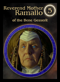
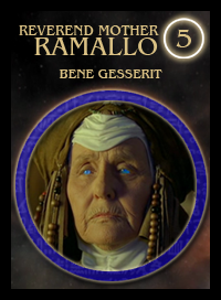
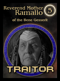
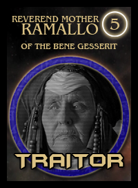
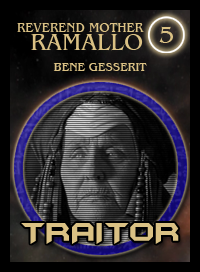
Leader cards. The thing I'm varying is the capital letters, and whether or not I should have "of the" before the faction name. The blue is the faction piece color, the 5 is the leader strength.
_
_
I want the title text of cards to be consistent between the card types. Here are a few of the other cards:
Traitor cards. Caps or not?
_
_
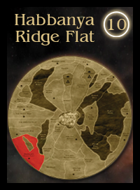
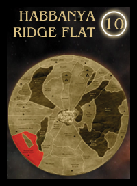
Cards showing where Spice appears on the board. Caps or not? The 10 is how much spice appears there-I'm going to shrink the distance between horizontal spacing for those.
_
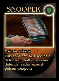
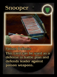
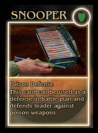
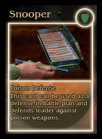
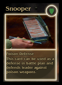
Treachery/item cards. Caps or not? How to enclose the text? The green shield will be a little reminder icon of what type of card this is. In this case, Defense (Shield), Poison (Green)
_
_
_
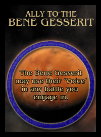
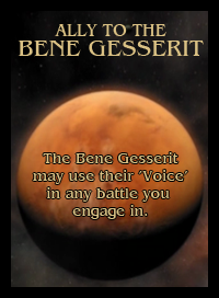
And the ally cards. Should I show the faction circle here again?
_
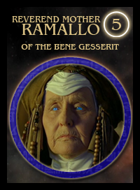
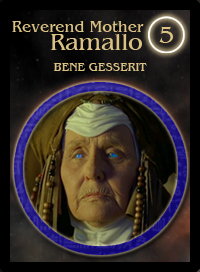
Leader cards. The thing I'm varying is the capital letters, and whether or not I should have "of the" before the faction name. The blue is the faction piece color, the 5 is the leader strength.
_
_
I want the title text of cards to be consistent between the card types. Here are a few of the other cards:
Traitor cards. Caps or not?
_
_
Cards showing where Spice appears on the board. Caps or not? The 10 is how much spice appears there-I'm going to shrink the distance between horizontal spacing for those.
_
Treachery/item cards. Caps or not? How to enclose the text? The green shield will be a little reminder icon of what type of card this is. In this case, Defense (Shield), Poison (Green)
_
_
_
And the ally cards. Should I show the faction circle here again?
_