Tutorial -11- bella emma
From 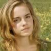
to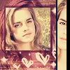
When I cropped my image to a square, and then resized it, I noticed that it became a bit blurry. So, I sharpened the image twice, and using the SMUDGE tool (opacity 40, hardness 40) I smoothed out the skin.

->
->
I duplicated the image twice. I set the topmost layer to SCREEN 44%, and the middle layer to HARD LIGHT 46%.

I merged all the layers. Once again, I duplicated the image once. I desaturated the duplicated layer, and I set it to SOFT LIGHT 100%. I created a new Raster Layer with #F4E1B2 and I set it to DARKEN 100%.

->
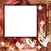
I merged all the layers. I took this texture, made by _pink_lilies_, and I set it to HARD LIGHT 100%.
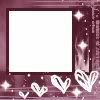
->
I went back to my base image and I duplicated it once. I brought the duplicated layer on top, and using the DEFORM tool, I shrunk the image down a bit and I cropped the sides a bit - I made it fit inside the square area of the texture.
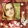
I noticed that the smaller image didn’t really pop, so I adjusted its contrast.
Adjust > Brightness and Contract > Automatic Contrast Enhancement (bias: neutral, strength: mild, appearance: bold)
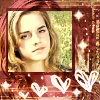
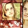
Using the SHAPE tool, I drew in a black rectangular box on the right side of the image. I duplicated the base image, brought the duplicated layer on top of all the other layers, and then using the SELECTION tool, I cut out some of the areas of the layer until I was left with an image just a pixel smaller than the black rectangle I made earlier. I flipped the image horizontally. I duplicated the topmost layer and set it to SCREEN 100%.
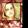
->
->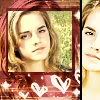
I created a new layer with #F5898B, and I set it to COLOR 28%.
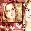
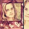
I created another new layer with #0B163F, and I set it to EXCLUSION 100%. And finally, using the SHAPE tool, I drew in another black rectangle, covering just a bit of the right side of the image.
->
to
When I cropped my image to a square, and then resized it, I noticed that it became a bit blurry. So, I sharpened the image twice, and using the SMUDGE tool (opacity 40, hardness 40) I smoothed out the skin.
->
->
I duplicated the image twice. I set the topmost layer to SCREEN 44%, and the middle layer to HARD LIGHT 46%.
I merged all the layers. Once again, I duplicated the image once. I desaturated the duplicated layer, and I set it to SOFT LIGHT 100%. I created a new Raster Layer with #F4E1B2 and I set it to DARKEN 100%.
->
I merged all the layers. I took this texture, made by _pink_lilies_, and I set it to HARD LIGHT 100%.
->
I went back to my base image and I duplicated it once. I brought the duplicated layer on top, and using the DEFORM tool, I shrunk the image down a bit and I cropped the sides a bit - I made it fit inside the square area of the texture.
I noticed that the smaller image didn’t really pop, so I adjusted its contrast.
Adjust > Brightness and Contract > Automatic Contrast Enhancement (bias: neutral, strength: mild, appearance: bold)
Using the SHAPE tool, I drew in a black rectangular box on the right side of the image. I duplicated the base image, brought the duplicated layer on top of all the other layers, and then using the SELECTION tool, I cut out some of the areas of the layer until I was left with an image just a pixel smaller than the black rectangle I made earlier. I flipped the image horizontally. I duplicated the topmost layer and set it to SCREEN 100%.
->
->
I created a new layer with #F5898B, and I set it to COLOR 28%.
I created another new layer with #0B163F, and I set it to EXCLUSION 100%. And finally, using the SHAPE tool, I drew in another black rectangle, covering just a bit of the right side of the image.
->