Gimp tutorial: photocopy effect, darken only mode
Gimp tutorial!
From this: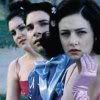
to this: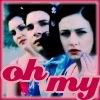
Before I start, I need to get this out of the way: This is to help you learn techniques and Gimp tools. Copying someone's icon exactly is silly. I'd love to see what you did with the technique, though!
1. I cropped an image from But I'm a Cheerleader (and an unknown source) to get this:

2. I duplicated the layer and then increased the saturation (Layer->Colors->Hue-Saturation). You can modify the saturation (and lightness or hue) of six main colors or the entire layer. I left the Master button selected (so I would be modifying the entire layer) and just pulled the Saturation slider to the right until it looked appropriately bright. The movie is all about candy colors. This layer was my new base, so it was Normal at 100% opacity.
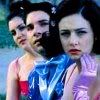
3. I then duplicated the saturated layer and went to Filters->Artistic->Photocopy. I moved the Sharpness and Mask Radius sliders until their faces were mostly fuzzy. Percent Black and Percent White were adjusted to allow for some shades of grey across the hands and clothing, but not much. This layer was set to
Soft light, 60%
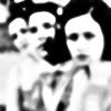
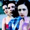
4. I made a new layer and put a light pink-to-translucent vertical gradient on the layer. I set this to Darken Only mode at 100%

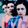
5. I set the background color to a dark pink and the foreground color to a light pink (the same pink as the gradient, actually). Then I made a new layer and Selected All. This enabled me to go to Edit->Stroke Selection and stroke the border of the image with a 6 pixel line. This made a light pink border.
I flipped the foreground and background colors, so that the foreground was now the dark pink. I Selected All again and returned to Edit->Stroke Selection. This time I used a 3 pixel stroke, so the border was thinner and the light pink border could show below the dark pink. (Note: this was done on the same layer, although I could have used two different layers and played with the modes.)
I then went to Filters->Blur->Gaussian Blur and blurred the whole thing to my discretion.
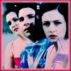
6. As a final touch, I added some text in the dark pink, using separate layers for each word. Once I got the right relative position of the Oh and the My, I merged the layers and used this technique to make Oh My outlined in light pink. I merged the two layers (light and dark pink) for easier positioning and set it to Normal mode at 100% opacity.


In summary:
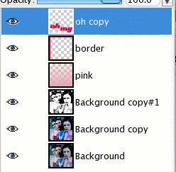
For more icons and tutorials, check out kniticons.
From this:

to this:

Before I start, I need to get this out of the way: This is to help you learn techniques and Gimp tools. Copying someone's icon exactly is silly. I'd love to see what you did with the technique, though!
1. I cropped an image from But I'm a Cheerleader (and an unknown source) to get this:

2. I duplicated the layer and then increased the saturation (Layer->Colors->Hue-Saturation). You can modify the saturation (and lightness or hue) of six main colors or the entire layer. I left the Master button selected (so I would be modifying the entire layer) and just pulled the Saturation slider to the right until it looked appropriately bright. The movie is all about candy colors. This layer was my new base, so it was Normal at 100% opacity.

3. I then duplicated the saturated layer and went to Filters->Artistic->Photocopy. I moved the Sharpness and Mask Radius sliders until their faces were mostly fuzzy. Percent Black and Percent White were adjusted to allow for some shades of grey across the hands and clothing, but not much. This layer was set to
Soft light, 60%


4. I made a new layer and put a light pink-to-translucent vertical gradient on the layer. I set this to Darken Only mode at 100%


5. I set the background color to a dark pink and the foreground color to a light pink (the same pink as the gradient, actually). Then I made a new layer and Selected All. This enabled me to go to Edit->Stroke Selection and stroke the border of the image with a 6 pixel line. This made a light pink border.
I flipped the foreground and background colors, so that the foreground was now the dark pink. I Selected All again and returned to Edit->Stroke Selection. This time I used a 3 pixel stroke, so the border was thinner and the light pink border could show below the dark pink. (Note: this was done on the same layer, although I could have used two different layers and played with the modes.)
I then went to Filters->Blur->Gaussian Blur and blurred the whole thing to my discretion.

6. As a final touch, I added some text in the dark pink, using separate layers for each word. Once I got the right relative position of the Oh and the My, I merged the layers and used this technique to make Oh My outlined in light pink. I merged the two layers (light and dark pink) for easier positioning and set it to Normal mode at 100% opacity.


In summary:

For more icons and tutorials, check out kniticons.