Fun with text texture
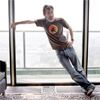
becomes

.
The interesting part of this icon is (I assume) the text. The icon was created in Photoshop CS3 (on a Mac), and the tutorial was originally posted to severalplums.
I usually concentrate on faces, but this time I liked David Tennant's pose so much I decided to do a full-length icon.
To begin with, I cropped and resized (obviously). My preferred method of cropping is actually to use the selection tool, set to fixed ratio to get a square, use the selection to create a new document, then resize. This means I end up with a white background layer-which is sometimes useful.
The original base layer:

Next, I created a new layer, and painted in white over all the background, then used a mask to remove any white that had 'spilled' over DT. Then, on further reflection, uncovered a little patch of the floor around his feet. I duplicated the base layer (just in case) and combined the upper copy of the base and the white painted bits into a new base.
Duplicated the new base, and set to Hard Light at 100%. That's all I did to the actual figure in the icon.
(At some point, I decided I wanted a bit of 'floor' for the lettering, so scooped up a little from the original base layer using the feathery lasso tool, and put it on a new layer just below the lettering, Normal set to 68%. But we could pretend I did that right at the beginning instead...)
Now for the fun part-the text.
I settled on Arial Black at 24 point, and created the W, H and O? in three separate layers-I thought it would be easier to set them exactly where I wanted them by moving around, rather than typing vertically and messing about with spacing. Then selected all three layers together, and stretched using the Move tool until they looked like a column of the right height. Incidentally, the colour I used was picked out from DT's t-shirt, but it doesn't really matter what colour the text was in originally. It was a bit strong, so I reduced the opacity to 68%.
Next, amalgamated the three text layers into one new layer. It's important not to do this until you've definitely finished editing the text. I used a layer mask to remove the parts of the W which are 'under' DT's arm. (In my experience, masking is a much better bet than using the Erase tool, because with masking, you can go back twenty minutes later and change things if you want to.)
And now, to get that textured effect on the text, I used the Lasso tool with feathering set to 2, and selected a random shape from DT's jeans from the new base layer . Copied it onto a new layer, and duplicated this new layer twice, then used the Move tool to set each layer somewhere over the letters. There was definitely some rotating involved, and quite possibly a bit of stretching as well.
When I was satisfied that I had good coverage of the letters, I combined the three random bits of jeans into one layer, and positioned that layer immediately above the text layer. Then overlaid the jeans layer (I'm sure there's a proper name for this, which one of you may be able to supply): to do this, go to the Layers palette and rest the cursor on the line between the two layers. Then press Alt (on a Mac-it may possibly be a different key for Windows machines). The cursor symbol changes to a sideways arrow with a black ball part-covering a grey ball. Then click. This makes the upper layer cover only what is on the layer immediately below - so no need for tedious masking of unruly edges. The Jeans layer is set to Normal, 100%. This is a really handy technique for getting texture onto text-or onto a brush, or any single element that's on its own layer. You can even stack the layers.
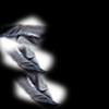
This is what the 'random jeans bits' layer looks like - I've put a black background so that you can see what I actually lassoed, but the black parts are actually transparent on the layer itself.
It looked a little bare, so I used a 35 soft brush and colour 5a627f to draw a diagonal line on a new layer. For a nice straight line, click on the start point then hold down the shift key before clicking at the end point. Set this to Exclusion at 51%, duplicated the layer, and set the upper one to Vivid Light at 100%. (This was after quite a bit of experimenting, you understand!) I did fairly approximate masks of the parts of DT's torso that were covered by the bar.
Lastly, I wanted a little less grey in the overall tone, so I added this gradient from a set by adoralyna, set to Color at 55%, and masked off DT's body and quite a bit of the upper right hand side of the icon.

Then, saved the .psd, and then Saved for Web and Devices as PNG 24.
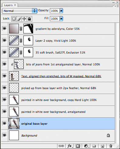
This is what my Layers palette looks like:
And here, just to remind you, is the finished icon:

If there's anything I've not made clear, please ask.