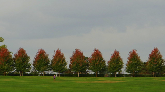
I like the third because of the human interest factor (people and dogs)that liven up the row of trees. I'd crop part of teh sky, though to make it look more panoramic.
In the first one, the two-toned colour of the trees is more evident.
I think the first is best. The human interest in three is too small and so ends up being a distraction. You want to capture the fall? It's the colors along with the repetition of the form that satisfies.
I guess we all perceive scenes differently...the humans and dogs don't distract me. They add to the picture in my perception. That's what makes it all interesting...how we all react differently. :)
First one is best for tree colour, but I like the second one because you have the texture and shades in the clouds in that one as well, which is kind of a foretaste of the winter to come.
I'd pick the first one, but maybe crop out the tree on the far left, which removes the distraction of the greener, taller tree behind it. Actually, come to think of it, maybe I'd crop down to just the middle five trees.
Comments 6
In the first one, the two-toned colour of the trees is more evident.
Hmmm
Reply
Reply
That's what makes it all interesting...how we all react differently.
:)
Reply
Reply
Reply
Reply
Leave a comment