Tutorials #37 & #38 - Harry Potter and Keira Knightley
*Requested by serena04.
Going from this to
.
*USING PSP8*
PLEASE DON'T COPY THIS ICON, USE THE STEPS TO CREATE SOMETHING THAT IS YOUR OWN; THAT'S MAKES IT MORE FUN, ANYWAY :)
- I took this picture from The Leaky Cauldron and cropped it down to a 100x100 base and desaturated it.

- Duplicated the base layer. Set it to multiply 100 and do a Copy Merge (Ctrl+Shift+c) and paste it as a new layer on the top. Set this layer to hard light 100. I had to go back to the multiply layer and lower the opacity to 14 because it was too dark, but all images vary, I suppose.

This gives it a bit more depth, IMO. :P
- I took a "grungy" texture from Shattered Elegance and set it in between the hard light and multiply layers. I set it to screen 100 and duplicated it then lowered the duplicated opacity to 50. (my layers)
>
- For the text I used Episode I. Size 4. All Caps. In White.

>
And that's all. :)
**Opacities for layers may vary depending upon your image; don't be afraid to experiment!**
Requested by sjjtnj.
Going from this to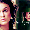
.
*USING PSP8*
PLEASE DON'T COPY THIS ICON, USE THE STEPS TO CREATE SOMETHING THAT IS YOUR OWN; THAT'S MAKES IT MORE FUN, ANYWAY :)
- I took a picture from Keira Knightley Fan and cropped it down to a 100x100 base. Duplicated the base layer and set it to screen 38.
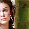
- I added a new Curves Adjustment layer and used the following settings:
RGB: Input-0, Output-0
Red: (1 click) I-135, O-200
Green I-0, O-0
Blue (1st click) I-77, O-77
(2nd click) I-176, O-111
Clicked OK and set it to Normal 78.
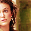
- Added another curves adjustment layer using the following settings:
RGB: I-0, O-0
Red: (1 click) I-94, O-39
Green: I-0, O-0
Blue: (1st click) I-41, O-94
(2nd click) I-117, O-145
Clicked OK and set the layer to Normal 58.
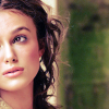
- Next, I duplicate that 2nd curves layer I just made (the one from the last step); I changed the blend mode and opacity to soft light 30.
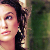
It should only make it a little darker, okay?
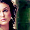
- Created a new layer and flood fill it with light blue (#8BBEE1). I set this layer to Burn 50.

>
- I did a copy merge and "pasted as a new layer" at the very top; this layer's set to soft light 66.
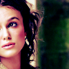
MERGED LAYERS.
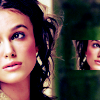
- Using the Selection Tool (the Rounded Rectangle selection type), I selected a portion of Keira's face. Once you have your selection, "promote" it to a new layer (Ctrl+Shift+P). Now that the selection is on it's own layer, I resized it (just THAT layer) down a bit; I went down to 55 px, but do whatever looks best on your icon. I next mirrored the promoted layer and set it off to the right.

>
- For the text I used Violation. In White. Size 5. In Italics.

>
And that's it. :)
**Opacities for layers may vary depending upon your image; don't be afraid to experiment!**
FRIEND ME | RESOURCES | OTHER TUTORIALS
Going from this to
.
*USING PSP8*
PLEASE DON'T COPY THIS ICON, USE THE STEPS TO CREATE SOMETHING THAT IS YOUR OWN; THAT'S MAKES IT MORE FUN, ANYWAY :)
- I took this picture from The Leaky Cauldron and cropped it down to a 100x100 base and desaturated it.
- Duplicated the base layer. Set it to multiply 100 and do a Copy Merge (Ctrl+Shift+c) and paste it as a new layer on the top. Set this layer to hard light 100. I had to go back to the multiply layer and lower the opacity to 14 because it was too dark, but all images vary, I suppose.
This gives it a bit more depth, IMO. :P
- I took a "grungy" texture from Shattered Elegance and set it in between the hard light and multiply layers. I set it to screen 100 and duplicated it then lowered the duplicated opacity to 50. (my layers)
>
- For the text I used Episode I. Size 4. All Caps. In White.
>
And that's all. :)
**Opacities for layers may vary depending upon your image; don't be afraid to experiment!**
Requested by sjjtnj.
Going from this to
.
*USING PSP8*
PLEASE DON'T COPY THIS ICON, USE THE STEPS TO CREATE SOMETHING THAT IS YOUR OWN; THAT'S MAKES IT MORE FUN, ANYWAY :)
- I took a picture from Keira Knightley Fan and cropped it down to a 100x100 base. Duplicated the base layer and set it to screen 38.
- I added a new Curves Adjustment layer and used the following settings:
RGB: Input-0, Output-0
Red: (1 click) I-135, O-200
Green I-0, O-0
Blue (1st click) I-77, O-77
(2nd click) I-176, O-111
Clicked OK and set it to Normal 78.
- Added another curves adjustment layer using the following settings:
RGB: I-0, O-0
Red: (1 click) I-94, O-39
Green: I-0, O-0
Blue: (1st click) I-41, O-94
(2nd click) I-117, O-145
Clicked OK and set the layer to Normal 58.
- Next, I duplicate that 2nd curves layer I just made (the one from the last step); I changed the blend mode and opacity to soft light 30.
It should only make it a little darker, okay?
- Created a new layer and flood fill it with light blue (#8BBEE1). I set this layer to Burn 50.
>
- I did a copy merge and "pasted as a new layer" at the very top; this layer's set to soft light 66.
MERGED LAYERS.
- Using the Selection Tool (the Rounded Rectangle selection type), I selected a portion of Keira's face. Once you have your selection, "promote" it to a new layer (Ctrl+Shift+P). Now that the selection is on it's own layer, I resized it (just THAT layer) down a bit; I went down to 55 px, but do whatever looks best on your icon. I next mirrored the promoted layer and set it off to the right.
>
- For the text I used Violation. In White. Size 5. In Italics.
>
And that's it. :)
**Opacities for layers may vary depending upon your image; don't be afraid to experiment!**
FRIEND ME | RESOURCES | OTHER TUTORIALS