sixteenth
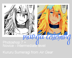
This was requested by a watcher about a couple weeks ago. I apologize for the lateness!
Before we start, I'm going to say that I'm absolute rubbish at 1. Teaching people and 2. Writing. So please have patience and bear with me!
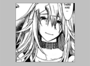
I'll assume you've already cleaned and cropped the image.
Make a few layers over this image and set them all to Hard Light. With each different layer, you will be using a different color, or at least, a different body part for each layer.
So, let's start by selecting the feature we want to color first with the Polygonal Lasso, in this case, I chose her face.
There are other (better) ways of selecting a part of an image, but the Polygonal Lasso has become somewhat of a habit for me now.
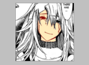
After you've selected her face, fill in the color of the skintone you want. For tips on skintone, refer to the bottom of this guide. Selecting the layer is important to stay inside the lines. Don't select the entire square in the canvas, however. Instead, make sure you select whatever has already been filled in with your color. This is very important for the rest of the guide because it relies on this so much.
So what you do is Right-click the preview image on the layer (this part) and choose, "Select Pixels." That should select only what you have filled in the layer. As a side note, I want to recommend level's method of utilizing Clipping Masks. You can read about them in her own manga coloring tutorial here.
Anyway, usually I'll erase the part of the skin that overlaps with the eyes and sometimes even the eyelashes too.
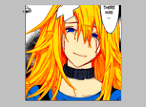
Here's her hair, eyes and clothes colored in. Note that the shade of her hair is a little off. She looks more like Orihime from Bleach than Kururu from Air Gear! xD
But the trick is usually to get a medium color, where you reserve the lighter color for the light and the darker colors for the shadows.
With Kururu, copper orange hair is best. ^^
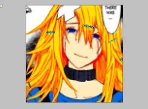
What I did with her hairclips was that, in a new layer, I colored them in as I would, then hit CTRL + left mouse button over the image layer's preview image, which selects all the layer's filled in parts.
Then I took that selection to the hair layer and erased it, so that the color from her clips don't overlap with the color of her hair.
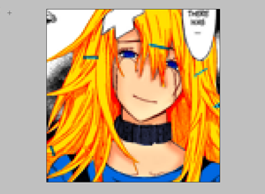
Now that we're done with the base coloring, we can move onto adding depth and shadows to our image.
Let's pretend our light source is above Kururu, like a ceiling light. Naturally, the hair over heir face and shoulders would be shadowed, as well as the area under her chin. We'll put the darkest shadows where, logically, there would be no light and we will keep the areas we assume would be touched by the light in the original colors.
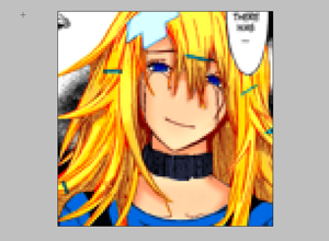
Here is her hair. Now it's in a lighter color overall, despite the shadows we've have applied.
We used a lighter orange to convey light on her head and shoulders. As we move lower towards the ends of the hair and the insides, we add a darker shade of orange. The most contrast between light, medium and dark means more emphasis on shadow, texture and light.
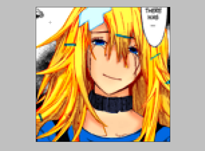
Here, we added a bit more shadows to her clothes and her neck piece. It's a bit subtle, but hopefully you notice the difference in the end result. I also added a bit more depth to her eyes by adding a darker color blue to them.
I forgot to take a screenshot of doing her lips and tears! I made the tears with using a light color on top of her skin tone to convey opacity (or lack thereof), and just put a pink color on top of her lips.
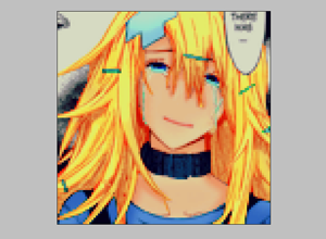
So here's the result. I added Selective Coloring to enhance the tears and her hair, a Brightness/Contrast layer to matte down her face a little, a Hue/Saturation layer to saturate the image after the color was washed out from the previous layer. I also put Curves in to give it a little bit more contrast and a Color Fill (dark dark blue) set to Exclusion.
Here is a screenshot of all my layers in action.
This was kind of a cursory attempt at coloring an image. However, this image is not being distributed in yarinige so I didn't feel like making it all super pretty.
Sorry, no PSD files for you! Just try it out and see for yourself. Also, I don't expect (nor desire) truckloads of colored icons colored the same way. So experiment! Find your own niche. Walk your own road. ;)
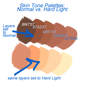
So here's the skin palette that I mentioned earlier.
The top bunch are skin tones that I use a lot, ranging from very dark to medium toned. They may seem like they're a little too dark to use on manga, but if you set them to Hard Light, they look a little bit more pleasing!
So usually, I'll choose the ones on the very right as my base skin tone and the rest as variations of shadows.
You don't have to use these particular colors, however. Pick whatever you want!
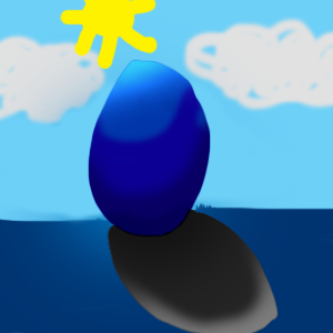
Also, here's my surfer Easter egg, lounging under the sun. Assume the sun is behind and above him. Therefore, the light would be towards the top and as it gets lower, the shadows would become more prevalent. Since this is a sphere (at least, I tried to make it a sphere!), you will notice that the shadows are in a U shape.
The dark grey thing represents the shadow, but most people don't need that when they are coloring manga.
I also love using the other Hue/Saturation on Photoshop that doesn't leave a layer! This only affects one layer instead of all of the layers below it. So if you don't like a certain hue of a hair or whatever, use this nifty tool! Simply go to Image -> Adjustments -> Hue/Saturation, or simply command CTRL+U.
Well, that's it! Hope you enjoyed this guide. If there are certain parts you don't understand, do leave a comment! I will try to clarify the best I can.