Tutorial #14 by star_jrock

Credits: xloliconsx
Made in: AdobePhotoshop 7.0
Creator: star_jrock
E X A M P L E S:


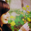
RULES:
♥ Comments would be awesome! :)
♥ Credit is not needed, unless you take one of the examples. xD
♥ Don't hotlink, please.
♥ Don't redistribute.
♥ Questions are welcomed.
♥ I would love to see your results!
♥ This entry will become F-Locked within 48 hours.
♥ Enjoy!
*note: This image works best with images that have a white-ish background or you can say, bright. This is not for images that have a black background, the results won't turn out nice. Lol.
o1. New Adjustment Layer > Selective Color
REDS:
cyan: -100
magenta: 0
yellow: 25
black: 0
YELLOWS:
cyan: 100
magenta: 30
yellow: 35
black: 0
WHITES:
cyan: 0
magenta: 0
yellow: 0
black: -45
NEUTRALS:
cyan: 15
magenta: 5
yellow: 9
black: -10
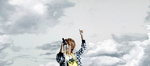
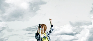
『note: for the first step, we're just adding a little color to it and making the white come out more from the picture.』
o2. New Adjustment Layer > Channel Mixer
RED:
red: 100
green: -10
blue: 0
GREEN:
red: 100
green: -10
blue: 0

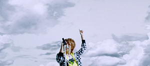
『note: for the second, we're making the color of the image more less yellow and so it'll be easier to work with.』
o3. Layer > New Fill Layer > Solid Color
MODE: EXCLUSION OPACITY: 40%
COLOR: #524E24


『note: for the third step, i'm toning down the sharpness of the image. we're smoothing it out a little.』
o4. Layer > New Fill Layer > Solid Color
MODE: COLOR BURN OPACITY: 30%
COLOR: #C0D4F9

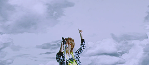
『note: for the fourth step, to the images that don't have too much blue on the subject, we're just adding the blue and darkness to it.』
o5. Layer > New Fill Layer > Solid Color
MODE: SOFT LIGHT OPACITY: 20%
COLOR: #F9E3CA

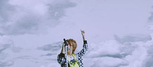
『note: for the fifth step, i'm brightening the image up more with a pink-ish color, so it'll look better to the eyes...well, my eyes, at least.』
o6. Duplicate base and drag it to the top. Set the layer to DARKEN.

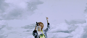
『note: for the sixth step, i've done this, because the clearness of the subject was a bit not so clear anymore, but all i wanted was the subject to be clear, and nothing else [including the background and such] and so that's why i set it to darken.』
o7. Layer > New Adjustment Layer > Colour Balance
MIDTONES:
22 | 14 | 14
SHADOWS:
-21 | 4 | 8
HIGHLIGHTS:
15 | -3 | 5

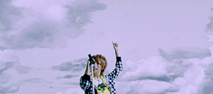
『note: for the seventh step, basically, just adding a little more color to the image.』
o8. Layer > New Adjustment Layer > Hue/Saturation
MASTER:
saturation: +25

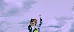
『note: for the eighth step, basically, just adding a little more color to the image.』
o9. Add Texture
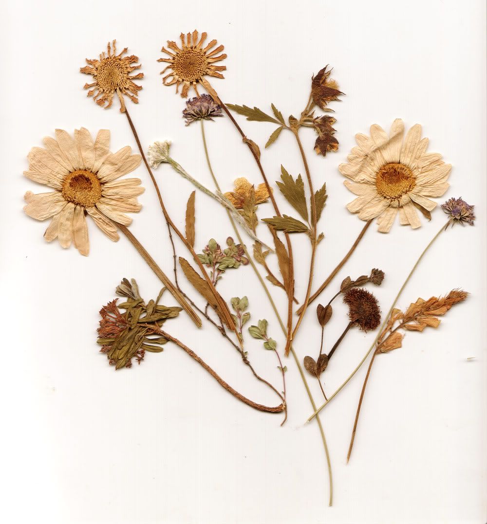
Set to: DARKEN
OPACITY: 100%
FILL: 100%
Made by: zeldona

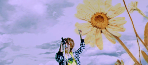
『note: for the ninth step, i'm making it look pretty, duh.』
o10. Add Texture
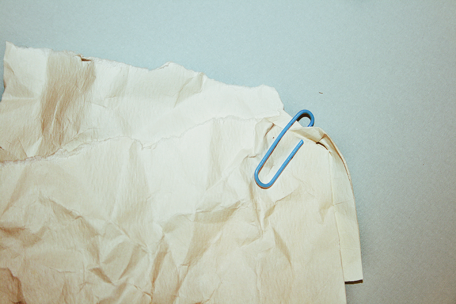
Set to: SOFT LIGHT
OPACITY: 100%
FILL: 100%
Made by: yunhe

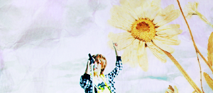
『note: for the tenth step, i'm brightening the image up more with a more yellow tone to it and a paper texture. also, i was trying to get rid of the blueness in the background...it's not pretty.』
o11. Layer > New Fill Layer > Solid Color
MODE: LINEAR BURN OPACITY: 40%
COLOR: #B3B3B3

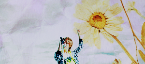
『note: for the eleventh step, basically, the image was a bight too bright and frilly, so i toned it down with a gray color. Notice that it not only tones down the brightness, it also gives the image a gray-ish mask that makes the image a bit more softer.』
o12. New Adjustment Layer > Curves
INPUT 155
OUTPUT: 175

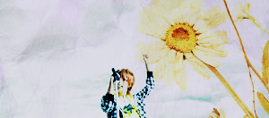
『note: for the twelfth step, it was a bit too dark, so i made it a little bright...again. lol.』
o13. Add Texture
Set to: SCREEN
OPACITY: 100%
FILL: 50%
Made by: xcugglesx

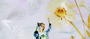
『note: for the thirteenth step, once again, just making it look pretty. :P』
o14. Add Texture
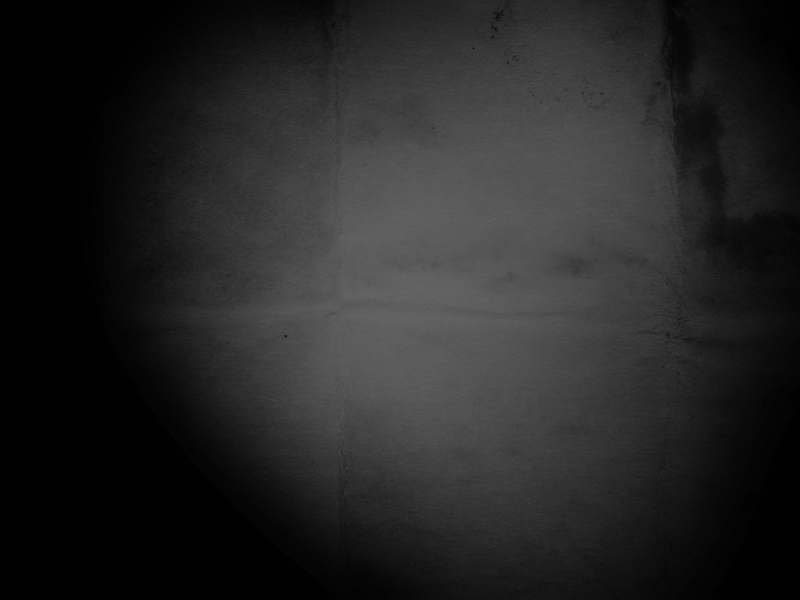
Set to: LIGHTEN
OPACITY: 100%
FILL: 100%
Made by: 51291

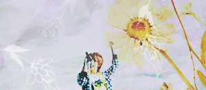
『note: for the fourteenth step, adding a little light that you probably can't even see that well, but it looks cool to me. lol.』
o15. Add Texture

Set to: LIGHTEN
OPACITY: 100%
FILL: 100%
Made by: star_jrock

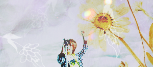
『note: for the last step, adding my own light texture, i've done so because the image looked boring without a light, so i added a light texture to make it look a little more "wow".』
You are now done. If you want, you can add text like how I did it with mine. If you're curious as to what the font I used for the handwriting is called, it's called, "Susie's Hand". The Japanese kanji's called, "Kozuka Mincho Pro".
『.P S D』
DOWNLOADS: #162
.PSD will not be removed, since I know that this tutorial has ALOT of steps in it. Hahaha. But please do comment when taking it. It's irritating knowing that someone's taking your creation without even thanking you when you offered to help them out. That's rude.
Thank you for checking out my tutorial! ♥