Working with backgrounds - Photoshop tutorial
I made a new header for coolbreeze1 and had to work with Sheppard's pic of him in the rain from The Eye. I had never seen a tutorial about creating a full background with a smaller picture before, so I made this one. This is my second tutorial ever. ^_^
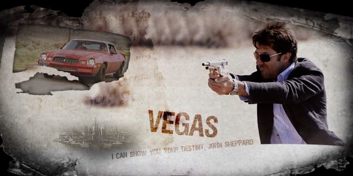
We will work in Photoshop (CS2) to make a LJ header similar to this one:
First, open a new document, 700px by 350px, transparent background.
Background:
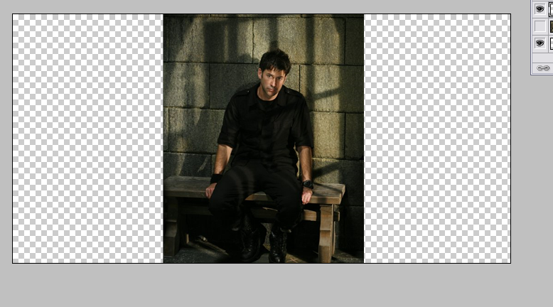
We will use this pic for the background:
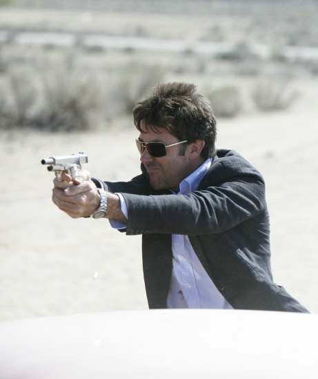
As you can see, the pic is has the wrong measures to fit the canvas. Resizing it to make Shep the right size , leaves part of the canvas uncovered (Edit > Free Transform - keep 'Ctrl' pressed to resize the pic keeping the proportions) .
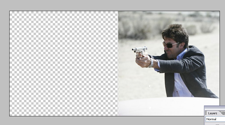
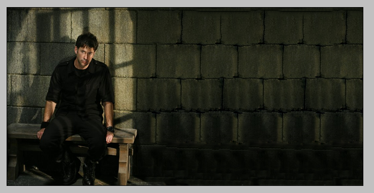
Luckly for us, Shep is against a plain background, which means we can clone the desert and trees in the distance and fill the rest of the canvas with it, making it look like one giant desert. If you work with it enough, you can make it cover the whole canvas, or only part of it.
To do this we are going to use two tools in Photoshop: the Clone Stamp Tool and the Healing Brush Tool.
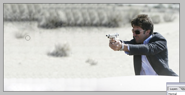
Press 'S' in the keyboard to select the Clone Stamp Tool. Go to a portion of the desert and press 'Alt' and click over it. You just selected a source to clone. Now, go to the edge of the pic and use this tool to brush over it. As you can see, new desert is being created there. When the source ends, just select a new one ('Alt' + click) and keep doing this over and over.
After you have a part of the filling done, you may notice that parts of the desert looks like it's repeating itself.
We have to get rid of the lines and the patterns that keep repeating. We do this with the Healing Brush Tool. Basically this tool will heal these parts and make then blend seamlessly.
Press 'J' to select the Healing Brush Tool. This tool works just like the Clone Stamp Tool, but it is used to heal and blend already cloned parts. 'Alt' + click a source and brush over the repeating patterns and lines. Use small brushings. Change the source sometimes and continue doing this until you are satisfied with the end result.
Here is a more complex example:
Coloring
Now let's do some coloring. Go to Layer > New Adjustment Layer > Brightness/Contrast. Adjust the settings to Brightness -5 and Contrast +12.
Now, go to to Layer > New Adjustment Layer > Selective Coloring. Adjust the settings like this:
Reds:
Cyan: -50%
Magenta: -20%
Yellow: +20%
Black: -5%
Yellows:
Cyan: -100%
Magenta: 0
Yellow: +100%
Black: +100%
Whites:
Cyan: -20%
Magenta: +27%
Yellow: +24%
Black: -15%
Neutrals:
Cyan: -15%
Magenta: 0
Yellow: 0
Black: 0
Blacks:
Cyan: +15%
Magenta: +15%
Yellow: +15%
Black: 0
Textures and Composition:
Now, place this texture over all the layers and resize to fit the canvas. Change the blending mode to Multiply.
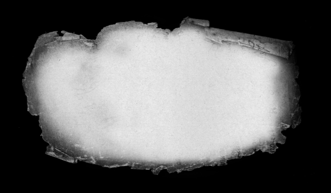
Credit of texture goes to caugraphics.
We get this:
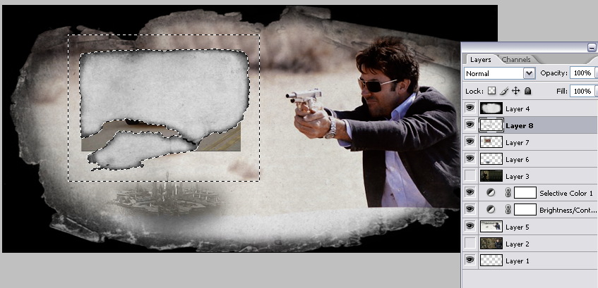
Under this texture, put this image of Atlantis, resized to be very small.
Use a medium size eraser with soft edges to erase all the borders until we have mostly only Atlantis. Change the blending mode to Luminosity at 70%. We get this:
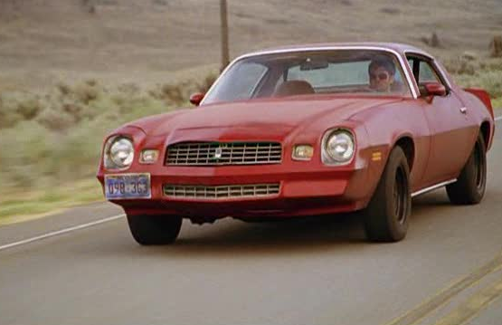
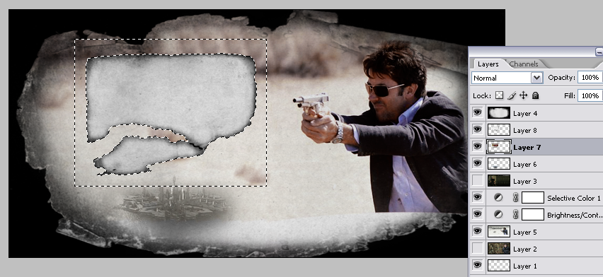
Now, open this image and resize it to make it slightly bigger than Atlantis.
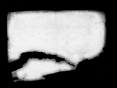
Now, open this texture, also by caugraphics:
Resize it to make it about the same size as the car image and place it over it. Press 'W' to use the Magic Wand Tool. Select the black area around the texture and delete it. Now, don't deselect it, change to the car layer and delete the same selection.
Change the blending mode of the texture to Multiply.
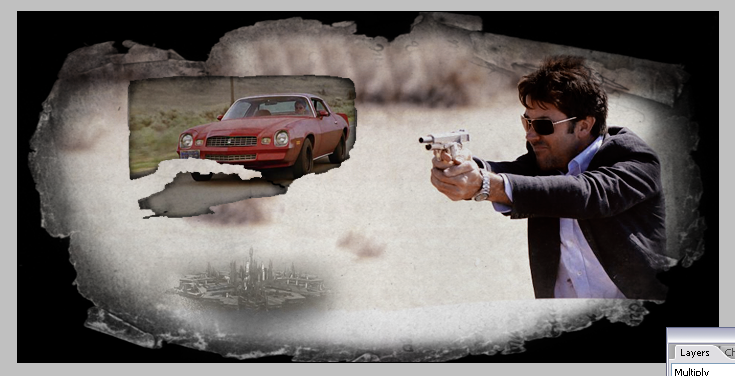
Then, I changed the opacity of both layers (texture and car) to 85% each, because the car was too red and getting too much attention away from Shep.
'Shift' + select both layers, go to Edit > Free Transform and tilt the images.
Text:
Write 'Vegas' with a grungy texture (I used 'Viper Nora') in a brownish color. Use the Eyedropper Tool to choose a color from the image itself. Set the blending mode to 'Color Burn' and tilt it a little (Edit > Free Transform).
Write a quote from the episode and apply the same settings, but now make it smaller and change the opacity to 50%.
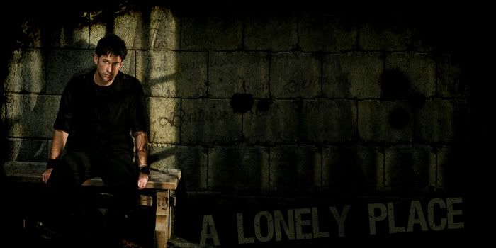
Final:
Also check out coolbreeze1's header for another example of a similar design.
We will work in Photoshop (CS2) to make a LJ header similar to this one:
First, open a new document, 700px by 350px, transparent background.
Background:
We will use this pic for the background:
As you can see, the pic is has the wrong measures to fit the canvas. Resizing it to make Shep the right size , leaves part of the canvas uncovered (Edit > Free Transform - keep 'Ctrl' pressed to resize the pic keeping the proportions) .
Luckly for us, Shep is against a plain background, which means we can clone the desert and trees in the distance and fill the rest of the canvas with it, making it look like one giant desert. If you work with it enough, you can make it cover the whole canvas, or only part of it.
To do this we are going to use two tools in Photoshop: the Clone Stamp Tool and the Healing Brush Tool.
Press 'S' in the keyboard to select the Clone Stamp Tool. Go to a portion of the desert and press 'Alt' and click over it. You just selected a source to clone. Now, go to the edge of the pic and use this tool to brush over it. As you can see, new desert is being created there. When the source ends, just select a new one ('Alt' + click) and keep doing this over and over.
After you have a part of the filling done, you may notice that parts of the desert looks like it's repeating itself.
We have to get rid of the lines and the patterns that keep repeating. We do this with the Healing Brush Tool. Basically this tool will heal these parts and make then blend seamlessly.
Press 'J' to select the Healing Brush Tool. This tool works just like the Clone Stamp Tool, but it is used to heal and blend already cloned parts. 'Alt' + click a source and brush over the repeating patterns and lines. Use small brushings. Change the source sometimes and continue doing this until you are satisfied with the end result.
Here is a more complex example:
Coloring
Now let's do some coloring. Go to Layer > New Adjustment Layer > Brightness/Contrast. Adjust the settings to Brightness -5 and Contrast +12.
Now, go to to Layer > New Adjustment Layer > Selective Coloring. Adjust the settings like this:
Reds:
Cyan: -50%
Magenta: -20%
Yellow: +20%
Black: -5%
Yellows:
Cyan: -100%
Magenta: 0
Yellow: +100%
Black: +100%
Whites:
Cyan: -20%
Magenta: +27%
Yellow: +24%
Black: -15%
Neutrals:
Cyan: -15%
Magenta: 0
Yellow: 0
Black: 0
Blacks:
Cyan: +15%
Magenta: +15%
Yellow: +15%
Black: 0
Textures and Composition:
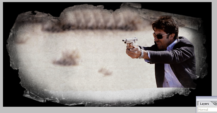
Now, place this texture over all the layers and resize to fit the canvas. Change the blending mode to Multiply.
Credit of texture goes to caugraphics.
We get this:
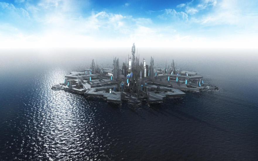
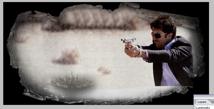
Under this texture, put this image of Atlantis, resized to be very small.
Use a medium size eraser with soft edges to erase all the borders until we have mostly only Atlantis. Change the blending mode to Luminosity at 70%. We get this:
Now, open this image and resize it to make it slightly bigger than Atlantis.
Now, open this texture, also by caugraphics:
Resize it to make it about the same size as the car image and place it over it. Press 'W' to use the Magic Wand Tool. Select the black area around the texture and delete it. Now, don't deselect it, change to the car layer and delete the same selection.
Change the blending mode of the texture to Multiply.
Then, I changed the opacity of both layers (texture and car) to 85% each, because the car was too red and getting too much attention away from Shep.
'Shift' + select both layers, go to Edit > Free Transform and tilt the images.
Text:
Write 'Vegas' with a grungy texture (I used 'Viper Nora') in a brownish color. Use the Eyedropper Tool to choose a color from the image itself. Set the blending mode to 'Color Burn' and tilt it a little (Edit > Free Transform).
Write a quote from the episode and apply the same settings, but now make it smaller and change the opacity to 50%.
Final:
Also check out coolbreeze1's header for another example of a similar design.