snaking text, a flashing star, Image Ready and Tween
Tutorial for icon #8 in this batch, using photoshop cs and image ready, requested by earlylight .
Yes. I thought this tutorial would be a brief one. I was definitely wrong.
This tutorial is a step-by-step guide on how to make
from scrap, hopefully easy to follow - even for photoshop and Image Ready beginners.
Notes:
Photoshop shortcuts are shown in the round brackets: e.g. (ctrl + shift + n); (v); etc…
My photoshop is German. Should anything be unclear despite the screenshots, please drop a comment, and I will try to translate the parts in the screenshots that aren’t clear.
1. To get the fake community look:
Open up your livejournal profile and make a screenshot by pressing the print-button [next to F12] on your keypad.
Open a new file (ctrl + n), make sure the canvas you’re about to open is big enough. Then insert the screenshot into your empty canvas (ctrl + v).
Now zoom in using the magnifying tool (z or alt + z, depending on your settings) to 300% or more.
Select the wand tool (w) and, while holding down the shift button, click on the colored parts of the little red community icon. Once everything is selected, copy what you’ve got (ctrl + c), or even better: cut it out of your canvas (ctrl +x). That way, you can be sure you’ve got all the parts you’ll need.
Now open a new canvas (ctrl + n). For practicality’s sake, make it a 100x100 leaving the background transparent. Insert the community icon (ctrl + v).
Now select the text color (i) for your fake community link from the screenshot. (That is why we zoomed in to high percentage.) Switch back to your 100x100 and create a text-layer (t), and select a common font. In this case, I used Arial.
Type away!
Now select the line-tool (u).
At the top of your screen, a sub-header will appear.
[
]
Select the fourth box as shown. Photoshop might ask you if you want to grid your layer. If it does, press ok.
Create a new layer: layer - new - layer (ctrl + shift + n)
Now, using the same color as you did for the text, draw a line. The length doesn’t matter, since you can erase the excess later on.
Now move your community icon, the line and your text around with the move tool (v) till you think it looks right, then erase (e) those parts of the lines that stick out too far from under your text. Maybe a square-shaped brush would work best for this.
[When erasing, make sure you have the right layer selected. If you make a mistake and would like to go one step back, press (ctrl + z). This will only work for one step!].
Once you are sure everything looks just right, merge your layers together: layer - merge visible (ctrl + shift + e)
[
] very inaccurate example image
Create a new layer (ctrl + shift + n) and fill it (g) with white.
Add your text (t) and move things around till you’ve got what you want, then merge your visible layers again.
In this case, the layer I created then looked like this: [
]
2. The animated text (snaking from one letter to the next).
Click on the visibility icon [
] of your last layer. You won’t bee needing it for a while.
Create a new layer. For now, fill it with any color that will contrast well with the color you will choose for your text you are about to animate. In this case, I chose background color white and text-color black. Then type your text, and align it whichever way you please.
Now open three new canvases (ctrl + n) and fill (g) each with different shades of one color. Then arrange them in such a way that they’ll be easily accessible. You’ll be busy with them for quite a while - depending on the length of your text.
Go back to your text layer and duplicate it (ctrl + j) several times… or many times, actually. Then press on the visibility icon for all except the one all the way at the bottom.
Now select your bottom text-layer and double click on the capital “T” in your layer window. This should highlight your text, so you can manipulate it.
Select the first letter, and fill it with your palest color. Then select the second letter and fill it with your medium-shaded color, and finally the third letter with the darkest color.
Activate the visibility of your next layer. You might like to keep the visibility on for the prior layer, just to make things easier.
Note: work thoroughly here! If you mess up one these layers, you’ll bite your own butt later on. It’s extremely annoying to click your way through a billion layers to find a tiny mistake - especially if you’ve already started the animation, clicked the preview, and notice that something looks somehow wrong. So be careful here. Just in case.
Once you have finished coloring all of your letters, switch to your background layer, and fill it (g) with the same color you chose for your text, so that nothing but the three colored letters in each frame will be visible.
This is what the first frame looked like in my case [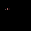
]
3. The wee blinkie:
Now create a new layer (ctrl + shift + n), deactivate the visibility of all other layers and duplicate the top-most text-layer, then change the color of your text to whatever you please. I chose one of the rose-hues for this icon. Then make this new text-layer invisible as well.
Move your empty layer on top of all your other layers, then select a brush (b) and a pale color (in this case white). From the brush menu, I selected a photoshop-default brush that looked like a starburst.
Apply the brush to your empty layer once, then duplicate it thrice.
Again, for practicality’s sake, we only keep the layer we’re currently working on visible, and right now, we’ll need the second starburst.
Now go to edit - free transform (ctrl + t). A new sub-header will appear.
[
]
There will be seven white input-boxes. The fifth is for angle-values. For this frame, type in 3,0. You will see that your starburst has angled by 3°. Deselect the starburst. A new window will open, asking you whether you want to apply the transformation settings. Press enter or ok.
Do the same for the other two frames using the values 6 and 12.
So in the end, you’ll have the starburst unchanged, the second starburst angled at 3°, the third at 6° and the fourth at 12°.
Now you link all of your starburst-layers [
]. Select one of the starburst layers, and then press on the empty little box next to where the visibility icon [
] would be.
Now you can move your starburst around on the canvas without things getting messed up. They will all move in unison.
And now, just to make sure that none of your layers are lost when sending things over to Image Ready, I suggest saving the psd file (ctrl + s).
4. Final step: animating using “tween” in Image Ready
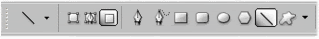
Note: if you don’t the basic tools to use in IR, then please view the provided screenshot now. The same link appears below, too.
Once your file is open in Image Ready, go to window - animation.
Your first frame will be your fake-community layer, second frame will be nothing but the black background, third layer will be your first layer with the colored text, fourth layer the second text layer and so on and so on.
After all of your triple-letter-color layers, comes a plain black layer again, and after that, your first text that is fully colored - without a starburst-layer. The one after that, the fully colored text with a starburst layer, and finally the last frame pure black.
Here is what your animation window would look like. (All but one of the triple-color-text layers are included here). The mouse is hovering on an option, which will allow you to tweak the preview size of the frames you are animating. In this example, they are large.
Your animation window will be much longer than this one.
Now switch to your first frame and press the tween button. A window will open, and it will look like something like this:
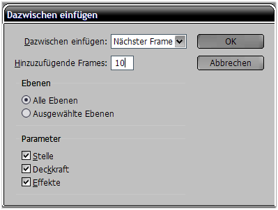
Apply your setting as shown:
Insert in-between - next frame.
Frames to add - 10
Layers - all layers
Parameter - check all boxes.
With these settings, IR will add 10 layers between your first frame and the next, decreasing the opacity of frame one till it reaches 0%, while increasing the opacity of your original frame #2, till it reaches 100% opacity.
These settings are also practical if you want to use a scrolling text as in this icon.
Now switch to the first black frame that comes before your first fully-colored-text frame. Repeat the tweening, but add fewer frames, so that you the fully-colored-text gradually appear once your icon is finished.
Now switch to the last fully-colored-text frame, which comes before the one that contains the first starburst.
Apply the same settings as before. For this example, adding 5 frames will suffice completely.
Now switch to your second-last frame, the one containing the last starburst.
Apply the same settings as before. Now you are almost done.
To give the finished animated icon a bit of time before it starts a new loop, change the time setting in the last frame. Choose a value to your liking. I think I chose 2 seconds.
Now save your finished icon (ctrl + shift + s) - BUT DO NOT CLOSE IMAGE READY YET!!!
Be sure to check the file size. Depending on the colors you used, and the amount of frames required for your animation, your file size could be extremely high. So check that before you shut down your program.
Livejournal has a maximum space of 40 kb. Should your icon be bigger than that, then you might have to go back and undo some of the changes you made, and apply them anew. (I recommend this, rather than deleting some random frames. If you don’t, your animation might not turn out very smooth.)
You can undo your actions by opening the histories and choosing the step from which you want to start again.
Congrats if you survived all of this.
Comments on how to improve the tutorial would be great.
Thanks for watching/reading/
Yes. I thought this tutorial would be a brief one. I was definitely wrong.
This tutorial is a step-by-step guide on how to make
from scrap, hopefully easy to follow - even for photoshop and Image Ready beginners.
Notes:
Photoshop shortcuts are shown in the round brackets: e.g. (ctrl + shift + n); (v); etc…
My photoshop is German. Should anything be unclear despite the screenshots, please drop a comment, and I will try to translate the parts in the screenshots that aren’t clear.
1. To get the fake community look:
Open up your livejournal profile and make a screenshot by pressing the print-button [next to F12] on your keypad.
Open a new file (ctrl + n), make sure the canvas you’re about to open is big enough. Then insert the screenshot into your empty canvas (ctrl + v).
Now zoom in using the magnifying tool (z or alt + z, depending on your settings) to 300% or more.
Select the wand tool (w) and, while holding down the shift button, click on the colored parts of the little red community icon. Once everything is selected, copy what you’ve got (ctrl + c), or even better: cut it out of your canvas (ctrl +x). That way, you can be sure you’ve got all the parts you’ll need.
Now open a new canvas (ctrl + n). For practicality’s sake, make it a 100x100 leaving the background transparent. Insert the community icon (ctrl + v).
Now select the text color (i) for your fake community link from the screenshot. (That is why we zoomed in to high percentage.) Switch back to your 100x100 and create a text-layer (t), and select a common font. In this case, I used Arial.
Type away!
Now select the line-tool (u).
At the top of your screen, a sub-header will appear.
[
]
Select the fourth box as shown. Photoshop might ask you if you want to grid your layer. If it does, press ok.
Create a new layer: layer - new - layer (ctrl + shift + n)
Now, using the same color as you did for the text, draw a line. The length doesn’t matter, since you can erase the excess later on.
Now move your community icon, the line and your text around with the move tool (v) till you think it looks right, then erase (e) those parts of the lines that stick out too far from under your text. Maybe a square-shaped brush would work best for this.
[When erasing, make sure you have the right layer selected. If you make a mistake and would like to go one step back, press (ctrl + z). This will only work for one step!].
Once you are sure everything looks just right, merge your layers together: layer - merge visible (ctrl + shift + e)
[
] very inaccurate example image
Create a new layer (ctrl + shift + n) and fill it (g) with white.
Add your text (t) and move things around till you’ve got what you want, then merge your visible layers again.
In this case, the layer I created then looked like this: [
]
2. The animated text (snaking from one letter to the next).
Click on the visibility icon [
] of your last layer. You won’t bee needing it for a while.
Create a new layer. For now, fill it with any color that will contrast well with the color you will choose for your text you are about to animate. In this case, I chose background color white and text-color black. Then type your text, and align it whichever way you please.
Now open three new canvases (ctrl + n) and fill (g) each with different shades of one color. Then arrange them in such a way that they’ll be easily accessible. You’ll be busy with them for quite a while - depending on the length of your text.
Go back to your text layer and duplicate it (ctrl + j) several times… or many times, actually. Then press on the visibility icon for all except the one all the way at the bottom.
Now select your bottom text-layer and double click on the capital “T” in your layer window. This should highlight your text, so you can manipulate it.
Select the first letter, and fill it with your palest color. Then select the second letter and fill it with your medium-shaded color, and finally the third letter with the darkest color.
Activate the visibility of your next layer. You might like to keep the visibility on for the prior layer, just to make things easier.
Note: work thoroughly here! If you mess up one these layers, you’ll bite your own butt later on. It’s extremely annoying to click your way through a billion layers to find a tiny mistake - especially if you’ve already started the animation, clicked the preview, and notice that something looks somehow wrong. So be careful here. Just in case.
Once you have finished coloring all of your letters, switch to your background layer, and fill it (g) with the same color you chose for your text, so that nothing but the three colored letters in each frame will be visible.
This is what the first frame looked like in my case [
]
3. The wee blinkie:
Now create a new layer (ctrl + shift + n), deactivate the visibility of all other layers and duplicate the top-most text-layer, then change the color of your text to whatever you please. I chose one of the rose-hues for this icon. Then make this new text-layer invisible as well.
Move your empty layer on top of all your other layers, then select a brush (b) and a pale color (in this case white). From the brush menu, I selected a photoshop-default brush that looked like a starburst.
Apply the brush to your empty layer once, then duplicate it thrice.
Again, for practicality’s sake, we only keep the layer we’re currently working on visible, and right now, we’ll need the second starburst.
Now go to edit - free transform (ctrl + t). A new sub-header will appear.
[
]
There will be seven white input-boxes. The fifth is for angle-values. For this frame, type in 3,0. You will see that your starburst has angled by 3°. Deselect the starburst. A new window will open, asking you whether you want to apply the transformation settings. Press enter or ok.
Do the same for the other two frames using the values 6 and 12.
So in the end, you’ll have the starburst unchanged, the second starburst angled at 3°, the third at 6° and the fourth at 12°.
Now you link all of your starburst-layers [
]. Select one of the starburst layers, and then press on the empty little box next to where the visibility icon [
] would be.
Now you can move your starburst around on the canvas without things getting messed up. They will all move in unison.
And now, just to make sure that none of your layers are lost when sending things over to Image Ready, I suggest saving the psd file (ctrl + s).
4. Final step: animating using “tween” in Image Ready
Note: if you don’t the basic tools to use in IR, then please view the provided screenshot now. The same link appears below, too.
Once your file is open in Image Ready, go to window - animation.
Your first frame will be your fake-community layer, second frame will be nothing but the black background, third layer will be your first layer with the colored text, fourth layer the second text layer and so on and so on.
After all of your triple-letter-color layers, comes a plain black layer again, and after that, your first text that is fully colored - without a starburst-layer. The one after that, the fully colored text with a starburst layer, and finally the last frame pure black.
Here is what your animation window would look like. (All but one of the triple-color-text layers are included here). The mouse is hovering on an option, which will allow you to tweak the preview size of the frames you are animating. In this example, they are large.
Your animation window will be much longer than this one.
Now switch to your first frame and press the tween button. A window will open, and it will look like something like this:
Apply your setting as shown:
Insert in-between - next frame.
Frames to add - 10
Layers - all layers
Parameter - check all boxes.
With these settings, IR will add 10 layers between your first frame and the next, decreasing the opacity of frame one till it reaches 0%, while increasing the opacity of your original frame #2, till it reaches 100% opacity.
These settings are also practical if you want to use a scrolling text as in this icon.
Now switch to the first black frame that comes before your first fully-colored-text frame. Repeat the tweening, but add fewer frames, so that you the fully-colored-text gradually appear once your icon is finished.
Now switch to the last fully-colored-text frame, which comes before the one that contains the first starburst.
Apply the same settings as before. For this example, adding 5 frames will suffice completely.
Now switch to your second-last frame, the one containing the last starburst.
Apply the same settings as before. Now you are almost done.
To give the finished animated icon a bit of time before it starts a new loop, change the time setting in the last frame. Choose a value to your liking. I think I chose 2 seconds.
Now save your finished icon (ctrl + shift + s) - BUT DO NOT CLOSE IMAGE READY YET!!!
Be sure to check the file size. Depending on the colors you used, and the amount of frames required for your animation, your file size could be extremely high. So check that before you shut down your program.
Livejournal has a maximum space of 40 kb. Should your icon be bigger than that, then you might have to go back and undo some of the changes you made, and apply them anew. (I recommend this, rather than deleting some random frames. If you don’t, your animation might not turn out very smooth.)
You can undo your actions by opening the histories and choosing the step from which you want to start again.
Congrats if you survived all of this.
Comments on how to improve the tutorial would be great.
Thanks for watching/reading/