#28 - Tutorial
In the Ask the Maker meme, happy_harper13 asked me about this icon: 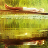
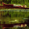
, which I made for my last movie20in20 claim. Unfortunately, I didn't save the PSP, so I recreated it! I came as close as I could. :)
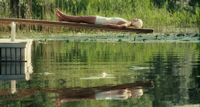
to
First, I open the cap in Paint Shop Pro. I'm in the minority here on LJ among icon-makers since I don't have PhotoShop, but I'm certain that all these steps will translate. Once I open the cap, I go to Adjust >> One Step Noise Removal. This is pretty self-explanatory. It smoothes-over all the rough, noisy parts of the image. I do this on almost all images that are over 700px. Anything smaller than that and the image gets too smooth and you can't distungish facial features or any other important parts.
Cropping
I usually crop icons the same way every time. I take my selection tool and set it to square. That way, no matter what I select, it's a perfect square. After I make a selection, I copy it and paste it as a new image. I then resize it to 100x100. I zoom in on the cap if I feel like doing a close crop. In this case, I wanted the far crop. I didn't like the way it looked with the end of the board in the icon like this,
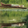
It just bugged me. I thought making the whole board cross the top of the icon like so
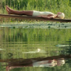
makes a better composition. I also made sure that Cecilia is in the center. After resizing the image, this is my base.
Getting Down To Business
So let's defeat the Huns make this icon! Overall, I want the icon to be soft and pretty. Yeah, that's a pretty general goal. I don't want the greens to be killed out. Even though in the movie it's a hot, sticky day, I want the icon to look like paradise.
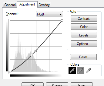
01. Curves Layer - Under RGB: Point 1 is 107 > 84 and Point 2 is 125 > 103. Layer is set to Normal at 100% opacity. I'm sure Curves is different in other programs, so here's a screenshot:
02. Color Layer - Fill with #c0c0c0 and set to Soft Light at 100% opacity.

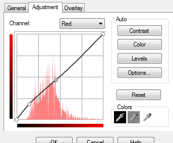
03. Curves Layer - Under Red: Point 1 is 37 > 46 and Point 2 is 116 > 118. Layer is set to Multiply at 35% opacity.
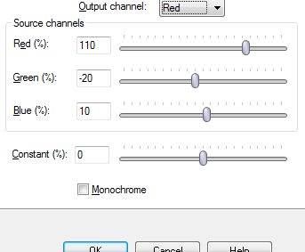
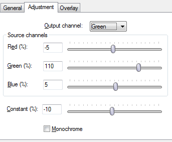
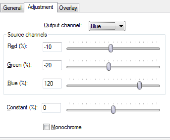
04. Channel Mixer Layer - I am not an expert on with this adjustment layer. I usually just play around with the settings a bit. Under Red channel: Red 110, Green -20, Blue 10, Constant 0; Under Green channel: Red -5, Green 110, Blue 5, Constant -10; Under Blue channel: Red -10, Green -20, Blue 120, Constant 0. The layer is set to Normal at 100%. Screenshots!
I then copy this layer and set the copy to Soft Light at 75% opacity.
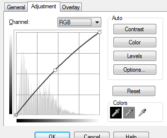
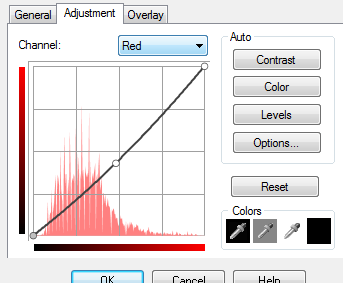
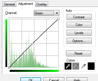
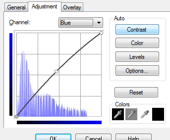
05. Curves Layer - Under RGB: Point is 119 > 138; Under Red: Point is 123 > 109; Under Green: Point is 119 > 124; Under Blue: Point is 120 > 137. Layer is set to Normal at 100%. Screenshots!
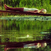
06. I then duplicate the base and drag it the top. I do nothing but lower it's opacity to 46%.
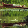
07. I duplicate the base again and drag it the top. I set it to Screen at 100%. Then I go to Adjust >> One Step Noise Removal. Remember what I said about smoothing everything over when the image is too small? I really like the effect it makes in icons when I use it like this. I'll set the layer to Screen or Soft Light, or sometimes just lower the opacity.
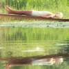
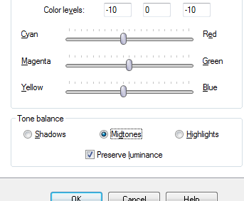
08. Color Balance Layer - I'm fairly sure this is the same in every program, but I'm giving you a screenshot just in case. All I do is change the midtones a bit: -10 0 -10. The layer is set to Normal at 100%.
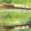
09. Hue/Saturation/Lightness Layer - Under Master, bump up Saturation to 40. The layer is set to Normal at 65% opacity.
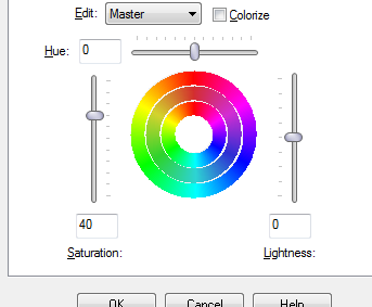
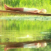
10. Hue/Saturation/Lightness Layer - This time, under Greens Saturation: 20, and under Blues Saturation: 20. The layer is set to Normal at 100%.
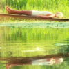
11. I copy the Green/Blue Saturation layer twice.
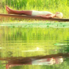
12. Texture - I add this texture
and set it to Soft Light at 85% opacity.
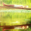
13. Brightness/Contrast Layer - I put brightness at -20 and contrast at 20. I think that adding brightness AND contrast makes the icon TOO contrasted, so I always make the brightness negative when I'm adding one of these layers. This layer is set to Normal at 55%.
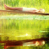
14. Texture - I add this texture
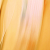
and set it to Soft Light at 38% opacity. I think it adds nice orange tones, which contrast nicely with the greens, and therefore make the greens pop more.
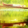
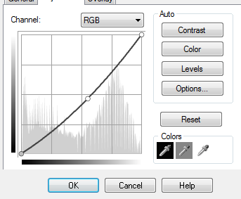
15. Curves Layer - Last layer! It's a little too bright, so I add this Curves layer. Under RGB: Point is 141 > 118.
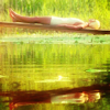
16. Sharpening - This is always my last step. I copy all the layers and paste them at the top. I do this with ctrl + shift + C and then ctrl + L. I go to Adjust >> Sharpness >> Sharpen. I then lower the opacity of this layer to 40%. Done!
I hope you enjoy this little tut! :)

Ask The Maker || My Thread
comment | credit | enjoy
join the community | find WW on tumblr

, which I made for my last movie20in20 claim. Unfortunately, I didn't save the PSP, so I recreated it! I came as close as I could. :)

to

First, I open the cap in Paint Shop Pro. I'm in the minority here on LJ among icon-makers since I don't have PhotoShop, but I'm certain that all these steps will translate. Once I open the cap, I go to Adjust >> One Step Noise Removal. This is pretty self-explanatory. It smoothes-over all the rough, noisy parts of the image. I do this on almost all images that are over 700px. Anything smaller than that and the image gets too smooth and you can't distungish facial features or any other important parts.
Cropping
I usually crop icons the same way every time. I take my selection tool and set it to square. That way, no matter what I select, it's a perfect square. After I make a selection, I copy it and paste it as a new image. I then resize it to 100x100. I zoom in on the cap if I feel like doing a close crop. In this case, I wanted the far crop. I didn't like the way it looked with the end of the board in the icon like this,

It just bugged me. I thought making the whole board cross the top of the icon like so

makes a better composition. I also made sure that Cecilia is in the center. After resizing the image, this is my base.
Getting Down To Business
So let's defeat the Huns make this icon! Overall, I want the icon to be soft and pretty. Yeah, that's a pretty general goal. I don't want the greens to be killed out. Even though in the movie it's a hot, sticky day, I want the icon to look like paradise.
01. Curves Layer - Under RGB: Point 1 is 107 > 84 and Point 2 is 125 > 103. Layer is set to Normal at 100% opacity. I'm sure Curves is different in other programs, so here's a screenshot:


02. Color Layer - Fill with #c0c0c0 and set to Soft Light at 100% opacity.

03. Curves Layer - Under Red: Point 1 is 37 > 46 and Point 2 is 116 > 118. Layer is set to Multiply at 35% opacity.


04. Channel Mixer Layer - I am not an expert on with this adjustment layer. I usually just play around with the settings a bit. Under Red channel: Red 110, Green -20, Blue 10, Constant 0; Under Green channel: Red -5, Green 110, Blue 5, Constant -10; Under Blue channel: Red -10, Green -20, Blue 120, Constant 0. The layer is set to Normal at 100%. Screenshots!


I then copy this layer and set the copy to Soft Light at 75% opacity.

05. Curves Layer - Under RGB: Point is 119 > 138; Under Red: Point is 123 > 109; Under Green: Point is 119 > 124; Under Blue: Point is 120 > 137. Layer is set to Normal at 100%. Screenshots!


06. I then duplicate the base and drag it the top. I do nothing but lower it's opacity to 46%.

07. I duplicate the base again and drag it the top. I set it to Screen at 100%. Then I go to Adjust >> One Step Noise Removal. Remember what I said about smoothing everything over when the image is too small? I really like the effect it makes in icons when I use it like this. I'll set the layer to Screen or Soft Light, or sometimes just lower the opacity.

08. Color Balance Layer - I'm fairly sure this is the same in every program, but I'm giving you a screenshot just in case. All I do is change the midtones a bit: -10 0 -10. The layer is set to Normal at 100%.


09. Hue/Saturation/Lightness Layer - Under Master, bump up Saturation to 40. The layer is set to Normal at 65% opacity.


10. Hue/Saturation/Lightness Layer - This time, under Greens Saturation: 20, and under Blues Saturation: 20. The layer is set to Normal at 100%.

11. I copy the Green/Blue Saturation layer twice.

12. Texture - I add this texture

and set it to Soft Light at 85% opacity.

13. Brightness/Contrast Layer - I put brightness at -20 and contrast at 20. I think that adding brightness AND contrast makes the icon TOO contrasted, so I always make the brightness negative when I'm adding one of these layers. This layer is set to Normal at 55%.

14. Texture - I add this texture

and set it to Soft Light at 38% opacity. I think it adds nice orange tones, which contrast nicely with the greens, and therefore make the greens pop more.

15. Curves Layer - Last layer! It's a little too bright, so I add this Curves layer. Under RGB: Point is 141 > 118.


16. Sharpening - This is always my last step. I copy all the layers and paste them at the top. I do this with ctrl + shift + C and then ctrl + L. I go to Adjust >> Sharpness >> Sharpen. I then lower the opacity of this layer to 40%. Done!
I hope you enjoy this little tut! :)

Ask The Maker || My Thread
comment | credit | enjoy
join the community | find WW on tumblr