Basic Screencap-to-Icon Tutorial
I've been asked to share some tips on getting good color and image quality in icons made from screencaps (specifically nuranar's caps of "Hogan's Heroes", but it can apply to anything). Since I've been doing a lot of those icons and have it down to a system, I'll be happy to share it. For a lot of people this will be very basic, but I hope it will help the person who requested it. :)
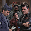
1. We must obviously begin at the beginning... crop your screencap the way you want it, then resize it to 100x100. You can also sharpen it a bit at this point (which I do). Here is my base for this example:
2. Next, I add a series of five new layers, in this sequence:
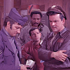
Soft light, 100% opacity, filled with #F597E7
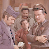
Soft light ,100% opacity, filled with #E4F597
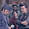
Burn/colorburn, 100% opacity, filled with #96CCF6
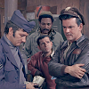
Multiply, 100% opacity, filled with #efe6d9
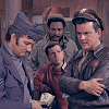
Soft light, 100% opacity, filled with #816971
Don't hesitate to play around with these colors to get the hues you want in the icon.
3. To add some crispness to the image, copy the merged layers and paste the whole thing in as a new layer, set to soft light 100%.
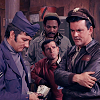
4. To lighten it, copy the merged layers and set the image as a new layer again, this time set to screen. Adjust the opacity until the icon is as light or dark as you want it. (80% seems to work for me.)
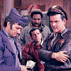
You now have basically the finished product. Depending on the look you're after, you can keep tinkering with the hues of the previous layers, adjust the brightness/contrast a little more, or even adjust the red/green/blue levels to further enhance the color. The important thing is to experiment!
1. We must obviously begin at the beginning... crop your screencap the way you want it, then resize it to 100x100. You can also sharpen it a bit at this point (which I do). Here is my base for this example:

2. Next, I add a series of five new layers, in this sequence:

Soft light, 100% opacity, filled with #F597E7

Soft light ,100% opacity, filled with #E4F597

Burn/colorburn, 100% opacity, filled with #96CCF6

Multiply, 100% opacity, filled with #efe6d9

Soft light, 100% opacity, filled with #816971
Don't hesitate to play around with these colors to get the hues you want in the icon.
3. To add some crispness to the image, copy the merged layers and paste the whole thing in as a new layer, set to soft light 100%.

4. To lighten it, copy the merged layers and set the image as a new layer again, this time set to screen. Adjust the opacity until the icon is as light or dark as you want it. (80% seems to work for me.)

You now have basically the finished product. Depending on the look you're after, you can keep tinkering with the hues of the previous layers, adjust the brightness/contrast a little more, or even adjust the red/green/blue levels to further enhance the color. The important thing is to experiment!