Results LIMS Challenge 11
Sorry for posting 3 hours late. Great turnout for Lims Challenge 11! Unfortunately 1 participant will be leaving us tonight.
ELIMINATIONS
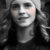
VOTED OFF
&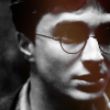
by rhye (-7)
CONGRATULATIONS!
FAVORITE ICON + BANNER
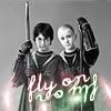
by beybey16510 (+3) » Click to Save your Banner !
NO NEGATIVE VOTE (Congrats!)
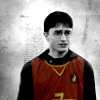
by 17tvfreek (2)

by beybey16510 (3)
MOVING ON TO THE FINAL ROUND!
17tvfreek
beybey16510
VOTING TALLIES!
Here's the tally. Remember we're picking 3 least favorites and 1 favorite. Therefore, a negative (-) denotes how many people voted against your icon and a plus (+) denotes how many people voted your icon their favorit, zero (0) means you got neither or that they anuled each other out. So if you have a + point, pat yourself on the back!
Lims Challenge 11: B&W Selective Coloring
01
02
03


04
05
06


01: -3 + 0 = -3
02: -0 + 2 = 2
03: -2 + 1 = -1
04: -0 + 3 = 3
05: -4 + 0 = -4
06: -3 + 0 = -3
Icons made by the same participants, for the final count:
01 & 05 Votes: -3 + -4 = -7
02 & 06 Votes: 2 + -3 = -1
03 & 04 Votes: -1 + 3 = 2
+ POSITIVE VOTING COMMENTS +
#02 -- I really like the textures used and the coloring is lovely.
#02 -- The texturing on this image is fantastic. It gives the background a very rich appearance.
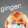
#03 -- This cropping is awesome with the text. and the ginger color is perfect!
#04 -- Good use of light texture and very original use of the mirrored text.
#04 -- The desaturation is well done and the text as well as the coloured texture fit the composition perfectly.
#04 -- Great composition and the way the text was done is creative and lovely.
- NEGATIVE VOTING COMMENTS -
» Don't take these comments as mean pointless critics, they could help you make a better icon for the next challenge!
#01 -- While I like the idea, the pink is a little difficult to see and the crop could have been a bit more interesting.
#01 -- There is not enough contrast in the icon and the pink touch gibes the icon a bad quality feeling.
#01 -- The icon looks a bit washed out and blurry. It might also need more contrast.
#03 -- The text choice seems odd, as it's only a remark on Ron's coloring, and the coloring is already accentuated in the icon. I'm also not a fan of the font or the text placement, it could be closer to Ron.
#03 -- The brightness of Ron's face washes him out.
#05 -- The quality seems to be lost, especially in the darker areas.
#05 -- There is no colors in this icon, or too dark to notice.
#05 -- There's barely any colour to be seen and the icon has too much contrast.
#05 -- The light texture is not really visible and the placement washes the details of the eye.
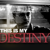
#06 -- The font color is an odd choice. The dusty pink color doesn't really fit with either Harry or with the slight green/yellow coloring behind it. The horizontal blur is a great way to match the text to the very horizontal nature of the image, but it also makes the text look like it's in a box.
#06 -- The cap choice probably isn't good for an icon. The cap and the lack of contrast make Harry barely recognisable. The text is also too big and clunky.
#06 -- The text doesn't match the icon and the texture used over Harry's forehead is distracting from the focus.
It's my turn to do the Nomination for the winning icon. (with the Noms for Week 247 -PLEASE enter some icons- in a couple of days)
ELIMINATIONS
VOTED OFF
&
by rhye (-7)
CONGRATULATIONS!
FAVORITE ICON + BANNER
by beybey16510 (+3) » Click to Save your Banner !
NO NEGATIVE VOTE (Congrats!)
by 17tvfreek (2)
by beybey16510 (3)
MOVING ON TO THE FINAL ROUND!
17tvfreek
beybey16510
VOTING TALLIES!
Here's the tally. Remember we're picking 3 least favorites and 1 favorite. Therefore, a negative (-) denotes how many people voted against your icon and a plus (+) denotes how many people voted your icon their favorit, zero (0) means you got neither or that they anuled each other out. So if you have a + point, pat yourself on the back!
Lims Challenge 11: B&W Selective Coloring
01
02
03
04
05
06
01: -3 + 0 = -3
02: -0 + 2 = 2
03: -2 + 1 = -1
04: -0 + 3 = 3
05: -4 + 0 = -4
06: -3 + 0 = -3
Icons made by the same participants, for the final count:
01 & 05 Votes: -3 + -4 = -7
02 & 06 Votes: 2 + -3 = -1
03 & 04 Votes: -1 + 3 = 2
+ POSITIVE VOTING COMMENTS +
#02 -- I really like the textures used and the coloring is lovely.
#02 -- The texturing on this image is fantastic. It gives the background a very rich appearance.
#03 -- This cropping is awesome with the text. and the ginger color is perfect!
#04 -- Good use of light texture and very original use of the mirrored text.
#04 -- The desaturation is well done and the text as well as the coloured texture fit the composition perfectly.
#04 -- Great composition and the way the text was done is creative and lovely.
- NEGATIVE VOTING COMMENTS -
» Don't take these comments as mean pointless critics, they could help you make a better icon for the next challenge!
#01 -- While I like the idea, the pink is a little difficult to see and the crop could have been a bit more interesting.
#01 -- There is not enough contrast in the icon and the pink touch gibes the icon a bad quality feeling.
#01 -- The icon looks a bit washed out and blurry. It might also need more contrast.
#03 -- The text choice seems odd, as it's only a remark on Ron's coloring, and the coloring is already accentuated in the icon. I'm also not a fan of the font or the text placement, it could be closer to Ron.
#03 -- The brightness of Ron's face washes him out.
#05 -- The quality seems to be lost, especially in the darker areas.
#05 -- There is no colors in this icon, or too dark to notice.
#05 -- There's barely any colour to be seen and the icon has too much contrast.
#05 -- The light texture is not really visible and the placement washes the details of the eye.
#06 -- The font color is an odd choice. The dusty pink color doesn't really fit with either Harry or with the slight green/yellow coloring behind it. The horizontal blur is a great way to match the text to the very horizontal nature of the image, but it also makes the text look like it's in a box.
#06 -- The cap choice probably isn't good for an icon. The cap and the lack of contrast make Harry barely recognisable. The text is also too big and clunky.
#06 -- The text doesn't match the icon and the texture used over Harry's forehead is distracting from the focus.
It's my turn to do the Nomination for the winning icon. (with the Noms for Week 247 -PLEASE enter some icons- in a couple of days)