LIMS 12 Results
Great turnout for Lims Challenge 12! Unfortunately one person will be leaving us tonight.
CHALLENGE 12 ELIMINATIONS!
VOTED OFF
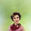
&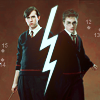
by i_we_you (-6)
CHALLENGE 12 CONGRATULATIONS!
FAVORITE ICON
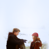
by alfiri (+2)
MOVING ON TO NEXT ROUND
alfiri
lauradumb
CHALLENGE 12 VOTING TALLIES!
Here's the tally... Remember we're picking 3 least favorites and 1 favorite. Therefore, a negative (-) denotes how many people voted against your icon and a plus (+) denotes how many people voted your icon their favorit, zero (0) means you got neither or that they anuled each other out. So if you have a + point, pat yourself on the back!
Lims Challenge 12:
01
02
03


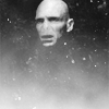
04
05
06

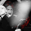
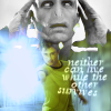
01: -1 +3 = 2
06: -5 +2 = -3
Contestant One 2-3 = -1
02: -1 +2 = 1
04: -7 +0 = -7
Contestant Two 1-7 = -6
03: -1 +1 = 0
05: -4 +1 = -3
Contestant Three = -3
CHALLENGE 12 POSITIVE VOTING COMMENTS!
#01 Fantastic use of negative space. Nice colouring and cropping. The icon has a lovely feel over all.
#01 -- Simple, but well cropped.
#001 -- I love the crop, the textures used and the colouring. Beautiful icon!
#01 -- The white contrasts nicely with Harry and Hermione.
#02 -- The contrast between the pink and the green works very well and the quality of the icon is wonderful.
#02 -- nice use of negative space. great use of colorring. good job cutting the image out of the background.
#03 -- There's nothing that looks out of place, everything fits smoothly, the b/w maked the icon classy/grungy, but not overly so.
#05 -- HOLY CRAP AWESOME COMPOSITION! *is jealous* And I like the tiny splashes of red.
#06 -- Nice composition of the pictures, the text and the lightening.
#6 -- i love the text and blending
CHALLENGE 12 NEGATIVE VOTING COMMENTS!
#01 -- The face looks blury and the coloring seems too normal.
#01 -- It looks rather plain, despite the rather smooth transition of the background into the image. Plus, the subject isn't one of the most original - I have seen such icons out and about for years.
#02 There's no emotion in this icon. You haven't used your negative space well and the backround doesn't go with the cap at all.
#3 -- voldemort's head just seems to be randomly floating there and i don't think it suits the icon
#04 -- Neville & the "lightning brush" looks too sharpened while the face of Harry seems blury.
#04 -- The brush is overpowering and the points and numbers randomly placed take away from the focus of the icon.
#04 -- It was a good idea, but I don't think you needed that number texture.
#04 -- Cute idea, but not so great execution. The dot/number texture thing is really distracting and takes away from the images. Possibly try a different crop to get more blank space.
#4 -- i find the colouring too dull
#04 -- The ligthing is dark on Harry's face making the icon seem very unbalanced.
#04 -- The lightning bolt looks pixelly and I don't quite understand what the numbers are doing there.
#05 -- Good idea, but poor execution, in my opinion. The blending might be subtle and clever, but the overall effect is the icon being way too busy, the light textures seem out of place.
#05 -- It's hard to make out the second picture because it's very bright, and the light texture is overpowering.
#05 The pictures don't blend well together and the texture makes the icon look all funny.
#05 -- too cluttered and busy
#06 -- too cluttered, busy, and the coloring doesn't work well for the overall result
#06 -- I like the idea, but pictures are not so well blended.
#06 -- I don't think the maker didn't quite grasp the idea of blank space. There's too much going on in the icon; the two pictures, the text and the textures all distract from one another. If Harry had been taken out of the icon, it would've been nice.
#06 -- The blending on Harry and Voldemort seems a bit awkward and teh text is blurry and very hard to read.
#06 -- Good composition, but the yellowish green and the font don't work well. It looks too cluttered with that text.
Don't take these comments as mean pointless critics, they could help you make a better icon for the next challenge!
It's hpnarnia's turn to do the nomination for the winning icon and bloodflowsgreen to do the banner.
CHALLENGE 12 ELIMINATIONS!
VOTED OFF
&
by i_we_you (-6)
CHALLENGE 12 CONGRATULATIONS!
FAVORITE ICON
by alfiri (+2)
MOVING ON TO NEXT ROUND
alfiri
lauradumb
CHALLENGE 12 VOTING TALLIES!
Here's the tally... Remember we're picking 3 least favorites and 1 favorite. Therefore, a negative (-) denotes how many people voted against your icon and a plus (+) denotes how many people voted your icon their favorit, zero (0) means you got neither or that they anuled each other out. So if you have a + point, pat yourself on the back!
Lims Challenge 12:
01
02
03
04
05
06
01: -1 +3 = 2
06: -5 +2 = -3
Contestant One 2-3 = -1
02: -1 +2 = 1
04: -7 +0 = -7
Contestant Two 1-7 = -6
03: -1 +1 = 0
05: -4 +1 = -3
Contestant Three = -3
CHALLENGE 12 POSITIVE VOTING COMMENTS!
#01 Fantastic use of negative space. Nice colouring and cropping. The icon has a lovely feel over all.
#01 -- Simple, but well cropped.
#001 -- I love the crop, the textures used and the colouring. Beautiful icon!
#01 -- The white contrasts nicely with Harry and Hermione.
#02 -- The contrast between the pink and the green works very well and the quality of the icon is wonderful.
#02 -- nice use of negative space. great use of colorring. good job cutting the image out of the background.
#03 -- There's nothing that looks out of place, everything fits smoothly, the b/w maked the icon classy/grungy, but not overly so.
#05 -- HOLY CRAP AWESOME COMPOSITION! *is jealous* And I like the tiny splashes of red.
#06 -- Nice composition of the pictures, the text and the lightening.
#6 -- i love the text and blending
CHALLENGE 12 NEGATIVE VOTING COMMENTS!
#01 -- The face looks blury and the coloring seems too normal.
#01 -- It looks rather plain, despite the rather smooth transition of the background into the image. Plus, the subject isn't one of the most original - I have seen such icons out and about for years.
#02 There's no emotion in this icon. You haven't used your negative space well and the backround doesn't go with the cap at all.
#3 -- voldemort's head just seems to be randomly floating there and i don't think it suits the icon
#04 -- Neville & the "lightning brush" looks too sharpened while the face of Harry seems blury.
#04 -- The brush is overpowering and the points and numbers randomly placed take away from the focus of the icon.
#04 -- It was a good idea, but I don't think you needed that number texture.
#04 -- Cute idea, but not so great execution. The dot/number texture thing is really distracting and takes away from the images. Possibly try a different crop to get more blank space.
#4 -- i find the colouring too dull
#04 -- The ligthing is dark on Harry's face making the icon seem very unbalanced.
#04 -- The lightning bolt looks pixelly and I don't quite understand what the numbers are doing there.
#05 -- Good idea, but poor execution, in my opinion. The blending might be subtle and clever, but the overall effect is the icon being way too busy, the light textures seem out of place.
#05 -- It's hard to make out the second picture because it's very bright, and the light texture is overpowering.
#05 The pictures don't blend well together and the texture makes the icon look all funny.
#05 -- too cluttered and busy
#06 -- too cluttered, busy, and the coloring doesn't work well for the overall result
#06 -- I like the idea, but pictures are not so well blended.
#06 -- I don't think the maker didn't quite grasp the idea of blank space. There's too much going on in the icon; the two pictures, the text and the textures all distract from one another. If Harry had been taken out of the icon, it would've been nice.
#06 -- The blending on Harry and Voldemort seems a bit awkward and teh text is blurry and very hard to read.
#06 -- Good composition, but the yellowish green and the font don't work well. It looks too cluttered with that text.
Don't take these comments as mean pointless critics, they could help you make a better icon for the next challenge!
It's hpnarnia's turn to do the nomination for the winning icon and bloodflowsgreen to do the banner.