Coloring Tutorial
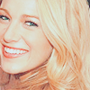
Today I'll be teaching you how to turn this:

to this
Program used: Adobe Photoshop CS4
Difficulty: Easy
1) First, select the image you're going to edit. I chose this one from www.lady-gaga.net. I cropped a part of it to 100 x 100 pixels so that abides the standard icon size here in LJ.
2) Next, I duplicated the base layer (the cropped image) and sharpened the newly duplicated layer so that we can add more detail into the image. Let's reduce the opacity to about 50-65% so that it won't look too sharp.
3) Let's merge all the layers by right clicking on one layer -> Merge Visible.
4) We're going to duplicate the merged layer one time and set its blending options to "Soft Light" and set its opacity to 45% to add depth to the image.
5) Let's duplicate the bottom most layer and drag it onto the top. We're going to set its blending options to "Screen" and set its opacity to 65% so that the image'll look brighter. You may always change the opacity to whatever best fits the image.
4) Next, make a new Selective Color adjustment layer by going to Layer -> New Adjustment Layer -> Selective Color and set it to these settings:
RED: -100, 15, 10, 5
YELLOW: -40, 10, 30, -35
CYAN: 35, -10, 20, -60
WHITE: -100, -60, 20, 15
NEUTRAL: -10, 5, 5, -15
This layer's purpose is too add a slight orange-ish color to the image.
5) Let's make another Selective Coloring adjustment layer and set it to these settings:
RED: -45, 5, 10, 0
YELLOW: 0, -5, 50, 0
NEUTRAL: 15, -20, -20, 0
This layer's purpose is too add a slight semi-dark turquoise color to the image.
6) By the time you've finished setting the second Selective Color layer, the icon looks quite nice but we're not finished yet. Let's make the image livelier by making new Hue/Saturation adjustment layer by going to Layer -> New Adjustment Layer -> Vibrance (this requires Photoshop CS4) and set it to these settings:
VIBRANCE: 60, SATURATION: 5
(If you don't have CS4, a nice substitute would be making a new Hue/Saturation adj. layer by going to Layer -> New Adjustment Layer -> Hue/Saturation and setting the Saturation to 25.)
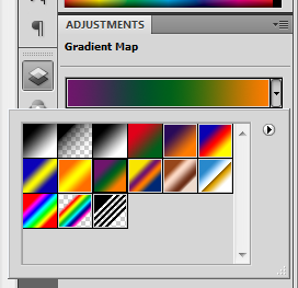
7) Make a new Gradient Map adjustment layer by going to Layer -> New Adjustment Layer -> Gradient Map and set it to these settings:

Set its blending mode to Exclusion with 20% opacity. By setting it to this, the Gaga's skin looks more turquoise which looks good with the orange feel of the image. The gradient layer also increases the vibrance of the orange.
8) Let's fill a new layer with #FFFFFF by pressing CTRL + SHIFT + N on your keyboard. Set the mode to "Soft Light", 30% opacity. Fill the layer with #FFFFFF afterward using the Paint Bucket tool(shortcut: G). This layer softens the image and lightens it up, too.
9) To decrease the image's file size and for us to format it better, we can merge the layers into one by going to Layers -> Flatten Image.
Here are some other icons with this tutorial's coloring:


Now aren't the images vibrant and pleasing to look at? Try this coloring out and experiment by adding text, textures or whatever you may! Enjoy!
PSD link: http://www.sendspace.com/file/aj39ph

to this

Program used: Adobe Photoshop CS4
Difficulty: Easy
1) First, select the image you're going to edit. I chose this one from www.lady-gaga.net. I cropped a part of it to 100 x 100 pixels so that abides the standard icon size here in LJ.
2) Next, I duplicated the base layer (the cropped image) and sharpened the newly duplicated layer so that we can add more detail into the image. Let's reduce the opacity to about 50-65% so that it won't look too sharp.
3) Let's merge all the layers by right clicking on one layer -> Merge Visible.
4) We're going to duplicate the merged layer one time and set its blending options to "Soft Light" and set its opacity to 45% to add depth to the image.
5) Let's duplicate the bottom most layer and drag it onto the top. We're going to set its blending options to "Screen" and set its opacity to 65% so that the image'll look brighter. You may always change the opacity to whatever best fits the image.
4) Next, make a new Selective Color adjustment layer by going to Layer -> New Adjustment Layer -> Selective Color and set it to these settings:
RED: -100, 15, 10, 5
YELLOW: -40, 10, 30, -35
CYAN: 35, -10, 20, -60
WHITE: -100, -60, 20, 15
NEUTRAL: -10, 5, 5, -15
This layer's purpose is too add a slight orange-ish color to the image.
5) Let's make another Selective Coloring adjustment layer and set it to these settings:
RED: -45, 5, 10, 0
YELLOW: 0, -5, 50, 0
NEUTRAL: 15, -20, -20, 0
This layer's purpose is too add a slight semi-dark turquoise color to the image.
6) By the time you've finished setting the second Selective Color layer, the icon looks quite nice but we're not finished yet. Let's make the image livelier by making new Hue/Saturation adjustment layer by going to Layer -> New Adjustment Layer -> Vibrance (this requires Photoshop CS4) and set it to these settings:
VIBRANCE: 60, SATURATION: 5
(If you don't have CS4, a nice substitute would be making a new Hue/Saturation adj. layer by going to Layer -> New Adjustment Layer -> Hue/Saturation and setting the Saturation to 25.)
7) Make a new Gradient Map adjustment layer by going to Layer -> New Adjustment Layer -> Gradient Map and set it to these settings:

Set its blending mode to Exclusion with 20% opacity. By setting it to this, the Gaga's skin looks more turquoise which looks good with the orange feel of the image. The gradient layer also increases the vibrance of the orange.
8) Let's fill a new layer with #FFFFFF by pressing CTRL + SHIFT + N on your keyboard. Set the mode to "Soft Light", 30% opacity. Fill the layer with #FFFFFF afterward using the Paint Bucket tool(shortcut: G). This layer softens the image and lightens it up, too.
9) To decrease the image's file size and for us to format it better, we can merge the layers into one by going to Layers -> Flatten Image.
Here are some other icons with this tutorial's coloring:


Now aren't the images vibrant and pleasing to look at? Try this coloring out and experiment by adding text, textures or whatever you may! Enjoy!
PSD link: http://www.sendspace.com/file/aj39ph