(no subject)
OMG I wrote another tutorial *gasp*. I'm really on a roll with posting in this journal, but since school is rearing its ugly head, I'm online 24/7...which officially makes me a school geek. So I had time for a quick tutorial.
I suck at these, you should know. I always make them fast and not very complicated, usually because of time. And I incorporated the glowing-eye thing that people seemed to want to know about, so hopefully this helps. But anyway - here you go...
A tutorial for this icon:
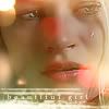
is right
We're going to head from this base:
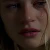
to this icon:

Step One
I chose this screencap because I love the emotional poignancy, and Claire is just awesome. Anyway - the screencap is from crumblingwalls and the episode is 'Raised By Another'. I resized and cropped it to this:

Step Two
This is pretty simple. I duplicated the layer and set the second layer on 'Screen'. I then flattened the image.

Step Three
I duplicated the image again, and used the options 'sharpen' and 'sharpen edges', both on the filter menu. I flattened the image again.

Step Four
This part gets a little complicated. I didn't like the overly-gritty look to her face so I decided to do something about it. I duplicated the layer again and smoothed out her skin with the 'blur' tool at 50%. However, I chose not to smooth out her hair, lips, eyes, or the tear on her cheek. I left those alone because I wanted them to stand out. I (again) flattened the image when I was finished.
Step Five
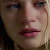
I duplicated the layer again and started to work on making her facial features stand out a little more. I created a new layer and took a 3px paintbrush and painted over her eyes with the color #89E5C6, a light green color. Then I applied the filter 'blur' to this layer and set it on Overlay, opacity 75%. This made her eyes stand out a little more, gave them some vibrance. I created another new layer and this time used the paintbrush to paint over her lips with the color #F1778B (a rose-pink). I set this layer to 'Soft Light', opacity 25%. I didn't want her lips *too* accentuated. Lastly, I created a new layer on top of the others and used a 1px brush to outline her eyes in the color black (#000000). This gives her an eyeliner look and also brings out her eyes. I blurred the eye layer and set it to 'Soft Light', opacity 50%. I flattened the image. This is the end result:

Step Six
I took a stock that I found from Stock X-change and used a section of it over the icon. The stock:
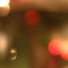
I set the stock's layer to 'Screen' at 100% opacity. Then I flattened the image. End result:
Step 7
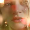
I started and a new layer and put a gradient of the color #68B69C (a soft green) in the lower left corner, going diagonally upwards. I set this gradient on 'Screen' at 60% opacity. I flattened the image.
Step 8
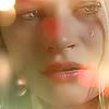
A small step; I duplicated the layer and adjusted the Brightness/Contrast. I set the Contrast to 5 and the Brightness to -5
Step 9
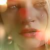
I put a small gradient from the left outward in a light yellow color, #F1E3AB. I then flattened the image. I created a new layer and put a brush in the lower left corner from classic.tere-art.com. It is in the same color, #F1EA3B. I set this brush-layer on 'Screen' and duplicated it three times, making it a pale yellow color.

Step 10
I added text in a new layer, in the font Book Antiqua at 6px. It says 'Beautiful Girl' and I chose to hide it in the brush in the lower left corner.

This ends my tutorial! I hope you enjoyed it and it helped you out in some way. It also outed my secret about the eye thing, which totally wasn't complicated at all :)
I suck at these, you should know. I always make them fast and not very complicated, usually because of time. And I incorporated the glowing-eye thing that people seemed to want to know about, so hopefully this helps. But anyway - here you go...
A tutorial for this icon:

is right
We're going to head from this base:

to this icon:

Step One
I chose this screencap because I love the emotional poignancy, and Claire is just awesome. Anyway - the screencap is from crumblingwalls and the episode is 'Raised By Another'. I resized and cropped it to this:

Step Two
This is pretty simple. I duplicated the layer and set the second layer on 'Screen'. I then flattened the image.

Step Three
I duplicated the image again, and used the options 'sharpen' and 'sharpen edges', both on the filter menu. I flattened the image again.

Step Four
This part gets a little complicated. I didn't like the overly-gritty look to her face so I decided to do something about it. I duplicated the layer again and smoothed out her skin with the 'blur' tool at 50%. However, I chose not to smooth out her hair, lips, eyes, or the tear on her cheek. I left those alone because I wanted them to stand out. I (again) flattened the image when I was finished.

Step Five
I duplicated the layer again and started to work on making her facial features stand out a little more. I created a new layer and took a 3px paintbrush and painted over her eyes with the color #89E5C6, a light green color. Then I applied the filter 'blur' to this layer and set it on Overlay, opacity 75%. This made her eyes stand out a little more, gave them some vibrance. I created another new layer and this time used the paintbrush to paint over her lips with the color #F1778B (a rose-pink). I set this layer to 'Soft Light', opacity 25%. I didn't want her lips *too* accentuated. Lastly, I created a new layer on top of the others and used a 1px brush to outline her eyes in the color black (#000000). This gives her an eyeliner look and also brings out her eyes. I blurred the eye layer and set it to 'Soft Light', opacity 50%. I flattened the image. This is the end result:

Step Six
I took a stock that I found from Stock X-change and used a section of it over the icon. The stock:

I set the stock's layer to 'Screen' at 100% opacity. Then I flattened the image. End result:

Step 7
I started and a new layer and put a gradient of the color #68B69C (a soft green) in the lower left corner, going diagonally upwards. I set this gradient on 'Screen' at 60% opacity. I flattened the image.

Step 8
A small step; I duplicated the layer and adjusted the Brightness/Contrast. I set the Contrast to 5 and the Brightness to -5

Step 9
I put a small gradient from the left outward in a light yellow color, #F1E3AB. I then flattened the image. I created a new layer and put a brush in the lower left corner from classic.tere-art.com. It is in the same color, #F1EA3B. I set this brush-layer on 'Screen' and duplicated it three times, making it a pale yellow color.

Step 10
I added text in a new layer, in the font Book Antiqua at 6px. It says 'Beautiful Girl' and I chose to hide it in the brush in the lower left corner.

This ends my tutorial! I hope you enjoyed it and it helped you out in some way. It also outed my secret about the eye thing, which totally wasn't complicated at all :)