Icon Coloring Tutorial
Well, hello there, strangers. Someone recently asked me to make an icon coloring tutorial, and since I have a lot of time at the moment, I thought I should at least try. The way I color icons is pretty straightforward. I subscribe to the idea that simpler is better when you're making something as small as a 100x100 pixel square, so don't sweat the small stuff. Things that look bad when the image is large can look good when it's small, and vice versa.
So without further ado, here goes nothing. Or rather, here goes a day in front of the computer.
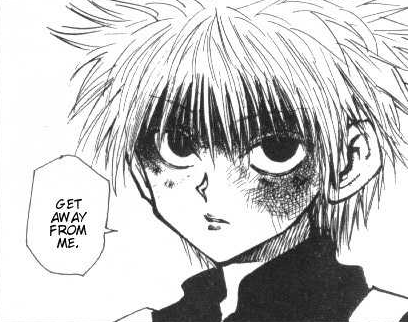
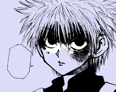
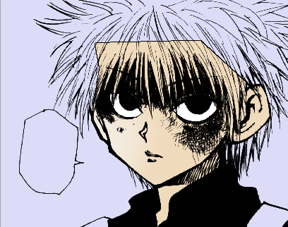
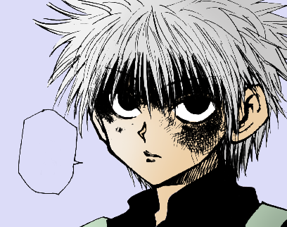
This is what I'm starting out with. One of the earlier panels of Hunter x Hunter. As such, it's also pretty faded and ugly, so before coloring even starts, the levels need to be adjusted.
Image --> Adjustments --> Levels.
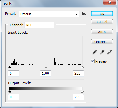
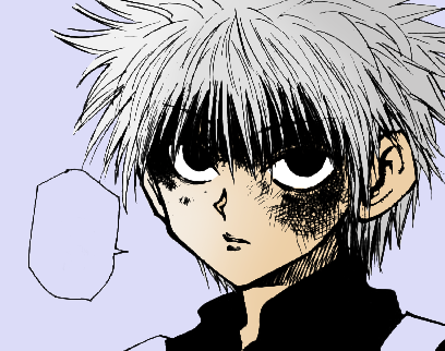
Ignore the output levels for now. Just adjust the input levels. Feel free to fiddle with those triangles until the panel looks presentable. Moving the far right one toward the center will white out the unwanted gray, and moving the far left one toward the center will make the blacks blacker. The center one can move both ways. It's usually better to slide the center triangle to the spot you prefer first and then adjust the image's levels accordingly with the end triangles.
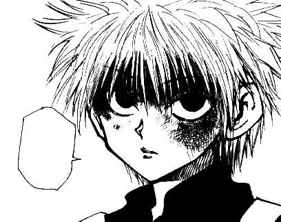
I don't like having text in my icons, so I also delete that. Which leaves me with a nice, clean starting point.
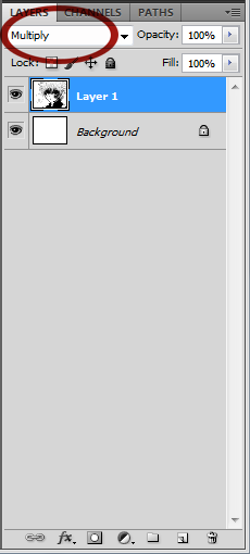
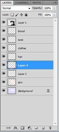
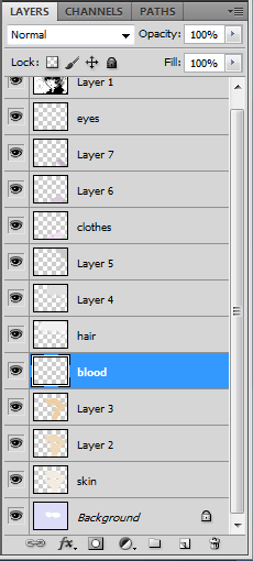
Next, go to the layers window and change the line art layer to multiply.
After that, add the base layers and label them so you don't lose track. One layer for skin, one for hair, one for clothing, one for eyes, and one for anything extra, in this case blood.
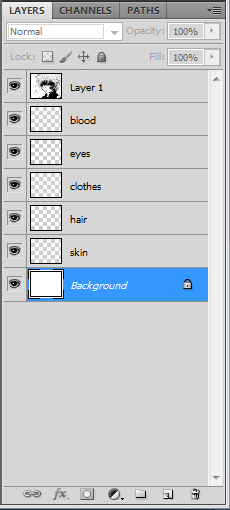
I choose that specific order because it works best for me, but the order doesn't matter ultimately outside of your own preferences. What happens is that a layer above another layer in the hierarchy of the layers window is literally above the other layer in the image. Colors on a higher layer will cover the colors below them.
If I'm planning to make more than one icon of the same character, I open a new, blank file, size it 500x500 pixels, and use it as a color palette. As I decide on each color for each step, I add it to the palette.
Killua's palette, after finishing my last batch of icons, looks like this:
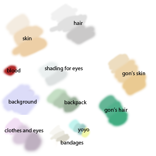
Something which is probably visible in the above color palette is that I don't use many dark colors. The reason for this is that dark colors beneath the black line art just look black. Pale colors beneath the black line art look dark. It's a personal stylistic choice on my part, as I feel the pastels just look better.
Now, finally, coloring can happen.
Start out with the background layer. No renaming was required for this layer because it's already named. Background. Choose your background color and go nuts. Just make sure anything white stays white, namely the eyes and the mouth if it's open. Usually it's faster to just color everything, then grab the eraser tool and erase the color from those areas.
Next, hop up to the skin layer and grab the polygonal lasso tool. Using the polygonal lasso tool, trace over the line art of the face, neck and ears. Because it's a lower layer in the hierarchy, it's fine if hair and clothing is selected too.
Consider overlap when tracing the line art. Do you want to line art around the face to be the color of the background or the color of the skin? Definitely the skin. So include the black line art itself in the polygonal lasso tool selection.
Don't deselect what you've selected.
Once the base color is down, shading is next. Double click the foreground color square in the left bottom corner in order to bring up the color picker window. Whichever color you chose for the base, move two circles horizontally to the right. (The color picker itself is a circle, and the indicator of what color is currently selected is also a circle. The way I decide what shade should be next is by touching the side of the color picker to the side of the circle indicating the base color, lining the two circles up horizontally. Then I click and do the same thing a second time.) You can choose to do the same vertically instead of horizontally, or you can choose a completely different way that works better for you. That's how I like to keep it uniform though.
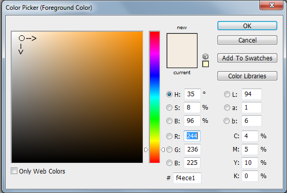
Once you've chosen your second color, add it to the palette. You can do the same thing again, and add the new color to your palette as well. That makes three skin colors: base, shading 1, and shading 2. Now you need a layer for each. Create two new layers. You can label them if you'd like, but I don't.
On the layer directly above the skin layer, use your second color. Make sure the brush is large and with zero hardness. Then choose where the light is coming from. Usually it has less to do with what's realistic and more to do with what looks good. In this particular panel, there is a lot more shading drawn in to the right, so it'll look better if the light is coming from the left and the shade is to the right. Take the brush and follow the contour of the face (usually a backwards C shape) to shade the right half of the face. Don't worry about any details. Anything to the right of the nose is fair game, and everything to the left is fine as is.
Now the second shading layer. Grab your third skin color, the darkest one, and do exactly the same thing with a slightly smaller brush. In this case, the first shading layer was colored with a size 175 brush, and the second was size 125. Aim the edge at around the center of the eye rather than the nose.
If the artist has drawn shading for the nose, I tend to color that in too.

And that's skin finished! All the other layers follow the same basic method.
With the skin colored, hair is next. Selecting all of the hair with the polygonal lasso tool is probably the most tedious part of the process. Because it's above the skin and background layers, nothing but the hair itself can be included in the selection. When the hair is as messy as Killua's can get, I'll select it in sections so that I don't lose everything if I make a mistake.
After that, just pick your base color and hit everything in the selection area.
Find your two darker shades, create your shading 1 and shading 2 layers, and follow the same shading pattern (shade goes to the right following the contours of the selected area).
After hair is clothing. Killua's shirt is black, but I'm still going to color it. This is probably where things are going to make more sense.
Select the shirt with the polygonal lasso tool, just like with the skin and hair layers. Now, click on the line art layer (should be the top layer in the layer window) and open the levels window again. This time, ignore the input levels and only work with the output levels.
Slide the far left triangle toward the center until you find the exact color you want. Remember the number that corresponds to it. I've settled comfortably into using 112.
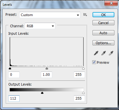
After that, cancel the levels change and go back to the clothes base layer. Shade as per usual.
Once the clothing is colored, the next layer is the eyes. Those can be colored in the same way as the shirt. Although for a panel like this, I don't generally bother with shading. It's better for that "soulless" look to have the eyes be the same color throughout. The same applies when the eyes are small. There's no point in shading them if no one's going to be able to see it.
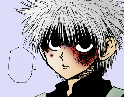
Finally, the last layer. Blood. To make this easier on me, I'm going to drop the blood layer to below the hair layer.
Now select the face again. Because the blood layer is below the hair, selecting the hair is fine. Thus, much easier. Grab some red, and go over the blood. If you'd like, you can also change the blood layer to multiply like the line art layer. It looks a little more like it's on top of the skin that way.
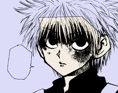
Stopping here is fine. It's pretty much a finished product. I've really enjoyed the effect of messing with the output levels though, so that's what I've done.
Make sure everything is deselected, and then click on the line art layer again. Go to the levels window and type in that number I told you to remember.
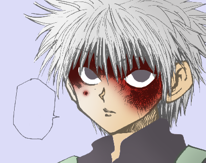
Voila.
If you don't like the way the blood looks (it's a bright, dark color against all those pastels), there is a way to make it look less gaudy using the eraser tool. Size up the eraser (in this case, size 150) and make sure the hardness is zero. Now click around the edges of the blood. Keep the eraser's circle itself away from the red color, but lining it up against the edge in order to fade out the brightness of the red and lessen the abruptness of change from pastel to dark makes the whole thing easier on the eyes.
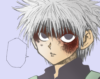
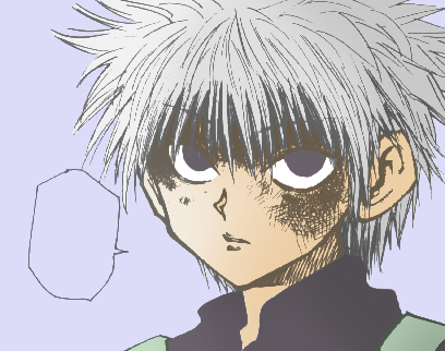
It looks perfectly fine without the blood as well. I usually leave it out when it comes to small scratches.
When you've finished all of that, you just crop and resize.


Hooray, icon!
So without further ado, here goes nothing. Or rather, here goes a day in front of the computer.
This is what I'm starting out with. One of the earlier panels of Hunter x Hunter. As such, it's also pretty faded and ugly, so before coloring even starts, the levels need to be adjusted.
Image --> Adjustments --> Levels.
Ignore the output levels for now. Just adjust the input levels. Feel free to fiddle with those triangles until the panel looks presentable. Moving the far right one toward the center will white out the unwanted gray, and moving the far left one toward the center will make the blacks blacker. The center one can move both ways. It's usually better to slide the center triangle to the spot you prefer first and then adjust the image's levels accordingly with the end triangles.
I don't like having text in my icons, so I also delete that. Which leaves me with a nice, clean starting point.
Next, go to the layers window and change the line art layer to multiply.
After that, add the base layers and label them so you don't lose track. One layer for skin, one for hair, one for clothing, one for eyes, and one for anything extra, in this case blood.
I choose that specific order because it works best for me, but the order doesn't matter ultimately outside of your own preferences. What happens is that a layer above another layer in the hierarchy of the layers window is literally above the other layer in the image. Colors on a higher layer will cover the colors below them.
If I'm planning to make more than one icon of the same character, I open a new, blank file, size it 500x500 pixels, and use it as a color palette. As I decide on each color for each step, I add it to the palette.
Killua's palette, after finishing my last batch of icons, looks like this:
Something which is probably visible in the above color palette is that I don't use many dark colors. The reason for this is that dark colors beneath the black line art just look black. Pale colors beneath the black line art look dark. It's a personal stylistic choice on my part, as I feel the pastels just look better.
Now, finally, coloring can happen.
Start out with the background layer. No renaming was required for this layer because it's already named. Background. Choose your background color and go nuts. Just make sure anything white stays white, namely the eyes and the mouth if it's open. Usually it's faster to just color everything, then grab the eraser tool and erase the color from those areas.
Next, hop up to the skin layer and grab the polygonal lasso tool. Using the polygonal lasso tool, trace over the line art of the face, neck and ears. Because it's a lower layer in the hierarchy, it's fine if hair and clothing is selected too.
Consider overlap when tracing the line art. Do you want to line art around the face to be the color of the background or the color of the skin? Definitely the skin. So include the black line art itself in the polygonal lasso tool selection.
Don't deselect what you've selected.
Once the base color is down, shading is next. Double click the foreground color square in the left bottom corner in order to bring up the color picker window. Whichever color you chose for the base, move two circles horizontally to the right. (The color picker itself is a circle, and the indicator of what color is currently selected is also a circle. The way I decide what shade should be next is by touching the side of the color picker to the side of the circle indicating the base color, lining the two circles up horizontally. Then I click and do the same thing a second time.) You can choose to do the same vertically instead of horizontally, or you can choose a completely different way that works better for you. That's how I like to keep it uniform though.
Once you've chosen your second color, add it to the palette. You can do the same thing again, and add the new color to your palette as well. That makes three skin colors: base, shading 1, and shading 2. Now you need a layer for each. Create two new layers. You can label them if you'd like, but I don't.
On the layer directly above the skin layer, use your second color. Make sure the brush is large and with zero hardness. Then choose where the light is coming from. Usually it has less to do with what's realistic and more to do with what looks good. In this particular panel, there is a lot more shading drawn in to the right, so it'll look better if the light is coming from the left and the shade is to the right. Take the brush and follow the contour of the face (usually a backwards C shape) to shade the right half of the face. Don't worry about any details. Anything to the right of the nose is fair game, and everything to the left is fine as is.
Now the second shading layer. Grab your third skin color, the darkest one, and do exactly the same thing with a slightly smaller brush. In this case, the first shading layer was colored with a size 175 brush, and the second was size 125. Aim the edge at around the center of the eye rather than the nose.
If the artist has drawn shading for the nose, I tend to color that in too.
And that's skin finished! All the other layers follow the same basic method.
With the skin colored, hair is next. Selecting all of the hair with the polygonal lasso tool is probably the most tedious part of the process. Because it's above the skin and background layers, nothing but the hair itself can be included in the selection. When the hair is as messy as Killua's can get, I'll select it in sections so that I don't lose everything if I make a mistake.
After that, just pick your base color and hit everything in the selection area.
Find your two darker shades, create your shading 1 and shading 2 layers, and follow the same shading pattern (shade goes to the right following the contours of the selected area).
After hair is clothing. Killua's shirt is black, but I'm still going to color it. This is probably where things are going to make more sense.
Select the shirt with the polygonal lasso tool, just like with the skin and hair layers. Now, click on the line art layer (should be the top layer in the layer window) and open the levels window again. This time, ignore the input levels and only work with the output levels.
Slide the far left triangle toward the center until you find the exact color you want. Remember the number that corresponds to it. I've settled comfortably into using 112.
After that, cancel the levels change and go back to the clothes base layer. Shade as per usual.
Once the clothing is colored, the next layer is the eyes. Those can be colored in the same way as the shirt. Although for a panel like this, I don't generally bother with shading. It's better for that "soulless" look to have the eyes be the same color throughout. The same applies when the eyes are small. There's no point in shading them if no one's going to be able to see it.
Finally, the last layer. Blood. To make this easier on me, I'm going to drop the blood layer to below the hair layer.
Now select the face again. Because the blood layer is below the hair, selecting the hair is fine. Thus, much easier. Grab some red, and go over the blood. If you'd like, you can also change the blood layer to multiply like the line art layer. It looks a little more like it's on top of the skin that way.
Stopping here is fine. It's pretty much a finished product. I've really enjoyed the effect of messing with the output levels though, so that's what I've done.
Make sure everything is deselected, and then click on the line art layer again. Go to the levels window and type in that number I told you to remember.
Voila.
If you don't like the way the blood looks (it's a bright, dark color against all those pastels), there is a way to make it look less gaudy using the eraser tool. Size up the eraser (in this case, size 150) and make sure the hardness is zero. Now click around the edges of the blood. Keep the eraser's circle itself away from the red color, but lining it up against the edge in order to fade out the brightness of the red and lessen the abruptness of change from pastel to dark makes the whole thing easier on the eyes.
It looks perfectly fine without the blood as well. I usually leave it out when it comes to small scratches.
When you've finished all of that, you just crop and resize.
Hooray, icon!