Memeage.
Tag me with "icons" in the replies and I will choose some of your icons to tell us about. Reply in your journal!! Or don't. No skin off my back.
Chosen by my long-time pal lotusice:
1. Electrified fence

This fence surrounds a power relay station in the industrial area at the east footing of the Fremont Bridge in Portland. The photo itself was taken largely because I find industrial, utilitarian things fascinating. As for its inclusion as an icon, if I use it one might infer a less-than-public entry.
2. Burma

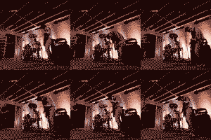
This is a teensy gif I put together from a series of shots of Mission Of Burma, that venerable and storied Boston Post-Punk musical goliath, playing at the Doug Fir. Of late my photography m.o. has been to set the camera to take repeated exposures and just lean on the shutter release button. I have nearly song-length sets of images, but it helps cut down on those moments lost to focusing time and perceptual lag. (Of course, I also end up with 1200 exposures of a single show, but c'est la vie.) I refuse to use a flash to shoot live performances, as I think it's rude to the artist(s) and to the rest of the audience, but if someone else is using a flash I'm willing to exploit that. One frame of this gif is someone else doing just that. The icon was intended for use on music posts, which haven't happened as often as I'd like.
3. Erosion

I am still unconvinced I can call a thing "art" to which I haven't actually taken my hand. This is a 18" x 24" oil pastel self portrait I did for an architectural graphics class in the early 2000s. It's based on a Photoshop file in which I gradually ate away at two overlapping high-contrast photos of myself. It's actually the penultimate version. When I turned it in my instructor informed me he'd be keeping it, and suggested I might want to explore one further iteration. I did, but apparently I looked bummed enough by his intent that he took pictures for future use in class & returned it. So now I have two similar works. In person neither of them are always recognized as human, looking more like some abstract mapping of some sort until one sees them from a distance of 8' or more. This pleases me. As an icon it's to indicate a bad mood, or feeling worn & at wit's end. (NOTE: Version two, on the living room wall, absolutely fascinates my infant son. He rarely tires of smiling at it. He's my son all right.)
4. knotwork heart

Circa 1994 I decided I'd try my hand at knotwork. (Working at Books, Inc. at the time I had access to several decent books and a remarkable amount of on-the-clock downtime, so it made sense.) It proved simple, so my designs got a little more complex. HOWEVER! At home I made a real show of struggling with a simple trefoil knot, much to Kelli's perplexity. Meanwhile, I worked on the heart at work as Valentine's Day approached, and on the big day I shocked the heck out of her. She loved it, but when she realized that she'd been had, she hit me. I considered that a win.
5. Doomed!

A distant wildfire colored the sunlight amber. The whole week was like that, and the feeling was surreal, as if some apocalyptic event were hovering over the entire city. At night the moon oscillated from blood red to a citric orange. My photography of celestial objects has been a lingering source of frustration, as they rarely turn out. This moon is one of the few exceptions. This icon usually indicates some sort of world-is-ending-via-human-stupidity entry.
6. Mt. Angel

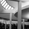
Ah. Mount Angel. This is a heavily cropped shot of the main reading room of the Mount Angel Benedictine Abbey Library, my favorite building. It is one of two full-on buildings in North America by otherwise prolific Finnish architect Alvar Aalto, one of the ten best architects of the 20th century. (The other building is the Baker House dorm at M.I.T., where he taught in the 1940s.) The Abbey, a seminary by vocation, has had a large collection of important religious texts (including original Gregorian Chant notation and centuries-old Judaica), but they'd been keeping the books all over the place since their library burned down. In the mid-1960s a monk was sent down to U.C. Berkeley to ask who they'd ask to design a library. Not taking it too seriously, someone at Cal blurted out the best-case scenario, Aalto. They wrote to Aalto, who politely blew them off by insisting on a face-to-face meeting, in Finland. Aalto was knocked for a loop when the head librarian showed up a few months later, and, taken with the site map Fr. Barnabas Reasoner brought with him, began designing the library. The Abbey is on a bluff overlooking the Willamette River Valley, with the buildings perched along the rim, surrounding a central gathering area. The library is low-key in presentation, the lowest building on the bluff, a single story brick building, resolutely rectilinear and, in many ways, humble and boring. Then you enter, and the building spills down the hillside into a three-story height, creating a an amazing, breathtaking space that, in the words of my wife, combines the serenity of "a library and a monastery." The monks are proud as punch of the building, and welcome architectural tourists like me. I had a conversation with a monk who'd met Aalto when he visited in 1971 and the man was so happy to tell me about the experience, and what a gift the building had been in the last 30 years of his time at the Abbey. As a side note, this was the Abbey Dave Guastaferro attempted to join, and he and I had a frighteningly intense conversation about the awesomeness of the library.
So it's my default icon, and if I ever, ever design a building with even 20% of this library's power to enrich the lives of users there will be no living with my massive ego.
Chosen by my long-time pal lotusice:
1. Electrified fence

This fence surrounds a power relay station in the industrial area at the east footing of the Fremont Bridge in Portland. The photo itself was taken largely because I find industrial, utilitarian things fascinating. As for its inclusion as an icon, if I use it one might infer a less-than-public entry.
2. Burma

This is a teensy gif I put together from a series of shots of Mission Of Burma, that venerable and storied Boston Post-Punk musical goliath, playing at the Doug Fir. Of late my photography m.o. has been to set the camera to take repeated exposures and just lean on the shutter release button. I have nearly song-length sets of images, but it helps cut down on those moments lost to focusing time and perceptual lag. (Of course, I also end up with 1200 exposures of a single show, but c'est la vie.) I refuse to use a flash to shoot live performances, as I think it's rude to the artist(s) and to the rest of the audience, but if someone else is using a flash I'm willing to exploit that. One frame of this gif is someone else doing just that. The icon was intended for use on music posts, which haven't happened as often as I'd like.
3. Erosion

I am still unconvinced I can call a thing "art" to which I haven't actually taken my hand. This is a 18" x 24" oil pastel self portrait I did for an architectural graphics class in the early 2000s. It's based on a Photoshop file in which I gradually ate away at two overlapping high-contrast photos of myself. It's actually the penultimate version. When I turned it in my instructor informed me he'd be keeping it, and suggested I might want to explore one further iteration. I did, but apparently I looked bummed enough by his intent that he took pictures for future use in class & returned it. So now I have two similar works. In person neither of them are always recognized as human, looking more like some abstract mapping of some sort until one sees them from a distance of 8' or more. This pleases me. As an icon it's to indicate a bad mood, or feeling worn & at wit's end. (NOTE: Version two, on the living room wall, absolutely fascinates my infant son. He rarely tires of smiling at it. He's my son all right.)
4. knotwork heart

Circa 1994 I decided I'd try my hand at knotwork. (Working at Books, Inc. at the time I had access to several decent books and a remarkable amount of on-the-clock downtime, so it made sense.) It proved simple, so my designs got a little more complex. HOWEVER! At home I made a real show of struggling with a simple trefoil knot, much to Kelli's perplexity. Meanwhile, I worked on the heart at work as Valentine's Day approached, and on the big day I shocked the heck out of her. She loved it, but when she realized that she'd been had, she hit me. I considered that a win.
5. Doomed!

A distant wildfire colored the sunlight amber. The whole week was like that, and the feeling was surreal, as if some apocalyptic event were hovering over the entire city. At night the moon oscillated from blood red to a citric orange. My photography of celestial objects has been a lingering source of frustration, as they rarely turn out. This moon is one of the few exceptions. This icon usually indicates some sort of world-is-ending-via-human-stupidity entry.
6. Mt. Angel

Ah. Mount Angel. This is a heavily cropped shot of the main reading room of the Mount Angel Benedictine Abbey Library, my favorite building. It is one of two full-on buildings in North America by otherwise prolific Finnish architect Alvar Aalto, one of the ten best architects of the 20th century. (The other building is the Baker House dorm at M.I.T., where he taught in the 1940s.) The Abbey, a seminary by vocation, has had a large collection of important religious texts (including original Gregorian Chant notation and centuries-old Judaica), but they'd been keeping the books all over the place since their library burned down. In the mid-1960s a monk was sent down to U.C. Berkeley to ask who they'd ask to design a library. Not taking it too seriously, someone at Cal blurted out the best-case scenario, Aalto. They wrote to Aalto, who politely blew them off by insisting on a face-to-face meeting, in Finland. Aalto was knocked for a loop when the head librarian showed up a few months later, and, taken with the site map Fr. Barnabas Reasoner brought with him, began designing the library. The Abbey is on a bluff overlooking the Willamette River Valley, with the buildings perched along the rim, surrounding a central gathering area. The library is low-key in presentation, the lowest building on the bluff, a single story brick building, resolutely rectilinear and, in many ways, humble and boring. Then you enter, and the building spills down the hillside into a three-story height, creating a an amazing, breathtaking space that, in the words of my wife, combines the serenity of "a library and a monastery." The monks are proud as punch of the building, and welcome architectural tourists like me. I had a conversation with a monk who'd met Aalto when he visited in 1971 and the man was so happy to tell me about the experience, and what a gift the building had been in the last 30 years of his time at the Abbey. As a side note, this was the Abbey Dave Guastaferro attempted to join, and he and I had a frighteningly intense conversation about the awesomeness of the library.
So it's my default icon, and if I ever, ever design a building with even 20% of this library's power to enrich the lives of users there will be no living with my massive ego.