Terri Clark Originals
Yeah, so my mom got into a bit of an "archival" stage while I was off at college. She found my old stack of sketchbooks and scanned in the Terri Clark sketches I've done. Then an old art teacher asked me to put them up online with some comments and original photos for comparison. (It'll at least be entertaining for the Hat Brats.)
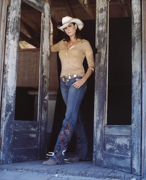
Not my first but the earliest I could find:

O/P:

This is probably from late 2005/early '06. I like the red/warm hues.
Proportion's a bit off, and wow- eyeliner galore.
My first real attempt at colored pencils in about 2 years. Not bad, shadow-wise.
Let's move on. Same O/P, different take:

I like this better. Nothing wrong with a little Calgary Flames love. Photoshop; the old-fashioned way. Early '07.
Rudy and the hat add some depth, although I need to work on drawing dogs.
I tossed a photocopy of this onstage to Terri at my 1st Opry show. Can you say stalker star-struck?
On to Acrylics:

A bit of super-imposing here. Some O/P photos of Tootsie's from me and the Terri pic is from her website (a trip to the Caribbean.) The canvas is only 11"x14", and this took me a long time to finish, thanks to my A/P Art exam. Winter '07 - Spring '08. For the record, I took lots of creative liberty with the background.

18"x24" self-portrait from Spring 2006. I'm playing pool at the Wildhorse Saloon. If-fy lighting, I know, but the canvas is just a tad big to fit on a scanner. Incase you're wondering, the computer-chip design on the pool table shows how technology supports even the simplest games, like billiards. (Don't believe me? Go get a composite questick.) Looking for Terri? Look onstage. (Was originally Jason Michael Carroll. Sorry Mr Carroll.)


Mom likes this one. Says it shows the "whole process" with the initial sketch at the bottom, the "refinement" in John Rich's hat, and then the shadows/highlights. I think it's very much unfinished, but what the hell. Spring '07.
Now my personal favorites:

Another one that's too big for the scanner. Summer '06, colored pencil and Sharpie, maybe 11"x17. Love this O/P (currently offline) and Terri's obvious energy. "TERRI CLARK" is superimposed over the purple, it's just way too hard to see. I enjoyed drawing this one and I'm proud of how it came out.

O/P:
This is probably the only picture I've gotten a compliment for (mid-drawing) in a non-art class by the teacher. Spring '08, graphite. More Calgary Flames love. I didn't use much of the O/P and I really like this one. A lot.
I have more but my mom couldn't find/scan them. (Although I've only been away from home for about 4 hours now, maybe she has...)
Thanks for scrolling!
Wildthing
Not my first but the earliest I could find:
O/P:
This is probably from late 2005/early '06. I like the red/warm hues.
Proportion's a bit off, and wow- eyeliner galore.
My first real attempt at colored pencils in about 2 years. Not bad, shadow-wise.
Let's move on. Same O/P, different take:
I like this better. Nothing wrong with a little Calgary Flames love. Photoshop; the old-fashioned way. Early '07.
Rudy and the hat add some depth, although I need to work on drawing dogs.
I tossed a photocopy of this onstage to Terri at my 1st Opry show. Can you say stalker star-struck?
On to Acrylics:
A bit of super-imposing here. Some O/P photos of Tootsie's from me and the Terri pic is from her website (a trip to the Caribbean.) The canvas is only 11"x14", and this took me a long time to finish, thanks to my A/P Art exam. Winter '07 - Spring '08. For the record, I took lots of creative liberty with the background.
18"x24" self-portrait from Spring 2006. I'm playing pool at the Wildhorse Saloon. If-fy lighting, I know, but the canvas is just a tad big to fit on a scanner. Incase you're wondering, the computer-chip design on the pool table shows how technology supports even the simplest games, like billiards. (Don't believe me? Go get a composite questick.) Looking for Terri? Look onstage. (Was originally Jason Michael Carroll. Sorry Mr Carroll.)
Mom likes this one. Says it shows the "whole process" with the initial sketch at the bottom, the "refinement" in John Rich's hat, and then the shadows/highlights. I think it's very much unfinished, but what the hell. Spring '07.
Now my personal favorites:
Another one that's too big for the scanner. Summer '06, colored pencil and Sharpie, maybe 11"x17. Love this O/P (currently offline) and Terri's obvious energy. "TERRI CLARK" is superimposed over the purple, it's just way too hard to see. I enjoyed drawing this one and I'm proud of how it came out.
O/P:
This is probably the only picture I've gotten a compliment for (mid-drawing) in a non-art class by the teacher. Spring '08, graphite. More Calgary Flames love. I didn't use much of the O/P and I really like this one. A lot.
I have more but my mom couldn't find/scan them. (Although I've only been away from home for about 4 hours now, maybe she has...)
Thanks for scrolling!
Wildthing