(no subject)

-Done in Paint Shop Pro 9
-Intermediate/Advanced
Other icons:


I decided to give up my old coloring sekritz since I got Photoshop and a new coloring :P
1. Get a pretty pic. Crop and resize to 100 x 100.
2. Duplicate layer. Set the layer to screen.
3. Make a new layer and fill with #FEE7AE. Set to MULTIPLY.
4. Adjust > Color Balance > Channel Mixer. Put in these settings:
Output Channel : Red
Red (%): 90
Green (%): -20
Blue (%): 0
Output Channel : Green
Red (%):-10
Green (%): 40
Blue (%): 60
Output Channel : Blue
Red (%): -50
Green (%): 80
Blue (%): 60
Constant (%): 20
Set this layer to SCREEN.
5. Layer > Adjustment Layer > Hue/Saturation/Lightness
Master saturation: 10
Yellow saturation: -60
6. Layer > New Adjustment Layer > Color Balance
Midtones: 0 -20 20
Shadows: -40 50 70
Highlights: 0 0 0
7. Layer > New Adjustment Layer > Levels
Main
I: 15 0.82 255
O: 0 255
Red
I:0 0.81 255
O: 0 255
Green
I:0 0.81 255
O: 0 255
Blue
I: 10 1.25 255
O: 35 225
8. Layer > New Adjustment Layer > Curves
I:60
O: 0
9. Make a new layer, fill with #B2D4F4. Set to burn and change opacity to 40%.
DISCLAIMER: This works with some images! If it looks funny/funky, there's a couple of things you could do.
☠If it looks like this:

Then duplicate base, and set to screen:

☠If it looks like this:

Then, delete the SCREEN layer :

☠If it looks too yellow, lower opacity of MULTIPLY layer.
More examples:

-----old tutorials

-Done in Paint Shop Pro 9
-Easy
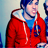
Ryro and Brendon
1. Get your base. Sharpen, crop, resize, you know... the fun stuff AGAIN=P I used a pic of Brendon and Ryan from Panic! at the freakin' Disco. Love those guys... anyways.
2. Okay, now comes the hard part (well, not really). Make a color balance layer (layer->new adjustment layer->color balance). Here are the settings:
Midtones
Cyan -5
Magenta 6
Yellow 10
Shadows
Cyan 26
Magenta -4
Yellow 35
Highlights
Cyan 1
Magenta 17
Yellow -5
Make sure 'Preserve Luminance' is checked.
3. Make a new layer and fill with #8de2ff. Set to Soft Light at 100%
4. Make a new Hue/Saturation/Layer (Layers->New Adjustment Layer->Hue/Saturation/Lightness) and set the saturation to 64.
FIN
------------------------------------------------------------------------------------------
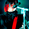
Frank
1. Get your base. Sharpen, crop, resize, you know... the fun stuff AGAIN=P I used a pic of Frank from MCR. Yum XDD
2. Duplicate your base and set to screen. I always do this to all of my icons. Change the opacity to anywhere from 50%-75%. Play around with the opacity.
3. Okay, now comes the hard part (well, not really). Make a color balance layer (layer->new adjustment layer->color balance). Here are the settings:
Midtones
Cyan -5
Magenta 6
Yellow 10
Shadows
Cyan 26
Magenta -4
Yellow 35
Highlights
Cyan 1
Magenta 17
Yellow -5
Make sure 'Preserve Luminance' is checked.
Did you get through that? C'mon, it wasn't that bad =P
4. Make a new layer and fill with #8de2ff. Set this layer to soft light. I set mine to 100% opacity.
5. Made a new hue/saturation/lightness layer and set the saturation to 64.
6. Duplicate the hue/saturation layer. Set the opacity to 20-50%. PLAAAAAAAY around.
7. Make a new layer. Fill with #fbe6b5. Set to multiply on 100% opacity.
8. Duplicate the base and drag it to the top. Set this layer to soft light.
FIN
☠ Comments are love.