41 - Tutorials
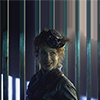
to
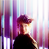
requested by zhaoxun
River Song tutorial:
1 - I dragged the picture onto my canvas and used the smudge tool to extend the background (probably with a square brush I use when I work with relatively simple backgrounds like this one. The strength of the smudge tool must be 100%). So I got my base.

2 - I sharpened first. I don’t remember if I used Sharpen or Smart Sharpen (I really need to start labeling my layers), but it was over-sharpened so I lowered the opacity of the layer to 54%.
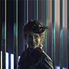
3 - I duplicated the non-sharpened base three times and put those layers on top of the sharpened layer. I set two layers to screen and the last one to Soft Light, and used Gaussian Blur on the Soft Light layer (3.5 px).
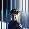
4 - Curves layer to brighten it up:
RBG: input: 121; output: 140
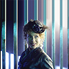
5 - The picture was too blue, I wanted to change the colouring. I made a Colour Balance layer:
Midtones: + 40/ -14 / -67
6 - Another curves layer:
RBG: Input: 85; Output: 125
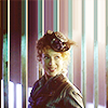
7 - I wanted more pinkish tones. Colour fill layer: fca2a2, set to Soft Light, 31% opacity.
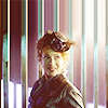
8 - Now it was too red and I wanted to bring back different blues (yes, blues, I know, I make no sense). Colour fill: 2186a7, set to Soft Light, 37% opacity.
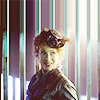
9 - The lighting was flat, so I created a gradient fill layer. The usual B&W, and for once I kept the default settings, that is style: linear and angle:90°.
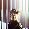
10 - I created a new layer, copy+merged my layers and set the new layer to Soft Light. I Gaussian blurred it (3.5 px). Now we have this light area on the right that I like.
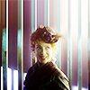
11 - I used
">this texture by deny1984 and set it to Soft Light.
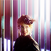
12 - Another texture by deny1984, set to Soft Light, 66% opacity. Now the colouring has more variety.
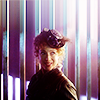
13 - The picture was too dark. Yet another curves layer.
RGB: Input: 104; Output: 127
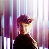
14 - Now I wanted more vivacity so I added a Vibrance layer:
Vibrance: +38
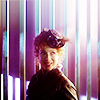
15 - I copy+merged my layers again and set the new layer to Soft Light, then Gaussian blurred it. It affected the colouring badly, and this was before I learned that desaturating those layers gives the glowy effect and leaves your colouring alone. *facepalm* So what I did was create a Colour Balance layer with a clipping mask, so only the last Soft Light + Gaussian Blur layer was affected.
Midtones: -19/+40/+34
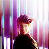

And we’re done! =)
to
requested by zhaoxun
Downton Abbey tutorial :
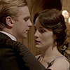
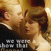
I’ve been trying to use more muted colours and subtler lightings recently, and this is one of my attempts.
1 - Originally, this icon was going to include some blending, but then I decided against it. But I prepared my canvas as I would if I were making a blended icon. So I filled my canvas with black, pasted my cap on the canvas, dragged and resized it until I got my crop, and set it to screen. Then I duplicated it twice, set one duplicate to Screen and the other to Soft Light. I used Gaussian blur on the Soft Light copy (3.5 px).

>
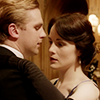
2 - Then I created a curves layer (Input: 113 - Output: 127). I think it was an Auto curves layer, I wanted to see if my picture had enough light and contrast.
3 - I created a Colour Balance layer, but I only wanted to make small changes to the colouring, so:
Midtones: +43 / +24 / -15 (‘Preserve luminosity’checked)
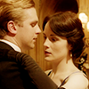
4 - Colour Fill layer: fb8b8b (Soft Light, 30% opacity)
Colour Fill layer: 049185 (Soft Light, 100% opacity)
Colour Fill layer: f27676 (Soft Light, 63% opacity)
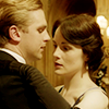
5 - A classic B&W gradient, to make the lighting more dramatic. I didn't change the angle this time either (I usually play around a lot with gradients, but if the default placement is the best, why change it?). Just set it to Soft Light, 100% opacity.
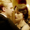
6 - I Copy+Merged the layers into a new one. Then: Filter > Noise > Reduce Noise
This filter is great if you want softness and a painted feel to your icons. (Also it’s good at, well… reducing noise, which is, you’re going to tell me, what it was initially made for, so yeah. What I mean is it’s great if you’re working with LQ, grainy caps, so don’t forget it’s there.) I’ve loved this filter for a long time, but recently I came across a tutorial by tinebrella, and obviously she was using more effective settings than mine, lol, so now I’m using the ones she gave (Strength: 7; Preserve details: 1%; Reduce colour noise: 0%; Sharpen details: 35%).
Once you’ve used Reduce Noise the icon looks too blurry, so reduce the opacity of the layer to 52%.
7 - Now I needed to sharpen a bit. Filter > Sharpen > Sharpen, and I set the layer to 26% opacity.
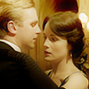
8 - I used this wonderful texture by deny1984 and set it to Soft Light, 55% opacity.
9 - Another gradient fill. B&W again, style: linear, angle: 14,04°. I needed light on both their faces, not just Matthew’s, and poor Mary was in the dark.
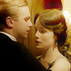
10 - See that saturated red spot above Mary’s head? I don’t like it. I used black blobs to get rid of it. Use a round air brush, about 20px wide, and paint a black blob with a brush opacity of 20% over the red spot. Set the layer to Soft Light, 54% opacity, duplicate it and set the second one to Soft Light, 100% opacity. I had to layer mask to second one not to add shadows on Mary’s face as well. So now it’s not as red and distracting.
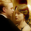
11 - Vibrance layer: Vibrance: +42 ; Saturation: 0
12 - Colour Balance layer: Midtones: +4 / -7 / -17. I wanted the colouring to be slightly more orange.
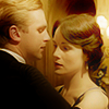
13 - I created a new layer and used my air brush again, approx. 35px wide, and painted black blobs with a low opacity brush in the bottom left hand and top right hand corners, and a white line that goes across the icon. I set the layer to Soft Light, 35% opacity.
14 - New layer. I painted two big white light blobs in the top left hand corner and the bottom right hand corner. I set it to Soft Light, 100% opacity.
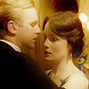
15 - Then I used this texture by erzebet (it’s one of my go-to textures these days) and set it to Soft Light, 55%. Bright icon, dark icon, I didn’t really know what I wanted…
16 - A bit of a grainy effect with this texture (by ??), set to Screen, 64%. And now we’re done with the colouring
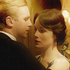
17 - Text time! I never know what I’m doing with text, so I won’t babble about that. I used Times New Roman 9pt, Smooth, created four text layers with bits of my quote in them ('we', 'were a', 'show that' and 'flopped'), and moved them around until I was happy with the placement. I picked a colour from the icon for ‘flopped’, it’s ‘bc9249’. The other layers are simple white. For once I didn’t duplicate and blurred my text, which is what I normally do. I think I tried but it didn’t fit. Anyway, this is probably one of my ‘less bad’ text uses so far, so I’m rather pleased with it.

And that’s it!
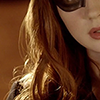
to
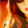
requested by 12feethigh
Amy Pond tutorial:
1 - My crops have become very generic and uninteresting lately… This is a rare example of a more original crop. I think I used the crop tool for this icon. So we have our base.

2 - I duplicate the base, set two layers to Screen and the last one to Soft Light (the Soft Light one is on top).
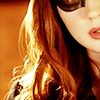
3 - I wanted to give this icon a soft and slightly painty look, so what we’re going to do is very simple: smudge tool! When I smudge I usually zoom (at least 200%). I used a round air brush, probably around 10px wide and set the strength of the smudge tool to 12%. Smudge slowly over the whole picture, the background, Amy’s face and hair. Make sure you smudge following the way the hair and muscle go (i.e you don’t want to smudge the hair horizontally).
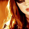
4 - Next up is a Vibrance layer to make the colours pop. It looks ugly, but don’t worry, we’re going to fix that.
Vibrance: +100 / Saturation: +15
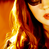
5 - Selective Colour layer:
Reds: -9; -21; +27; 0
Yellows: 0; 0; -48; 0
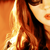
6 - Colour Balance:
Midtones: +63; +41; +43
At this point I wanted the colouring to be mostly orange, but not completely monotone, which is why I added some green hues to it.

7 - Another Vibrance layer:
Vibrance: +48
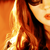
8 - I wanted to add more greens. Colour Fill layer, with 03ac72, set to Soft Light, 80% opacity.
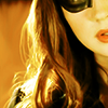
9 - Channel Mixer! O.o
I never use Channel Mixer, so I can’t really tell you why I did so here. It’s stupid because all in all I like this tool, it makes subtle but in-depth changes to your colouring, though I can’t explain how it works. My way with it is to move things around and see what happens. *ahem* Here we go:
Green channel: Red: +16; Green: +119; Blue: -5
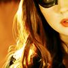
10 - Second Channel Mixer layer:
Green channel: Red: -2; Green: +93; Blue+5
Blue channel: Red: +12; Green: -14; Blue: +116
The colouring is still mostly orange but we’ve brought green and blue-ish tones to it.

11 - The icons lacks contrast and shadows, and I was deep in my contrast phase when I made this icon, so it’s Levels time:
RGB: 43 / 1,04 / 255
Contrast and colours enhanced, lots of shadows: win! The only thing is now it’s a bit too dark.
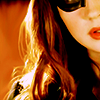
12 - I want to work on the lighting, so I make a gradient fill layer, the classic B&W one, and set it to Soft Light. Style: linear and angle: 42, 27°
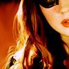
13 - Take this texture by deny1984 and set it to Screen 35% opacity.

14 - Another texture by deny1984. Set it to Screen 26% opacity.
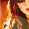
15 - Time for the final steps. I had a way of finishing my icons back then, I don’t work like that anymore, but here’s what I did:
Make a new layer and clone stamp your image. Go to Filter > Blur > Surface Blur. My settings were along the lines of: Radius: 30; Threshold: 100. Lower the opacity of the layer to 29%.
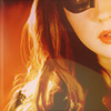
16 - New layer and clone stamp again. Set the layer to Soft Light and use Gaussian blur (3.5 px).

17 - The icon is really blurry, so I sharpened it. I can’t remember if I used Sharpen or Smart Sharpen, but you get the idea. I layer masked parts of Amy’s hair because it looked too crispy after sharpening.

18 - The lower part of Amy’s hair (under the visible texture) is looking too green to my taste, so I picked an orange colour from her hair in the top part of the icon, created a new layer, and painted over the lower part of her hair. I set the layer to Colour, 41% opacity, duplicated it and set it to Soft Light, 100% opacity.

And we’re done!
I hope these are useful. If you could leave a comment it would be much appreciated, I'd love feedback. :) If you have any questions, feel free to ask! Sorry if I'm not clear or if my English is funky (I'm reading books in three different languages at the moment, it's a it confusing :P). I still have three tuts to write, but I won't have the time before I leave, I'm sorry :/ I posted these because they're colouring tutorials, the others include blending so I though it'd be nice to post them together as well! Until I get back, take care! You can still ask me questions or request tuts at 'Ask the Maker'.

Ask The Maker || My Thread