Early Icons
I'm a little bit disappointed. I'm part of a few icon challenge communities, I use them as motivators to make icons and learn new icon making stuff. Anyway one of the communities put the voting up a day early so I was able to submit the icons I'd made. I was trying some new techniques and I was quite happy with how they turned out. Since I wasn't able to enter them in the challenge I'm going to post them here to show off.

~ This icon was the first time I'd ever messed with the spacing of the text. I'm generally not that impressed with tiny text but I think I'm actually starting to like it as a decorative touch, especially when paired with normal text.
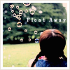
~ I get frustrated with white border brushes sometimes 'cause they disappear on white backgrounds and that tends to lessen the effect I'm going for when I use white borders. So I discovered this border technique and I think it's pretty darn cool.
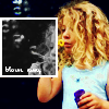
~ I've seen this technique around used in various ways. I made this icon as a experiment, trying to find a way to make this style work for me. It didn't turn out too bad if I do say so myself.

~ This icon was the first time I'd ever messed with the spacing of the text. I'm generally not that impressed with tiny text but I think I'm actually starting to like it as a decorative touch, especially when paired with normal text.

~ I get frustrated with white border brushes sometimes 'cause they disappear on white backgrounds and that tends to lessen the effect I'm going for when I use white borders. So I discovered this border technique and I think it's pretty darn cool.

~ I've seen this technique around used in various ways. I made this icon as a experiment, trying to find a way to make this style work for me. It didn't turn out too bad if I do say so myself.