[bestof_icons] Best of 2016
Hey~ so I'm sure you guys know that I joined bestof_icons this year which is also be my first time joining this so I'm going to post some of my thoughts about it, inspired by what cool_spectrum did right here. Thank you to everyone here for this past one year (2016) and special thanks for you who took your time to nominate my icons in the community. Anyway, here goes nothing~
2016 Icon of the Year
Close Calls


Personal Favs
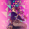
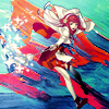
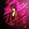
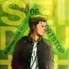

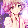
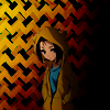
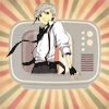
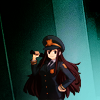


Extra: Non-Nominated Personal Favs

Comments
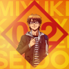
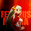
Alright, first of all, I'm VERY like really very surprised with the winning icon. I've been living my life making textless icons (unless it is necessary) and last year I tried to use text once in a while. That icon was from a challenge on 20muses, the challenge was supposed to have geometrical shapes somewhere in the icon. I was trying to get out of my comfort zone and it somehow worked? XD
Last year I posted an icon summary and you all know that I always make simple icons, while as you can see this year, I tried to make more complicated icons, but well simple icons still there of course because I love simple icons LOL
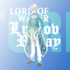
What I also surprised is the blue icon (Mikleo) in the close calls. I admit I've never been good working with the color blue and I thought those texts are all over the place so I kinda surprised people like it?
---
Anyway, I didn't make a lot of icons last year especially the second half of the year because I was focusing on my final project in uni and luckily I've passed the final project and waiting for my graduation now~ Hopefully I will be able to make more icons this year.
Hopefully I will do more experiment with icons and I'm going to work on my typography this year. I also hope I can do more vibrant/bold colors icons instead of the soft/muted ones! The resolution is a bit late because it's March already but, why not?
2016 Icon of the Year

Close Calls


Personal Favs


Extra: Non-Nominated Personal Favs


Comments
Alright, first of all, I'm VERY like really very surprised with the winning icon. I've been living my life making textless icons (unless it is necessary) and last year I tried to use text once in a while. That icon was from a challenge on 20muses, the challenge was supposed to have geometrical shapes somewhere in the icon. I was trying to get out of my comfort zone and it somehow worked? XD
Last year I posted an icon summary and you all know that I always make simple icons, while as you can see this year, I tried to make more complicated icons, but well simple icons still there of course because I love simple icons LOL
What I also surprised is the blue icon (Mikleo) in the close calls. I admit I've never been good working with the color blue and I thought those texts are all over the place so I kinda surprised people like it?
---
Anyway, I didn't make a lot of icons last year especially the second half of the year because I was focusing on my final project in uni and luckily I've passed the final project and waiting for my graduation now~ Hopefully I will be able to make more icons this year.
Hopefully I will do more experiment with icons and I'm going to work on my typography this year. I also hope I can do more vibrant/bold colors icons instead of the soft/muted ones! The resolution is a bit late because it's March already but, why not?