challenge 1; round 1: results
Unfortunately we must say bye to the following this week:


by welleg-fic with -4 votes.
Thanks for participating, hope you stay around!
VOTER'S CHOICE:


by dance-the-dance with +2 votes
MOD'S CHOICE:
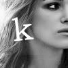

by cerberusk
TALLY
02; - = -1
03; - = -1
04; + + = +2 >> VOTER'S CHOICE
05; - = -1
06; - = -1
07; + = +1
08; - = -1
09; - = -1
10; - - = -2
12; + = +1
13; - - - - = -4 >> ELIMINATED
COMMENTS
2:
- I'm not entirely sure if that's really Keira Knightley, but anyway. Her shoulders look a bit choppy, so may blur them a bit? You can't really notice that the picture didn't originally have a black background until you see her shoulders.:) The coloring of the Johnny Depp icon doesn't work well with the picture, as well as the font. Maybe a different shade of blue, or not the entire icon in that color
3:
- both are kinda flat (places that should be lighter are filled with the same color as the rest)... nice text placement on the first icon though
4:
+ both have very interesting crops
+ The contrast on both is great and I absolutely adore the crop of Johnny
5:
- the icon of Keira appears a bit grainy & the text is badly placed. I like the crop of Johnny's icon, but the text box is really out of place & distracts from the image
6:
- Both are very dark, without much contrast. Keira is so dark in her icon that I wouldn't have been able to recognize the icon as her if I didn't know that was part of the challenge
7:
+ Very nice coloring on both icons. They are simple yet clean.:)
8:
- The brown (orange?) part of the Keira icon and the text don't work together. Just one of them would do.:) The way the orange/brown part on the Johnny Depp icon was cut makes it look like the orange part isn't Johnny anymore. Maybe change the layer properties? Looks like it's set on Pin Light
9:
- both have quite plain crop, and gradient over a b&w pic doesn't look very neat
10:
- the crops are boring. The icon of Johnny appears oversharpened
- Though the coloring on Keira looks great, she is way over-sharpened. So much that the icon looks rather grainy around her. The cropping around Johnny's arms looks rather odd as well
12:
+ simply gorgeous b&w on both!
13:
- Very little seems to have been done with the icons overall
- Both are very plain looking. In Keira's icon the red pops out alot, but the rest of the icon doesn't go with it. The rest of a icon is super dull, maybe if the icon maker had brought out some of the other colors it would have looked better. The Johnny icon is also dull, with close to no contrast which is crucial in black and white icons
- I feel that, for both icons, there wasn't anything done. The pictures were just cropped. For the Keira icon, the coloring of the red shirt is too bright. Lower the brightness and saturation a bit?
- very uneven coloring of the first icon... and the second icon could use more contrast
If you have any questions, feel free to ask.
by welleg-fic with -4 votes.
Thanks for participating, hope you stay around!
VOTER'S CHOICE:
by dance-the-dance with +2 votes
MOD'S CHOICE:
by cerberusk
TALLY
02; - = -1
03; - = -1
04; + + = +2 >> VOTER'S CHOICE
05; - = -1
06; - = -1
07; + = +1
08; - = -1
09; - = -1
10; - - = -2
12; + = +1
13; - - - - = -4 >> ELIMINATED
COMMENTS
2:
- I'm not entirely sure if that's really Keira Knightley, but anyway. Her shoulders look a bit choppy, so may blur them a bit? You can't really notice that the picture didn't originally have a black background until you see her shoulders.:) The coloring of the Johnny Depp icon doesn't work well with the picture, as well as the font. Maybe a different shade of blue, or not the entire icon in that color
3:
- both are kinda flat (places that should be lighter are filled with the same color as the rest)... nice text placement on the first icon though
4:
+ both have very interesting crops
+ The contrast on both is great and I absolutely adore the crop of Johnny
5:
- the icon of Keira appears a bit grainy & the text is badly placed. I like the crop of Johnny's icon, but the text box is really out of place & distracts from the image
6:
- Both are very dark, without much contrast. Keira is so dark in her icon that I wouldn't have been able to recognize the icon as her if I didn't know that was part of the challenge
7:
+ Very nice coloring on both icons. They are simple yet clean.:)
8:
- The brown (orange?) part of the Keira icon and the text don't work together. Just one of them would do.:) The way the orange/brown part on the Johnny Depp icon was cut makes it look like the orange part isn't Johnny anymore. Maybe change the layer properties? Looks like it's set on Pin Light
9:
- both have quite plain crop, and gradient over a b&w pic doesn't look very neat
10:
- the crops are boring. The icon of Johnny appears oversharpened
- Though the coloring on Keira looks great, she is way over-sharpened. So much that the icon looks rather grainy around her. The cropping around Johnny's arms looks rather odd as well
12:
+ simply gorgeous b&w on both!
13:
- Very little seems to have been done with the icons overall
- Both are very plain looking. In Keira's icon the red pops out alot, but the rest of the icon doesn't go with it. The rest of a icon is super dull, maybe if the icon maker had brought out some of the other colors it would have looked better. The Johnny icon is also dull, with close to no contrast which is crucial in black and white icons
- I feel that, for both icons, there wasn't anything done. The pictures were just cropped. For the Keira icon, the coloring of the red shirt is too bright. Lower the brightness and saturation a bit?
- very uneven coloring of the first icon... and the second icon could use more contrast
If you have any questions, feel free to ask.