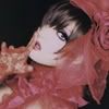
Icon Tutorial #2 feat. Kaya
From 
to
then
Difficulty: Easy/Medium
Steps: 4-6
Program: Photoshop CS
Translatable: Nope
PSD: Yes
1. Get a base. I will be using this one with Kaya-sama! :3
Come back at the end to duplicate it and set it to screen or soft light. In this case I didnt need it.

2. Layer>>New Adjustment Layer>> Hue/Saturation:
Master: 0/30/0
Yellow: -16/30/0 (this is VERY important. It keeps your image from turning ugly greenish yellow at the end)

3. Layer>>New Adjustment Layer>> Channel Mixer:
Red: +58/+6/+18
Green: +20/+66/-10
Blue: +26/-4/+58

Whoa. Big Difference huh? Lets bring out the reds a bit .
4. Layer>>New Adjustment Layer>>Selective Color layer:
Reds: -100/+21/+27/+28
Magentas: +79/-77/+61/+8
Neutrals: -7/-11/-19/+10
Blacks: 0/0/0/-10
Method: RELATIVE

5. Layer>>New Adjustment Layer>>Color Balance:
Midtones: +2/+1/-15
Shadows: -5/+9/+28
Highlights: -10/+29/+22
and finally:
6. Layer>>New Adjustment Layer>>Selective Color:
Reds: -70/+28/0/+25
Method RELATIVE

If you want the brownish coloring either,
A. Ommit step 5
B. Ommit Step 4+5
C. Ommit step 4+5+6
PSD!
Comment If using!! I would LOVE to see your results!
Other Examples:


to
then
Difficulty: Easy/Medium
Steps: 4-6
Program: Photoshop CS
Translatable: Nope
PSD: Yes
1. Get a base. I will be using this one with Kaya-sama! :3
Come back at the end to duplicate it and set it to screen or soft light. In this case I didnt need it.
2. Layer>>New Adjustment Layer>> Hue/Saturation:
Master: 0/30/0
Yellow: -16/30/0 (this is VERY important. It keeps your image from turning ugly greenish yellow at the end)

3. Layer>>New Adjustment Layer>> Channel Mixer:
Red: +58/+6/+18
Green: +20/+66/-10
Blue: +26/-4/+58

Whoa. Big Difference huh? Lets bring out the reds a bit .
4. Layer>>New Adjustment Layer>>Selective Color layer:
Reds: -100/+21/+27/+28
Magentas: +79/-77/+61/+8
Neutrals: -7/-11/-19/+10
Blacks: 0/0/0/-10
Method: RELATIVE

5. Layer>>New Adjustment Layer>>Color Balance:
Midtones: +2/+1/-15
Shadows: -5/+9/+28
Highlights: -10/+29/+22
and finally:
6. Layer>>New Adjustment Layer>>Selective Color:
Reds: -70/+28/0/+25
Method RELATIVE
If you want the brownish coloring either,
A. Ommit step 5
B. Ommit Step 4+5
C. Ommit step 4+5+6
PSD!
Comment If using!! I would LOVE to see your results!
Other Examples: