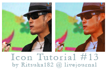
Icon Tutorial #13 feat. FLOW

Program: Photoshop CS
Steps: 7
Translatable: Yes
PSD: ask and I'll give you one!! (:
works best with images that have a lot of color and not too many whites
1. Get a base. I'll be using Kohshi from FLOW. You can duplicate it and set it to SCREEN or SOFT LIGHT. I set mine to SOFT LIGHT 50%

2. Go layer>>new fill layer>>solid color:
fill with #4D3101 and set it to EXCLUSION
this will help tone things down in the end and make whites blue/purple-ish

3. layer>>new adjustment layer>>channel mixer:
Red: 138, -42, 0, 0
this brings out the reds and colors just a little bit. too much red and he'll be looking like an orange. D:

4. layer>>new adjustment layer>>brightness/contrast:
C: +15
it was starting to become way too faded so i added a bit of contrast to fix it

5. layer>>new adjustment layer>>levels:
RGB: I- 0, 0.78, 212 O- 33, 226
Red: I- 72, 1.51, 225 O- 52, 221
Green: I- 0, 0.83, 255 O- 0, 255
this layer will make his skin more red than yellow. it'll make the colors pop more in the end.

6. Duplicate your base, drag it to the top and set it to LUMINOCITY. I set my opacity to 40% the opacity depends on your base but i usually set it to 40% to 60%
this is to keep your icon from being too faded in the end

7. layer>>new adjustment layer>>hue/sat:
Reds: 0,20,0
Yellows: 0, 10,0
Blues: 0, 20, 0
Magentas: -7, 0, 0
this
is to make the colors stand-out and be more vibrant! Play with these how ever you want!
you're done!

PSD or here @ DeviantArt
I would LOVE to see your results!
Other Examples: