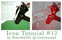
Icon Tutorial #12 feat. FLOW
made this tutorial for friends @ flow-generation.com its for noobs, basically. so if youre a noob try it out XD

Program: Photoshop CS
Steps: 5
Translatable: Yes
PSD: yep!
Works best with black and white images but color ones are ok too.
1. Start with your base. I'm using this one of GOT'S from FLOW in the COLORS PV! Go Image>>Adjustments>>Desaturate or go Image>>Adjustments>>Hue/Sat and make the master saturation -100. Basically just find a way to make it black and white! XD made it black and white cuz i find it looks nicer that way

>>
>>IMPORTANT NOTE: Your text is supposed to go after step 1. Due to something thats too long to explain the font isn't visible in the examples after each step. Anyway, the font is called 'Idiot' I wrote "ROCK!" then I tilted it and added a black border using 'stroke' on Photoshop. If your text is white you NEED something black behind it so you can see the font in the end. Don't worry in the PSD text is there.
2. Paste this texture by winterchaos Desaturate it, set the blend mode to SCREEN %100 and move it around till' you like what you see.

>>
it makes those dots and i find it looks cool in the end. used it to "fill-up" the icon ^^
3. If you're using photoshop create a red/black gradient like this one and set it to SCREEN %100 if you can't, use the one I made

>>
adds a red glow to all the grey/black areas
4. Next paste this texture. I don't know who made it. sorry. Set it to DARKEN %100. This will give your icon the sexy dirty look.

>>
5. Next paste this texture by shalowater TWICE. Put one on top and one on the bottom; align them together. Set them both to MULTIPLY %40
Erase around your text so the lines don't cover the word(s). As you can see that space is where my text is. You can just leave it like this with no text or erase it how you like. looks nice either way.

>>
>>
Well thats pretty much it. Somehow I feel like I didn't explain it properly due to the fact that the text isn't in the previews. >< sorry if thats the case. Ask me questions if you need help.
Download the PSD here @ deviantart or here @ mediafire
I WOULD LOVE TO SEE YOUR RESULTS!!!
FAQ:
What's a PSD? -sorry if this explanation is confusing-
As you may or may not know Photoshop has layers. Almost every step in this tutorial is a new layer. PSD keeps these layers intact so if you open a PSD in Photoshop everything in this tutorial will be there. All you have to do is switch the base and text. Saves you loads of time ey? But it's always best to read the tutorial text to make sure you don't have to do something that can't be shown in the PSD. (eg. how to desaturate the image itself)
I know it seems confusing but it isn't really. Imagine that PNG's and JPEG's are 2D and PSD's are 3D. Does that help you understand? no? fine >_>
What does 'Translatable' mean?
Translatable means that the tutorial can be made in programs other than Photoshop such as Paint Shop Pro or GIMP. Selective Color is the most frequently used layer adjustment in Photoshop that IS NOT translatable. Usually if something is translatable it means it doesn't have Selective Color.
More Examples:


Program: Photoshop CS
Steps: 5
Translatable: Yes
PSD: yep!
Works best with black and white images but color ones are ok too.
1. Start with your base. I'm using this one of GOT'S from FLOW in the COLORS PV! Go Image>>Adjustments>>Desaturate or go Image>>Adjustments>>Hue/Sat and make the master saturation -100. Basically just find a way to make it black and white! XD made it black and white cuz i find it looks nicer that way
>>

>>IMPORTANT NOTE: Your text is supposed to go after step 1. Due to something thats too long to explain the font isn't visible in the examples after each step. Anyway, the font is called 'Idiot' I wrote "ROCK!" then I tilted it and added a black border using 'stroke' on Photoshop. If your text is white you NEED something black behind it so you can see the font in the end. Don't worry in the PSD text is there.
2. Paste this texture by winterchaos Desaturate it, set the blend mode to SCREEN %100 and move it around till' you like what you see.

>>

it makes those dots and i find it looks cool in the end. used it to "fill-up" the icon ^^
3. If you're using photoshop create a red/black gradient like this one and set it to SCREEN %100 if you can't, use the one I made

>>

adds a red glow to all the grey/black areas
4. Next paste this texture. I don't know who made it. sorry. Set it to DARKEN %100. This will give your icon the sexy dirty look.

>>

5. Next paste this texture by shalowater TWICE. Put one on top and one on the bottom; align them together. Set them both to MULTIPLY %40
Erase around your text so the lines don't cover the word(s). As you can see that space is where my text is. You can just leave it like this with no text or erase it how you like. looks nice either way.

>>

>>
Well thats pretty much it. Somehow I feel like I didn't explain it properly due to the fact that the text isn't in the previews. >< sorry if thats the case. Ask me questions if you need help.
Download the PSD here @ deviantart or here @ mediafire
I WOULD LOVE TO SEE YOUR RESULTS!!!

FAQ:
What's a PSD? -sorry if this explanation is confusing-
As you may or may not know Photoshop has layers. Almost every step in this tutorial is a new layer. PSD keeps these layers intact so if you open a PSD in Photoshop everything in this tutorial will be there. All you have to do is switch the base and text. Saves you loads of time ey? But it's always best to read the tutorial text to make sure you don't have to do something that can't be shown in the PSD. (eg. how to desaturate the image itself)
I know it seems confusing but it isn't really. Imagine that PNG's and JPEG's are 2D and PSD's are 3D. Does that help you understand? no? fine >_>
What does 'Translatable' mean?
Translatable means that the tutorial can be made in programs other than Photoshop such as Paint Shop Pro or GIMP. Selective Color is the most frequently used layer adjustment in Photoshop that IS NOT translatable. Usually if something is translatable it means it doesn't have Selective Color.
More Examples: