Another Tutorial!
Tutorial time!

>>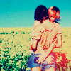
1. Crop your base. Sharpen/Blur as you like.
2. Duplicate your base and set to Screen 50% (do it twice or three times if the base is too dark).
3. Add a Level Layer (Layer >> New Adjustment Layer >> Levels). Put this setting in RGB channel:
Input: 32 // 1,00 // 255
Output: 0 // 255
4. Hue/Saturation Layer:
Sat: +33
5. Color Fill Layer with #FCFFAE (light yellow). Set to Soft Light. Opacity 79% and Fill 86%.
6. Another Color Fill layer, but put a light blue color. I put #98DCFF. Set to Color Burn 100%
7. Selective Color layer:
Red: -82 // +84 // +70 // +22
Yellow: 0 // -18 // -52 // 0
Cyan: +100 // +33 // +31 // +19
Neutrals: +22 // +15 // -12 // +6
8. Color Fill Layer with #000929 (dark blue) and set to Exclusion 100%.
9. Hue/Sat layer:
Reds: +5 // +18 // 0
10. Yet another Color Fill layer. Flood with #FFE19A (tan orange-ish) and set to Multiply 22% (this really varies with your picture - it should look rather tanned).
11. Selective Color:
Red: -54 // +5 // +29 // 0
Yellows: 0 // -70 // -77 // +14
Neutrals: +9 // 0 // -21 // -5
12. Yes, another Color Fill Layer :) Flood with #030025 (dark blue) and set to Exclusion 100%.
13. We're almost done. Now, go back to your original base, duplicate, and drag to top. Set to Soft Light 50% (this really depends on your image. It shouldn't look too light or dark).
14. (Optional). You can either add a grainy texture or a Color Fill Layer with a light gray (#DDDDDD) and set to Multiply 100% so that it doesn't look too bright. Your choice :)
15. (Also optional). Add a Level Layer.
Output: 0 // 230
Other icons done with this tutorial:
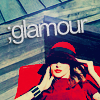
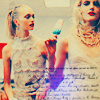
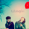
.PSD Here
Please comment! If you like what you see, don't be afraid to friend! :)

>>

1. Crop your base. Sharpen/Blur as you like.
2. Duplicate your base and set to Screen 50% (do it twice or three times if the base is too dark).
3. Add a Level Layer (Layer >> New Adjustment Layer >> Levels). Put this setting in RGB channel:
Input: 32 // 1,00 // 255
Output: 0 // 255
4. Hue/Saturation Layer:
Sat: +33
5. Color Fill Layer with #FCFFAE (light yellow). Set to Soft Light. Opacity 79% and Fill 86%.
6. Another Color Fill layer, but put a light blue color. I put #98DCFF. Set to Color Burn 100%
7. Selective Color layer:
Red: -82 // +84 // +70 // +22
Yellow: 0 // -18 // -52 // 0
Cyan: +100 // +33 // +31 // +19
Neutrals: +22 // +15 // -12 // +6
8. Color Fill Layer with #000929 (dark blue) and set to Exclusion 100%.
9. Hue/Sat layer:
Reds: +5 // +18 // 0
10. Yet another Color Fill layer. Flood with #FFE19A (tan orange-ish) and set to Multiply 22% (this really varies with your picture - it should look rather tanned).
11. Selective Color:
Red: -54 // +5 // +29 // 0
Yellows: 0 // -70 // -77 // +14
Neutrals: +9 // 0 // -21 // -5
12. Yes, another Color Fill Layer :) Flood with #030025 (dark blue) and set to Exclusion 100%.
13. We're almost done. Now, go back to your original base, duplicate, and drag to top. Set to Soft Light 50% (this really depends on your image. It shouldn't look too light or dark).
14. (Optional). You can either add a grainy texture or a Color Fill Layer with a light gray (#DDDDDD) and set to Multiply 100% so that it doesn't look too bright. Your choice :)
15. (Also optional). Add a Level Layer.
Output: 0 // 230
Other icons done with this tutorial:


.PSD Here
Please comment! If you like what you see, don't be afraid to friend! :)