003;
>>
Caroline Forbes icon requested by john_scorpy
>>
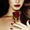
Lana Del Rey icon requested by 12feethigh
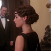
>>
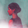
>>
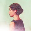
Piper Halliwell icon requested by 12feethigh
If you want to request some tutorial, here is my thread.
I has to recreate this icon, so it is not exactly the same.
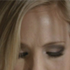
Original:
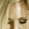
Recreated:

ONE.
I used this cap.
Crop the cap and we can start working!
The first thing I did was duplicate the original layer and use some Topaz Clean,
and erase the lines of the face that didn't go well. For example, I erased the lines on the fronthead.

TWO.
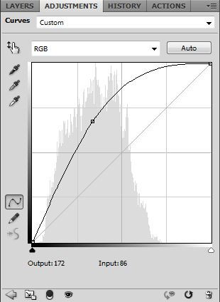
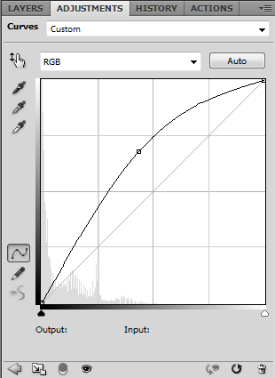
We need some light in here right? It is time for curves!
RGB: Output: 172 | Input: 86
>>
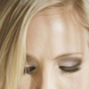
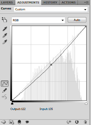
Make another curves layer, this time to darken a little bit the icon.
RGB: Output: 122 | Input: 135
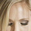
And lower the opacity to 75%
THREE.
Texture time!
I used this one (by unknown)set to soft light 100%
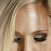
FOUR.
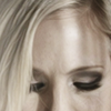
Time to desaturate!
Make a new gradient map layer.
The first stop dark grey and the second stop white.
Then lower the opacity to 50%
FIVE.
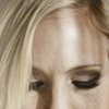
Make a new vibrance layer.
Vibrance: 100%
SIX.
Make a new Color Fill layer with this colour (#c2a637)
And set to to soft light 45% opacity, and...
VOILÀ!

I didn't save the psd for this icon, so I had to recreate it, hope this is close enough!
Original:
Recreated:

ONE.
I used this picture.
Crop the image and we can start!
I added some Topaz Clean to the image.

TWO.
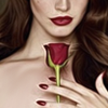
New gradient map.
The first stop black and the second white
Lower the opacity to 71% and the fill to 53%
THREE.
Make a new brightness/contrast layer
brightness: 7
contrast: 80
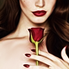
FOUR.
Color Fill with this colur (#cdca7f)
Set to multiply 19% fill.
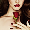
FIVE.
Texture time!
I used this one (by unknown), rotate it and set to soft light.
And this one (made by me) set to soft light.

AND DONE!
And we're going for the third one...
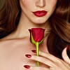
I don't think this is going to be helpful, I don't even know what I was thinking when I made this icon
crazy colour all the way!
I used this cap
ONE.
As always, crop the image, and I changed the background with this colour (#8b8b8b)
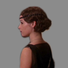
TWO.
Make a new brightness/contrast layer
Brightness: -75
Contrast: 100
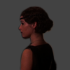
THREE.
Make a new curves layer
RGB: Output: 171 | Input: 111
>>
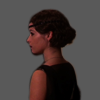
50% opacity
Make another curves layer
RGB: Output: 109 | Input: 105 | Output: 190 | Input: 160
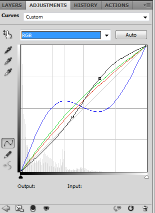
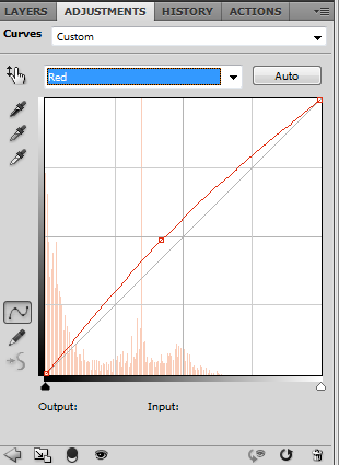
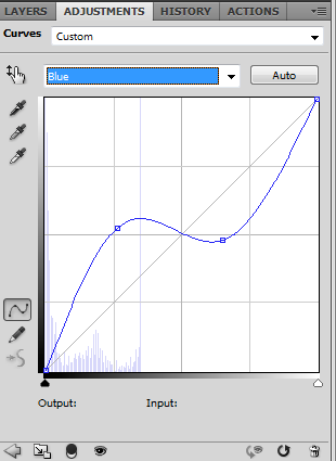
Red: Output: 123 | Input: 107
Green: Output: 116 | Input: 92 | Output: 140 | Input: 115
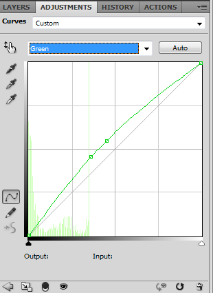
Blue: Output: 134 | Input: 67 | Output: 123 | Input: 166
>>
FOUR.
Make a new Selective Color layer
Reds:0, 97, 82, -54
Neutrals: 0, 0, 32, 0
FIVE.
Make a new Hue/Saturation layer
Saturation: 22
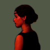
SIX.
Make a new Color Balance layer
Midtones: -96, 0, 30
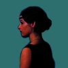
SEVEN.
Selective Color again!
Reds: 0, 58, 59, -22
Neutrals: 6, 0, 8, 0
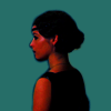
EIGHT.
Hue/Saturation layer
Saturation: 11

NINE.
Color Fill with this colour: (#ffd512)
Set to soft light 20% fill
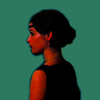
TEN.
Another Selective Color layer
Reds: 0, 18, -6, 0

ELEVEN.
Aaaaaaaaaand, textures time!
This texture (by unknown) set to screen 17% opacity
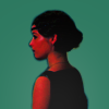
This texture (by lumsx) set to soft light 42% opacity
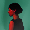
This texture (by unknown) set to screen 100%
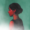
This texture (by unknown) set to soft light 100%

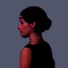
AND VOILÀ! ICON FINISHED!
You'll have another result very very different if you delete the first brightness/contrast layer
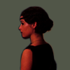
It would look something like this:

Rules
»Comments are really apreciated.
»Please, don't just copy/paste, be creative!
Previous tutorial:
