LIMS: Challenge 4 VOTING
The rules are a little different this challenge, so BE SURE TO READ THE RULES! We had a lot of people use their skips this time too..heh, so there are only 58 icons this time.
Rules:
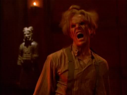
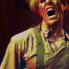
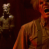
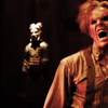
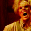
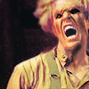
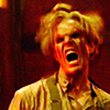
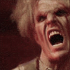
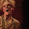
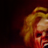
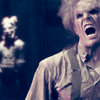
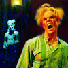
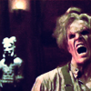
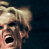
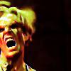
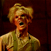
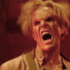
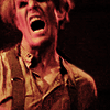
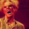
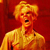
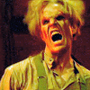
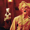
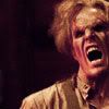
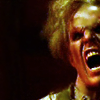
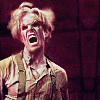
You are still voting for the LESSER QUALITY icons, but this time you should be looking for different things. There are no brushes, light effects, trends or text to judge. You are just voting on quality here. Cropping is NOT important. Things to looks for: how much has the clarity been improved upon, how did they handle the coloring(the oversaturation of red in the orginal cap), the contrast/brightness & sharpness. I have inlcuded the orginal cap to make for easier comparison. If the icon looks like it was just cropped & nothing else was done to it, then that is a sufficient reason to vote for it. If you have questions about voting, PLEASE ASK because I know this may be a bit confusing.
eta: Yeah I forgot that important detail of how many to vote for :/ You are voting for FIVE (5) icons!!!!
Reasons to vote for an icon:
99. face is still too blurry & lacks clarity
88. icon looks like it has no coloring improvement done to it.
77. too sharp & jagged-like
01.
02.
03.
04.
05.
06.
07.
08.
09.
10.
11.
12.
13.
14.
15.
16.
17.
18.
19.
20.
21.
22.
23.
24.
25.
26.
27.
28.
29.
30.
31.
32.
33.
34.
35.
36.
37.
38.
39.
40.
41.
42.
43.
44.
45.
46.
47.
48.
49.
50.
51.
52.
53.
54.
55.
56.
57.
58.
If you'd also like to include your favorite icon while voting, you may do so. :)
Rules:
You are still voting for the LESSER QUALITY icons, but this time you should be looking for different things. There are no brushes, light effects, trends or text to judge. You are just voting on quality here. Cropping is NOT important. Things to looks for: how much has the clarity been improved upon, how did they handle the coloring(the oversaturation of red in the orginal cap), the contrast/brightness & sharpness. I have inlcuded the orginal cap to make for easier comparison. If the icon looks like it was just cropped & nothing else was done to it, then that is a sufficient reason to vote for it. If you have questions about voting, PLEASE ASK because I know this may be a bit confusing.
eta: Yeah I forgot that important detail of how many to vote for :/ You are voting for FIVE (5) icons!!!!
Reasons to vote for an icon:
99. face is still too blurry & lacks clarity
88. icon looks like it has no coloring improvement done to it.
77. too sharp & jagged-like

01.
02.
03.
04.

05.

06.

07.

08.

09.
10.

11.

12.
13.
14.

15.

16.

17.

18.

19.
20.

21.
22.

23.

24.
25.

26.

27.

28.

29.

30.

31.
32.

33.

34.

35.

36.

37.
38.
39.
40.
41.

42.

43.
44.

45.

46.

47.

48.

49.

50.

51.

52.

53.
54.

55.

56.

57.
58.

If you'd also like to include your favorite icon while voting, you may do so. :)