Challenge 6 Results
Sorry this is a little late, I developed an ear infection yesterday :(
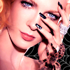
This week we're going to have to say goodbye to ...
queen_nothin with 4 negative votes
Community Choice with 4 postive votes...
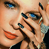
by spriink
Mod's Choice
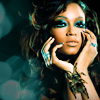
by princess2k19
I really like the blue colouring and the texture isn't overpowering.
Voting Tally
01: -0 +0
02: -4 +0
03: -1 +4
04: -1 +0
05: -3 +0
06: -0 +0
07: -3 +1
08: -1 +2
09: -1 +0
Comments Table
ICON NUMBER ONE(1)
No Comments
ICON NUMBER TWO(2)
- The coloring is way too pink and the texture, though a good idea, is kind of lost, not enough of it is exposed.
- coloring is too pink
- over saturated in a magenta color and a bit oversharppened
- The colouring is too pink. Though I like the detail of the spider web in the background.
ICON NUMBER THREE(3)
- unfortunately the texture used is making her skin look dirty and the crop is too close to her face and is overpowering
+ i love the close crop, and the coloring is really lovely
+ The crop is fantastic and the coloring is just so vibrant and clean.
+ I like the coloring.
ICON NUMBER FOUR(4)
- The coloring is not appealing, her eyes kinda disappeared in the green.
ICON NUMBER FIVE(5)
- its slightly blurry, and just generally uninteresting because there is no color in it, just a whole lot of black.
- bad coloring - her face is too pale and everything else is too dark
- The coloring came out too dark on the icon and it makes it too hard to see any details in the picture.
ICON NUMBER SIX(6)
No Comments
ICON NUMBER SEVEN(7)
- it's too dark on the outsides of the icon, it doesn't flow very well
- The image looks saturated and is extremely dark
- The colouring is too dark.
+ very pretty composition
ICON NUMBER EIGHT(8)
- It's too busy with the tiny text, color, and light texture. Maybe keep it simple so it doesn't look too overloaded.
+ the crop is nice, the use of texture is great. not too over whelming, and the placement of the text and light textures is perfect.
+ all the elements work well together, from the light texture to the tiny text to the defused glow of the color around the model.
ICON NUMBER NINE(9)
- though the coloring is pretty, the light texture is too distracting
This week we're going to have to say goodbye to ...
queen_nothin with 4 negative votes

Community Choice with 4 postive votes...

by spriink
Mod's Choice

by princess2k19
I really like the blue colouring and the texture isn't overpowering.
Voting Tally
01: -0 +0
02: -4 +0
03: -1 +4
04: -1 +0
05: -3 +0
06: -0 +0
07: -3 +1
08: -1 +2
09: -1 +0
Comments Table
ICON NUMBER ONE(1)
No Comments
ICON NUMBER TWO(2)
- The coloring is way too pink and the texture, though a good idea, is kind of lost, not enough of it is exposed.
- coloring is too pink
- over saturated in a magenta color and a bit oversharppened
- The colouring is too pink. Though I like the detail of the spider web in the background.
ICON NUMBER THREE(3)
- unfortunately the texture used is making her skin look dirty and the crop is too close to her face and is overpowering
+ i love the close crop, and the coloring is really lovely
+ The crop is fantastic and the coloring is just so vibrant and clean.
+ I like the coloring.
ICON NUMBER FOUR(4)
- The coloring is not appealing, her eyes kinda disappeared in the green.
ICON NUMBER FIVE(5)
- its slightly blurry, and just generally uninteresting because there is no color in it, just a whole lot of black.
- bad coloring - her face is too pale and everything else is too dark
- The coloring came out too dark on the icon and it makes it too hard to see any details in the picture.
ICON NUMBER SIX(6)
No Comments
ICON NUMBER SEVEN(7)
- it's too dark on the outsides of the icon, it doesn't flow very well
- The image looks saturated and is extremely dark
- The colouring is too dark.
+ very pretty composition
ICON NUMBER EIGHT(8)
- It's too busy with the tiny text, color, and light texture. Maybe keep it simple so it doesn't look too overloaded.
+ the crop is nice, the use of texture is great. not too over whelming, and the placement of the text and light textures is perfect.
+ all the elements work well together, from the light texture to the tiny text to the defused glow of the color around the model.
ICON NUMBER NINE(9)
- though the coloring is pretty, the light texture is too distracting