Icon round up for 2011
My Yearly Icon Round Up. The good and the not so good.
This year I made an effort to improve on getting brighter colors in the icons as well as improve on making black and white icons, so there tended to be a lot more of those.
Also, I did a fairly bad job of whittling these down, so I apologize for the sheer amount *L*
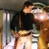
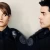
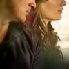
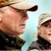
The Best
The ones that stood out to me, for one reason of another.


The Worst
Ok, so these aren't actually the worst ones that I made this year, those have either been mercifully deleted by now or are just boring enough for me to not have any strong emotion one way or the other about. The ones I chose here weren't all bad, the idea behind them might even have been a good one in fact. Theses are the ones that didn't live up to their potential (or at least the picture in my head) and when I look at them I think, "Wow, I really should have done that better."


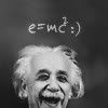
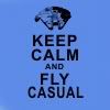
The Chatty
I don't add text often, but here are some of the ones did get some this year.

The Unloved
These are the ones that didn't get much (or in some cases any) love and maybe rightly so... but I liked them *g*


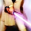
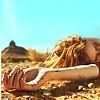
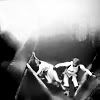
The Cropped
Some of my bolder crops this year


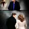


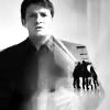
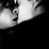
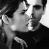
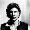
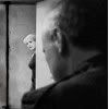
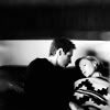
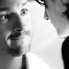
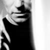
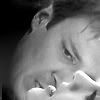
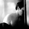
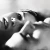
The Ones Without Color
In an attempt to get better at black and white icons, I made a lot more of them this year. These are some that I liked.


This year I made an effort to improve on getting brighter colors in the icons as well as improve on making black and white icons, so there tended to be a lot more of those.
Also, I did a fairly bad job of whittling these down, so I apologize for the sheer amount *L*
The Best
The ones that stood out to me, for one reason of another.


The Worst
Ok, so these aren't actually the worst ones that I made this year, those have either been mercifully deleted by now or are just boring enough for me to not have any strong emotion one way or the other about. The ones I chose here weren't all bad, the idea behind them might even have been a good one in fact. Theses are the ones that didn't live up to their potential (or at least the picture in my head) and when I look at them I think, "Wow, I really should have done that better."


The Chatty
I don't add text often, but here are some of the ones did get some this year.


The Unloved
These are the ones that didn't get much (or in some cases any) love and maybe rightly so... but I liked them *g*


The Cropped
Some of my bolder crops this year


The Ones Without Color
In an attempt to get better at black and white icons, I made a lot more of them this year. These are some that I liked.


