rejects/variations for challenge 001 at chevronlocked
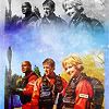
Reject 1: 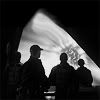
I hated this one. It seemed really cool when I thought of it, but I couldn't do much past black/white gradient map + a brightness/contrast layer. Bleh.
Reject 2: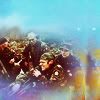
I liked this one but I liked my submitted ones more. Same goes for the next icon.
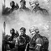
Reject 3: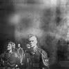
The only problem I had was this one is I couldn't get the right balance of sharpness.
Alternates for the second submitted icon: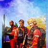
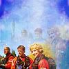
Clearly I had way too much fun with this one haha. I couldn't decide between the one I entered, the first one here, and the last one here. I hope I made the right choice :D

I hated this one. It seemed really cool when I thought of it, but I couldn't do much past black/white gradient map + a brightness/contrast layer. Bleh.
Reject 2:

I liked this one but I liked my submitted ones more. Same goes for the next icon.
Reject 3:

The only problem I had was this one is I couldn't get the right balance of sharpness.
Alternates for the second submitted icon:


Clearly I had way too much fun with this one haha. I couldn't decide between the one I entered, the first one here, and the last one here. I hope I made the right choice :D