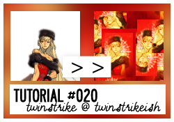
❝ 177 ❞ ► yay another tutorial
► Program: Adobe Photoshop CS4
► Type: Composition/Coloring
► Difficult: Medium - Hard
► PSD: No
► Requested by: rizuka - Blocking Tutorial
TUTORIAL #020
Note: I don't think I can do a good "Blocking" icon but I like to do it anyways. This tutorial covers the way I do it but I bet there are easier and nicer ways to do it. :'( And if you want to see SPECIFICALLY the "Blocking" part see steps #14-#18 (this tutorial covers the initial composition and coloring too, even if it's similar to Tutorial #019). And no other examples, sorry.
STEP #001
FULL IMAGE
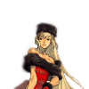
Prepare your base. Make extractions, resize, rotate and place it as you like.
STEP #002

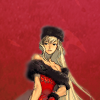
Now to work with the background. Place this texture made by twinstrikeish. Since this icon is going to be mostly red change the color of the texture. Yes second time changing the color of a texture I made. I should make more yellow or reds textures but this is for another post.
STEP #003

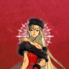
Using the Color White pick one of these Ornamental Shapes from this Brush Set by sya @ DA. Add around the subject's head. You'll probably need to resize it or change the size of the brush before using.
STEP #004

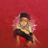
Now you'll duplicate the Texture Layer and place it above the Base Layer (the one with your subject). Erase a few bits to make a Fade effect.
STEP #005

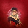
Finished the composition, time to start the coloring. Add a New Fill Layer.
New Fill Layer - Gradient Fill
Pick a White-to-Black gradient. Style - Radial, Angle - 90º. Set this Layer to Soft Light, Opacity 100%.
Use this Layer Mask to erase the parts around the subject's face.
STEP #006

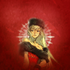
New Adjustment Layer - Color Balance
Shadows - +10, +15, +10
Midtones - +35, +22, -5
Highlights - -15, +25, +5
Set the Opacity of this Layer to 75%.
STEP #007

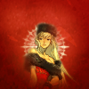
New Adjustment Layer - Channel Mixer
Red +115, 0, 0
Green 0, +100, 0
Blue -20, 2, +105
Set the Opacity of this Layer to 55%.
STEP #008

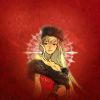
New Adjustment Layer - Photo Filter
Cooling Filter (80)
Density - 16%
Check Preserve Luminosity.
STEP #009

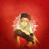
New Adjustment Layer - Curves
Add one new point:
1 - Output: 212 Input: 183
STEP #010

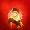
New Adjustment Layer - Hue/Saturation
Masters
Saturation +55
Set the Opacity of this Layer to 61%.
STEP #011

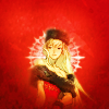
New Adjustment Layer - Brightness/Contrast
Brightness: +15
Contrast: +50
Set the Opacity of this Layer to 46%
STEP #012

New Adjustment Layer - Vibrance
Vibrance: +55
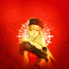
STEP #013

New Adjustment Layer - Channel Mixer
Red +110, +10, -6
Green -6, +106, -6
Blue +5, -7, +91
Set the Opacity of this Layer to 44%
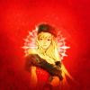
STEP #014

Now Flatten/Merge All/Merge Visible your icon.

STEP #015

With the Retangle Marquee Tool copy a small portion of your icon and paste into another layer. Resize and place it somewhere you prefer.
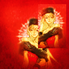
STEP #016

Repeat the previous step until you have a good amount of crops around your icon. The number depends on your composition.
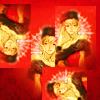
STEP #017

Now Select All (Ctrl+A) and Copy Merged (Shift+Ctrl+C) and Paste into a new Layer.
Then fo to Filter - OThers - Offset. Select Wrap Around and play with the numbers. When you feel satisfied go "Ok". I used the Retangle Marquee Tool to crop small portion of this layer.
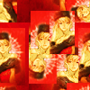
STEP #018

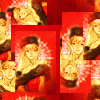
Now Flatten/Merge All/Merge Visible and Use the Offset filter again. You can play with it until you feel you are satisfied with the composition.
► COMMENTS ARE NICE → ♥
► CREDITS ARE LOVE → twinstrike or twinstrikeish;
► RESOURCES → ( here );
► AFFILIATES → ( here );
► UPDATES → ( watch );