❝ 124 ❞ ▄ ( tutorials )
▄ Program: Adobe Photoshop CS4
▄ Type: Coloring/Composition
▄ Difficult: Medium-Hard
▄ PSD: No
▄ Requested by: stharridan and margerydaw_s2*
*margerydaw_s2 actually requested tutorials for icons #01 and #09 from this set. But they were done with this tutorial step with a few tweaks (really minors) and different textures.
TUTORIAL #011
STEP #001
FULL IMAGE
Prepare your base. Crop, resize and extract the background. My tip is NEVER use the Magic Wand Tool for it. Extract carefully with the Polygonal Lasso Tool or with the Eraser if you have a tablet. And don't do like me who totally used the Magic Wand for this tutorial. lol lazy extraction tiem. And that's why the edges are blurried. Blurry the edges if the extraction goes wrong or something.

STEP #002

Under the Base Layer add this texture by myself.
STEP #003

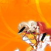
Now add this texture by myself. Rotate it and erase the parts behind the subject.
STEP #004

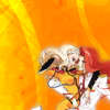
Now add this texture by ? and flip it horizontally.
Set it to Multiply and Opacity to 29%.
STEP #005

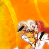
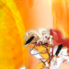
Now behind the subject add some white. It can be a texture or some random brushes. Set the Opacity to 71%.
STEP #006

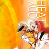
Now add your text. Font used here is Helvetica Neue (Thin Condensed) and Color #FFFFFF. Rotate it 90º. Add Layer Style to it. Layer Style - Drop Shadow. Multiply - Opacity 29%, Distance 1px and Size 2px.
STEP #007

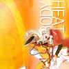
Now let's start to work above the initial base. Add a light texture with mostly reds and yellows. It can be any light texture as long it works with your base nd composition. Set this Layer to Screen and Opacity 60%.
STEP #008

New Fill Layer - Gradient Fill
Pick a White-to-Black gradient. Style - Radial, Angle - 90º. Set this Layer to Soft Light, Opacity 57%.

STEP #009

New Adjustment Layer - Color Balance
Shadows - +12, +9, +6
Midtones - +24, +12, +11
Highlights - -9, +9, +2

STEP #010

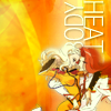
New Adjustment Layer - Channel Mixer
Red +100, 0, 0
Green 0, +100, 0
Blue -15, 0, +100
STEP #011

New Adjustment Layer - Curves
Add two new points:
1 - Output: 78 Input: 59
2 - Output: 222 Input: 199
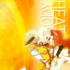
STEP #012

New Adjustment Layer - Hue/Saturation
Masters
Saturation +35
Set the Opacity of this Layer to 75%.
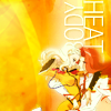
STEP #013

New Adjustment Layer - Brightness/Contrast
Brightness: +27
Contrast: +42
Set the Opacity of this Layer to 46%
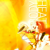
STEP #014

New Adjustment Layer - Vibrance
Vibrance: +79
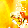
STEP #015

New Adjustment Layer - Channel Mixer
Red +110, +10, -6
Green -6, +106, -6
Blue +5, -7, +91
Set the Opacity of this Layer to 44%

EXAMPLES
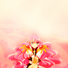
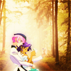

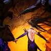

▄ Program: Adobe Photoshop CS4
▄ Type: Coloring/Composition
▄ Difficult: Medium-Hard
▄ PSD: No
▄ Requested by: nna_chan
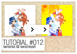
TUTORIAL #012
STEP #001
FULL IMAGE
Same deal. Prepare your base. Crop, resize and extract the background.
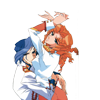
STEP #002

Add this texture by myself under the base layer. Flip it horizontally.
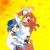
STEP #003

Now add this texture by myself above step #002's layer. Crop it.
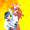
STEP #004

Create a New Layer. Now to have a small effect add some dashed lines around the cropped texture.
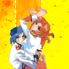
STEP #005

Still working in the dashed lines layer add Layer Style to it. Layer Style - Drop Shadow. Multiply - Opacity 17%, Distance 2px and Size 2px.

STEP #006

Now let's work above the base layer and with the icon coloring.
New Fill Layer - Gradient Fill
Pick a White-to-Black gradient. Style - Radial, Angle - 90º. Set this Layer to Soft Light, Opacity 52%.
STEP #007

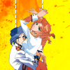
New Adjustment Layer - Color Balance
Shadows - +17, +19, +20
Midtones - +31, -8, +8
Highlights - -12, +15, +24
STEP #008

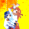
New Adjustment Layer - Curves
Add one new point:
1 - Output: 81 Input: 61
STEP #009

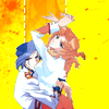
New Adjustment Layer - Hue/Saturation
Masters
Saturation +45
Lightness +3
Set the Opacity of this Layer to 61%.
STEP #010

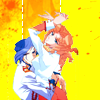
New Adjustment Layer - Brightness/Contrast
Brightness: +29
Contrast: +42
Set the Opacity of this Layer to 46%
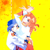
STEP #011

New Adjustment Layer - Vibrance
Vibrance: +83
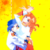
EXAMPLES


▄ Program: Adobe Photoshop CS4
▄ Type: Coloring
▄ Difficult: Medium
▄ PSD: No
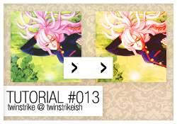
TUTORIAL #013
STEP #001
FULL IMAGE
Crop and resize your base. Sharpen if necessary but in this coloring is not recommended.
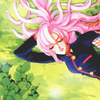
STEP #002

New Adjustment Layer - Curves
Add two new points:
1 - Output: 116 Input: 79
2 - Output: 194 Input: 163

STEP #003

New Adjustment Layer - Vibrance
Vibrance: +47
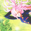
STEP #004

New Adjustment Layer - Channel Mixer
Red +125, +25, +5
Green 0, +100, 0
Blue -5, +30, +75

STEP #005

New Adjustment Layer - Gradient Map
Pick the Blue-Purple-Red-Ornage-Yellow default gradient.
Set to Soft Light and Opacity 42%
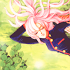
STEP #006

New Adjustment Layer - Levels
14 - 0,89 - 255
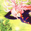
STEP #007

New Adjustment Layer - Channel Mixer
Red +85, -25, +25
Green -35, +60, +75
Blue -70, +65, +89
Set the Opacity of this Layer to 24%
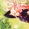
STEP #008

New Fill Layer - Solid Color
Color - 1f0303
Set this Layer to Exclusion and Fill to 13%

STEP #009

New Adjustment Layer - Color Balance
Shadows - +17, 0, -31
Midtones - -3, 0, +27
Highlights - +1, -13, +15
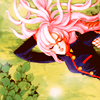
STEP #010

New Adjustment Layer - Hue/Saturation
Masters
Saturation +17
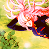
STEP #011

New Adjustment Layer - Exposure
Exposure - +0,10
Offset - -0,0183
Gamma - 1,12
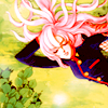
STEP #012

New Adjustment Layer - Brightness/Contrast
Check Use Legacy
Brightness: +17
Contrast: -12
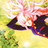
STEP #013

New Adjustment Layer - Photo Filter
Warming Filter (81)
Density - 35%
Check Preserve Luminosity.
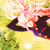
EXAMPLES


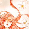
▄ NOTES ¹ → A tip for all tutorials. Try always to tweak a bit the adjustments layers. I always do it myself. I have now like two or three .psds saved with my own favorite colorings and I'm always trying and changing something. Actually I save for a few months the .psds from SOME of 20in20s and icontests icons. But I delete it after some time. :~
² → Feel free to request tutorials here.
³ → And don't forget. If you try any tutorial please show me your results! I'd love to see it.
▄ COMMENTS ARE NICE → ♥
▄ CREDITS ARE LOVE → twinstrike or twinstrikeish;
▄ RESOURCES → ( here );
▄ REQUESTS → ( here );
▄ AFFILIATES → ( here );
▄ UPDATES → ( watch );