Round 1 - Challenge 11 - Results
ROUND 1 - CHALLENGE 11 - RESULTS
As always, please let me know if there are any mistakes.
1ST PLACE [5 points]:

juanxyo with +8 votes.
2ND PLACE [4 points]:
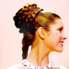
tinebrella with +6 votes [And more 1st place votes].
3RD PLACE [3 points]:
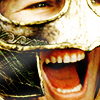
memonechan with +6 votes.
BEST INTERPRETATION OF THEME [3-way-tie] [2 points]:

juanxyo with +3 votes.
BEST INTERPRETATION OF THEME [3-way-tie] [2 points]:

memonechan with +3 votes.
BEST INTERPRETATION OF THEME [3-way-tie] [2 points]:

regularamanda with +3 votes.
MODS CHOICE [1 point]:
[absolutelybatty]

scifi_tv_addict
There's something so haunting about this icon. The color scheme and the composition work together so well to show off a different and unique take on the theme.
[raiindust]

bam_87
I love the texture use in this icon. To me, it completely relates back to the type of hero The Doctor is - crazy, brilliant and a little dysfunctional. I think all the elements of this icon work to showcase that.
TABLE KEY:
+++ = 1st Place Vote
++ = 2nd Place Vote
+ = 3rd Place Vote | Beginning of a new comment.
Note: Votes are not weighted in this round. Meaning a 1st, 2nd or 3rd vote will only give you 1 point when tallying the votes. Except in the case of a tie - then the icon with the most 1st place votes will be given first.
ICON VOTES

mer_moonchildPOSITIVE VOTES
None.
BEST INTERPRETATION OF THEME
None.
CONSTRUCTIVE VOTES
+ I really like the idea for the composition here, but with the image you've chosen it just winds up feeling a bit busy to me. Also (perhaps because of the high contrast) there's a bit of over sharpening going on around the outlines of their faces.
+ It has a really good composition and cropping. I like the way the maker played with the picture but I find theicon iven if it's full of pics a little bit empty of textures and color. Adding some more of them would make the icon stand out more.
+ I love the composition of this icon. However, it is a bit dark and the edges of the figures look rather grainy. Maybe adding some more light to the center image (try using a soft beige or white brush or a light texture even) to brighten it up and draw focus there would help, and a soft blur to the edges to reduce some of the grainy feel.
+ While I like the repetition of the images, and the crops are lovely, it goes a bit overboard making it very busy and hard to focus on.
ADDITIONAL VOTES
None.
tinebrellaPOSITIVE VOTES
++ great crop and simple, but very pretty coloring. Very effective
+ i love how simple it is. the colouring is just perfect and i love how the crop is just off centre
++ Simple, yet elegant. The edges around Leia are seamless and she stands out nicely against the complementary background.
+++ Clean, simple, and utterly gorgeous.
++ Lovely coloring. I like how the slightly off-centered crop puts the attention on her ornate hairdo.
++ A lovely simple beautiful cap
BEST INTERPRETATION OF THEME
None.
CONSTRUCTIVE VOTES
None.
ADDITIONAL VOTES
+ It's a nice crop with a perfect contrast and sharpen. I really like the coloring too: it's a beautiful icon indeed. :)
leire_pjPOSITIVE VOTES
+++ I really like this crop, it's well balanced and very eye catching. The colors are lovely as well. I like the fact that it's simple, but still done with an expert touch.
++ Amazing crop, it draws attention to the subject without being overwhelming as well as adding emotion to the icon.
BEST INTERPRETATION OF THEME
+ I love this natural vibrant coloring, and I think your image choice is great: it doesn't show an epic moment, it shows Buffy as a scared - brave - girl prepared to fight. Amazing interpretation of the theme, really.
CONSTRUCTIVE VOTES
+ This image could work really well with a better capture (so it's more defined) and with the highlighting of the colours of her hair. The crops good and made the focus really easy in this image, it's just the colours that come across as a too neutral, so playing with colours and making them more firery would make it a really affective image.
ADDITIONAL VOTES
+ Fantastic choice of heroine. The coloring is soft and gorgeous. I love the warm tones of her face and hair. It could be a touch brighter to draw more attention to the face though.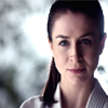
crazed_delusionPOSITIVE VOTES
None.
BEST INTERPRETATION OF THEME
None.
CONSTRUCTIVE VOTES
+ could be my monitor but it feels like the aspect ratio is off on this icon, there is an awesome tutorial on aspect ratio that could help
+ Aspect ratio is messed up and the icon looks a tad too similar to the original image, so I think the coloring is a little too bland.
+ the aspect ratio looks a bit off and there doesnt seem to be much of a colouring added to the icon. try adding some contrast and vibrance to brighten it up a bit
+ The icon is a bit dark and lacks of a bit of contrast. The image seems also a bit "compressed" like the aspect ratio is a bit messed up. Maybe a tutorial like this one could help you more than I can :)
+ The image feels a bit stretched vertically and the colors use just a bit of a boost.
+ The icon is stretched out on my monitor. It's a great image but the aspect ratio might be off on the initial screencap, just something to be wary of.
+ The image is rather flat, color and contrast wise. It also looks as if the aspect ratio is off.
+ The aspect ratio looks a bit off here. That may be due to an issue with the original cap, or an error that occurred when the image was resized. In the first case, I would suggest keeping an eye out for aspect ratio when choosing caps and avoiding sources where images look distorted. If one cap looks off, the whole set probably is. If its a resizing issue, make sure the "constrain proportions" option is selected when resizing in Photoshop (or an equivalent option if you use another program).
+ The aspect ratio of this icon is slightly out, which makes her head look stretched. Try holding down the shift button when using the free transform tool to resize, and if using resize make sure that the ratio check box is clicked.
ADDITIONAL VOTES
None.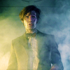
defyxgravityxPOSITIVE VOTES
+++ I love the way the fog and coloring work so well in this icon.
BEST INTERPRETATION OF THEME
+ No reason left.
CONSTRUCTIVE VOTES
+ great crop but the coloring is a little bit dark making the left side that is so light feel unbalanced
+ The crop is quite good but the icon is a bit too much dark and lacks of a bit of contrast. I would also like a stronger coloring, maybe with a stronger contrast between the yellow tones and the blue tones.
ADDITIONAL VOTES
+ I lacks a bit of contrast, but coloring is very nice.
vividcuriosityPOSITIVE VOTES
+ Striking combination of images and good use of color.
BEST INTERPRETATION OF THEME
None.
CONSTRUCTIVE VOTES
+ I do love this icon. It is one of my favorite caps. However, the brightness of the icon, while an interesting take, has actually made the shadows in the icon grainy and pixellated. Anything that is black or dark (the blue shadows, the deep purples) has red pixels that don't flatter the image at all. This is an easy fix though! Just make a new layer and take a brush (in the same color as the shadow you're working with) and brush over the unsightly pixels. Then you get to keep the brightness of the icon while preserving the shadows. Be careful to keep everything looking natural though! Try a small brush so that you can weave in and out of the details (this would be important on, say, the soldier in the right front corner's cloak).
ADDITIONAL VOTES
+ Nice contrast and coloring! The icons looks a tad over-sharpened, though.
+ I love the lighting and soft coloring. It really complements the shadows in the image

ofourdreamsPOSITIVE VOTES
None.
BEST INTERPRETATION OF THEME
+ This icon - in my opinion - fits very well with the theme. I didn't know the fandom but the choice of the image, the crop and the extreme vivid coloring make me the idea of heroes.
+ No reason left.
CONSTRUCTIVE VOTES
+ This icon looks burned, I would use a bit less contrast and tone down on the pink or add another strong colour for balance.
+ I really love the crop here and I like the bright vibrant colors as well, but I feel like the contrast is just punched up too high here. Her face is almost entirely blown out and so all of the midtones are blended together into bright whiteness. Doing this has caused a massive loss of detail, and also some over sharpening.
+ It's a touch too bright and it looks a little over-sharpened. Too bad, because the crop is good and the coloring is vivid and beautiful.
+ I like the use of texture, but it's so bright.
+ The coloring is too strong, mostly the pink and blue parts. And oversharpened.
+ the colouring is very bright and overpowering. try to add more contrast and decrease the brightness to stop it being overpowing
+ While you chose a nice shot, the saturation and colors on this are just a little too much paired with the sharpness.
+ The crop is great, but the reds and magentas are over-saturated, and the contrast is a bit too high. As a result, the image looks oversharpened.
ADDITIONAL VOTES
+ I like this icon, however the contrast is a bit too high, and the purple colouring a bit strong and over-saturated.
scifi_tv_addictPOSITIVE VOTES
++ I like this icon very much. The coloring is pretty and the contrast is perfect.
+ There's something very striking about this icon; I'm not sure what. The composition is lovely. The cap choice is great; her expression really catches you. The coloring is also amazing. I love how it highlights this sense of, I don't know, hopelessness which is something all heroes have to face before they triumph. It's a really great icon.
++ The coloring is very nice. I like the half and half texture in the background, and the use of light really makes this one stand out.
BEST INTERPRETATION OF THEME
+ No reason left.
CONSTRUCTIVE VOTES
None.
ADDITIONAL VOTES
+ Nice coloring and very good crop!
marcasitePOSITIVE VOTES
++ amazing colouring and i love the crop used.
+++ I like the crop and the coloring. The contrast is good, and she stands out well from the background.
BEST INTERPRETATION OF THEME
+ No reason left.
CONSTRUCTIVE VOTES
None.
ADDITIONAL VOTES
+ The icon looks a tad over-sharpened, but the coloring is vibrant, and the contrast is lovely.
+ The crop is beautiful.
+ Gorgeous crop and the coloring is amazing. I think the sharpness to perfect as well. It could use a little something to make it pop and stand out from the rest though. Maybe a light blob, a texture, or just a little extra contrast to really give it the extra edge.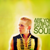
_puchula_POSITIVE VOTES
+ Awesome use of text & texture here. I love the slight outline around the subject which makes him pop out of the bg a bit, it's an interesting touch that doesn't always work, but comes across really nicely here. Also great use of color, the bg and the subject really go together quite well.
+ nice crop, negative space and text use
+++ Gorgeous use of negative space. The coloring is really good too but I find the text distracting but the icon has a really nice composition.
+++ I love the style of this, especially the subtle outer glow on the image. The combination of the background and foreground is seamless and the text adds just the right touch to the emotion of the icon.
+ Love the coloring and the soft texture use in the negative space. The text is also nice.
BEST INTERPRETATION OF THEME
+ No reason left.
CONSTRUCTIVE VOTES
+ Love the use of negative space and the texture work in this icon, but the text is a bit awkward.
ADDITIONAL VOTES
+ This could have been a great negative space icon without the text: I think it's a bit distracting and makes the icons slightly unbalanced.
+ The actual figure is a little over contrasted, and it makes him grainy around the edges and in the face. Other than that though this icon is lovely. The green is gorgeous, and I love that you chose to use negative space.
juanxyoPOSITIVE VOTES
+ I think the purple tones in this icon are adorable and the focus within the image is very strong. The focus on Harry is done really well with the light background surrounding him.
+ Great use of neutral space and very good colouring. I also like how the subtle texture use makes it seem almost as if it's moving.
+++ love the coloring and great use of textures
++ Lovely icon. The use of color is really original and as magical as the subject. The cropping helps to center the atention in Harry and the Snitch which I find wonderful. The only thing I have to say about this icon or the only concrit I have to give is that Harry's face looks a bit blurry, maybe because of the texture use or the coloring. Some more sharpening would fit really good the icon.
+++ Nice negative space and coloring and I like very much your use of textures. Maybe the icon is just a bit blurry, but there's nothing that a bit of Sharpen couldn't fix :)
++ Lovely use of textures and the coloring is gorgeous.
+++ Gorgeous colouring & crop. I really think the light texture used brings out a brightness in the icon thats lovely.
+ I love the colouring and negative space. Image quality looks a little low unfortunately, and could do with a little more sharpness. Otherwise, really pretty.
BEST INTERPRETATION OF THEME
+ I like the image because it's of Harry before he really is ever defined as or has become the hero we all know him to be. The colouring and image itself catches him at a stage where he's still innocently unaware of everything to come. It's a nice way to interpret the theme.
+ No reason left.
+ A perfect subject for this theme. Harry definitely "plays the hero." Nice use of negative space as well.
CONSTRUCTIVE VOTES
+ The coloring seems very off in this icon like it was over adjusted into purple. Also the image could of used some sharpening.
ADDITIONAL VOTES
+ Lovely! Great texture work here, and lovely colors! I think you find a good balance between sharp and blurry, also.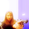
lumsxPOSITIVE VOTES
+ Lovely color and use of negative space.
++ I love the coloring, maybe a little blurry over Olivia's head, but very pretty.
+++ Crop, coloring and negative space are all gorgeous
+++ I like the negative space, the sharpness, the soft yet bright colouring and the lighting. It's simple, but effective.
BEST INTERPRETATION OF THEME
+ No reason left.
CONSTRUCTIVE VOTES
None.
ADDITIONAL VOTES
+ Lovely coloring and crop, but I think her face is a tad too blurry.
+ The warm coloring on this icon is lovely to look at. I love how dreamy the icon looks right up until you get to the point of the gun. It is a very dramatic effect.
sgflutegirlPOSITIVE VOTES
None.
BEST INTERPRETATION OF THEME
None.
CONSTRUCTIVE VOTES
None.
ADDITIONAL VOTES
+ I think the crop is great, and the image chosen definitely has a heroic vibe about it. Perhaps a little more colour and vibrance would have helped to really make the natural colours pop in the icon.
bam_87POSITIVE VOTES
+++ Striking colouring and very creative composition.
BEST INTERPRETATION OF THEME
None.
CONSTRUCTIVE VOTES
+ I like this icon, but I think the bright textured background is a tad distracting, because the subject is rather dark compared to it.
+ The texture used doesn't quite fit the image.
ADDITIONAL VOTES
+ Very interesting use of textures. I feel like they should be out of place against such a simple image of the Doctor, but they don't. It all ties together surprisingly well!
memonechanPOSITIVE VOTES
+++ Really affective crop and such a strong close up (they're usually a little harder to pull off, so it's snazzy that this one works so well). The lighting is done well and I like how the side of her helmet is highlighted and it's textures can be seen. The brilliant thing about this icon is it's use of light.
+ Great close crop, and lovely coloring.
+ Lovely cropping and use of color.
+++ The crop is stunning.
+ Such a beautiful close up crop that wouldn't always work but this time it's payed off. The colouring is gorgeous, and it works with the crop to depict the anger in the icon. Beautiful work!
+ The crop on this is great and the lighting gives it a nice effect.
BEST INTERPRETATION OF THEME
+ I like how this icon depicts Eowyn's ultimate action of heroism and the moment she truly becomes a hero.
+ No reason left.
+ No reason left.
CONSTRUCTIVE VOTES
+ I think this crop is too close, and the way the chin and left eye are cut off look quite awkward. focusing on one side of the face would have worked better, rather than the centre.
ADDITIONAL VOTES
+ I really like the close crop.
+ The dramatic crop is amazing! It did take me a moment to realize who I was looking at though.
regularamandaPOSITIVE VOTES
+++ GORGEOUS! I really love the crop on this icon, and the multiple images work really well together.
+ Lovely composition.
+++ i love the colouring and the repition of the picture inside each other
+ Nice composition and coloring. Maybe the icon is just a little blurry.
+ The coloring is very vivid and I like the overlapping of the images.
++ I like the way the images have been blended, and the strong colouring, even if it is a little overpowering. I also like how the lightsaber blends into the icon and helps the images combine.
BEST INTERPRETATION OF THEME
+ No reason left.
+ No reason left.
+ No reason left.
CONSTRUCTIVE VOTES
+ This is a wonderful image, just so you know, and the colouring and tones are all really great. I think, however, that it would have been a little bolder with the background's crop being a little different. Perhaps without his nose cropped out of the image and just watch out for the over sharpening of the smaller image of Yoda. These really are more just thoughts though, because it's still a great image as it is.
+ The image overlay is interesting, but the colouring is too overdone. I would tone down the orange and green.
ADDITIONAL VOTES
+ I like the coloring, the bright green of Yoda's lightsaber against the vivid red of his clothes. Composition is nice too, the closer crop works very well as a background to the foreground crop.
+ This icon is a bight overwhelming. There's so much going on. My focus does go straight to the smaller figure, but I think this icon would have benefited from to background image being less saturated than the smaller image in front.
everythingshinyPOSITIVE VOTES
+ Coloring is very pretty, and the contrast is perfect. Plus, I like the simple composition of this icon
BEST INTERPRETATION OF THEME
None.
CONSTRUCTIVE VOTES
None.
ADDITIONAL VOTES
+ Nice icon with a lovely composition. The crop is very good and the coloring is lovely too.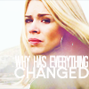
relaxjolenePOSITIVE VOTES
+++ The soft colours in this icon are really lovely and though I don't know the context of the image or the character and her fandom, somehow it feels as though the colouring is so fitting to her. I like the crop and the focus of the icon and how her face is clearly defined against the softer half of the image (how it's kind of softly blurred below the text).
++ Very good use of texture, I like how it washes away the colour except in Rose's face, helping focus on her. Great use of text too.
BEST INTERPRETATION OF THEME
None.
CONSTRUCTIVE VOTES
+ Crop is a little bit awkward: maybe a closer one would have worked, or you might have shifted her to the left. I'm unsure about the text too, especially the first line: it's almost unreadable mainly because letters are too close to each others.
+ The cap looks amazing but the slightly pinker gradient used comes off a bit strong and makes the white text harder to read. Maybe try lowering the opacity slight to help this.
ADDITIONAL VOTES
+ Lovely crop on this icon, however the texture use is slightly bright.
+ I love the overall composition and soft coloring, though the text is difficult to read. Lowering the opacity on the light texture at the bottom of the icon a might create a bit more contrast between the letters and the background. Another trick that I sometimes use for text is to duplicate my text layer(s), change the color of the front to a slightly darker shade (usually one I pick from a darker area of the icon), moving the darker text underneath the white text, and then blurring it. You can adjust the opacity and/or blur the text even more so that you don't have an obvious dark halo around the letters, but still create a little more contrast behind the white text on the pale background.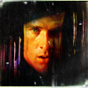
spud66catPOSITIVE VOTES
++ REALLY excellent use of textures here, and the bright vibrant colors really make this one stand out from the rest. I like how everything around John's face is dark and so he stands out even more so because of this.
+++ Amazing coloring, this icon is just gorgeous.
++ Lovely coloring, composition and texture work.
BEST INTERPRETATION OF THEME
None.
CONSTRUCTIVE VOTES
+ This icon is really interesting. I like the cropping but I think that the subject is a little bit hidden behind the textures. The coloring is a bit over saturated but fits the image really good.
+ The coloring is nice, but the image is somewhat lost. I'm not sure if its the texture or if that is how the image originally was.
ADDITIONAL VOTES
+ Love the rich coloring of this icon, and how the texture frames everything. The bit of his forehead showing looks a bit awkward though, and you could probably have made an equally (if not more so) stunning icon is the texture had covered that bit up as well.
+ I love the idea of this icon, but the black texture is a bit too strong. I think a coloured one would have suited the image better, and collectively made a better visual.
Updated Scoring Spreadsheet
As always, please let me know if there are any mistakes.
1ST PLACE [5 points]:

juanxyo with +8 votes.
2ND PLACE [4 points]:

tinebrella with +6 votes [And more 1st place votes].
3RD PLACE [3 points]:
memonechan with +6 votes.
BEST INTERPRETATION OF THEME [3-way-tie] [2 points]:

juanxyo with +3 votes.
BEST INTERPRETATION OF THEME [3-way-tie] [2 points]:
memonechan with +3 votes.
BEST INTERPRETATION OF THEME [3-way-tie] [2 points]:

regularamanda with +3 votes.
MODS CHOICE [1 point]:
[absolutelybatty]
scifi_tv_addict
There's something so haunting about this icon. The color scheme and the composition work together so well to show off a different and unique take on the theme.
[raiindust]

bam_87
I love the texture use in this icon. To me, it completely relates back to the type of hero The Doctor is - crazy, brilliant and a little dysfunctional. I think all the elements of this icon work to showcase that.
TABLE KEY:
+++ = 1st Place Vote
++ = 2nd Place Vote
+ = 3rd Place Vote | Beginning of a new comment.
Note: Votes are not weighted in this round. Meaning a 1st, 2nd or 3rd vote will only give you 1 point when tallying the votes. Except in the case of a tie - then the icon with the most 1st place votes will be given first.
ICON VOTES

mer_moonchildPOSITIVE VOTES
None.
BEST INTERPRETATION OF THEME
None.
CONSTRUCTIVE VOTES
+ I really like the idea for the composition here, but with the image you've chosen it just winds up feeling a bit busy to me. Also (perhaps because of the high contrast) there's a bit of over sharpening going on around the outlines of their faces.
+ It has a really good composition and cropping. I like the way the maker played with the picture but I find theicon iven if it's full of pics a little bit empty of textures and color. Adding some more of them would make the icon stand out more.
+ I love the composition of this icon. However, it is a bit dark and the edges of the figures look rather grainy. Maybe adding some more light to the center image (try using a soft beige or white brush or a light texture even) to brighten it up and draw focus there would help, and a soft blur to the edges to reduce some of the grainy feel.
+ While I like the repetition of the images, and the crops are lovely, it goes a bit overboard making it very busy and hard to focus on.
ADDITIONAL VOTES
None.

tinebrellaPOSITIVE VOTES
++ great crop and simple, but very pretty coloring. Very effective
+ i love how simple it is. the colouring is just perfect and i love how the crop is just off centre
++ Simple, yet elegant. The edges around Leia are seamless and she stands out nicely against the complementary background.
+++ Clean, simple, and utterly gorgeous.
++ Lovely coloring. I like how the slightly off-centered crop puts the attention on her ornate hairdo.
++ A lovely simple beautiful cap
BEST INTERPRETATION OF THEME
None.
CONSTRUCTIVE VOTES
None.
ADDITIONAL VOTES
+ It's a nice crop with a perfect contrast and sharpen. I really like the coloring too: it's a beautiful icon indeed. :)

leire_pjPOSITIVE VOTES
+++ I really like this crop, it's well balanced and very eye catching. The colors are lovely as well. I like the fact that it's simple, but still done with an expert touch.
++ Amazing crop, it draws attention to the subject without being overwhelming as well as adding emotion to the icon.
BEST INTERPRETATION OF THEME
+ I love this natural vibrant coloring, and I think your image choice is great: it doesn't show an epic moment, it shows Buffy as a scared - brave - girl prepared to fight. Amazing interpretation of the theme, really.
CONSTRUCTIVE VOTES
+ This image could work really well with a better capture (so it's more defined) and with the highlighting of the colours of her hair. The crops good and made the focus really easy in this image, it's just the colours that come across as a too neutral, so playing with colours and making them more firery would make it a really affective image.
ADDITIONAL VOTES
+ Fantastic choice of heroine. The coloring is soft and gorgeous. I love the warm tones of her face and hair. It could be a touch brighter to draw more attention to the face though.
crazed_delusionPOSITIVE VOTES
None.
BEST INTERPRETATION OF THEME
None.
CONSTRUCTIVE VOTES
+ could be my monitor but it feels like the aspect ratio is off on this icon, there is an awesome tutorial on aspect ratio that could help
+ Aspect ratio is messed up and the icon looks a tad too similar to the original image, so I think the coloring is a little too bland.
+ the aspect ratio looks a bit off and there doesnt seem to be much of a colouring added to the icon. try adding some contrast and vibrance to brighten it up a bit
+ The icon is a bit dark and lacks of a bit of contrast. The image seems also a bit "compressed" like the aspect ratio is a bit messed up. Maybe a tutorial like this one could help you more than I can :)
+ The image feels a bit stretched vertically and the colors use just a bit of a boost.
+ The icon is stretched out on my monitor. It's a great image but the aspect ratio might be off on the initial screencap, just something to be wary of.
+ The image is rather flat, color and contrast wise. It also looks as if the aspect ratio is off.
+ The aspect ratio looks a bit off here. That may be due to an issue with the original cap, or an error that occurred when the image was resized. In the first case, I would suggest keeping an eye out for aspect ratio when choosing caps and avoiding sources where images look distorted. If one cap looks off, the whole set probably is. If its a resizing issue, make sure the "constrain proportions" option is selected when resizing in Photoshop (or an equivalent option if you use another program).
+ The aspect ratio of this icon is slightly out, which makes her head look stretched. Try holding down the shift button when using the free transform tool to resize, and if using resize make sure that the ratio check box is clicked.
ADDITIONAL VOTES
None.

defyxgravityxPOSITIVE VOTES
+++ I love the way the fog and coloring work so well in this icon.
BEST INTERPRETATION OF THEME
+ No reason left.
CONSTRUCTIVE VOTES
+ great crop but the coloring is a little bit dark making the left side that is so light feel unbalanced
+ The crop is quite good but the icon is a bit too much dark and lacks of a bit of contrast. I would also like a stronger coloring, maybe with a stronger contrast between the yellow tones and the blue tones.
ADDITIONAL VOTES
+ I lacks a bit of contrast, but coloring is very nice.

vividcuriosityPOSITIVE VOTES
+ Striking combination of images and good use of color.
BEST INTERPRETATION OF THEME
None.
CONSTRUCTIVE VOTES
+ I do love this icon. It is one of my favorite caps. However, the brightness of the icon, while an interesting take, has actually made the shadows in the icon grainy and pixellated. Anything that is black or dark (the blue shadows, the deep purples) has red pixels that don't flatter the image at all. This is an easy fix though! Just make a new layer and take a brush (in the same color as the shadow you're working with) and brush over the unsightly pixels. Then you get to keep the brightness of the icon while preserving the shadows. Be careful to keep everything looking natural though! Try a small brush so that you can weave in and out of the details (this would be important on, say, the soldier in the right front corner's cloak).
ADDITIONAL VOTES
+ Nice contrast and coloring! The icons looks a tad over-sharpened, though.
+ I love the lighting and soft coloring. It really complements the shadows in the image

ofourdreamsPOSITIVE VOTES
None.
BEST INTERPRETATION OF THEME
+ This icon - in my opinion - fits very well with the theme. I didn't know the fandom but the choice of the image, the crop and the extreme vivid coloring make me the idea of heroes.
+ No reason left.
CONSTRUCTIVE VOTES
+ This icon looks burned, I would use a bit less contrast and tone down on the pink or add another strong colour for balance.
+ I really love the crop here and I like the bright vibrant colors as well, but I feel like the contrast is just punched up too high here. Her face is almost entirely blown out and so all of the midtones are blended together into bright whiteness. Doing this has caused a massive loss of detail, and also some over sharpening.
+ It's a touch too bright and it looks a little over-sharpened. Too bad, because the crop is good and the coloring is vivid and beautiful.
+ I like the use of texture, but it's so bright.
+ The coloring is too strong, mostly the pink and blue parts. And oversharpened.
+ the colouring is very bright and overpowering. try to add more contrast and decrease the brightness to stop it being overpowing
+ While you chose a nice shot, the saturation and colors on this are just a little too much paired with the sharpness.
+ The crop is great, but the reds and magentas are over-saturated, and the contrast is a bit too high. As a result, the image looks oversharpened.
ADDITIONAL VOTES
+ I like this icon, however the contrast is a bit too high, and the purple colouring a bit strong and over-saturated.
scifi_tv_addictPOSITIVE VOTES
++ I like this icon very much. The coloring is pretty and the contrast is perfect.
+ There's something very striking about this icon; I'm not sure what. The composition is lovely. The cap choice is great; her expression really catches you. The coloring is also amazing. I love how it highlights this sense of, I don't know, hopelessness which is something all heroes have to face before they triumph. It's a really great icon.
++ The coloring is very nice. I like the half and half texture in the background, and the use of light really makes this one stand out.
BEST INTERPRETATION OF THEME
+ No reason left.
CONSTRUCTIVE VOTES
None.
ADDITIONAL VOTES
+ Nice coloring and very good crop!

marcasitePOSITIVE VOTES
++ amazing colouring and i love the crop used.
+++ I like the crop and the coloring. The contrast is good, and she stands out well from the background.
BEST INTERPRETATION OF THEME
+ No reason left.
CONSTRUCTIVE VOTES
None.
ADDITIONAL VOTES
+ The icon looks a tad over-sharpened, but the coloring is vibrant, and the contrast is lovely.
+ The crop is beautiful.
+ Gorgeous crop and the coloring is amazing. I think the sharpness to perfect as well. It could use a little something to make it pop and stand out from the rest though. Maybe a light blob, a texture, or just a little extra contrast to really give it the extra edge.
_puchula_POSITIVE VOTES
+ Awesome use of text & texture here. I love the slight outline around the subject which makes him pop out of the bg a bit, it's an interesting touch that doesn't always work, but comes across really nicely here. Also great use of color, the bg and the subject really go together quite well.
+ nice crop, negative space and text use
+++ Gorgeous use of negative space. The coloring is really good too but I find the text distracting but the icon has a really nice composition.
+++ I love the style of this, especially the subtle outer glow on the image. The combination of the background and foreground is seamless and the text adds just the right touch to the emotion of the icon.
+ Love the coloring and the soft texture use in the negative space. The text is also nice.
BEST INTERPRETATION OF THEME
+ No reason left.
CONSTRUCTIVE VOTES
+ Love the use of negative space and the texture work in this icon, but the text is a bit awkward.
ADDITIONAL VOTES
+ This could have been a great negative space icon without the text: I think it's a bit distracting and makes the icons slightly unbalanced.
+ The actual figure is a little over contrasted, and it makes him grainy around the edges and in the face. Other than that though this icon is lovely. The green is gorgeous, and I love that you chose to use negative space.

juanxyoPOSITIVE VOTES
+ I think the purple tones in this icon are adorable and the focus within the image is very strong. The focus on Harry is done really well with the light background surrounding him.
+ Great use of neutral space and very good colouring. I also like how the subtle texture use makes it seem almost as if it's moving.
+++ love the coloring and great use of textures
++ Lovely icon. The use of color is really original and as magical as the subject. The cropping helps to center the atention in Harry and the Snitch which I find wonderful. The only thing I have to say about this icon or the only concrit I have to give is that Harry's face looks a bit blurry, maybe because of the texture use or the coloring. Some more sharpening would fit really good the icon.
+++ Nice negative space and coloring and I like very much your use of textures. Maybe the icon is just a bit blurry, but there's nothing that a bit of Sharpen couldn't fix :)
++ Lovely use of textures and the coloring is gorgeous.
+++ Gorgeous colouring & crop. I really think the light texture used brings out a brightness in the icon thats lovely.
+ I love the colouring and negative space. Image quality looks a little low unfortunately, and could do with a little more sharpness. Otherwise, really pretty.
BEST INTERPRETATION OF THEME
+ I like the image because it's of Harry before he really is ever defined as or has become the hero we all know him to be. The colouring and image itself catches him at a stage where he's still innocently unaware of everything to come. It's a nice way to interpret the theme.
+ No reason left.
+ A perfect subject for this theme. Harry definitely "plays the hero." Nice use of negative space as well.
CONSTRUCTIVE VOTES
+ The coloring seems very off in this icon like it was over adjusted into purple. Also the image could of used some sharpening.
ADDITIONAL VOTES
+ Lovely! Great texture work here, and lovely colors! I think you find a good balance between sharp and blurry, also.

lumsxPOSITIVE VOTES
+ Lovely color and use of negative space.
++ I love the coloring, maybe a little blurry over Olivia's head, but very pretty.
+++ Crop, coloring and negative space are all gorgeous
+++ I like the negative space, the sharpness, the soft yet bright colouring and the lighting. It's simple, but effective.
BEST INTERPRETATION OF THEME
+ No reason left.
CONSTRUCTIVE VOTES
None.
ADDITIONAL VOTES
+ Lovely coloring and crop, but I think her face is a tad too blurry.
+ The warm coloring on this icon is lovely to look at. I love how dreamy the icon looks right up until you get to the point of the gun. It is a very dramatic effect.

sgflutegirlPOSITIVE VOTES
None.
BEST INTERPRETATION OF THEME
None.
CONSTRUCTIVE VOTES
None.
ADDITIONAL VOTES
+ I think the crop is great, and the image chosen definitely has a heroic vibe about it. Perhaps a little more colour and vibrance would have helped to really make the natural colours pop in the icon.

bam_87POSITIVE VOTES
+++ Striking colouring and very creative composition.
BEST INTERPRETATION OF THEME
None.
CONSTRUCTIVE VOTES
+ I like this icon, but I think the bright textured background is a tad distracting, because the subject is rather dark compared to it.
+ The texture used doesn't quite fit the image.
ADDITIONAL VOTES
+ Very interesting use of textures. I feel like they should be out of place against such a simple image of the Doctor, but they don't. It all ties together surprisingly well!
memonechanPOSITIVE VOTES
+++ Really affective crop and such a strong close up (they're usually a little harder to pull off, so it's snazzy that this one works so well). The lighting is done well and I like how the side of her helmet is highlighted and it's textures can be seen. The brilliant thing about this icon is it's use of light.
+ Great close crop, and lovely coloring.
+ Lovely cropping and use of color.
+++ The crop is stunning.
+ Such a beautiful close up crop that wouldn't always work but this time it's payed off. The colouring is gorgeous, and it works with the crop to depict the anger in the icon. Beautiful work!
+ The crop on this is great and the lighting gives it a nice effect.
BEST INTERPRETATION OF THEME
+ I like how this icon depicts Eowyn's ultimate action of heroism and the moment she truly becomes a hero.
+ No reason left.
+ No reason left.
CONSTRUCTIVE VOTES
+ I think this crop is too close, and the way the chin and left eye are cut off look quite awkward. focusing on one side of the face would have worked better, rather than the centre.
ADDITIONAL VOTES
+ I really like the close crop.
+ The dramatic crop is amazing! It did take me a moment to realize who I was looking at though.

regularamandaPOSITIVE VOTES
+++ GORGEOUS! I really love the crop on this icon, and the multiple images work really well together.
+ Lovely composition.
+++ i love the colouring and the repition of the picture inside each other
+ Nice composition and coloring. Maybe the icon is just a little blurry.
+ The coloring is very vivid and I like the overlapping of the images.
++ I like the way the images have been blended, and the strong colouring, even if it is a little overpowering. I also like how the lightsaber blends into the icon and helps the images combine.
BEST INTERPRETATION OF THEME
+ No reason left.
+ No reason left.
+ No reason left.
CONSTRUCTIVE VOTES
+ This is a wonderful image, just so you know, and the colouring and tones are all really great. I think, however, that it would have been a little bolder with the background's crop being a little different. Perhaps without his nose cropped out of the image and just watch out for the over sharpening of the smaller image of Yoda. These really are more just thoughts though, because it's still a great image as it is.
+ The image overlay is interesting, but the colouring is too overdone. I would tone down the orange and green.
ADDITIONAL VOTES
+ I like the coloring, the bright green of Yoda's lightsaber against the vivid red of his clothes. Composition is nice too, the closer crop works very well as a background to the foreground crop.
+ This icon is a bight overwhelming. There's so much going on. My focus does go straight to the smaller figure, but I think this icon would have benefited from to background image being less saturated than the smaller image in front.

everythingshinyPOSITIVE VOTES
+ Coloring is very pretty, and the contrast is perfect. Plus, I like the simple composition of this icon
BEST INTERPRETATION OF THEME
None.
CONSTRUCTIVE VOTES
None.
ADDITIONAL VOTES
+ Nice icon with a lovely composition. The crop is very good and the coloring is lovely too.

relaxjolenePOSITIVE VOTES
+++ The soft colours in this icon are really lovely and though I don't know the context of the image or the character and her fandom, somehow it feels as though the colouring is so fitting to her. I like the crop and the focus of the icon and how her face is clearly defined against the softer half of the image (how it's kind of softly blurred below the text).
++ Very good use of texture, I like how it washes away the colour except in Rose's face, helping focus on her. Great use of text too.
BEST INTERPRETATION OF THEME
None.
CONSTRUCTIVE VOTES
+ Crop is a little bit awkward: maybe a closer one would have worked, or you might have shifted her to the left. I'm unsure about the text too, especially the first line: it's almost unreadable mainly because letters are too close to each others.
+ The cap looks amazing but the slightly pinker gradient used comes off a bit strong and makes the white text harder to read. Maybe try lowering the opacity slight to help this.
ADDITIONAL VOTES
+ Lovely crop on this icon, however the texture use is slightly bright.
+ I love the overall composition and soft coloring, though the text is difficult to read. Lowering the opacity on the light texture at the bottom of the icon a might create a bit more contrast between the letters and the background. Another trick that I sometimes use for text is to duplicate my text layer(s), change the color of the front to a slightly darker shade (usually one I pick from a darker area of the icon), moving the darker text underneath the white text, and then blurring it. You can adjust the opacity and/or blur the text even more so that you don't have an obvious dark halo around the letters, but still create a little more contrast behind the white text on the pale background.

spud66catPOSITIVE VOTES
++ REALLY excellent use of textures here, and the bright vibrant colors really make this one stand out from the rest. I like how everything around John's face is dark and so he stands out even more so because of this.
+++ Amazing coloring, this icon is just gorgeous.
++ Lovely coloring, composition and texture work.
BEST INTERPRETATION OF THEME
None.
CONSTRUCTIVE VOTES
+ This icon is really interesting. I like the cropping but I think that the subject is a little bit hidden behind the textures. The coloring is a bit over saturated but fits the image really good.
+ The coloring is nice, but the image is somewhat lost. I'm not sure if its the texture or if that is how the image originally was.
ADDITIONAL VOTES
+ Love the rich coloring of this icon, and how the texture frames everything. The bit of his forehead showing looks a bit awkward though, and you could probably have made an equally (if not more so) stunning icon is the texture had covered that bit up as well.
+ I love the idea of this icon, but the black texture is a bit too strong. I think a coloured one would have suited the image better, and collectively made a better visual.
Updated Scoring Spreadsheet