Round 9 - Challenge 06 - Results
ROUND 9 - CHALLENGE 06 - RESULTS
1ST PLACE [5 points]:

kayable with +5 votes (and more first place votes).
2ND PLACE [4 points]:

margerydaw_s2 with +5 votes.
3RD PLACE [3 points]:

&
scoobyatemysnax &
with +3 votes (and the most & an equal amount of first place votes).
BEST INTERPRETATION/MOST CREATIVE [2 points]:

scoobyatemysnax with +4 votes.
MODS CHOICE [1 point]:
absolutelybatty

marcasite
[My sister actually popped over and picked this one out of the lot. I agree with her though. It is a really lovely icon. I love the warm coloring that seems so out of place with the scene in a very interesting way.]
raiindust
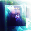
ellaangelus
[The composition of this is marvelous, and I love the use of light and shadows to create a very strong contrast. Gorgeous work.]
TABLE KEY:
+++ = 1st Place Vote
++ = 2nd Place Vote
+ = 3rd Place Vote | Beginning of a new comment.
Note: Votes are not weighted in this round. Meaning a 1st, 2nd or 3rd vote will only give you 1 point when tallying the votes. Except in the case of a tie - then the icon with the most 1st place votes will be given first.
ICON VOTES

kayablePOSITIVE VOTES
+++ Interesting and eye-catching composition! I love the BW subject and bright background combo. I can't really say what's written in the text, though.
+++ Great colouring, I love the use of black and white for Naruto VS. blue and yellow background, it certainly makes an impact !
++ I like how you went for a b&w as well as colour composition. It makes Naruto stand out a lot more and draws the viewers eye in.
+ I love the motion in Naruto's pose and the way impact is alluded to. The use of text is also really great although I think if the text were smaller and repeated so that we were better able to read it, the icon would have been taken up a level.
+ I love the combination of b&w with color! I think having your subject a bit higher contrast might work better with the brightness of the background, but this icon is definitely intriguing!
MOST CREATIVE
+ No reason provided.
+ No reason provided.
CONSTRUCTIVE VOTES
+ The combination of monochrome character and colorful background & text is interesting, but it could use some work. The image lacks contrast - there are lots of medium greys, but not enough whites and blacks. Also, it might be a good idea to add some subtle colorful accents to the image, to make the icon more cohesive as a whole.
ADDITIONAL VOTES
+ I can't decide if I like the composition--I mean, I like it but it feels like it needs a little extra. It's an interesting choice to leave the character in black and white and have vibrant background colors. Maybe some more shadows or a b/w gradient in soft light to make the icon a little more dramatic to give it an extra oomph.

scoobyatemysnaxPOSITIVE VOTES
+++ I love the simplicity of this icon, it's very elegant. The color scheme works great with the image, and the border adds a nice final touch.
+++ I love the coloring here! The bright reds really fit the theme.
++ This is such a great icon! The reds against the black look great! But I think the border draws much too much attention to it.
MOST CREATIVE
+ Love the idea and execution of this icon!
+ I like the idea of this icon, but the composition right now makes it look oddly cramped for a negative space icon. I think removing the border, at least on the sides, would help to open it up more. The fact that each person in the image is really close already gives the icon a tight feel, and by boxing them in on the sides, the texture supports that and throws off the expected balance of the icon.
+ No reason provided.
+ Great composition !!
CONSTRUCTIVE VOTES
None.
ADDITIONAL VOTES
+ I like the idea behind this icon. The browns of the background are really gorgeous and the cutout is pretty much perfect. I love the sense of motion and the simplicity and the only thing I can think of to critique is that the border is maybe unnecessary? I think leaving it out would let us focus on the really interesting cap and that fantastic sense of motion.

angelamariaPOSITIVE VOTES
+ The shadows are absolutely fabulous in this and I really like how sharp and crisp the icon is. Very good translation of the theme as well!
+ Lovely lighting and coloring, they really make the icon stand out!
+ Great coloring and light use.
MOST CREATIVE
None.
CONSTRUCTIVE VOTES
None.
ADDITIONAL VOTES
None.

sheekapPOSITIVE VOTES
None.
MOST CREATIVE
None.
CONSTRUCTIVE VOTES
+ the lower part of her chin joined with her hair is a bit pixelated, maybe it's because of a certain layer of the coloring so try masking around it!
ADDITIONAL VOTES
None.

ellaangelusPOSITIVE VOTES
++ The coloring and composition of this icon are both really lovely! The small border at the top is kind of distracting, so I think it would help if you smudged it out, but other than that it's great!
+ The composition here is seriously great, and I love how bright the colors are. The only thing I’m not sold on is the small strip on the top.
MOST CREATIVE
+ No reason provided.
+ Interesting use of the duplicated image.
CONSTRUCTIVE VOTES
+ I love the composition of this icon but I feel like because of the heavy lighting the blocking looks cluttered. I think this would have looked better without the repetition because the colouring in gorgeous and the lighting equally so :) If the maker thought that there was too much negative space or wanted to draw attention more towards the center of the icon then perhaps text or a decorative brush might have worked better? Alternatively if the maker really wanted to keep the composition as it is.
+ The colouring and composition of it are stunning, but my eyes are immediately drawn to the distracting line at the top of the icon.
+ I really love the candy colors you have going on here, and the composition is really lovely too. I'm not sure however about the 1px line on the top and left of the icon, especially since there is none at the bottom/right it feels like it was just cropped wrongly to include a little of the black movie/cap border.
+ Actually, this icon looks quite interesting! I think it is a bit too busy though. Maybe it would have been better not to dublicate the image. I also find the black line at the top and left very distracting. The blues and purples are pretty, tbh.
+ The composition is interesting, but the images look very LQ and it's very difficult to see what is going on - all I can make out is the TARDIS and a figure in front of it.
ADDITIONAL VOTES
None.

regisPOSITIVE VOTES
+++ I am so in love with the colouring of this. Beautiful work!
+++ The contrast and colouring is impressive! The colour of his skin and his scarf in combination with the deep purples look great!
MOST CREATIVE
None.
CONSTRUCTIVE VOTES
+ I like how you coloured Hook's face, but the purple background looks out of place and distracting. Also you might want to use levels or a layer of soft light to make the dark colours (such as his hair and the bottom right of the icon) a little bit darker/black, as it will give the icon a better sence of depth.
+ i think your coloring could be toned down a little, because i find his skin really yellow and saturated.
+ I feel like this icon has so much potential! His expression is great and I love the purple background. There are a couple of issues that need to be addressed, mainly inconsistencies in coloring and image quality and I think that they tie together somewhat. I've already mentioned that I love the purple background and I think that it's a strong enough color to stand on its own. The red on the bottom left is a little distracting and it's also lapsing over onto his neck, making the skin there considerably darker than his face and lowering the overall quality of the icon. What I do love about the coloring is that the blacks aren't absolute but be careful of where the grunge texture overlaps his hair and other shadows. It gives those areas a pixelated quality that contributes to the LQ effect so maybe think about masking those areas out or smudging them. Lastly, I think the layer used to sharpen the icon need to be lowered in opacity because making the lines of Hooks face and clothes far to harsh. So, yeah, there are a few problems but I really do thin this icon has a lot of promise.
ADDITIONAL VOTES
None.

12feethighPOSITIVE VOTES
+++ Such a creative composition! I love the half circle/half rectangle cutout of the subject and the texture frame behind him really brings the icon together and helps merge the subject and background into something cohesive. The lighting is fantastic too. Great job!
+ I really like the texture use in here. The composition is simple yet so pretty.
MOST CREATIVE
+ No reason provided.
+ No reason provided.
CONSTRUCTIVE VOTES
+ The bright colors of the border/background don't really seem to fit with the black and white cap that has sort of a somber mood. I think this icon would be better served by a more muted background, and maybe a darker one as well because the brightness of the blue draws the eye away from the cap.
ADDITIONAL VOTES
+ Very nice composition, I would just shift the crop down slightly so we see a bit more of Jaqen's face.

rocketgirl2POSITIVE VOTES
++ I adore the softness and airy feel to this icon. Gorgeous colours too.
+ The pastel colours create a very nice effect, and I like how bright the icon is.
+ I think the colors of this icon are great, i really like the idea of a saturated and bright background and sort of a muted subject.
MOST CREATIVE
None.
CONSTRUCTIVE VOTES
+ This icon looks a bit washed out and rather blurry - adding more contrast would probably solve both these problems. The crop is good, but it might look better if the character was more centered.
+ This is a lovely icon with lovely coloring but it seems a little too blurry on my monitor and the coloring doesn't seem to match the overall (sad?) mood of the icon.
+ The icon is too bright, making the subjects washing out the subject and making the icon look low-quality. Maybe if you added some contrast it would make it better.
ADDITIONAL VOTES
+ I really, really love the watercolour feel to this icon, the effect works great with the cap and it's soft and pretty and different. I do think however that the icon is a little too blurry. Strong sharpening would really lift it to the next level.

margerydaw_s2POSITIVE VOTES
+++ love the colors and simplicity of this icon! Gorgeous.
++ I love the sense of motion in this icon, the warm coloring is also well done :) The edges of her hair look a bit oversharpened to me, I would blur these parts a bit.
++ The coloring of this icon is great - the monochrome scheme fits well here. I love how smooth the image is too.
++ Lovely soft coloring.
+ The colouring is beautiful! I also like the black silhouettes.
MOST CREATIVE
None.
CONSTRUCTIVE VOTES
None.
ADDITIONAL VOTES
+ I love the girls expression here and the action in this and the action in the cap. I think that the silhouette cutouts in the foreground are a little distracting though and I'd love the icon even more than I already do without them.
+ I love the use of colour, however the figures in the foreground seem a bit unnecessary and out of place, and they make it difficult to see what is going on. I think the icon might look better without them.

marcasitePOSITIVE VOTES
++ I love the cropping, very emotionall.
MOST CREATIVE
None.
CONSTRUCTIVE VOTES
+ To me the icon seem to sharp. I would lower the opacity of the sharpening layer down a bit and maybe also use the smudge tool to smooth out some very sharp lines. To make the icon more alive you could also add a black&white gradient on soft light. The lightning that is present is already in favour of a stronger lightning. What I like about this icon is the colouring! The yellow/orange is great!
+ That cyan spot on the left side is very distracting, especially with the icon being mostly in brownish - yellow colors.
ADDITIONAL VOTES
+ Love this far crop/unusual angle! My only complaint is the icon looks overly sharp to me.
+ Such a clever cap! I immediately want to know more, what the show is and what's happening to have him so injured and prone! Tne one thing I would say is that the background and the stuff on the left, below his hand detracts our attention from that incredible scene so maybe masking/smudging out the background would have worked better?

val_valeriePOSITIVE VOTES
None.
MOST CREATIVE
None.
CONSTRUCTIVE VOTES
+ I was going to vote for this icon, because I really like the colouring and crop, but it seems too blurry on my screen. A touch of sharpness and it'll be perfect.
+ While I like the yellow touch you gave this icon I think it would benefit from a bit more sharpening and I'd also move the crop up a bit so that you haven't such a huge forehead visible or a bit down to show more of his hair. Right now it seems a bit awkward to me. Oh and the lightning is spectacular!
+ This is an interesting crop and lovely coloring and shadow work, but it feels like he's a bit too...smooth? It makes him look a little plasticky, like a mannequin. Some light grunge might work well for this icon, or a lower opacity on whatever layer is smoothing out his skin.
+ Hmm, there is something about this icon I don't really like. Maybe it's the pink/yellow face ot just generally the yellow/green that doesn't fit so well. I don't know the original, but I think you could make a very interesting b&w icon out of it, changing the background to black completely and also the jacket, leaving the face and the mug ..
+ Interesting crop, but it looks a bit too blurry in my screen, and I believe it could benefit from stronger contrast as well.
ADDITIONAL VOTES
+ Gorgeous cap, gorgeous crop and really gorgeous icon but it's far to blurry on my monitor. Stronger sharpening would definitely benefit the icon.
+ I like your crop here, but the icon looks pretty blurry on my monitor right now. A quick smart sharpen filter could help it look more defined and finished, in my opinion.
gribouillePOSITIVE VOTES
None.
MOST CREATIVE
None.
CONSTRUCTIVE VOTES
None.
ADDITIONAL VOTES
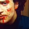
+ This is a very interesting crop, and the vibrant reds of the blood on his face is arresting. I think some shadow work to make the icon a little more dramatic would give this icon some more "presence", maybe work some of the natural shadows on his face to make it even more dramatic, or try an even closer crop to have more of his face in and less of the background.
+ I love the crop and the coloring is gorgeous with the way the blood on his face really pops out. His skin is a bit too pale/bright on my monitor though and I think that adjusting that would really help to improve the icon :) Kudos to the maker for their clever choice of cap though!

mm3butterflyPOSITIVE VOTES
+++ For one I really like the interpretation of the theme. The icon translates it very well. I'm also a big fan of the vibrant colours and how you managed to involve so many in it!
+++ Great use of lights and colors! it really does give life to the icon.
++ I love the colors in this icon The greens and cyan and splash of yellow are a great combination and, well, nothing makes an impact quite like the Hulk :) If I had one critique it's that the whites to the left and right of Hulk are a little blinding. Only the maker can tell for certain but I have a feeling that the 'impact' factor of the icon would be heightened if those bits were left cyan or green.
MOST CREATIVE
+ No reason provided.
+ No reason provided.
CONSTRUCTIVE VOTES
None.
ADDITIONAL VOTES
None.

vampire_sessahPOSITIVE VOTES
+++ Lovely soft coloring and light play! The misty soft colors are an unexpected choice to the action in the cap, but it's well executed and does make the icon interesting and unique.
++ Stunning composition. I like how you went for cool colors instead of warm ones, with a theme like impact, I thought people would mostly go for warm colors.
MOST CREATIVE
None.
CONSTRUCTIVE VOTES
None.
ADDITIONAL VOTES
+ I really love the composition and use of light here, although it might appear a bit too bright on some spots (bottom left and just over her hair). Maybe a bit more contrast or playing with levels might solve that.
+ I love the lighting on this icon but the crop feels a little awkward to me. I get that the maker wants to draw attention to gun and it's difficult to tell without seeing the original cap but it looks like she might have both hands stretched out? If that's the case then I think a central crop would have worked better.
Updated Scoring Spreadsheet
1ST PLACE [5 points]:

kayable with +5 votes (and more first place votes).
2ND PLACE [4 points]:

margerydaw_s2 with +5 votes.
3RD PLACE [3 points]:

&

scoobyatemysnax &
with +3 votes (and the most & an equal amount of first place votes).
BEST INTERPRETATION/MOST CREATIVE [2 points]:

scoobyatemysnax with +4 votes.
MODS CHOICE [1 point]:
absolutelybatty

marcasite
[My sister actually popped over and picked this one out of the lot. I agree with her though. It is a really lovely icon. I love the warm coloring that seems so out of place with the scene in a very interesting way.]
raiindust

ellaangelus
[The composition of this is marvelous, and I love the use of light and shadows to create a very strong contrast. Gorgeous work.]
TABLE KEY:
+++ = 1st Place Vote
++ = 2nd Place Vote
+ = 3rd Place Vote | Beginning of a new comment.
Note: Votes are not weighted in this round. Meaning a 1st, 2nd or 3rd vote will only give you 1 point when tallying the votes. Except in the case of a tie - then the icon with the most 1st place votes will be given first.
ICON VOTES

kayablePOSITIVE VOTES
+++ Interesting and eye-catching composition! I love the BW subject and bright background combo. I can't really say what's written in the text, though.
+++ Great colouring, I love the use of black and white for Naruto VS. blue and yellow background, it certainly makes an impact !
++ I like how you went for a b&w as well as colour composition. It makes Naruto stand out a lot more and draws the viewers eye in.
+ I love the motion in Naruto's pose and the way impact is alluded to. The use of text is also really great although I think if the text were smaller and repeated so that we were better able to read it, the icon would have been taken up a level.
+ I love the combination of b&w with color! I think having your subject a bit higher contrast might work better with the brightness of the background, but this icon is definitely intriguing!
MOST CREATIVE
+ No reason provided.
+ No reason provided.
CONSTRUCTIVE VOTES
+ The combination of monochrome character and colorful background & text is interesting, but it could use some work. The image lacks contrast - there are lots of medium greys, but not enough whites and blacks. Also, it might be a good idea to add some subtle colorful accents to the image, to make the icon more cohesive as a whole.
ADDITIONAL VOTES
+ I can't decide if I like the composition--I mean, I like it but it feels like it needs a little extra. It's an interesting choice to leave the character in black and white and have vibrant background colors. Maybe some more shadows or a b/w gradient in soft light to make the icon a little more dramatic to give it an extra oomph.

scoobyatemysnaxPOSITIVE VOTES
+++ I love the simplicity of this icon, it's very elegant. The color scheme works great with the image, and the border adds a nice final touch.
+++ I love the coloring here! The bright reds really fit the theme.
++ This is such a great icon! The reds against the black look great! But I think the border draws much too much attention to it.
MOST CREATIVE
+ Love the idea and execution of this icon!
+ I like the idea of this icon, but the composition right now makes it look oddly cramped for a negative space icon. I think removing the border, at least on the sides, would help to open it up more. The fact that each person in the image is really close already gives the icon a tight feel, and by boxing them in on the sides, the texture supports that and throws off the expected balance of the icon.
+ No reason provided.
+ Great composition !!
CONSTRUCTIVE VOTES
None.
ADDITIONAL VOTES
+ I like the idea behind this icon. The browns of the background are really gorgeous and the cutout is pretty much perfect. I love the sense of motion and the simplicity and the only thing I can think of to critique is that the border is maybe unnecessary? I think leaving it out would let us focus on the really interesting cap and that fantastic sense of motion.

angelamariaPOSITIVE VOTES
+ The shadows are absolutely fabulous in this and I really like how sharp and crisp the icon is. Very good translation of the theme as well!
+ Lovely lighting and coloring, they really make the icon stand out!
+ Great coloring and light use.
MOST CREATIVE
None.
CONSTRUCTIVE VOTES
None.
ADDITIONAL VOTES
None.

sheekapPOSITIVE VOTES
None.
MOST CREATIVE
None.
CONSTRUCTIVE VOTES
+ the lower part of her chin joined with her hair is a bit pixelated, maybe it's because of a certain layer of the coloring so try masking around it!
ADDITIONAL VOTES
None.

ellaangelusPOSITIVE VOTES
++ The coloring and composition of this icon are both really lovely! The small border at the top is kind of distracting, so I think it would help if you smudged it out, but other than that it's great!
+ The composition here is seriously great, and I love how bright the colors are. The only thing I’m not sold on is the small strip on the top.
MOST CREATIVE
+ No reason provided.
+ Interesting use of the duplicated image.
CONSTRUCTIVE VOTES
+ I love the composition of this icon but I feel like because of the heavy lighting the blocking looks cluttered. I think this would have looked better without the repetition because the colouring in gorgeous and the lighting equally so :) If the maker thought that there was too much negative space or wanted to draw attention more towards the center of the icon then perhaps text or a decorative brush might have worked better? Alternatively if the maker really wanted to keep the composition as it is.
+ The colouring and composition of it are stunning, but my eyes are immediately drawn to the distracting line at the top of the icon.
+ I really love the candy colors you have going on here, and the composition is really lovely too. I'm not sure however about the 1px line on the top and left of the icon, especially since there is none at the bottom/right it feels like it was just cropped wrongly to include a little of the black movie/cap border.
+ Actually, this icon looks quite interesting! I think it is a bit too busy though. Maybe it would have been better not to dublicate the image. I also find the black line at the top and left very distracting. The blues and purples are pretty, tbh.
+ The composition is interesting, but the images look very LQ and it's very difficult to see what is going on - all I can make out is the TARDIS and a figure in front of it.
ADDITIONAL VOTES
None.

regisPOSITIVE VOTES
+++ I am so in love with the colouring of this. Beautiful work!
+++ The contrast and colouring is impressive! The colour of his skin and his scarf in combination with the deep purples look great!
MOST CREATIVE
None.
CONSTRUCTIVE VOTES
+ I like how you coloured Hook's face, but the purple background looks out of place and distracting. Also you might want to use levels or a layer of soft light to make the dark colours (such as his hair and the bottom right of the icon) a little bit darker/black, as it will give the icon a better sence of depth.
+ i think your coloring could be toned down a little, because i find his skin really yellow and saturated.
+ I feel like this icon has so much potential! His expression is great and I love the purple background. There are a couple of issues that need to be addressed, mainly inconsistencies in coloring and image quality and I think that they tie together somewhat. I've already mentioned that I love the purple background and I think that it's a strong enough color to stand on its own. The red on the bottom left is a little distracting and it's also lapsing over onto his neck, making the skin there considerably darker than his face and lowering the overall quality of the icon. What I do love about the coloring is that the blacks aren't absolute but be careful of where the grunge texture overlaps his hair and other shadows. It gives those areas a pixelated quality that contributes to the LQ effect so maybe think about masking those areas out or smudging them. Lastly, I think the layer used to sharpen the icon need to be lowered in opacity because making the lines of Hooks face and clothes far to harsh. So, yeah, there are a few problems but I really do thin this icon has a lot of promise.
ADDITIONAL VOTES
None.

12feethighPOSITIVE VOTES
+++ Such a creative composition! I love the half circle/half rectangle cutout of the subject and the texture frame behind him really brings the icon together and helps merge the subject and background into something cohesive. The lighting is fantastic too. Great job!
+ I really like the texture use in here. The composition is simple yet so pretty.
MOST CREATIVE
+ No reason provided.
+ No reason provided.
CONSTRUCTIVE VOTES
+ The bright colors of the border/background don't really seem to fit with the black and white cap that has sort of a somber mood. I think this icon would be better served by a more muted background, and maybe a darker one as well because the brightness of the blue draws the eye away from the cap.
ADDITIONAL VOTES
+ Very nice composition, I would just shift the crop down slightly so we see a bit more of Jaqen's face.

rocketgirl2POSITIVE VOTES
++ I adore the softness and airy feel to this icon. Gorgeous colours too.
+ The pastel colours create a very nice effect, and I like how bright the icon is.
+ I think the colors of this icon are great, i really like the idea of a saturated and bright background and sort of a muted subject.
MOST CREATIVE
None.
CONSTRUCTIVE VOTES
+ This icon looks a bit washed out and rather blurry - adding more contrast would probably solve both these problems. The crop is good, but it might look better if the character was more centered.
+ This is a lovely icon with lovely coloring but it seems a little too blurry on my monitor and the coloring doesn't seem to match the overall (sad?) mood of the icon.
+ The icon is too bright, making the subjects washing out the subject and making the icon look low-quality. Maybe if you added some contrast it would make it better.
ADDITIONAL VOTES
+ I really, really love the watercolour feel to this icon, the effect works great with the cap and it's soft and pretty and different. I do think however that the icon is a little too blurry. Strong sharpening would really lift it to the next level.

margerydaw_s2POSITIVE VOTES
+++ love the colors and simplicity of this icon! Gorgeous.
++ I love the sense of motion in this icon, the warm coloring is also well done :) The edges of her hair look a bit oversharpened to me, I would blur these parts a bit.
++ The coloring of this icon is great - the monochrome scheme fits well here. I love how smooth the image is too.
++ Lovely soft coloring.
+ The colouring is beautiful! I also like the black silhouettes.
MOST CREATIVE
None.
CONSTRUCTIVE VOTES
None.
ADDITIONAL VOTES
+ I love the girls expression here and the action in this and the action in the cap. I think that the silhouette cutouts in the foreground are a little distracting though and I'd love the icon even more than I already do without them.
+ I love the use of colour, however the figures in the foreground seem a bit unnecessary and out of place, and they make it difficult to see what is going on. I think the icon might look better without them.

marcasitePOSITIVE VOTES
++ I love the cropping, very emotionall.
MOST CREATIVE
None.
CONSTRUCTIVE VOTES
+ To me the icon seem to sharp. I would lower the opacity of the sharpening layer down a bit and maybe also use the smudge tool to smooth out some very sharp lines. To make the icon more alive you could also add a black&white gradient on soft light. The lightning that is present is already in favour of a stronger lightning. What I like about this icon is the colouring! The yellow/orange is great!
+ That cyan spot on the left side is very distracting, especially with the icon being mostly in brownish - yellow colors.
ADDITIONAL VOTES
+ Love this far crop/unusual angle! My only complaint is the icon looks overly sharp to me.
+ Such a clever cap! I immediately want to know more, what the show is and what's happening to have him so injured and prone! Tne one thing I would say is that the background and the stuff on the left, below his hand detracts our attention from that incredible scene so maybe masking/smudging out the background would have worked better?

val_valeriePOSITIVE VOTES
None.
MOST CREATIVE
None.
CONSTRUCTIVE VOTES
+ I was going to vote for this icon, because I really like the colouring and crop, but it seems too blurry on my screen. A touch of sharpness and it'll be perfect.
+ While I like the yellow touch you gave this icon I think it would benefit from a bit more sharpening and I'd also move the crop up a bit so that you haven't such a huge forehead visible or a bit down to show more of his hair. Right now it seems a bit awkward to me. Oh and the lightning is spectacular!
+ This is an interesting crop and lovely coloring and shadow work, but it feels like he's a bit too...smooth? It makes him look a little plasticky, like a mannequin. Some light grunge might work well for this icon, or a lower opacity on whatever layer is smoothing out his skin.
+ Hmm, there is something about this icon I don't really like. Maybe it's the pink/yellow face ot just generally the yellow/green that doesn't fit so well. I don't know the original, but I think you could make a very interesting b&w icon out of it, changing the background to black completely and also the jacket, leaving the face and the mug ..
+ Interesting crop, but it looks a bit too blurry in my screen, and I believe it could benefit from stronger contrast as well.
ADDITIONAL VOTES
+ Gorgeous cap, gorgeous crop and really gorgeous icon but it's far to blurry on my monitor. Stronger sharpening would definitely benefit the icon.
+ I like your crop here, but the icon looks pretty blurry on my monitor right now. A quick smart sharpen filter could help it look more defined and finished, in my opinion.
gribouillePOSITIVE VOTES
None.
MOST CREATIVE
None.
CONSTRUCTIVE VOTES
None.
ADDITIONAL VOTES
+ This is a very interesting crop, and the vibrant reds of the blood on his face is arresting. I think some shadow work to make the icon a little more dramatic would give this icon some more "presence", maybe work some of the natural shadows on his face to make it even more dramatic, or try an even closer crop to have more of his face in and less of the background.
+ I love the crop and the coloring is gorgeous with the way the blood on his face really pops out. His skin is a bit too pale/bright on my monitor though and I think that adjusting that would really help to improve the icon :) Kudos to the maker for their clever choice of cap though!

mm3butterflyPOSITIVE VOTES
+++ For one I really like the interpretation of the theme. The icon translates it very well. I'm also a big fan of the vibrant colours and how you managed to involve so many in it!
+++ Great use of lights and colors! it really does give life to the icon.
++ I love the colors in this icon The greens and cyan and splash of yellow are a great combination and, well, nothing makes an impact quite like the Hulk :) If I had one critique it's that the whites to the left and right of Hulk are a little blinding. Only the maker can tell for certain but I have a feeling that the 'impact' factor of the icon would be heightened if those bits were left cyan or green.
MOST CREATIVE
+ No reason provided.
+ No reason provided.
CONSTRUCTIVE VOTES
None.
ADDITIONAL VOTES
None.

vampire_sessahPOSITIVE VOTES
+++ Lovely soft coloring and light play! The misty soft colors are an unexpected choice to the action in the cap, but it's well executed and does make the icon interesting and unique.
++ Stunning composition. I like how you went for cool colors instead of warm ones, with a theme like impact, I thought people would mostly go for warm colors.
MOST CREATIVE
None.
CONSTRUCTIVE VOTES
None.
ADDITIONAL VOTES
+ I really love the composition and use of light here, although it might appear a bit too bright on some spots (bottom left and just over her hair). Maybe a bit more contrast or playing with levels might solve that.
+ I love the lighting on this icon but the crop feels a little awkward to me. I get that the maker wants to draw attention to gun and it's difficult to tell without seeing the original cap but it looks like she might have both hands stretched out? If that's the case then I think a central crop would have worked better.
Updated Scoring Spreadsheet