Round 3 - Challenge 08 - Results
ROUND 3 - CHALLENGE 8 - RESULTS
1ST PLACE [5 points]:

giulsss with +4 votes (and all first place votes).
2ND PLACE [4 points]:

erzsebet with +4 votes.
3RD PLACE [3 points]:

enriana with +3 votes.
BEST ART DIRECTION [2 points]:

arctic_flower with +2 votes.
MODS CHOICE [1 point]:
[absolutelybatty]

fireinmybones
[Excellent cap choice! Crazy facial expressions are one of the many advantages of an animated movie, and this icon, along with its warm coloring, show that off quite well.]
[raiindust]

wildalyss
[I love the colour and composition of this. The text use is also really effective!]
TABLE KEY:
+++ = 1st Place Vote
++ = 2nd Place Vote
+ = 3rd Place Vote | Beginning of a new comment.
Note: Votes are not weighted in this round. Meaning a 1st, 2nd or 3rd vote will only give you 1 point when tallying the votes. Except in the case of a tie - then the icon with the most 1st place votes will be given first.
ICON VOTES

enrianaPOSITIVE VOTES
+++ I adore the crop, the choice of cap, and the colouring is brilliant.
+++ this crop is so fun that it makes me want to fly away on an amazing adventure, too.
++ I love the crop of this icon. Simple but effective and plays with the subject.
BEST INTERPRETATION OF THEME
None.
CONSTRUCTIVE VOTES
+ This crop is spectacular! I just wish that the colouring were a little brighter/more saturated, since Up! (especially the shots of the house and balloons) has so many bright colours.
+ The colouring on your icon is gorgeous, but I find it weird that you cut off part of the balloon shape in your crop. Though it does leave some nice negative space in the lower righthand corner, it also just feels a bit awkward.
ADDITIONAL VOTES
None.
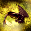
lwena11POSITIVE VOTES
None.
BEST INTERPRETATION OF THEME
None.
CONSTRUCTIVE VOTES
+ Your icon has fantastic colours (the yellow/green is absolutely lovely!), but it's hard for me to tell what's going on in it. Especially with the bit at the bottom that's set to screen (I assume) that covers up part of your subject and pushes focus upward, I don't know what I'm seeing. Maybe making your darks not quite so dark would help, and perhaps a little sharpening wouldn't go amiss either.
+ The icon appears very sharp, which in this case obscures the background. I think softening up the grass around Toothless would help enhance it as the natural background and not a texture (which is what I originally thought it was).
ADDITIONAL VOTES
None.

julie_izumiPOSITIVE VOTES
+ Lovely crop, with her hair taking all the space, and very nice colouring. I like the effect created by the use of the light brush.
BEST INTERPRETATION OF THEME
None.
CONSTRUCTIVE VOTES
+ With such a close crop, the red of Ariel's hair lacks depth. I would try playing with soft brushes in black or white with the layer on soft light to add dimension to the icon.
+ who lovely can a screencaps like this can be?! very eye-catching :D but a more impressive coloring would have worked better and attracted the attention even more!
ADDITIONAL VOTES
None.

midnightisclosePOSITIVE VOTES
+ I love the simplicity of your icon. Nice use of negative space!
BEST INTERPRETATION OF THEME
None.
CONSTRUCTIVE VOTES
+ I like the crop and the coloring. While the icon is clear, it is a tad sharp.
ADDITIONAL VOTES
+ I really like all the space and the wide-open sky in this icon. the balloons are just a tad over-sharpened on my screen.

fulminant8POSITIVE VOTES
+++ The negative space works really well, plus I love the artistic feel of the texture used in the background.
+ The coloring is very nice here, nice and soft and pink. The extended background is done very well here, really adds to the overall composition. Could be a little sharper but overall very well put together.
BEST INTERPRETATION OF THEME
+ No reason given.
CONSTRUCTIVE VOTES
None.
ADDITIONAL VOTES
+ Nice colouring and use of texture, but Belle appears too blurry, you might want to sharpen this part of the icon a bit more.

erzsebetPOSITIVE VOTES
+++ perfect coloring which doesn't sharp the image at all! the choice of the font is very original, as the positioning of the text too :D
++ I like your use of text in this icon; it works very well here, especially the word "fish" (that particular font fits a little better than the "tiny little"). As well, good colouring.
++ the crop is very well done, and it's a nice use of text - I like the fonts you used and th colours.
+ Normally, I'm not a fan of text but the two different colors and fonts is good use of the negative space.
BEST INTERPRETATION OF THEME
None.
CONSTRUCTIVE VOTES
None.
ADDITIONAL VOTES
+ I love the font and overall composition of this icon. Its really very adorable.

wildalyssPOSITIVE VOTES
++ I love the coloring you've used for the icon - having the lightness in the background seems counter-intuitive to me, but it really compliments the darker colour of Stitch.
BEST INTERPRETATION OF THEME
+ No reason given.
CONSTRUCTIVE VOTES
+ I really like the added band/bar thing at the top of the icon and the text placement with the added period is well done. There's a shadow across his face that is a bit distracting, not sure if it's a texture or on the original cap.
+ I like the intention of this icon. Perhaps, the top and bottom panels of Stitch could be thicker, while keeping the middle panel centered.
ADDITIONAL VOTES
+ lovely use of shadows and text! even though i think that a different color like redish pink would have worked better, or a darker light-blue :)
+ Nice use of text -I like the font, the position and the colour). I think this icon might need to be brightened a bit, or at least Stitch's body might need it so that it appears more colourful. Plus I don't quite see the point of the lines on the top and bottom of the icon, I think it would have worked better without them.

dudette_in_townPOSITIVE VOTES
None.
BEST INTERPRETATION OF THEME
None.
CONSTRUCTIVE VOTES
+ I like the use of colour in that icon, and the contrast between green and red. The only problem is that the character is very difficult to see, maybe a bit more sharpening/contrasting could help.
+ I like the bright coloring but the subject gets lost in the crop. Perhaps moving the image down a bit would help even out all the green.
+ the coloring and contrast on the leaves is very nice, but there's not really a focus to the figure in the icon - it gets lost in the foliage.
ADDITIONAL VOTES
None.

collsPOSITIVE VOTES
+ The brightness in the icon is lovely, and the heart brush/texture used really fits the icon.
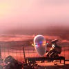
+ pure love of icon! *_* i adore the purlpe in the background and how the white robot make contrast with it!
BEST INTERPRETATION OF THEME
+ very creative use of brush, and nice colouring.
CONSTRUCTIVE VOTES
+ I like your colouring here! However, the hearts in the middle of the image are a little distracting and, in combination with the sparks that are also there, make the icon feel a little crowded/busy.
ADDITIONAL VOTES
None.
gribouillePOSITIVE VOTES
++ I adore the crop and coloring. Even though Eve and Wall-E are set off to the right it doesn't weigh the icon down and unbalance the icon. Great job!
BEST INTERPRETATION OF THEME
None.
CONSTRUCTIVE VOTES
None.
ADDITIONAL VOTES
+ nice earth tones in the background, and I like the crop and how Wall-E and Eve are slightly off centered.

fireinmybonesPOSITIVE VOTES
+ This icon caught my eye straight away, and I think that it's due to the combination of the close crop and the bright, crisp colouring. Even though this icon is simple, it really works well here.
BEST INTERPRETATION OF THEME
+ the crop makes the image very striking and "animated"
CONSTRUCTIVE VOTES
+ i would have cut the screencaps a little bit smaller, in order to be able to view the whole face of the horse! anyway, the screencaps makes me laugh so hard LOL
ADDITIONAL VOTES
+ I really love this icon the colouring, the brilliant crop, his expression. Great job !

arctic_flowerPOSITIVE VOTES
++ The icon is clear while also complex, vivid, and well composed.
+ the repeating image is creative and I like the crop.
BEST INTERPRETATION OF THEME
+ No reason given.
+ No reason given.
CONSTRUCTIVE VOTES
None.
ADDITIONAL VOTES
None.

giulsssPOSITIVE VOTES
+++ Lovely duo-tone coloring. It works well with the cap's lighting.
+++ I love the simplicity of this icon! The colouring is perfect and the crop focuses my eye right on Boo.
+++ The coloring is nice and soft here, definitely helps the composition. The center crop and positioning works extremely well here. She could be a bit sharper but otherwise its a lovely icon.
+++ I love how you used a texture that matched the colour of the shadows in your icon. It really pulls the whole thing together along with making it more interesting to look at.
BEST INTERPRETATION OF THEME
None.
CONSTRUCTIVE VOTES
None.
ADDITIONAL VOTES
+ I like the simple straight on crop and the amount of negative space in this icon.

alice_tripPOSITIVE VOTES
++ a great crop and the icon is nicely colored.
++ something in the dog is really fascinating... i can't explain exactly what, maybe the contrast between the warm black and the purple shadows! i think this icon is very smart.
BEST INTERPRETATION OF THEME
None.
CONSTRUCTIVE VOTES
None.
ADDITIONAL VOTES
+ Love the crop and coloring. Great use of the screencap here!

rocketgirl2POSITIVE VOTES
None.
BEST INTERPRETATION OF THEME
+ I like the way that you've duplicated the image across split panels, and the split panels blend into one another. It's an interesting idea!
CONSTRUCTIVE VOTES
+ the black frame seems too big to me, in my opinion you could probably remove it, but keeping the dark lines in the middle that suit the composition (nice blending by the way) well.
+ The slicing of the images is very creative, however, the black border is distracting. I'd try making the black border smaller, and have the image fill more of the icon.
ADDITIONAL VOTES
None.
Updated Scoring Spreadsheet
1ST PLACE [5 points]:

giulsss with +4 votes (and all first place votes).
2ND PLACE [4 points]:

erzsebet with +4 votes.
3RD PLACE [3 points]:

enriana with +3 votes.
BEST ART DIRECTION [2 points]:

arctic_flower with +2 votes.
MODS CHOICE [1 point]:
[absolutelybatty]

fireinmybones
[Excellent cap choice! Crazy facial expressions are one of the many advantages of an animated movie, and this icon, along with its warm coloring, show that off quite well.]
[raiindust]

wildalyss
[I love the colour and composition of this. The text use is also really effective!]
TABLE KEY:
+++ = 1st Place Vote
++ = 2nd Place Vote
+ = 3rd Place Vote | Beginning of a new comment.
Note: Votes are not weighted in this round. Meaning a 1st, 2nd or 3rd vote will only give you 1 point when tallying the votes. Except in the case of a tie - then the icon with the most 1st place votes will be given first.
ICON VOTES

enrianaPOSITIVE VOTES
+++ I adore the crop, the choice of cap, and the colouring is brilliant.
+++ this crop is so fun that it makes me want to fly away on an amazing adventure, too.
++ I love the crop of this icon. Simple but effective and plays with the subject.
BEST INTERPRETATION OF THEME
None.
CONSTRUCTIVE VOTES
+ This crop is spectacular! I just wish that the colouring were a little brighter/more saturated, since Up! (especially the shots of the house and balloons) has so many bright colours.
+ The colouring on your icon is gorgeous, but I find it weird that you cut off part of the balloon shape in your crop. Though it does leave some nice negative space in the lower righthand corner, it also just feels a bit awkward.
ADDITIONAL VOTES
None.

lwena11POSITIVE VOTES
None.
BEST INTERPRETATION OF THEME
None.
CONSTRUCTIVE VOTES
+ Your icon has fantastic colours (the yellow/green is absolutely lovely!), but it's hard for me to tell what's going on in it. Especially with the bit at the bottom that's set to screen (I assume) that covers up part of your subject and pushes focus upward, I don't know what I'm seeing. Maybe making your darks not quite so dark would help, and perhaps a little sharpening wouldn't go amiss either.
+ The icon appears very sharp, which in this case obscures the background. I think softening up the grass around Toothless would help enhance it as the natural background and not a texture (which is what I originally thought it was).
ADDITIONAL VOTES
None.

julie_izumiPOSITIVE VOTES
+ Lovely crop, with her hair taking all the space, and very nice colouring. I like the effect created by the use of the light brush.
BEST INTERPRETATION OF THEME
None.
CONSTRUCTIVE VOTES
+ With such a close crop, the red of Ariel's hair lacks depth. I would try playing with soft brushes in black or white with the layer on soft light to add dimension to the icon.
+ who lovely can a screencaps like this can be?! very eye-catching :D but a more impressive coloring would have worked better and attracted the attention even more!
ADDITIONAL VOTES
None.

midnightisclosePOSITIVE VOTES
+ I love the simplicity of your icon. Nice use of negative space!
BEST INTERPRETATION OF THEME
None.
CONSTRUCTIVE VOTES
+ I like the crop and the coloring. While the icon is clear, it is a tad sharp.
ADDITIONAL VOTES
+ I really like all the space and the wide-open sky in this icon. the balloons are just a tad over-sharpened on my screen.

fulminant8POSITIVE VOTES
+++ The negative space works really well, plus I love the artistic feel of the texture used in the background.
+ The coloring is very nice here, nice and soft and pink. The extended background is done very well here, really adds to the overall composition. Could be a little sharper but overall very well put together.
BEST INTERPRETATION OF THEME
+ No reason given.
CONSTRUCTIVE VOTES
None.
ADDITIONAL VOTES
+ Nice colouring and use of texture, but Belle appears too blurry, you might want to sharpen this part of the icon a bit more.

erzsebetPOSITIVE VOTES
+++ perfect coloring which doesn't sharp the image at all! the choice of the font is very original, as the positioning of the text too :D
++ I like your use of text in this icon; it works very well here, especially the word "fish" (that particular font fits a little better than the "tiny little"). As well, good colouring.
++ the crop is very well done, and it's a nice use of text - I like the fonts you used and th colours.
+ Normally, I'm not a fan of text but the two different colors and fonts is good use of the negative space.
BEST INTERPRETATION OF THEME
None.
CONSTRUCTIVE VOTES
None.
ADDITIONAL VOTES
+ I love the font and overall composition of this icon. Its really very adorable.

wildalyssPOSITIVE VOTES
++ I love the coloring you've used for the icon - having the lightness in the background seems counter-intuitive to me, but it really compliments the darker colour of Stitch.
BEST INTERPRETATION OF THEME
+ No reason given.
CONSTRUCTIVE VOTES
+ I really like the added band/bar thing at the top of the icon and the text placement with the added period is well done. There's a shadow across his face that is a bit distracting, not sure if it's a texture or on the original cap.
+ I like the intention of this icon. Perhaps, the top and bottom panels of Stitch could be thicker, while keeping the middle panel centered.
ADDITIONAL VOTES
+ lovely use of shadows and text! even though i think that a different color like redish pink would have worked better, or a darker light-blue :)
+ Nice use of text -I like the font, the position and the colour). I think this icon might need to be brightened a bit, or at least Stitch's body might need it so that it appears more colourful. Plus I don't quite see the point of the lines on the top and bottom of the icon, I think it would have worked better without them.

dudette_in_townPOSITIVE VOTES
None.
BEST INTERPRETATION OF THEME
None.
CONSTRUCTIVE VOTES
+ I like the use of colour in that icon, and the contrast between green and red. The only problem is that the character is very difficult to see, maybe a bit more sharpening/contrasting could help.
+ I like the bright coloring but the subject gets lost in the crop. Perhaps moving the image down a bit would help even out all the green.
+ the coloring and contrast on the leaves is very nice, but there's not really a focus to the figure in the icon - it gets lost in the foliage.
ADDITIONAL VOTES
None.

collsPOSITIVE VOTES
+ The brightness in the icon is lovely, and the heart brush/texture used really fits the icon.
+ pure love of icon! *_* i adore the purlpe in the background and how the white robot make contrast with it!
BEST INTERPRETATION OF THEME
+ very creative use of brush, and nice colouring.
CONSTRUCTIVE VOTES
+ I like your colouring here! However, the hearts in the middle of the image are a little distracting and, in combination with the sparks that are also there, make the icon feel a little crowded/busy.
ADDITIONAL VOTES
None.
gribouillePOSITIVE VOTES
++ I adore the crop and coloring. Even though Eve and Wall-E are set off to the right it doesn't weigh the icon down and unbalance the icon. Great job!
BEST INTERPRETATION OF THEME
None.
CONSTRUCTIVE VOTES
None.
ADDITIONAL VOTES
+ nice earth tones in the background, and I like the crop and how Wall-E and Eve are slightly off centered.

fireinmybonesPOSITIVE VOTES
+ This icon caught my eye straight away, and I think that it's due to the combination of the close crop and the bright, crisp colouring. Even though this icon is simple, it really works well here.
BEST INTERPRETATION OF THEME
+ the crop makes the image very striking and "animated"
CONSTRUCTIVE VOTES
+ i would have cut the screencaps a little bit smaller, in order to be able to view the whole face of the horse! anyway, the screencaps makes me laugh so hard LOL
ADDITIONAL VOTES
+ I really love this icon the colouring, the brilliant crop, his expression. Great job !

arctic_flowerPOSITIVE VOTES
++ The icon is clear while also complex, vivid, and well composed.
+ the repeating image is creative and I like the crop.
BEST INTERPRETATION OF THEME
+ No reason given.
+ No reason given.
CONSTRUCTIVE VOTES
None.
ADDITIONAL VOTES
None.

giulsssPOSITIVE VOTES
+++ Lovely duo-tone coloring. It works well with the cap's lighting.
+++ I love the simplicity of this icon! The colouring is perfect and the crop focuses my eye right on Boo.
+++ The coloring is nice and soft here, definitely helps the composition. The center crop and positioning works extremely well here. She could be a bit sharper but otherwise its a lovely icon.
+++ I love how you used a texture that matched the colour of the shadows in your icon. It really pulls the whole thing together along with making it more interesting to look at.
BEST INTERPRETATION OF THEME
None.
CONSTRUCTIVE VOTES
None.
ADDITIONAL VOTES
+ I like the simple straight on crop and the amount of negative space in this icon.

alice_tripPOSITIVE VOTES
++ a great crop and the icon is nicely colored.
++ something in the dog is really fascinating... i can't explain exactly what, maybe the contrast between the warm black and the purple shadows! i think this icon is very smart.
BEST INTERPRETATION OF THEME
None.
CONSTRUCTIVE VOTES
None.
ADDITIONAL VOTES
+ Love the crop and coloring. Great use of the screencap here!
rocketgirl2POSITIVE VOTES
None.
BEST INTERPRETATION OF THEME
+ I like the way that you've duplicated the image across split panels, and the split panels blend into one another. It's an interesting idea!
CONSTRUCTIVE VOTES
+ the black frame seems too big to me, in my opinion you could probably remove it, but keeping the dark lines in the middle that suit the composition (nice blending by the way) well.
+ The slicing of the images is very creative, however, the black border is distracting. I'd try making the black border smaller, and have the image fill more of the icon.
ADDITIONAL VOTES
None.
Updated Scoring Spreadsheet