Round 14 - Challenge 04 - Results
ROUND 14 - CHALLENGE 04 - RESULTS
1ST PLACE [5 points]:

sietepecados with +8 votes.
2ND PLACE [4 points]:

katy_111 with +6 votes.
3RD PLACE [3 points]:

morpho90 with +5 votes.
BEST INTERPRETATION [2 points]:

emiels with +3 votes.
MODS CHOICE [1 point]:

applepips16
[What a super cute icon! The text work is great. The coloring is well balanced and really vibrant while also being really natural. And that little light blob just ties it all in together!]
TABLE KEY:
+++ = 1st Place Vote
++ = 2nd Place Vote
+ = 3rd Place Vote | Beginning of a new comment.
Note: Votes are not weighted in this round. Meaning a 1st, 2nd or 3rd vote will only give you 1 point when tallying the votes.
[Tiebreaker procedure:]Except in the case of a tie - then the icon with the most 1st place votes will be given first. This is upheld in all cases unless 1) the amount of votes is equal in all cases (i.e. 3 first place, 2 second place, and 1 third place) or 2) breaking the tie would result in an icon with enough first place votes to place being knocked out of a placing spot (i.e a third place tie between two icons). In these cases, ties will stand as is in order to maintain a sense of fairness for all participants.
ICON VOTES

marcasitePOSITIVE VOTES
++ I love the colouring, the lighting and the composition of the icon.
+ Pretty use of text and nice composition!
BEST INTERPRETATION
None.
CONSTRUCTIVE VOTES
+ The composition is nice but the light washes out the text and the icon overall is very blurry.
+ The different colors of text and the choppy letters make this look too busy. I think one or the other would have been fine. The coloring and softness of the rest of the icon are beautiful.
+ While I love the bright colors on this icon, some areas are too bright, and the background blends with the character's face. A simple solution to that could be to flip the background horizontally, to use the darker side to provide contrast for her skin. Also, I think you had a good idea for text here, but the wide letter spacing, use of multiple fonts and colors, both lower and upper case and text warping makes it look rather messy - there's too much variety for something as small as an icon. I'd suggest using only two or three of these elements in the future, to avoid overloading the icon.
ADDITIONAL VOTES
+ I like how you used the text and emphasized the D for your icon. The smoothness is also very nice. But I think it's a little too bright and her face kind of blends into the background. It may have looked better if the gradient were reversed to have the lighter side on the left and the darker side on the right.
+ The icon is really bright, the subject almost disappears into the background. Adding a multiply layer could help with this.
morpho90POSITIVE VOTES
+++ The composition and text work are absolutely great and the coloring is pretty well done, too.
+++ I love the composition of the text (that it fill the whole background), aslo I really like the grungy look on this icon.
++ I love the grunginess of the background reds here. The way you've utilized the text in the different parts of the background and with different colors makes this icon stand out in a really strong way. It's complex but not overpowering at all, I'm really impressed.
+ I think the text is really well done here, and the colouring is really well done especially since red can be quite a tricky dominant colour to use.
+ The reds in this icon are fantastic, I love the coloring. The text is executed perfectly too, covering the entire background in text could have made it distracting and messy, but sticking to one font helped avoid that.
BEST INTERPRETATION
None.
CONSTRUCTIVE VOTES
+ I love the texture use and composition, but I feel the text kind of lets it down a bit - the font is a bit boring and in places oversharpened (like the 'hell is' next to the gun).
ADDITIONAL VOTES
None.
emielsPOSITIVE VOTES
+++ The work done here is wonderful! So well thought and gorgeous composition!
+++ The mix of text and characters is really well done, especially the correlation between character, text and color
++ The composition of this is fantastic. I thought this was a promo image before I clicked on the cap and saw that you used three different ones. I love that you matched the colors of each character to the letters. There was definitely a lot of work and attention to detail that went into this and it shows. A few edges are slightly oversharpened and I'd smooth those out, but great work overall.
+ I love the text arrangement and the way the letters seem to have some sort of a 3D effect.
BEST INTERPRETATION
+ No reason provided.
+ No reason provided.
+ This icon immediately caught my attention. It's very unique, with the way the text interacts with the subjects both in placement and color.
CONSTRUCTIVE VOTES
None.
ADDITIONAL VOTES
None.

novindalfPOSITIVE VOTES
+++ Beautiful, vibrant red! I love the grunge as well!
BEST INTERPRETATION
+ No reason provided.
+ Anyone who's seen or even heard of Once Upon a Time will know who this icon is about. The fiery reds fit perfectly and I like how you added her name but made the 'R's stick out and be noticed. Plus, the fact that all that text is in the background makes the focus stay on Regina rather than being distracting and overcrowding everything. I also like the subtle touch of light flames on her blazer.
CONSTRUCTIVE VOTES
None.
ADDITIONAL VOTES
+ Lovely use of text in the background! I think it is really cool how you put the letter R in a different color so it stood out more. On my screen, the subject's face is a bit pixel-y, maybe a mite too much redness vibrancy? I think if you used an adjustment layer or similar to cool her skin tone down a little bit it would look great.

ghanimasunPOSITIVE VOTES
None.
BEST INTERPRETATION
None.
CONSTRUCTIVE VOTES
+ I love the crop here, however, I think the text placement makes it a bit unbalanced with its horizontal orientation clashing with the vertical lines in the background.
+ I think the crop here is really nice and has created some interesting negative space within the icon. However, the text sort of feels like it's just floating there at the top of the icon. Perhaps making it larger to give it more attention and tilting it to create a sense of direction in the composition (rotating it sort of diagonally, think the same sort of angle her face is pointing in) would help to create a flow in the icon, as well as experimenting with font choices and the colour of the text.
+ I think this is a very solid simple icon, with a nice natural coloring and a good crop. However, the text doesn't fit with the rest of the icon at all - it looks awkwardly placed, and it disturbs the balance of the icon. Since the crop puts the character in the lower left corner, the text would look best if it filled the empty space in the upper right part.
ADDITIONAL VOTES
None.

queen_bartoniaPOSITIVE VOTES
+ Lovely coloring, and the composition is also quite nice. I like that it has that vintage feel, although I'm not 100% sold on the text as it seems to clutter up the icon a bit too much. Maybe taking out one of the text sections, like the one on the top left, would make it work better.
BEST INTERPRETATION
None.
CONSTRUCTIVE VOTES
None.
ADDITIONAL VOTES
+ This is a really, really cool composition! Love the different ways you've worked the subjects, colors and text in! It's a bit too sharp on the subjects in my screen, they have become a bit pixelated, but overall this icon is super cool.
+ I think this icon has a nice composition and a lovely vintage coloring that goes well with its subject, but there are a few problems with the text. Instead of repeating the entire title, splitting it between the two empty spaces might have been a good idea, since that way you'd have enough space to include actually include the entire title, rather than 'breakfast Tiffany' and 'Tiffa breakfast at', which looks rather odd. Also, the text on the lower part could stand out more from the background.

vaporPOSITIVE VOTES
None.
BEST INTERPRETATION
None.
CONSTRUCTIVE VOTES
+ Beautiful crop of the character but the text blends in a little too much losing its distinctiveness. The glo around the letters detract from the text itself and causes it to look a little smudged
+ The muted colors are really beautiful, but the bright red doesn't match them very well. I think a lighter shade of brownish yellow in the background would have made for a more balanced icon.
+ I know the theme is text, but the text in this icon is a little overpowering. It takes all the attention from the subject. Perhaps choosing a simpler, thinner font and make it white or use the eyedropper tool to pick a color that is already in the screencap could make the whole icon "come together" better.
+ I really like the light on this one, but the text is very dark on my monitor, and it's hard to read it. Especially on the right side. Maybe brighter shade of red, or contrast under the text would help make it more readable.
+ I like how the icon is set, but i don't like so much the text because it doesn't create harmony with all the rest. Another font with another color, could be better for me
ADDITIONAL VOTES
+ I like the image part of this icon - the coloring fits the mood, and the light textures add an interesting eerie glow, but the text looks as if it was meant for a different icon. The deep red color doesn't go well with the brown tones of the icon, and there's not enough contrast to make it stand out. I'd suggest using a lighter color picked from the background, moving the text up to the middle, and setting it on screen, to make the composition of the icon more cohesive.
+ The color of the text doesn't really match with the icon, and the overall look is far too dark. I think taking away that glow (?) behind the text and making it a lighter color, say light beige, would tie everything together much better.
katy_111POSITIVE VOTES
+++ I really love the clean composition of this icon. Centering the image with the text creates such a nice line down the middle that is just super pleasing to look at. I really like the colors and lighting you've gone with as well, it fits really cohesively. And kudos for pulling of all white text on a background that's not super dark, that's often really tricky to do!
+++ I love the text work here! The composition of this icon being vertically aligned is really nice too and the texture work is great
+++ I love the color tones used and how it was set to work. I also really like how you've used the letter choice, simple but effective. Really a great job
++ The composition of this icon is great, the image and the text only fill about 1/3rd of the icon, but it doesn't feel empty at all. The purple coloring and the simplicity of the composition create a lovely elegant look and the subtle light textures really tie it together.
+ Lovely colours and composition here, and great texture use and cutting-out. I feel as if it needs a little more contrast though.
+ I like the overall composition, and coloring on this one.
BEST INTERPRETATION
+ No reason provided.
+ It's clear what your letter choice was and it stands out perfectly
CONSTRUCTIVE VOTES
None.
ADDITIONAL VOTES
+ I really like the colors and composition here, as well as the interesting way you showcased your letter.

midnightisclosePOSITIVE VOTES
None.
BEST INTERPRETATION
None.
CONSTRUCTIVE VOTES
+ All the light really washes out the icon and the S looks out of place.
ADDITIONAL VOTES
+ There's some nice lighting work happening here, and I like the warm colors, but the letter looks really randomly placed in. It may have looked better in a small line of text with that letter emphasized. By itself it doesn't add anything to the composition, and in fact makes it look more unbalanced because the S is much taller than the subject.
+ The soft glow you achieved via the use of light textures is nice, but the beige one on the top overpowers the image a bit. As a result, there are three big elements fighting for attention in this icon - the big S, the bright top of the icon and the dark image - and none of them are central enough to be the focus. I'd suggest erasing some of the light textures, to create a left/right balance between the dark image and the bright text on the right side of the icon.

deternotPOSITIVE VOTES
+++ I absolutely love the crop in this icon, and the text is really well done. The muted, monochrome colouring also works really well.
BEST INTERPRETATION
None.
CONSTRUCTIVE VOTES
+ I love the composition of the text and how readable it is, however, I cannot make out the subject at at all properly. The crop and the texture are both very obscuring. I think a different crop and no texture (grainy one that is) would have made for a more neatly composed icon.
ADDITIONAL VOTES
+ You had a good idea here, but the lack of contrast and the crop make it rather hard to see what's going on in the background. I think making the crop a bit wider, or moving it to the right to include more of the character's face would make it less confusing. Also, the fact that there's 1px space between the first line and second line of the text, and 3px between the second and the third makes the text look slightly sloppy; it's a very minor thing, but moving the third line up would give the text a move polished look.
+ I like the bold text use, but at the same time it kind of obscures the subject so it's hard to tell what's going on.
+ If I hadn't looked at the original screencap, I'd have no idea what was in the icon. If her face wasn't cropped off and the text was a little smaller, it could be better.

margerydaw_s2POSITIVE VOTES
+++ Love the coloring on this. The teal coloring of the text goes really well with the pink of the background.
++ Beautiful color contrasts ... The pink and turquoise are very well together and I also really like the cut
++ I really like the colouring and texture use in this icon!
BEST INTERPRETATION
+ I think it is really cool and creative how you treated the text as almost a background texture, turning it into a decorative element to the icon. Your font choice was perfect for how you chose to use the text, it keeps it recognizable but also makes it seem more decorative/artistic.
CONSTRUCTIVE VOTES
+ I like the composition of this icon! I'm not sure about the text though especially because you've used intro inline, the red background that makes up the inline clashes with the green text. I would recommend using a solid font or even changing the colour of the text (white would probably work best, or even a light pink)
ADDITIONAL VOTES
+ The colouring is very pretty and I love how the text also acts as a decorative element.

naginisPOSITIVE VOTES
+ Great vintage coloring and lovely text.
+ I love the lights in this work and the contrast between the subject and the background. I also like how you put the text on the icon
+ Great text work! I really like the colouring of this icon too!
BEST INTERPRETATION
None.
CONSTRUCTIVE VOTES
+ I like that muted coloring on Walt, but I feel the text, background and subject's cutout with the slashed edges of the subject don't add up to make a cohesive icon. The font is more intricate and attention-grabbing while the rest is quite minimal, so the look is very conflicting. Perhaps a busier background and slightly less busy font would've matched together more.
ADDITIONAL VOTES
+ I love the coloring here, the limited color scheme gives the icon a very interesting vintage look. The way you cut off Walt's body is rather odd though, especially since it's soft and smudgey on the right, and jagged on the left - keeping it the same on both sides might have been a better idea.
+ Love the colouring and the placement of text. The Mustang font is not always easy to read but in this case it works perfectly.

slytheringurrlPOSITIVE VOTES
None.
BEST INTERPRETATION
+ Nice choice of text and subject. Being creative by using your letter in a way that isn't just a subject's name or title like many of the other icons.
CONSTRUCTIVE VOTES
None.
ADDITIONAL VOTES
+ I think this icon has an interesting composition, and I really like the typography, but the blurriness of the character's face looks rather out of place in the otherwise sharp icon. I like the idea behind the composition, but the icon looks too heavy in the lower left corner, and empty on the right - placing some of the text over the black parts could make it look more balanced.
sietepecadosPOSITIVE VOTES
+++ I like everything about this icon - the bright and vibrant coloring, the creative and cute text, and the subtle texture that adds some colors to the icon and makes the greens pop. Great job, I love it!
+++ I love the neat arrangement of text, the beautiful soft colouring and the fantastic texture use. Also, the subject is so adorable!
+++ I love the vibrant coloring here! The way you played with the text is also really great. I love the floating letters and how the word makes a clockwise circle. Nice texture use in the background as well with those multicolored stripes.
++ cute cut out and text work in arrangement
++ A very cool way of using text to create an interesting icon.
++ This is so cute! The coloring is so soft and lovely, and the letters are very fun and creative.
++ This icon is so cute! I love the text work and there's a good use of textures too with the yellow/blue lines framing the character
+ The text placement is really good. I like how it circles around Mike, it keeps the focus on him.
BEST INTERPRETATION
+ No reason provided.
+ The chosen letter is very visible but does not seem out of place in the composition of the icon.
CONSTRUCTIVE VOTES
+ This is a super cute icon, I really love everything you've done with the text! I'm not sure about the blue and yellow stripes, though, they don't really tie into other colors in the icon and so pull the focus a bit. I honestly feel just the text could carry the icon without any other complex elements, but you could also look into expanding those color sections so they feel more wholesome, have more blue and yellow texture pieces?
ADDITIONAL VOTES
+ It's cute, but the whole thing looks a bit washed out - the masses of white letters and the really light colours are a bit overwhelming, and it could do with a bit of contrast to balance that out.

val_valeriePOSITIVE VOTES
++ Great texture and text use! I also love the dual-tone colours going on, with the slight hint of the blue in the text and his eyes and the background to bring it all together.
BEST INTERPRETATION
None.
CONSTRUCTIVE VOTES
+ I like the composition, but Derek is much too dark against the background. Adding some contrast would lighten up certain parts of his face and make the icon stand out that much more. I'm also not sure about the text. I can't really read it and the placement seems a little haphazard. Perhaps spreading out the letters to kind of "float" them around the icon would have looked better.
+ The text is almost impossible to read. Just making it a bit bigger would make this a really pretty icon because the font choices and the colors are really pretty.
ADDITIONAL VOTES
+ Good job on the muted coloring, and the balance between light and dark parts of the icon is great, but the text is completely illegible - I can't make out the second line at all, both due to its tiny size and the color that blends with the background. I assume you picked it to match Derek's eyes, which is a nice touch, but making it darker, or placing it over a darker part of the icon, would help with the legibility.
+ This is a really beautiful composition, well done. I like the muted tones you've got going here, it is really nice, and I love the way the blue tones tie in to each other in his eyes and the text. His face appears a bit dark on my screen, so I might suggest brightening him up a little bit.
applepips16POSITIVE VOTES
++ Great coloring, the blue and yellow mesh well together and the arching of the text works nicely.
BEST INTERPRETATION
+ No reason provided.
CONSTRUCTIVE VOTES
None.
ADDITIONAL VOTES
+ Really cute coloring in this.
+ I like the brightness of this icon, especially with that little light texture/blob on the left to give it some dimension. The text is also cute and fun, which is very fitting with the subject.
+ I really like the idea of this icon, but Pikachu looks a bit muddy in colouring which doesn't really fit with the bright vibrant tones of the rest of the icon. Also, I think you could have used a less plain font to make it pop a bit more.

kayablePOSITIVE VOTES
+++ Such a fun and creative icon!
+++ I LOVE the composition of this icon - the way he seems to be emerging out of the circle, to grasp hold of the K (great incorporation of the letter to make it more prominent) - and the colours and lighting are really nice too.
++ I love the creative composition of the icon. The diagonal orientation makes it more dynamic.
+ This icon grows on me the more I look at it! At first I just noticed the really nice different colors, then I noticed how you integrated the text into different parts of the image, then I noticed how you treated the colors of the text to reinforce the color palette as a whole… there's just so much here I like!
BEST INTERPRETATION
+ No reason provided.
+ I really like how you make your chosen letter stand out against all the other text.
CONSTRUCTIVE VOTES
None.
ADDITIONAL VOTES
+ Great composition and colors in this icon! I really like how you did the text and made sure the K stood out.
+ I'm a big fan of the text here, especially the part on the bottom - I love how you used multiple colors but kept it simple enough to avoid messiness. I think the background you used for the text is too bright and doesn't provide enough contrast, so the text doesn't stand out enough. The icon has a great composition though, very creative use of different shapes!

julie_izumiPOSITIVE VOTES
None.
BEST INTERPRETATION
+ Out of all the icons in this challenge, I think yours does the best job of displaying the chosen letter prominently. The letter, despite its size, doesn't overpower the image; instead, it frames Zelena's face quite nicely, so great job! My only suggestion here would be to set 'alousie' to uppercase; if all letters had uniform height, you'd have been able to place them in the middle of J without any letters touching the edges.
CONSTRUCTIVE VOTES
+ There are great colors here and I love the crop, but I feel like the blocky font doesn't fit the icon. I think going with a handwritten font would make this much better.
ADDITIONAL VOTES
+ Love the composition and how the rest of the text falls neatly within the J.
sgflutegirlPOSITIVE VOTES
None.
BEST INTERPRETATION
None.
CONSTRUCTIVE VOTES
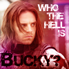
+ I find that the color is a bit 'forced and the subject is not highlighted so much. The font in this case does not help to beautify the icon, but it weighs the work. Maybe with a different type of font it could result a better work.
+ I like the crop in this icon, but I'm not sure about the text. The two text elements in the icon don't seem that well connected (my eyes are drawn to "bucky" before the actual beginning of the quote), so perhaps finding a way to position the two pieces of text closer together in a way which flows would work better. Picking a darker colour from the icon that isn't black also may have been better for the text at the bottom - there's no black elsewhere in the icon so while it does stand out, it doesn't seem like it fits with the rest of the icon.
+ The font and dark text on the bottom stands out and may have benefited from a less bold color, pehaps a darker shade of purple or even a light white that you used for the first part of your text. It would have belnded and tied the lines together.
ADDITIONAL VOTES
+ The soft monochrome coloring is nice here, but the icon could use a bit more contrast to bring out the shadows. I like the placement of the text, but a different font may have been a better idea - fonts like that look better at bigger sizes, where the 'ruined' effect can be seen well. At icon size, the jagged edges and 'debris' pixels look fuzzy and give the text a messy appearance. I think you had a good idea with the blocky, uppercase text, but I'd suggest using a 'clean' font instead, and maybe picking the colors for the text from the image, to tie the icon together.

kirtash_girlPOSITIVE VOTES
None.
BEST INTERPRETATION
None.
CONSTRUCTIVE VOTES
+ On my screen her face looks very oversharpen, and her body looks blurry. Leveling up those too would make a better combination.
+ This is a really rad concept for an icon and I really like how you have the black and white on the red background and the use of textures. The cutout is just a bit blurry for my taste, though it could just be my screen. I'd also suggest trying ways of integrating the text to more of the center of the icon, as right now it makes it feel a bit unbalanced toward the right. You could also just add more texture elements to the left side to balance it out.
+ The cut-out could have been better executed, because here it seems that for example part of her left arm was erased, making it look too thin to be natural. Also there is too much going on in the background, a simple red background without the texture would have help to focus more on the bubble and the text. And making her a bit smaller to make more room to that bubble of text would make the composition more well-balanced.
+ I like the composition, but the whole thing is rather blurry - her right arm and the speech bubble especially. Also, the text looks a bit basic and doesn't really fit in with the rest of the icon - she looks really classy but the text doesn't reflect that - and also the random purple looks really out of place.
+ I love the composition of the icon and the use of stark red to play off against the black and white of the subject. However, I do think the masking near her arms and shoulders could have been done better. Right now, its giving the subject wonky arms and shoulders. When you want to cut out a subject, one way to ensure that the cutout happens neatly is to zoom in really close as you mask away. That way, you dont get a really precise cutout.
ADDITIONAL VOTES
+ I like the contrast of black and white against color, but some of the edges are very soft and blurry while others are a little overly sharp. I would fix that to create more consistency. The text and speech bubble also look randomly squeezed into the icon, rather than looking like a natural part of it.
+ The composition of this icon is interesting, and I love the black & white and red color scheme, but there are some issues with sharpness and blurriness. I might be wrong, but it looks as if you used the brush tool to paint around the character instead of extracting her from the original background, and that resulted in soft, blurry edges, especially visible on her arms. If that's the case, I suggest using the pen tool instead - it can make the extraction look smooth and natural, but sharp. On the other hand, the image itself is too sharp, which led to bright outlines forming around dark parts; a simple solution to this problem is to duplicate the image before sharpening, and then erasing the problematic parts from the duplicated layer.

daaydreamerPOSITIVE VOTES
++ I love the negative space on the icon, and the text placement. Also I really like how she blends with the background, but not disappear completely.
++ I love the negative space and the coloring!
+ Beautiful color, great text work and perfect font choice
+ The warm coloring works very well. The icon is simple yet interesting.
BEST INTERPRETATION
None.
CONSTRUCTIVE VOTES
+ There's a good composition here and the text work is really nicely done too! It's just a little flat to me, I would play with the lighting of the icon just a little bit more. Her skin also looks a tad too orange.
ADDITIONAL VOTES
+ So cute! Love the text use, especially the font, and also the colours. The lines around Ariel are a tad blurry though - especially the top of her head.
+ Love the orange coloring and use of negative space but the icon could use a little sharpening.
Updated Scoring Spreadsheet
1ST PLACE [5 points]:
sietepecados with +8 votes.
2ND PLACE [4 points]:
katy_111 with +6 votes.
3RD PLACE [3 points]:
morpho90 with +5 votes.
BEST INTERPRETATION [2 points]:
emiels with +3 votes.
MODS CHOICE [1 point]:
applepips16
[What a super cute icon! The text work is great. The coloring is well balanced and really vibrant while also being really natural. And that little light blob just ties it all in together!]
TABLE KEY:
+++ = 1st Place Vote
++ = 2nd Place Vote
+ = 3rd Place Vote | Beginning of a new comment.
Note: Votes are not weighted in this round. Meaning a 1st, 2nd or 3rd vote will only give you 1 point when tallying the votes.
[Tiebreaker procedure:]Except in the case of a tie - then the icon with the most 1st place votes will be given first. This is upheld in all cases unless 1) the amount of votes is equal in all cases (i.e. 3 first place, 2 second place, and 1 third place) or 2) breaking the tie would result in an icon with enough first place votes to place being knocked out of a placing spot (i.e a third place tie between two icons). In these cases, ties will stand as is in order to maintain a sense of fairness for all participants.
ICON VOTES
marcasitePOSITIVE VOTES
++ I love the colouring, the lighting and the composition of the icon.
+ Pretty use of text and nice composition!
BEST INTERPRETATION
None.
CONSTRUCTIVE VOTES
+ The composition is nice but the light washes out the text and the icon overall is very blurry.
+ The different colors of text and the choppy letters make this look too busy. I think one or the other would have been fine. The coloring and softness of the rest of the icon are beautiful.
+ While I love the bright colors on this icon, some areas are too bright, and the background blends with the character's face. A simple solution to that could be to flip the background horizontally, to use the darker side to provide contrast for her skin. Also, I think you had a good idea for text here, but the wide letter spacing, use of multiple fonts and colors, both lower and upper case and text warping makes it look rather messy - there's too much variety for something as small as an icon. I'd suggest using only two or three of these elements in the future, to avoid overloading the icon.
ADDITIONAL VOTES
+ I like how you used the text and emphasized the D for your icon. The smoothness is also very nice. But I think it's a little too bright and her face kind of blends into the background. It may have looked better if the gradient were reversed to have the lighter side on the left and the darker side on the right.
+ The icon is really bright, the subject almost disappears into the background. Adding a multiply layer could help with this.
morpho90POSITIVE VOTES
+++ The composition and text work are absolutely great and the coloring is pretty well done, too.
+++ I love the composition of the text (that it fill the whole background), aslo I really like the grungy look on this icon.
++ I love the grunginess of the background reds here. The way you've utilized the text in the different parts of the background and with different colors makes this icon stand out in a really strong way. It's complex but not overpowering at all, I'm really impressed.
+ I think the text is really well done here, and the colouring is really well done especially since red can be quite a tricky dominant colour to use.
+ The reds in this icon are fantastic, I love the coloring. The text is executed perfectly too, covering the entire background in text could have made it distracting and messy, but sticking to one font helped avoid that.
BEST INTERPRETATION
None.
CONSTRUCTIVE VOTES
+ I love the texture use and composition, but I feel the text kind of lets it down a bit - the font is a bit boring and in places oversharpened (like the 'hell is' next to the gun).
ADDITIONAL VOTES
None.
emielsPOSITIVE VOTES
+++ The work done here is wonderful! So well thought and gorgeous composition!
+++ The mix of text and characters is really well done, especially the correlation between character, text and color
++ The composition of this is fantastic. I thought this was a promo image before I clicked on the cap and saw that you used three different ones. I love that you matched the colors of each character to the letters. There was definitely a lot of work and attention to detail that went into this and it shows. A few edges are slightly oversharpened and I'd smooth those out, but great work overall.
+ I love the text arrangement and the way the letters seem to have some sort of a 3D effect.
BEST INTERPRETATION
+ No reason provided.
+ No reason provided.
+ This icon immediately caught my attention. It's very unique, with the way the text interacts with the subjects both in placement and color.
CONSTRUCTIVE VOTES
None.
ADDITIONAL VOTES
None.
novindalfPOSITIVE VOTES
+++ Beautiful, vibrant red! I love the grunge as well!
BEST INTERPRETATION
+ No reason provided.
+ Anyone who's seen or even heard of Once Upon a Time will know who this icon is about. The fiery reds fit perfectly and I like how you added her name but made the 'R's stick out and be noticed. Plus, the fact that all that text is in the background makes the focus stay on Regina rather than being distracting and overcrowding everything. I also like the subtle touch of light flames on her blazer.
CONSTRUCTIVE VOTES
None.
ADDITIONAL VOTES
+ Lovely use of text in the background! I think it is really cool how you put the letter R in a different color so it stood out more. On my screen, the subject's face is a bit pixel-y, maybe a mite too much redness vibrancy? I think if you used an adjustment layer or similar to cool her skin tone down a little bit it would look great.
ghanimasunPOSITIVE VOTES
None.
BEST INTERPRETATION
None.
CONSTRUCTIVE VOTES
+ I love the crop here, however, I think the text placement makes it a bit unbalanced with its horizontal orientation clashing with the vertical lines in the background.
+ I think the crop here is really nice and has created some interesting negative space within the icon. However, the text sort of feels like it's just floating there at the top of the icon. Perhaps making it larger to give it more attention and tilting it to create a sense of direction in the composition (rotating it sort of diagonally, think the same sort of angle her face is pointing in) would help to create a flow in the icon, as well as experimenting with font choices and the colour of the text.
+ I think this is a very solid simple icon, with a nice natural coloring and a good crop. However, the text doesn't fit with the rest of the icon at all - it looks awkwardly placed, and it disturbs the balance of the icon. Since the crop puts the character in the lower left corner, the text would look best if it filled the empty space in the upper right part.
ADDITIONAL VOTES
None.
queen_bartoniaPOSITIVE VOTES
+ Lovely coloring, and the composition is also quite nice. I like that it has that vintage feel, although I'm not 100% sold on the text as it seems to clutter up the icon a bit too much. Maybe taking out one of the text sections, like the one on the top left, would make it work better.
BEST INTERPRETATION
None.
CONSTRUCTIVE VOTES
None.
ADDITIONAL VOTES
+ This is a really, really cool composition! Love the different ways you've worked the subjects, colors and text in! It's a bit too sharp on the subjects in my screen, they have become a bit pixelated, but overall this icon is super cool.
+ I think this icon has a nice composition and a lovely vintage coloring that goes well with its subject, but there are a few problems with the text. Instead of repeating the entire title, splitting it between the two empty spaces might have been a good idea, since that way you'd have enough space to include actually include the entire title, rather than 'breakfast Tiffany' and 'Tiffa breakfast at', which looks rather odd. Also, the text on the lower part could stand out more from the background.
vaporPOSITIVE VOTES
None.
BEST INTERPRETATION
None.
CONSTRUCTIVE VOTES
+ Beautiful crop of the character but the text blends in a little too much losing its distinctiveness. The glo around the letters detract from the text itself and causes it to look a little smudged
+ The muted colors are really beautiful, but the bright red doesn't match them very well. I think a lighter shade of brownish yellow in the background would have made for a more balanced icon.
+ I know the theme is text, but the text in this icon is a little overpowering. It takes all the attention from the subject. Perhaps choosing a simpler, thinner font and make it white or use the eyedropper tool to pick a color that is already in the screencap could make the whole icon "come together" better.
+ I really like the light on this one, but the text is very dark on my monitor, and it's hard to read it. Especially on the right side. Maybe brighter shade of red, or contrast under the text would help make it more readable.
+ I like how the icon is set, but i don't like so much the text because it doesn't create harmony with all the rest. Another font with another color, could be better for me
ADDITIONAL VOTES
+ I like the image part of this icon - the coloring fits the mood, and the light textures add an interesting eerie glow, but the text looks as if it was meant for a different icon. The deep red color doesn't go well with the brown tones of the icon, and there's not enough contrast to make it stand out. I'd suggest using a lighter color picked from the background, moving the text up to the middle, and setting it on screen, to make the composition of the icon more cohesive.
+ The color of the text doesn't really match with the icon, and the overall look is far too dark. I think taking away that glow (?) behind the text and making it a lighter color, say light beige, would tie everything together much better.
katy_111POSITIVE VOTES
+++ I really love the clean composition of this icon. Centering the image with the text creates such a nice line down the middle that is just super pleasing to look at. I really like the colors and lighting you've gone with as well, it fits really cohesively. And kudos for pulling of all white text on a background that's not super dark, that's often really tricky to do!
+++ I love the text work here! The composition of this icon being vertically aligned is really nice too and the texture work is great
+++ I love the color tones used and how it was set to work. I also really like how you've used the letter choice, simple but effective. Really a great job
++ The composition of this icon is great, the image and the text only fill about 1/3rd of the icon, but it doesn't feel empty at all. The purple coloring and the simplicity of the composition create a lovely elegant look and the subtle light textures really tie it together.
+ Lovely colours and composition here, and great texture use and cutting-out. I feel as if it needs a little more contrast though.
+ I like the overall composition, and coloring on this one.
BEST INTERPRETATION
+ No reason provided.
+ It's clear what your letter choice was and it stands out perfectly
CONSTRUCTIVE VOTES
None.
ADDITIONAL VOTES
+ I really like the colors and composition here, as well as the interesting way you showcased your letter.
midnightisclosePOSITIVE VOTES
None.
BEST INTERPRETATION
None.
CONSTRUCTIVE VOTES
+ All the light really washes out the icon and the S looks out of place.
ADDITIONAL VOTES
+ There's some nice lighting work happening here, and I like the warm colors, but the letter looks really randomly placed in. It may have looked better in a small line of text with that letter emphasized. By itself it doesn't add anything to the composition, and in fact makes it look more unbalanced because the S is much taller than the subject.
+ The soft glow you achieved via the use of light textures is nice, but the beige one on the top overpowers the image a bit. As a result, there are three big elements fighting for attention in this icon - the big S, the bright top of the icon and the dark image - and none of them are central enough to be the focus. I'd suggest erasing some of the light textures, to create a left/right balance between the dark image and the bright text on the right side of the icon.
deternotPOSITIVE VOTES
+++ I absolutely love the crop in this icon, and the text is really well done. The muted, monochrome colouring also works really well.
BEST INTERPRETATION
None.
CONSTRUCTIVE VOTES
+ I love the composition of the text and how readable it is, however, I cannot make out the subject at at all properly. The crop and the texture are both very obscuring. I think a different crop and no texture (grainy one that is) would have made for a more neatly composed icon.
ADDITIONAL VOTES
+ You had a good idea here, but the lack of contrast and the crop make it rather hard to see what's going on in the background. I think making the crop a bit wider, or moving it to the right to include more of the character's face would make it less confusing. Also, the fact that there's 1px space between the first line and second line of the text, and 3px between the second and the third makes the text look slightly sloppy; it's a very minor thing, but moving the third line up would give the text a move polished look.
+ I like the bold text use, but at the same time it kind of obscures the subject so it's hard to tell what's going on.
+ If I hadn't looked at the original screencap, I'd have no idea what was in the icon. If her face wasn't cropped off and the text was a little smaller, it could be better.
margerydaw_s2POSITIVE VOTES
+++ Love the coloring on this. The teal coloring of the text goes really well with the pink of the background.
++ Beautiful color contrasts ... The pink and turquoise are very well together and I also really like the cut
++ I really like the colouring and texture use in this icon!
BEST INTERPRETATION
+ I think it is really cool and creative how you treated the text as almost a background texture, turning it into a decorative element to the icon. Your font choice was perfect for how you chose to use the text, it keeps it recognizable but also makes it seem more decorative/artistic.
CONSTRUCTIVE VOTES
+ I like the composition of this icon! I'm not sure about the text though especially because you've used intro inline, the red background that makes up the inline clashes with the green text. I would recommend using a solid font or even changing the colour of the text (white would probably work best, or even a light pink)
ADDITIONAL VOTES
+ The colouring is very pretty and I love how the text also acts as a decorative element.
naginisPOSITIVE VOTES
+ Great vintage coloring and lovely text.
+ I love the lights in this work and the contrast between the subject and the background. I also like how you put the text on the icon
+ Great text work! I really like the colouring of this icon too!
BEST INTERPRETATION
None.
CONSTRUCTIVE VOTES
+ I like that muted coloring on Walt, but I feel the text, background and subject's cutout with the slashed edges of the subject don't add up to make a cohesive icon. The font is more intricate and attention-grabbing while the rest is quite minimal, so the look is very conflicting. Perhaps a busier background and slightly less busy font would've matched together more.
ADDITIONAL VOTES
+ I love the coloring here, the limited color scheme gives the icon a very interesting vintage look. The way you cut off Walt's body is rather odd though, especially since it's soft and smudgey on the right, and jagged on the left - keeping it the same on both sides might have been a better idea.
+ Love the colouring and the placement of text. The Mustang font is not always easy to read but in this case it works perfectly.
slytheringurrlPOSITIVE VOTES
None.
BEST INTERPRETATION
+ Nice choice of text and subject. Being creative by using your letter in a way that isn't just a subject's name or title like many of the other icons.
CONSTRUCTIVE VOTES
None.
ADDITIONAL VOTES
+ I think this icon has an interesting composition, and I really like the typography, but the blurriness of the character's face looks rather out of place in the otherwise sharp icon. I like the idea behind the composition, but the icon looks too heavy in the lower left corner, and empty on the right - placing some of the text over the black parts could make it look more balanced.
sietepecadosPOSITIVE VOTES
+++ I like everything about this icon - the bright and vibrant coloring, the creative and cute text, and the subtle texture that adds some colors to the icon and makes the greens pop. Great job, I love it!
+++ I love the neat arrangement of text, the beautiful soft colouring and the fantastic texture use. Also, the subject is so adorable!
+++ I love the vibrant coloring here! The way you played with the text is also really great. I love the floating letters and how the word makes a clockwise circle. Nice texture use in the background as well with those multicolored stripes.
++ cute cut out and text work in arrangement
++ A very cool way of using text to create an interesting icon.
++ This is so cute! The coloring is so soft and lovely, and the letters are very fun and creative.
++ This icon is so cute! I love the text work and there's a good use of textures too with the yellow/blue lines framing the character
+ The text placement is really good. I like how it circles around Mike, it keeps the focus on him.
BEST INTERPRETATION
+ No reason provided.
+ The chosen letter is very visible but does not seem out of place in the composition of the icon.
CONSTRUCTIVE VOTES
+ This is a super cute icon, I really love everything you've done with the text! I'm not sure about the blue and yellow stripes, though, they don't really tie into other colors in the icon and so pull the focus a bit. I honestly feel just the text could carry the icon without any other complex elements, but you could also look into expanding those color sections so they feel more wholesome, have more blue and yellow texture pieces?
ADDITIONAL VOTES
+ It's cute, but the whole thing looks a bit washed out - the masses of white letters and the really light colours are a bit overwhelming, and it could do with a bit of contrast to balance that out.
val_valeriePOSITIVE VOTES
++ Great texture and text use! I also love the dual-tone colours going on, with the slight hint of the blue in the text and his eyes and the background to bring it all together.
BEST INTERPRETATION
None.
CONSTRUCTIVE VOTES
+ I like the composition, but Derek is much too dark against the background. Adding some contrast would lighten up certain parts of his face and make the icon stand out that much more. I'm also not sure about the text. I can't really read it and the placement seems a little haphazard. Perhaps spreading out the letters to kind of "float" them around the icon would have looked better.
+ The text is almost impossible to read. Just making it a bit bigger would make this a really pretty icon because the font choices and the colors are really pretty.
ADDITIONAL VOTES
+ Good job on the muted coloring, and the balance between light and dark parts of the icon is great, but the text is completely illegible - I can't make out the second line at all, both due to its tiny size and the color that blends with the background. I assume you picked it to match Derek's eyes, which is a nice touch, but making it darker, or placing it over a darker part of the icon, would help with the legibility.
+ This is a really beautiful composition, well done. I like the muted tones you've got going here, it is really nice, and I love the way the blue tones tie in to each other in his eyes and the text. His face appears a bit dark on my screen, so I might suggest brightening him up a little bit.
applepips16POSITIVE VOTES
++ Great coloring, the blue and yellow mesh well together and the arching of the text works nicely.
BEST INTERPRETATION
+ No reason provided.
CONSTRUCTIVE VOTES
None.
ADDITIONAL VOTES
+ Really cute coloring in this.
+ I like the brightness of this icon, especially with that little light texture/blob on the left to give it some dimension. The text is also cute and fun, which is very fitting with the subject.
+ I really like the idea of this icon, but Pikachu looks a bit muddy in colouring which doesn't really fit with the bright vibrant tones of the rest of the icon. Also, I think you could have used a less plain font to make it pop a bit more.
kayablePOSITIVE VOTES
+++ Such a fun and creative icon!
+++ I LOVE the composition of this icon - the way he seems to be emerging out of the circle, to grasp hold of the K (great incorporation of the letter to make it more prominent) - and the colours and lighting are really nice too.
++ I love the creative composition of the icon. The diagonal orientation makes it more dynamic.
+ This icon grows on me the more I look at it! At first I just noticed the really nice different colors, then I noticed how you integrated the text into different parts of the image, then I noticed how you treated the colors of the text to reinforce the color palette as a whole… there's just so much here I like!
BEST INTERPRETATION
+ No reason provided.
+ I really like how you make your chosen letter stand out against all the other text.
CONSTRUCTIVE VOTES
None.
ADDITIONAL VOTES
+ Great composition and colors in this icon! I really like how you did the text and made sure the K stood out.
+ I'm a big fan of the text here, especially the part on the bottom - I love how you used multiple colors but kept it simple enough to avoid messiness. I think the background you used for the text is too bright and doesn't provide enough contrast, so the text doesn't stand out enough. The icon has a great composition though, very creative use of different shapes!
julie_izumiPOSITIVE VOTES
None.
BEST INTERPRETATION
+ Out of all the icons in this challenge, I think yours does the best job of displaying the chosen letter prominently. The letter, despite its size, doesn't overpower the image; instead, it frames Zelena's face quite nicely, so great job! My only suggestion here would be to set 'alousie' to uppercase; if all letters had uniform height, you'd have been able to place them in the middle of J without any letters touching the edges.
CONSTRUCTIVE VOTES
+ There are great colors here and I love the crop, but I feel like the blocky font doesn't fit the icon. I think going with a handwritten font would make this much better.
ADDITIONAL VOTES
+ Love the composition and how the rest of the text falls neatly within the J.
sgflutegirlPOSITIVE VOTES
None.
BEST INTERPRETATION
None.
CONSTRUCTIVE VOTES
+ I find that the color is a bit 'forced and the subject is not highlighted so much. The font in this case does not help to beautify the icon, but it weighs the work. Maybe with a different type of font it could result a better work.
+ I like the crop in this icon, but I'm not sure about the text. The two text elements in the icon don't seem that well connected (my eyes are drawn to "bucky" before the actual beginning of the quote), so perhaps finding a way to position the two pieces of text closer together in a way which flows would work better. Picking a darker colour from the icon that isn't black also may have been better for the text at the bottom - there's no black elsewhere in the icon so while it does stand out, it doesn't seem like it fits with the rest of the icon.
+ The font and dark text on the bottom stands out and may have benefited from a less bold color, pehaps a darker shade of purple or even a light white that you used for the first part of your text. It would have belnded and tied the lines together.
ADDITIONAL VOTES
+ The soft monochrome coloring is nice here, but the icon could use a bit more contrast to bring out the shadows. I like the placement of the text, but a different font may have been a better idea - fonts like that look better at bigger sizes, where the 'ruined' effect can be seen well. At icon size, the jagged edges and 'debris' pixels look fuzzy and give the text a messy appearance. I think you had a good idea with the blocky, uppercase text, but I'd suggest using a 'clean' font instead, and maybe picking the colors for the text from the image, to tie the icon together.
kirtash_girlPOSITIVE VOTES
None.
BEST INTERPRETATION
None.
CONSTRUCTIVE VOTES
+ On my screen her face looks very oversharpen, and her body looks blurry. Leveling up those too would make a better combination.
+ This is a really rad concept for an icon and I really like how you have the black and white on the red background and the use of textures. The cutout is just a bit blurry for my taste, though it could just be my screen. I'd also suggest trying ways of integrating the text to more of the center of the icon, as right now it makes it feel a bit unbalanced toward the right. You could also just add more texture elements to the left side to balance it out.
+ The cut-out could have been better executed, because here it seems that for example part of her left arm was erased, making it look too thin to be natural. Also there is too much going on in the background, a simple red background without the texture would have help to focus more on the bubble and the text. And making her a bit smaller to make more room to that bubble of text would make the composition more well-balanced.
+ I like the composition, but the whole thing is rather blurry - her right arm and the speech bubble especially. Also, the text looks a bit basic and doesn't really fit in with the rest of the icon - she looks really classy but the text doesn't reflect that - and also the random purple looks really out of place.
+ I love the composition of the icon and the use of stark red to play off against the black and white of the subject. However, I do think the masking near her arms and shoulders could have been done better. Right now, its giving the subject wonky arms and shoulders. When you want to cut out a subject, one way to ensure that the cutout happens neatly is to zoom in really close as you mask away. That way, you dont get a really precise cutout.
ADDITIONAL VOTES
+ I like the contrast of black and white against color, but some of the edges are very soft and blurry while others are a little overly sharp. I would fix that to create more consistency. The text and speech bubble also look randomly squeezed into the icon, rather than looking like a natural part of it.
+ The composition of this icon is interesting, and I love the black & white and red color scheme, but there are some issues with sharpness and blurriness. I might be wrong, but it looks as if you used the brush tool to paint around the character instead of extracting her from the original background, and that resulted in soft, blurry edges, especially visible on her arms. If that's the case, I suggest using the pen tool instead - it can make the extraction look smooth and natural, but sharp. On the other hand, the image itself is too sharp, which led to bright outlines forming around dark parts; a simple solution to this problem is to duplicate the image before sharpening, and then erasing the problematic parts from the duplicated layer.
daaydreamerPOSITIVE VOTES
++ I love the negative space on the icon, and the text placement. Also I really like how she blends with the background, but not disappear completely.
++ I love the negative space and the coloring!
+ Beautiful color, great text work and perfect font choice
+ The warm coloring works very well. The icon is simple yet interesting.
BEST INTERPRETATION
None.
CONSTRUCTIVE VOTES
+ There's a good composition here and the text work is really nicely done too! It's just a little flat to me, I would play with the lighting of the icon just a little bit more. Her skin also looks a tad too orange.
ADDITIONAL VOTES
+ So cute! Love the text use, especially the font, and also the colours. The lines around Ariel are a tad blurry though - especially the top of her head.
+ Love the orange coloring and use of negative space but the icon could use a little sharpening.
Updated Scoring Spreadsheet