Round 14 - Challenge 03 - Results
ROUND 14 - CHALLENGE 03 - RESULTS
1ST PLACE [5 points]:

emiels with +11 votes.
2ND PLACE [4 points]:

daaydreamer with +6 votes.
3RD PLACE [3 points]:

naginis with +5 votes.
MOST CREATIVE [2 points]:
naginis with +7 votes.
MODS CHOICE [1 point]:

novindalf
[The muted coloring and smoky use of light really create an atmospheric icon!]
TABLE KEY:
+++ = 1st Place Vote
++ = 2nd Place Vote
+ = 3rd Place Vote | Beginning of a new comment.
Note: Votes are not weighted in this round. Meaning a 1st, 2nd or 3rd vote will only give you 1 point when tallying the votes.
[Tiebreaker procedure:]Except in the case of a tie - then the icon with the most 1st place votes will be given first. This is upheld in all cases unless 1) the amount of votes is equal in all cases (i.e. 3 first place, 2 second place, and 1 third place) or 2) breaking the tie would result in an icon with enough first place votes to place being knocked out of a placing spot (i.e a third place tie between two icons). In these cases, ties will stand as is in order to maintain a sense of fairness for all participants.
ICON VOTES

queen_bartoniaPOSITIVE VOTES
+++ the crop is well done and the coloring and texture work well. the scene is very recognizable and framed well.
+++ Gorgeous colouring, fantastic texture and lighting work. Really makes the subject pop.
++ The rich coloring is really interesting and intriguing. It's a little bit on the too sharp side though.
MOST CREATIVE
None.
CONSTRUCTIVE VOTES
+ I like the colors you used here, but I think that gritty, smoky texture use feels out-of-place and doesn't add much to the icon. The white also makes the icon look a little LQ. If you had to use it, I'd suggest using a color fill layer on yellow, blue or some other color on multiply or color, then adding that as a clipping mask to the texture (which I assume is set on screen). That would add other pops of color and wouldn't make the icon look faded. However, I think it'd look much better with no textures whatsoever. It's also overly sharp in parts, like the guy on the left's arm and the guy on the right's shoulder.
+ The cropping is lovely and I like the cratch texture, but the icon appears too pink. I suggest that you have an eye on the brightness of the coloring, because it can happen that the background become too pixelated. It would be better to use a more pale coloring in this one or you can play with the light, maybe some white highlights can loosen up the brightness.
ADDITIONAL VOTES
+ This icon has a good planning and the scene is very representative.The color is quite good too, maybe the only thing that messes up the work is that texture... I think that it doesn't blend that much with all the rest.

marcasitePOSITIVE VOTES
++ It's a very brave crop, really well done. The muted coloring is also amazing, I love it.
MOST CREATIVE
+ No reason provided.
CONSTRUCTIVE VOTES
+ I like the crop, but the image is a bit flat and grainy. Maybe more contrast or a lighter texture might help.
+ I love the crop that you've chosen here! I'm not sure if it's because of the image but it does seem a little pixelated to me - I can see the patches of pixels especially around the eye area. I would also brighten the icon just a tad more.
+ The crop works well, but the icon is somewhat flat. Maybe a B&W gradient set to soft light or duplicating the icon and setting it to soft light or hard light would give the more contrast.
+ I like the crop here, it's a really nice example of a simple, yet effective close crop. However, the image looks quite fuzzy and grainy, as if it was cropped from a small section of a big screencap, or from a small, LQ screencap. If that was indeed the case, I suggest using screencaps more appropriate for close crops, i.e. HQ screencaps of scenes where the character's face takes up a significant portion of the screen, since these result in much sharper, HQ icons. If this is not the case, sharpening the whole image, then smudging or blurring the grainy parts could help combat the quality issues. Alternately, you could add a grainy texture to make the graininess more prominent, and therefore give it a more deliberate look.
+ I like the crop in this icon, but I feel like as a whole it's a bit dark and unfocused. Adding some extra contrast and sharpening more would help this icon to stand out.
+ I love how you crop the image, it fits perfectly for an icon. But the overall image appears too dark, especially at the eye. I would suggest a more vibrant coloring, because the icon appears a bit pale, you can give her skin a more bright and brown/yellow coloring. Furthermore it would be good idea to give the icon more sharpness and you can also play with lightning textures.
+ This is a truly lovely crop and I'm really into the coloring you used here. Using the darker shades make the icon feel more intimate. That said, on my monitor it appears fairly blurry. I'd suggest giving it a bit more sharpening, especially around her eyes and mouth.
+ I like the crop you have here, but it's much too blurry. I don't know if it's a filter, perhaps an attempt to have a painted look or if it just wasn't sharpened enough, but it's very fuzzy. There are also parts of her face that have odd lines on them and that makes the icon look more LQ. I'd try sharpening up the edges and then smoothing down the parts in between.
+ It's a little too washed out and grey to see the subject completely. Adding some more contrast and perhaps some brightness could liven up the icon a bit.
ADDITIONAL VOTES
None.

morpho90POSITIVE VOTES
++ The crop is awesome and the coloring is lovely as well. Especially the yellow lightning fits perfectly to the the face.
MOST CREATIVE
None.
CONSTRUCTIVE VOTES
+ I love the lighting of this icon! I would nudge the cap just a little further down though, so it doesn't cut off his eye a little awkwardly. Also, his skintone is a litttttle too red in that top left corner.
ADDITIONAL VOTES
+ The crop, with Bucky's eyes up near the corner, really highlights the emotion of the icon.
+ Nice coloring, but the crop itself is a little awkward. I think a close crop would've worked better, or a slightly zoomed out one that centers his face.
novindalfPOSITIVE VOTES
+++ Great purple coloring and use of light.
+ I love the texture used and the way the softness of it brings out the image.
MOST CREATIVE
None.
CONSTRUCTIVE VOTES
+ I really enjoy what you did with the background here. You used of lighting and textures gives it a lot of interest and I'm glad you played up the contrast between the cool colors of the background and the subject's warm clothes. The subject does appear a bit blurry on my monitor, however, and a bit under-contrasted. If you upped those two elements I think this icon would be perfection.
ADDITIONAL VOTES
+ I love how it was given prominence to this subject, leaving the background alone. I also really like how you used the lights .
sgflutegirlPOSITIVE VOTES
None.
MOST CREATIVE
None.
CONSTRUCTIVE VOTES
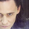
+ The muted colours are nice, but the crop is rather odd - there's too much of his forehead showing and it makes it the focus point which isn't really what you want to be looking at on Loki's face! Would look better with him shifted up so there's less of his forehead in the icon, and also some more contrast.
+ I don't really like this icon's cut , it doesn't give continuity to the work and maybe you could have solved the problem by moving a little loki's face on the left and slightly higher in the icon. Also the coloring could have been lightly more marked, so that some details could show up.
+ I think a side crop is a good idea for this screencap, but the crop you used here is a bit awkward, as if you couldn't quite commit to cropping off half of Loki's face. Moving it to the left, in order to completely hide his right eye, would make the crop stronger and more interesting; if you added a bit more contrast on top of that, to make his facial features stand out more, it would be a really good icon.
ADDITIONAL VOTES
None.

applepips16POSITIVE VOTES
++ great crop. the bright colors and lighting work well here.
++ I really like the bright, bold colors. I like how the light behind the subject helps to emphasize the subject.
+ There's some really lovely coloring going on here, and the negative space is nice too. It slightly bothers me that the cropping is off-kilter and Scott's not in the middle, but at the same time it's interesting how the dirt meets the darker area of green to make up half of the icon. That's an interesting play with darker and lighter elements in balancing everything out.
+ I like how you crop the image. The bright coloring is lovely as well and I like the idea with the little border on the bottom of the icon.
MOST CREATIVE
+ No reason provided.
+ Going for a wide-crop that isn't centered on the subject is a really creative choice, I like it! I also like how you have the icon divided in two almost with the dark and the light section. It really elevated the wide crop to something more.
CONSTRUCTIVE VOTES
None.
ADDITIONAL VOTES
+ I really like the crop here, and how you emphasized the pale/vibrant division to create balance in the icon. Scott's skin is a bit too yellow though - the rest of the icon, although vibrant, is naturally colored, so giving his skin a more natural shade might have been a better choice.

margerydaw_s2POSITIVE VOTES
+++ The lighting in this icon is so gorgeous, and I find the crop quite interesting.
++ The crop here is simple, but perfectly executed, and the rotation makes it more interesting. I like the coloring a well, it's just a very good icon overall.
+ Nice coloring and nice use of a slight crop rotation to make it stand out a bit more.
+ The coloring is great, and the central crop seems perfect for the cap. The lighting is also very well used and balanced.
MOST CREATIVE
None.
CONSTRUCTIVE VOTES
None.
ADDITIONAL VOTES
+ Really pretty coloring on this one!
+ I really like the cut and the lilac shade you used.
+ Lovely colours and crop, but a little on the blurry side.
+ I like the crop and light texture, also the coloring is really pretty.
+ I love the soft purple colouring of the icon. The rotation of the crop is interesting too.
daaydreamerPOSITIVE VOTES
+++ I love the soft coloring and the lighting in this icon.
+++ The crop is absolutely beautiful and the lighting is pretty much perfect.
+++ The crop here is just completely lovely and the lighting highlights it perfectly. I really like that you put the lighting on the side of her face that is more tilted up, it makes the icon feel really natural even with such strong lighting. Great sharpening, too.
++ I like the crop here and the colouring is really pretty too!
+ Lovely and crisp, interesting crop, nice lighting.
+ I like how you've gone for a very different close crop than everyone else, and the lighting and muted colouring is so pretty.
MOST CREATIVE
None.
CONSTRUCTIVE VOTES
+ I like the coloring, but on my screen the icon looks too sharpen. I think smoothing the layer out with the blur tool (at a low opacity) would help.
+ The lighting and natural coloring is really pretty, but the cropping is a bit strange. The focal point seems to be the parting of her hair. Maybe if it was cropped a bit further down so her eyes would be the focus could help.
ADDITIONAL VOTES
+ Great crop and coloring, they give the icon a dreamy, mysterious mood. It's a very nice icon, but some areas are a tad oversharpened, especially her hairband and hair in the center of the icon - you can see some jagged edges and lighter pixel borders in those places. I suggest using the blur tool at very low strength on these parts, that could help make the icon perfect.
+ Lovely crop and muted coloring. I especially like seeing the dark to light gradient over her hair.
naginisPOSITIVE VOTES
+++ The coloring is so gorgeously light and pastel in this icon. I love everything about it. And the texture use in the background adds just enough while still keeping the icon simple and with a good amount of negative space.
++ The vibrant coloring is really well done.
++ I really love the coloring choices you've made here. The greens and the cyans work together really well to make this icon stand out as being very unique. I like that you've made the subject a bit darker and sharper than the rest, it makes him stand out from the background in a really clear way so that the background doesn't seem overpowering.
++ Great colouring, love how it's almost both vibrant and muted at the same time. Also really inventive use of the negative space, while keeping the original background.
++ I like the shades you made use of: the work results very light and soft. I also really like how's been placed the subject , in the icon's centre.
MOST CREATIVE
+ No reason provided.
+ No reasons provided.
+ No reason provided.
+ the background coloring/filter and coloring work well here
+ Awesome coloring work, I like your bright and unsual coloring style.
+ I really love the creative colouring and use of negative space here!
+ I think the coloring of this icon really sets it apart. On the one hand, you can see that Bran is walking on something, but it looks as if he is walking on air at the same time. I don't know if you intended for the optical illusion, lol, but either way, well done.
CONSTRUCTIVE VOTES
None.
ADDITIONAL VOTES
+ I like the coloring of this icon, and the 'flat' look it has, but the green texture(s) overpower the icon. The diagonal lines are interesting and could look great, if it weren't for the green blob on the left side - it obscures too much of the background, and ruins the symmetry you created with the central crop. It doesn't necessarily have to go; lowering its opacity so as to show more of the background would probably be enough.

julie_izumiPOSITIVE VOTES
+++ I really the light and shadow in this one. The Coloring is soft and unagitated and I like how the face disappear into the dark.
++ Nice close crop and the use of light and shadows works well here.
+ Lovely crop and amazing light work.
MOST CREATIVE
None.
CONSTRUCTIVE VOTES
None.
ADDITIONAL VOTES
+ I love the simplicity of this icon immensely. It works really well with the crop you chose. However, while her hair is nice and bright, her face seems a bit dark to me and I'd like to be able to make it out a bit more. You could experiment with light textures or contrast layers to see what makes her pop!
+ The crop is lovely and I love the heavy shadows of the icon contrasted against the lightness of the subject's hair.
+ This icon has a very clear idea behind - the screencap choice, the below eyes crop, the muted coloring and the deep shadows all work together to create a strong sense of mystery, and I like it a lot. But I think you might have gone a bit too far with the 'deep shadows' part - the fact that the right side of the icon is a solid black gives it a slight 'floating head' look that could have been avoided if some of her neck and features visible in the shadows.
emielsPOSITIVE VOTES
+++ Great close crop plus the subtle coloring gives the icon a quiet power.
+++ The heavy contrast and yellow coloring fits well with the screencap. The icon stands out from the rest. I do wish it was a little less sharp, though.
+++ I love this icon because it has such amazing shades. The crop is wonderful and that vaguely vintage look on the subject makes the work look stunning. I really like how the yellow background was used like emphasis for its face too.
+++ The crop is great and the coloring soo lovely. Particularly appreciate the yellow background which gives so much power to the icon!
+++ Close crops sometimes seem weird; this one just looks stunning. The color is lovely. It may be a tad too sharpened for my taste, but even so, it's beautiful.
+++ Everything in this icon is perfect. The vibrant colors, the light and shadow and the crop!
++ I really like the bold colouring in this icon and you've acheived a really good balance between light and shadow.
++ Beautiful close crop, and I like how crisp and sharp the edges look without being overly sharp. It adds a grittiness to the image despite the icon being so sunny and bright.
++ What a lovely crop and what is more, such lovely sharpening. I love the way her features and her hair are so cripsly detailed without being overly pixelly.
+ the crop accentuates the subject well. the coloring also works well with the added yellow background.
+ I really like the colouring here! It's just a little too sharp (or burnt/grainy?) on the lower edge of her face (where it meets her hair)
MOST CREATIVE
+ No reason provided.
+ No reason provided.
CONSTRUCTIVE VOTES
None.
ADDITIONAL VOTES
+ The crop and colours here are gorgeous! Love the vibrant background to bring out all the colours.

slytheringurrlPOSITIVE VOTES
None.
MOST CREATIVE
None.
CONSTRUCTIVE VOTES
+ The colours here are lovely, but it's all a bit too bright which makes it hard to identify the subject and everything looks a bit washed-out, and it's a little bit sharp, especially around the two people.
+ I like the crop a lot but the icon is so bright that I can barely tell what it is. I like the contrast of the whites and the blues, but I think using selective color to make the whites even a little less white would be really nice. The icon also seems a bit blurry to me. Maybe using unsharp mask or smart sharpen would help so it's not too blurry or sharp!
+ I like the crop, but the icon is a bit too bright and the lighter parts of the man's leg are blending with the background, giving them an awkward look.
+ I like the colouring and I like the lighting of the icon too. However, I do think that the right side of the icon is overly bright. That side looks washed out. That could be fixed by painting that side with few blobs of black, blurrring it and setting it on softlight.
ADDITIONAL VOTES
+ The wide crop really works here to establish the setting while keeping the subject (House?) in the center. I adore the blue coloring which gives the icon a light, airy feel. The one thing is that there is a lot of white in the icon, which is pulling the eye away from your subject. By adding a selective coloring layer and increasing just the Cyan under the Whites would fill in the background with a little more color, making your subject stand out better.

deternotPOSITIVE VOTES
+++ I can't believe you got this icon out of such a small lq cap! I love the lighting and colouring here and perfect sharpness too!
+++ It's impressive how good this icon looks, considering how small and fuzzy the original screencap was! I like how you added some colors and shapes to spice it up, but without overloading it, and the slightly undercontrasted softness of the icon. It's definitely not the flashiest icon of this post, but it has an understated appeal that makes it my number one here.
+ This icon caught my eye almost immediately. The vintage-y coloring of beige, brown, pale orange and dark red all go well together. What really makes the icon are the intricate vines that stretch out. The one thing is that with all of these elements, your subject gets a little lost in the middle. He/she does not stand out in any way. Perhaps if you make that person into a silhouette then a lone dark figure in the middle would stand out more.
MOST CREATIVE
+ No reason provided.
CONSTRUCTIVE VOTES
+ The icon has nice natural coloring but overall it is way too blurry and the white light at the top left doesn't help that.
+ This is an interesting icon, and I like the texture used, but it's hard to tell what the image is.
ADDITIONAL VOTES
+ I want to like this but I can't really tell what's going on! The multiple textures may be too much - I'd suggest choosing the background one(s) or the main floral-y one only. I actually think it's the BG one(s) that are bothering me. They're different colors and the rectangles are distracting. I have no clue what the subject is, but I really want to. I know this would be amazing if it was a little less textured!
+ This is a really lovely far crop, and I like that the vines/branches add enough to the space so it's still pretty complex. However, it's a little too blurry and light, and I had to focus more on the icon before I could make out what the subject was.

ghanimasunPOSITIVE VOTES
None.
MOST CREATIVE
None.
CONSTRUCTIVE VOTES
+ I like the cut, but its extreme coloration makes all look so LQ, above all in the work's bright parts.
+ I think this is a little blurry in the rop right corner and a little too sharpened in other places. I think this may have more to do with the quality of the cap than anything else, though - so maybe try finding one with less movement. I like the direction the color was taking but it's a little overdone I think. It seems like selective color was used. I would suggest bringing down the yellows a bit, or even just lowering the opacity of the layer overall.
ADDITIONAL VOTES
+ It's a little too bright and there isn't enough balance of light between her face and body, so it looks a little like she's floating since the neck down is so dark.

val_valeriePOSITIVE VOTES
None.
MOST CREATIVE
None.
CONSTRUCTIVE VOTES
+ the blue and yellow coloring is nice; the subject's face looks too pink however.
+ This icon is a bit dull to look at. I think upping the contrast would be a good way to make the subject stand out.
ADDITIONAL VOTES
+ this is a good crop, although for a distant crop it feels a little too close to the subject.

kayablePOSITIVE VOTES
+ It's really cool what you've done with the crop here, I really like the rotation. I also really like the dark to light feel you've got going here, it gives a creepy mood to the icon that I like a lot! I'm not really sure about having both the text and the brain texture, they kind of feel like they are competing with each other for my focus instead of working together.
MOST CREATIVE
+ This icon immediately caught my eye with its text! I love the 3D effect on 'destroy' and the brain picture, they really make this icon stand out. Also, I like how you very cleverly created space for the text by rotating the image, it wouldn't look half as good without the rotation.
+ Adding text to a close crop icon is risky because it runs the risk of overcrowding the icon, but I think you pulled it off pretty well here. I especially like the use of that brain (?). It adds a fun touch.
CONSTRUCTIVE VOTES
+ I do like the text work at a lot the stock image of the brain is a particularly nice addition. However, I am not sure rotating the image works out that well. And up right crop with the subject's full face in focus would make the icon look more cohesive.
+ The idea of the icon is really good and very creative: I love the crop and the fact that the subject is 90° rotated. Despite this, it took me a bit to understand the composition: the use of fewer different colors for text and texture would have probably avoided it
+ I really like the crop, and light on this one, but in my opinion the text, and the decorative texture are stealing the whole focus from this nice crop. Maybe different placement or smaller text would have more neutral look.
+ The text and texture overpower the icon. The crop might have been nice but the subject is lost behind the text and texture.
ADDITIONAL VOTES
None.

katy_111POSITIVE VOTES
++ Great crop, and amazing use of light. Also the composition wit text looks great.
++ The crop and coloring are really nice together and the text ("maybe she's born with it" - lol!) is a funny touch.
+ The use of text on such a close crop works well here and looks very cool. The coloring/lighting is also nice, but it makes the text in the lower right corner a little hard to read.
+ The lighting and the text work in this icon are great!
MOST CREATIVE
+ No reason provided.
+ It really great how you changed the coloring so much from the original screencap and it still looks natural!
CONSTRUCTIVE VOTES
None.
ADDITIONAL VOTES
+ First of all, great job on getting rid of the green shadows! That was a good choice, the coloring looks very natural. The crop is nice as well, but the text is not quite there. The slogan you used is well known and instantly recognizable, but I think it would be better if you included all of it anyway - 'maybe she born with' looks and sounds odd. Also, the text could stand out more; adding a shadow or using brighter colors for the text could help here.
+ Love the text on the icon as well as the lighting!
+ Wow, kudos to you on how you brought out such pretty natural coloring on this cap! Really well done! It's a bit blurry to my eyes around her nose, so you might want to sharpen a bit there, but I'm just amazing at your coloring job. Nice going!
+ The colours and lighting here are lovely, but the text is a bit too cut-off and it's hard to figure out what it's supposed to say.
+ + Lighting & crop are great, but a bit of more saturation would have probably made a better coloring. Loving it though!

midnightisclosePOSITIVE VOTES
None.
MOST CREATIVE
None.
CONSTRUCTIVE VOTES
+ the crop is nice here, and the colors are pretty. the icon looks oversharpened; some blurring or just less sharpening would help
+ The coloring is nice especially the pops of green. The crop is somewhat awkward, though, because with Lorelei in the center crop, Luke is pushed to the side, making him feel like an after-thought. If you made it an even wider crop (possible extending the trees and background somewhat to fill any empty space), then Luke and Lor could be grouped together in a center crop or maybe even off to one side.
+ I find this icon a bit unfocused because my eyes aren't immediately sure where they are supposed to be looking. I think using lighting techniques to help create a point of focus and also lowering the sharpening would make it easier to see the important details.
ADDITIONAL VOTES
+ I really like your crop here (it's interesting that it's not just a default center crop and there's Luke on the side to add another element to the icon), as well as the neutral coloring. But it's much too sharp. You can see the areas where there's pixelation, especially on Luke's jacket, Lorelai's right arm and the trees on the right side of the icon. I'd suggest using the smudge or blur tool to smooth out the edges.

kirtash_girlPOSITIVE VOTES
++ I love the coloring of this one. The smidgen of red hair that you can see is awesome. The crop is tilted a little too far to the right for me, though.
MOST CREATIVE
None.
CONSTRUCTIVE VOTES
None.
ADDITIONAL VOTES
None.

sietepecadosPOSITIVE VOTES
+ I love the coloring and lighting of this icon, they're fantastic. The geometric texture looks good too, and it works well with the image, I thought it was a part of the original screencap at first.
MOST CREATIVE
+ No reason provided.
CONSTRUCTIVE VOTES
None.
ADDITIONAL VOTES
+ I'm really into the blue tones you've pulled out here, they look amazing! Well done! I'm not sure the white texture is really adding anything, however. White textures on top of an icon tend to draw the eye right to them to the exclusion of everything else and that is what happened for me with this icon. I think otherwise this icon would be perfect.

vaporPOSITIVE VOTES
+++ Excellent crop and composition. The coloring is great as well.
+ It's got a great crop enhancing the mood of the scene.
MOST CREATIVE
None.
CONSTRUCTIVE VOTES
None.
ADDITIONAL VOTES
+ The soft coloring is really pretty. The duplicated layer blurred and set to soft light works well by adding another level of softness. I wonder if maybe pulling the crop in even a bit closer, so that only a partial bit of their faces are visible, would draw from attention to the kiss.
+ I like the muted coloring of this icon, but the crop looks slightly awkward. While center crops are generally good for kiss scenes, here, the empty space under Kate's chin makes Sawyer's face appear too big, and the balance of the icon is distorted. I think it could work better if it was closer, focusing only their lips and eyes, or if you shifted it to an off-center crop, to include some of Kate's neck and less of Sawyer's face.
+ I don't think there's anything *bad* about this one, except that it's a little too bland for me. I like muted colors on some caps but I think this one (and Lost in general) would look nicer with the colors shining through. I think it would look great if their faces had a little more color and the green in the BG shone through more.
Updated Scoring Spreadsheet
1ST PLACE [5 points]:
emiels with +11 votes.
2ND PLACE [4 points]:
daaydreamer with +6 votes.
3RD PLACE [3 points]:
naginis with +5 votes.
MOST CREATIVE [2 points]:
naginis with +7 votes.
MODS CHOICE [1 point]:
novindalf
[The muted coloring and smoky use of light really create an atmospheric icon!]
TABLE KEY:
+++ = 1st Place Vote
++ = 2nd Place Vote
+ = 3rd Place Vote | Beginning of a new comment.
Note: Votes are not weighted in this round. Meaning a 1st, 2nd or 3rd vote will only give you 1 point when tallying the votes.
[Tiebreaker procedure:]Except in the case of a tie - then the icon with the most 1st place votes will be given first. This is upheld in all cases unless 1) the amount of votes is equal in all cases (i.e. 3 first place, 2 second place, and 1 third place) or 2) breaking the tie would result in an icon with enough first place votes to place being knocked out of a placing spot (i.e a third place tie between two icons). In these cases, ties will stand as is in order to maintain a sense of fairness for all participants.
ICON VOTES
queen_bartoniaPOSITIVE VOTES
+++ the crop is well done and the coloring and texture work well. the scene is very recognizable and framed well.
+++ Gorgeous colouring, fantastic texture and lighting work. Really makes the subject pop.
++ The rich coloring is really interesting and intriguing. It's a little bit on the too sharp side though.
MOST CREATIVE
None.
CONSTRUCTIVE VOTES
+ I like the colors you used here, but I think that gritty, smoky texture use feels out-of-place and doesn't add much to the icon. The white also makes the icon look a little LQ. If you had to use it, I'd suggest using a color fill layer on yellow, blue or some other color on multiply or color, then adding that as a clipping mask to the texture (which I assume is set on screen). That would add other pops of color and wouldn't make the icon look faded. However, I think it'd look much better with no textures whatsoever. It's also overly sharp in parts, like the guy on the left's arm and the guy on the right's shoulder.
+ The cropping is lovely and I like the cratch texture, but the icon appears too pink. I suggest that you have an eye on the brightness of the coloring, because it can happen that the background become too pixelated. It would be better to use a more pale coloring in this one or you can play with the light, maybe some white highlights can loosen up the brightness.
ADDITIONAL VOTES
+ This icon has a good planning and the scene is very representative.The color is quite good too, maybe the only thing that messes up the work is that texture... I think that it doesn't blend that much with all the rest.
marcasitePOSITIVE VOTES
++ It's a very brave crop, really well done. The muted coloring is also amazing, I love it.
MOST CREATIVE
+ No reason provided.
CONSTRUCTIVE VOTES
+ I like the crop, but the image is a bit flat and grainy. Maybe more contrast or a lighter texture might help.
+ I love the crop that you've chosen here! I'm not sure if it's because of the image but it does seem a little pixelated to me - I can see the patches of pixels especially around the eye area. I would also brighten the icon just a tad more.
+ The crop works well, but the icon is somewhat flat. Maybe a B&W gradient set to soft light or duplicating the icon and setting it to soft light or hard light would give the more contrast.
+ I like the crop here, it's a really nice example of a simple, yet effective close crop. However, the image looks quite fuzzy and grainy, as if it was cropped from a small section of a big screencap, or from a small, LQ screencap. If that was indeed the case, I suggest using screencaps more appropriate for close crops, i.e. HQ screencaps of scenes where the character's face takes up a significant portion of the screen, since these result in much sharper, HQ icons. If this is not the case, sharpening the whole image, then smudging or blurring the grainy parts could help combat the quality issues. Alternately, you could add a grainy texture to make the graininess more prominent, and therefore give it a more deliberate look.
+ I like the crop in this icon, but I feel like as a whole it's a bit dark and unfocused. Adding some extra contrast and sharpening more would help this icon to stand out.
+ I love how you crop the image, it fits perfectly for an icon. But the overall image appears too dark, especially at the eye. I would suggest a more vibrant coloring, because the icon appears a bit pale, you can give her skin a more bright and brown/yellow coloring. Furthermore it would be good idea to give the icon more sharpness and you can also play with lightning textures.
+ This is a truly lovely crop and I'm really into the coloring you used here. Using the darker shades make the icon feel more intimate. That said, on my monitor it appears fairly blurry. I'd suggest giving it a bit more sharpening, especially around her eyes and mouth.
+ I like the crop you have here, but it's much too blurry. I don't know if it's a filter, perhaps an attempt to have a painted look or if it just wasn't sharpened enough, but it's very fuzzy. There are also parts of her face that have odd lines on them and that makes the icon look more LQ. I'd try sharpening up the edges and then smoothing down the parts in between.
+ It's a little too washed out and grey to see the subject completely. Adding some more contrast and perhaps some brightness could liven up the icon a bit.
ADDITIONAL VOTES
None.
morpho90POSITIVE VOTES
++ The crop is awesome and the coloring is lovely as well. Especially the yellow lightning fits perfectly to the the face.
MOST CREATIVE
None.
CONSTRUCTIVE VOTES
+ I love the lighting of this icon! I would nudge the cap just a little further down though, so it doesn't cut off his eye a little awkwardly. Also, his skintone is a litttttle too red in that top left corner.
ADDITIONAL VOTES
+ The crop, with Bucky's eyes up near the corner, really highlights the emotion of the icon.
+ Nice coloring, but the crop itself is a little awkward. I think a close crop would've worked better, or a slightly zoomed out one that centers his face.
novindalfPOSITIVE VOTES
+++ Great purple coloring and use of light.
+ I love the texture used and the way the softness of it brings out the image.
MOST CREATIVE
None.
CONSTRUCTIVE VOTES
+ I really enjoy what you did with the background here. You used of lighting and textures gives it a lot of interest and I'm glad you played up the contrast between the cool colors of the background and the subject's warm clothes. The subject does appear a bit blurry on my monitor, however, and a bit under-contrasted. If you upped those two elements I think this icon would be perfection.
ADDITIONAL VOTES
+ I love how it was given prominence to this subject, leaving the background alone. I also really like how you used the lights .
sgflutegirlPOSITIVE VOTES
None.
MOST CREATIVE
None.
CONSTRUCTIVE VOTES
+ The muted colours are nice, but the crop is rather odd - there's too much of his forehead showing and it makes it the focus point which isn't really what you want to be looking at on Loki's face! Would look better with him shifted up so there's less of his forehead in the icon, and also some more contrast.
+ I don't really like this icon's cut , it doesn't give continuity to the work and maybe you could have solved the problem by moving a little loki's face on the left and slightly higher in the icon. Also the coloring could have been lightly more marked, so that some details could show up.
+ I think a side crop is a good idea for this screencap, but the crop you used here is a bit awkward, as if you couldn't quite commit to cropping off half of Loki's face. Moving it to the left, in order to completely hide his right eye, would make the crop stronger and more interesting; if you added a bit more contrast on top of that, to make his facial features stand out more, it would be a really good icon.
ADDITIONAL VOTES
None.
applepips16POSITIVE VOTES
++ great crop. the bright colors and lighting work well here.
++ I really like the bright, bold colors. I like how the light behind the subject helps to emphasize the subject.
+ There's some really lovely coloring going on here, and the negative space is nice too. It slightly bothers me that the cropping is off-kilter and Scott's not in the middle, but at the same time it's interesting how the dirt meets the darker area of green to make up half of the icon. That's an interesting play with darker and lighter elements in balancing everything out.
+ I like how you crop the image. The bright coloring is lovely as well and I like the idea with the little border on the bottom of the icon.
MOST CREATIVE
+ No reason provided.
+ Going for a wide-crop that isn't centered on the subject is a really creative choice, I like it! I also like how you have the icon divided in two almost with the dark and the light section. It really elevated the wide crop to something more.
CONSTRUCTIVE VOTES
None.
ADDITIONAL VOTES
+ I really like the crop here, and how you emphasized the pale/vibrant division to create balance in the icon. Scott's skin is a bit too yellow though - the rest of the icon, although vibrant, is naturally colored, so giving his skin a more natural shade might have been a better choice.
margerydaw_s2POSITIVE VOTES
+++ The lighting in this icon is so gorgeous, and I find the crop quite interesting.
++ The crop here is simple, but perfectly executed, and the rotation makes it more interesting. I like the coloring a well, it's just a very good icon overall.
+ Nice coloring and nice use of a slight crop rotation to make it stand out a bit more.
+ The coloring is great, and the central crop seems perfect for the cap. The lighting is also very well used and balanced.
MOST CREATIVE
None.
CONSTRUCTIVE VOTES
None.
ADDITIONAL VOTES
+ Really pretty coloring on this one!
+ I really like the cut and the lilac shade you used.
+ Lovely colours and crop, but a little on the blurry side.
+ I like the crop and light texture, also the coloring is really pretty.
+ I love the soft purple colouring of the icon. The rotation of the crop is interesting too.
daaydreamerPOSITIVE VOTES
+++ I love the soft coloring and the lighting in this icon.
+++ The crop is absolutely beautiful and the lighting is pretty much perfect.
+++ The crop here is just completely lovely and the lighting highlights it perfectly. I really like that you put the lighting on the side of her face that is more tilted up, it makes the icon feel really natural even with such strong lighting. Great sharpening, too.
++ I like the crop here and the colouring is really pretty too!
+ Lovely and crisp, interesting crop, nice lighting.
+ I like how you've gone for a very different close crop than everyone else, and the lighting and muted colouring is so pretty.
MOST CREATIVE
None.
CONSTRUCTIVE VOTES
+ I like the coloring, but on my screen the icon looks too sharpen. I think smoothing the layer out with the blur tool (at a low opacity) would help.
+ The lighting and natural coloring is really pretty, but the cropping is a bit strange. The focal point seems to be the parting of her hair. Maybe if it was cropped a bit further down so her eyes would be the focus could help.
ADDITIONAL VOTES
+ Great crop and coloring, they give the icon a dreamy, mysterious mood. It's a very nice icon, but some areas are a tad oversharpened, especially her hairband and hair in the center of the icon - you can see some jagged edges and lighter pixel borders in those places. I suggest using the blur tool at very low strength on these parts, that could help make the icon perfect.
+ Lovely crop and muted coloring. I especially like seeing the dark to light gradient over her hair.
naginisPOSITIVE VOTES
+++ The coloring is so gorgeously light and pastel in this icon. I love everything about it. And the texture use in the background adds just enough while still keeping the icon simple and with a good amount of negative space.
++ The vibrant coloring is really well done.
++ I really love the coloring choices you've made here. The greens and the cyans work together really well to make this icon stand out as being very unique. I like that you've made the subject a bit darker and sharper than the rest, it makes him stand out from the background in a really clear way so that the background doesn't seem overpowering.
++ Great colouring, love how it's almost both vibrant and muted at the same time. Also really inventive use of the negative space, while keeping the original background.
++ I like the shades you made use of: the work results very light and soft. I also really like how's been placed the subject , in the icon's centre.
MOST CREATIVE
+ No reason provided.
+ No reasons provided.
+ No reason provided.
+ the background coloring/filter and coloring work well here
+ Awesome coloring work, I like your bright and unsual coloring style.
+ I really love the creative colouring and use of negative space here!
+ I think the coloring of this icon really sets it apart. On the one hand, you can see that Bran is walking on something, but it looks as if he is walking on air at the same time. I don't know if you intended for the optical illusion, lol, but either way, well done.
CONSTRUCTIVE VOTES
None.
ADDITIONAL VOTES
+ I like the coloring of this icon, and the 'flat' look it has, but the green texture(s) overpower the icon. The diagonal lines are interesting and could look great, if it weren't for the green blob on the left side - it obscures too much of the background, and ruins the symmetry you created with the central crop. It doesn't necessarily have to go; lowering its opacity so as to show more of the background would probably be enough.
julie_izumiPOSITIVE VOTES
+++ I really the light and shadow in this one. The Coloring is soft and unagitated and I like how the face disappear into the dark.
++ Nice close crop and the use of light and shadows works well here.
+ Lovely crop and amazing light work.
MOST CREATIVE
None.
CONSTRUCTIVE VOTES
None.
ADDITIONAL VOTES
+ I love the simplicity of this icon immensely. It works really well with the crop you chose. However, while her hair is nice and bright, her face seems a bit dark to me and I'd like to be able to make it out a bit more. You could experiment with light textures or contrast layers to see what makes her pop!
+ The crop is lovely and I love the heavy shadows of the icon contrasted against the lightness of the subject's hair.
+ This icon has a very clear idea behind - the screencap choice, the below eyes crop, the muted coloring and the deep shadows all work together to create a strong sense of mystery, and I like it a lot. But I think you might have gone a bit too far with the 'deep shadows' part - the fact that the right side of the icon is a solid black gives it a slight 'floating head' look that could have been avoided if some of her neck and features visible in the shadows.
emielsPOSITIVE VOTES
+++ Great close crop plus the subtle coloring gives the icon a quiet power.
+++ The heavy contrast and yellow coloring fits well with the screencap. The icon stands out from the rest. I do wish it was a little less sharp, though.
+++ I love this icon because it has such amazing shades. The crop is wonderful and that vaguely vintage look on the subject makes the work look stunning. I really like how the yellow background was used like emphasis for its face too.
+++ The crop is great and the coloring soo lovely. Particularly appreciate the yellow background which gives so much power to the icon!
+++ Close crops sometimes seem weird; this one just looks stunning. The color is lovely. It may be a tad too sharpened for my taste, but even so, it's beautiful.
+++ Everything in this icon is perfect. The vibrant colors, the light and shadow and the crop!
++ I really like the bold colouring in this icon and you've acheived a really good balance between light and shadow.
++ Beautiful close crop, and I like how crisp and sharp the edges look without being overly sharp. It adds a grittiness to the image despite the icon being so sunny and bright.
++ What a lovely crop and what is more, such lovely sharpening. I love the way her features and her hair are so cripsly detailed without being overly pixelly.
+ the crop accentuates the subject well. the coloring also works well with the added yellow background.
+ I really like the colouring here! It's just a little too sharp (or burnt/grainy?) on the lower edge of her face (where it meets her hair)
MOST CREATIVE
+ No reason provided.
+ No reason provided.
CONSTRUCTIVE VOTES
None.
ADDITIONAL VOTES
+ The crop and colours here are gorgeous! Love the vibrant background to bring out all the colours.
slytheringurrlPOSITIVE VOTES
None.
MOST CREATIVE
None.
CONSTRUCTIVE VOTES
+ The colours here are lovely, but it's all a bit too bright which makes it hard to identify the subject and everything looks a bit washed-out, and it's a little bit sharp, especially around the two people.
+ I like the crop a lot but the icon is so bright that I can barely tell what it is. I like the contrast of the whites and the blues, but I think using selective color to make the whites even a little less white would be really nice. The icon also seems a bit blurry to me. Maybe using unsharp mask or smart sharpen would help so it's not too blurry or sharp!
+ I like the crop, but the icon is a bit too bright and the lighter parts of the man's leg are blending with the background, giving them an awkward look.
+ I like the colouring and I like the lighting of the icon too. However, I do think that the right side of the icon is overly bright. That side looks washed out. That could be fixed by painting that side with few blobs of black, blurrring it and setting it on softlight.
ADDITIONAL VOTES
+ The wide crop really works here to establish the setting while keeping the subject (House?) in the center. I adore the blue coloring which gives the icon a light, airy feel. The one thing is that there is a lot of white in the icon, which is pulling the eye away from your subject. By adding a selective coloring layer and increasing just the Cyan under the Whites would fill in the background with a little more color, making your subject stand out better.
deternotPOSITIVE VOTES
+++ I can't believe you got this icon out of such a small lq cap! I love the lighting and colouring here and perfect sharpness too!
+++ It's impressive how good this icon looks, considering how small and fuzzy the original screencap was! I like how you added some colors and shapes to spice it up, but without overloading it, and the slightly undercontrasted softness of the icon. It's definitely not the flashiest icon of this post, but it has an understated appeal that makes it my number one here.
+ This icon caught my eye almost immediately. The vintage-y coloring of beige, brown, pale orange and dark red all go well together. What really makes the icon are the intricate vines that stretch out. The one thing is that with all of these elements, your subject gets a little lost in the middle. He/she does not stand out in any way. Perhaps if you make that person into a silhouette then a lone dark figure in the middle would stand out more.
MOST CREATIVE
+ No reason provided.
CONSTRUCTIVE VOTES
+ The icon has nice natural coloring but overall it is way too blurry and the white light at the top left doesn't help that.
+ This is an interesting icon, and I like the texture used, but it's hard to tell what the image is.
ADDITIONAL VOTES
+ I want to like this but I can't really tell what's going on! The multiple textures may be too much - I'd suggest choosing the background one(s) or the main floral-y one only. I actually think it's the BG one(s) that are bothering me. They're different colors and the rectangles are distracting. I have no clue what the subject is, but I really want to. I know this would be amazing if it was a little less textured!
+ This is a really lovely far crop, and I like that the vines/branches add enough to the space so it's still pretty complex. However, it's a little too blurry and light, and I had to focus more on the icon before I could make out what the subject was.
ghanimasunPOSITIVE VOTES
None.
MOST CREATIVE
None.
CONSTRUCTIVE VOTES
+ I like the cut, but its extreme coloration makes all look so LQ, above all in the work's bright parts.
+ I think this is a little blurry in the rop right corner and a little too sharpened in other places. I think this may have more to do with the quality of the cap than anything else, though - so maybe try finding one with less movement. I like the direction the color was taking but it's a little overdone I think. It seems like selective color was used. I would suggest bringing down the yellows a bit, or even just lowering the opacity of the layer overall.
ADDITIONAL VOTES
+ It's a little too bright and there isn't enough balance of light between her face and body, so it looks a little like she's floating since the neck down is so dark.
val_valeriePOSITIVE VOTES
None.
MOST CREATIVE
None.
CONSTRUCTIVE VOTES
+ the blue and yellow coloring is nice; the subject's face looks too pink however.
+ This icon is a bit dull to look at. I think upping the contrast would be a good way to make the subject stand out.
ADDITIONAL VOTES
+ this is a good crop, although for a distant crop it feels a little too close to the subject.
kayablePOSITIVE VOTES
+ It's really cool what you've done with the crop here, I really like the rotation. I also really like the dark to light feel you've got going here, it gives a creepy mood to the icon that I like a lot! I'm not really sure about having both the text and the brain texture, they kind of feel like they are competing with each other for my focus instead of working together.
MOST CREATIVE
+ This icon immediately caught my eye with its text! I love the 3D effect on 'destroy' and the brain picture, they really make this icon stand out. Also, I like how you very cleverly created space for the text by rotating the image, it wouldn't look half as good without the rotation.
+ Adding text to a close crop icon is risky because it runs the risk of overcrowding the icon, but I think you pulled it off pretty well here. I especially like the use of that brain (?). It adds a fun touch.
CONSTRUCTIVE VOTES
+ I do like the text work at a lot the stock image of the brain is a particularly nice addition. However, I am not sure rotating the image works out that well. And up right crop with the subject's full face in focus would make the icon look more cohesive.
+ The idea of the icon is really good and very creative: I love the crop and the fact that the subject is 90° rotated. Despite this, it took me a bit to understand the composition: the use of fewer different colors for text and texture would have probably avoided it
+ I really like the crop, and light on this one, but in my opinion the text, and the decorative texture are stealing the whole focus from this nice crop. Maybe different placement or smaller text would have more neutral look.
+ The text and texture overpower the icon. The crop might have been nice but the subject is lost behind the text and texture.
ADDITIONAL VOTES
None.
katy_111POSITIVE VOTES
++ Great crop, and amazing use of light. Also the composition wit text looks great.
++ The crop and coloring are really nice together and the text ("maybe she's born with it" - lol!) is a funny touch.
+ The use of text on such a close crop works well here and looks very cool. The coloring/lighting is also nice, but it makes the text in the lower right corner a little hard to read.
+ The lighting and the text work in this icon are great!
MOST CREATIVE
+ No reason provided.
+ It really great how you changed the coloring so much from the original screencap and it still looks natural!
CONSTRUCTIVE VOTES
None.
ADDITIONAL VOTES
+ First of all, great job on getting rid of the green shadows! That was a good choice, the coloring looks very natural. The crop is nice as well, but the text is not quite there. The slogan you used is well known and instantly recognizable, but I think it would be better if you included all of it anyway - 'maybe she born with' looks and sounds odd. Also, the text could stand out more; adding a shadow or using brighter colors for the text could help here.
+ Love the text on the icon as well as the lighting!
+ Wow, kudos to you on how you brought out such pretty natural coloring on this cap! Really well done! It's a bit blurry to my eyes around her nose, so you might want to sharpen a bit there, but I'm just amazing at your coloring job. Nice going!
+ The colours and lighting here are lovely, but the text is a bit too cut-off and it's hard to figure out what it's supposed to say.
+ + Lighting & crop are great, but a bit of more saturation would have probably made a better coloring. Loving it though!
midnightisclosePOSITIVE VOTES
None.
MOST CREATIVE
None.
CONSTRUCTIVE VOTES
+ the crop is nice here, and the colors are pretty. the icon looks oversharpened; some blurring or just less sharpening would help
+ The coloring is nice especially the pops of green. The crop is somewhat awkward, though, because with Lorelei in the center crop, Luke is pushed to the side, making him feel like an after-thought. If you made it an even wider crop (possible extending the trees and background somewhat to fill any empty space), then Luke and Lor could be grouped together in a center crop or maybe even off to one side.
+ I find this icon a bit unfocused because my eyes aren't immediately sure where they are supposed to be looking. I think using lighting techniques to help create a point of focus and also lowering the sharpening would make it easier to see the important details.
ADDITIONAL VOTES
+ I really like your crop here (it's interesting that it's not just a default center crop and there's Luke on the side to add another element to the icon), as well as the neutral coloring. But it's much too sharp. You can see the areas where there's pixelation, especially on Luke's jacket, Lorelai's right arm and the trees on the right side of the icon. I'd suggest using the smudge or blur tool to smooth out the edges.
kirtash_girlPOSITIVE VOTES
++ I love the coloring of this one. The smidgen of red hair that you can see is awesome. The crop is tilted a little too far to the right for me, though.
MOST CREATIVE
None.
CONSTRUCTIVE VOTES
None.
ADDITIONAL VOTES
None.
sietepecadosPOSITIVE VOTES
+ I love the coloring and lighting of this icon, they're fantastic. The geometric texture looks good too, and it works well with the image, I thought it was a part of the original screencap at first.
MOST CREATIVE
+ No reason provided.
CONSTRUCTIVE VOTES
None.
ADDITIONAL VOTES
+ I'm really into the blue tones you've pulled out here, they look amazing! Well done! I'm not sure the white texture is really adding anything, however. White textures on top of an icon tend to draw the eye right to them to the exclusion of everything else and that is what happened for me with this icon. I think otherwise this icon would be perfect.
vaporPOSITIVE VOTES
+++ Excellent crop and composition. The coloring is great as well.
+ It's got a great crop enhancing the mood of the scene.
MOST CREATIVE
None.
CONSTRUCTIVE VOTES
None.
ADDITIONAL VOTES
+ The soft coloring is really pretty. The duplicated layer blurred and set to soft light works well by adding another level of softness. I wonder if maybe pulling the crop in even a bit closer, so that only a partial bit of their faces are visible, would draw from attention to the kiss.
+ I like the muted coloring of this icon, but the crop looks slightly awkward. While center crops are generally good for kiss scenes, here, the empty space under Kate's chin makes Sawyer's face appear too big, and the balance of the icon is distorted. I think it could work better if it was closer, focusing only their lips and eyes, or if you shifted it to an off-center crop, to include some of Kate's neck and less of Sawyer's face.
+ I don't think there's anything *bad* about this one, except that it's a little too bland for me. I like muted colors on some caps but I think this one (and Lost in general) would look nicer with the colors shining through. I think it would look great if their faces had a little more color and the green in the BG shone through more.
Updated Scoring Spreadsheet