Round 12 - Challenge 06 - Results
ROUND 12 - CHALLENGE 06 - RESULTS
1ST PLACE [5 points]:

Miss Violet with +8 votes (and more first place votes).
2ND PLACE [4 points]:

Lady Orange with +8 votes.
3RD PLACE [3 points]:

Miss Mimosa with +7 votes.
BEST INTERPRETATION [2 points]:

Countess Daffodil with +3 votes.
MOD'S CHOICE [1 point]:

Countess Capri
[The blending in this is done so seamlessly! The sense of motion is absolutely perfect for the theme you've chosen to interpret as well.]
TABLE KEY:
+++ = 1st Place Vote
++ = 2nd Place Vote
+ = 3rd Place Vote | Beginning of a new comment.
Note: Votes are not weighted in this round. Meaning a 1st, 2nd or 3rd vote will only give you 1 point when tallying the votes. Except in the case of a tie - then the icon with the most 1st place votes will be given first.
ICON VOTES

Mrs. OrangePOSITIVE VOTES
None.
BEST INTERPRETATION
+ I think this icon fits the them it represents perfectly.
CONSTRUCTIVE VOTES
+ It's a great crop but (at least on my screen) it looks a tad bit blurry and lacks something because it does.
ADDITIONAL VOTES
+ Lovely colouring, but the texture (?) you've used that adds all these light points to the icon is very distracting and draws the focus away from Simon and Alisha. The lighting works quite well on Simon's face, but on their hair and the bottom left-hand corner of the icon it looks awkward. You could try reducing the opacity of the texture/light blobs layers, layer mask parts of them or blur the most 'aggressive' parts for a softer-looking result.
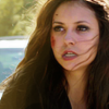
Miss VioletPOSITIVE VOTES
+++ I love the composition of this icon.
+++ I really like the red color and use of a texture.
+++ the coloring the sharpness and contrast are all perfect here.
+++ Amazing composition, the red monochrome fits the cap. You've kept the left side of the icon interesting, while the piece as a whole doesn't look too busy either. Great job!
+++ Such a lovely composition, I love the texture use and the extreme negative space!
++ The cutout looks really clean and well made. The negative space looks really good.
+ The composition makes this icon really stands out from the rest. Very effective.
+ Your minimalist approach was a great choice here! The clean composition, along with the limited palette looks super clean and well thought out.
BEST INTERPRETATION
+ No reason provided.
+ No reason provided.
CONSTRUCTIVE VOTES
+ I love what you were trying to do with this, the idea, but I don't think the execution quite happened. I think the negative space idea was a good one but since the subject portion is so dark it's hard to make who/what it is, especially with the white space in contrast against it. Maybe if there had been a tad more of the subject or if it had been a bit brighter it might have worked better.
ADDITIONAL VOTES
+ Love the idea of this icon!
Countess DaffodilPOSITIVE VOTES
++ great use of the light and good coloring.
+ I really like the use of lighting.
+ This icon has just the right amount of lighting and great colours!
+ Lovely coloring, the lighting is really nice!
BEST INTERPRETATION
+ No reason provided.
+ No reason provided.
+ No reason provided.
CONSTRUCTIVE VOTES
+ The light is a bit too harsh and lowers the quality.
ADDITIONAL VOTES
+ Lovely gradient lighting, and the monochome colouring works well with the cap and crop! However I think the left part of the icon is a bit too bright, which alters the colouring and draws the eye away from her face.
+ I like a lot about this icon, but I don’t think the bright sunny yellow really matches the expression on her face.

Lady RosePOSITIVE VOTES
None.
BEST INTERPRETATION
None.
CONSTRUCTIVE VOTES
+ The icon looks too sharp and grainy but the cap was very low quality to begin with so adding that much light/vibrancy didn't help to make it look better.
+ Although the coloring looks really lovely, I find that areas of the icon look a bit grainy and maybe a little overly sharp in some areas. I like the effect in some areas, but in others it looks more like a mistake, so I would suggest the use of a mildly grainy texture to help give the icon a little more of a grungy look on purpose.
+ The icon is too over-saturated in places, and seems to be lacking in contrast. The best way I can explain it is that the dark parts of the icon (the background, side of his helmet) are too bright and slightly washed out.
+ It's a bit oversaturated, making it look pixely, especially on the side left side of his helmet. Some smoothing out with the blur tool should help with this. :)
+ I feel like the brightening on this icon (screen layers, maybe?) was overdone and effected the quality of the image negatively. My suggestion, looking at the original cap. would be to aim for something that worked with the darkness of the cap - maybe something more shadowy.
ADDITIONAL VOTES
None.

King WhitePOSITIVE VOTES
None.
BEST INTERPRETATION
None.
CONSTRUCTIVE VOTES
+ Once Upon a Time caps are difficult to work with! Rumple looks quite oversharpened from here. Maybe you could try slightly blurring your base before working on lighting it up, it would smooth the edges and help avoid this oversharpened effect. Sometimes OUAT caps don't need much, if any, sharpening. The colouring and lighting also fall a bit flat, like they could have used more adjustment layers to find something that would make the icon pop.
ADDITIONAL VOTES
+ Great lighting and colors!
+ I think you needed more lighting, or maybe a different crop. There’s nothing in the icon which attracts my attention; I don’t know where to look first, and nothing really stands out.

Miss GoldPOSITIVE VOTES
+++ Beautiful composition, blending and colouring.
++ I love the blending of the two images together.
+ great use of the textures.
+ Though I think it would have been better with less text on it (it looks a bit cluttered), the composition is really cool and interesting.
BEST INTERPRETATION
+ No reason provided.
CONSTRUCTIVE VOTES
+ I really like the use of color, but there is little too much going on. It is hard to read the text.
+ I feel like there's a little too much going on in this icon. It would look better without the white texture in the upper left corner, and also the coloring is a little too washed out in the right hand side.
ADDITIONAL VOTES
+ Love the idea of this icon and the blending is very well executed.
+ I really, really love the idea of this icon -- the colors, the font and so on but I think in the end it was too much. Between the bright colors, the fonts, more than one image, I think it ended up making the icon a bit too busy looking and made it hard to tell where to look. It looks like you have either multiple textures or color layers, maybe use less next time and it also looks like you used more than one font and maybe use only one so that the icon isn't so busy looking? Again, it's still a very pretty icon though.
Countess CapriPOSITIVE VOTES
+++ Excellent usage of negative space. It's hard to even tell it's two images, that's how seamless they look together. Even though they are both very dark caps you can still make out the subject very well.
BEST INTERPRETATION
+ The composition here is very original, and the greenish-yellow coloring makes a stunning contrast with the darker tones!
CONSTRUCTIVE VOTES
+ Interesting composition, however the background subject looks to dark (on my monitor) maybe making it lighter would have worked a bit better.
+ The colors are amazing; the yellow color really stand out on her hair. However you have to work a lot harder to see what's going on. The reason for this could be the blending on the background.
+ The icon is a bit too dim, it could be brightened up a bit by playing with the curves layer. The blending is also a bit off and the background image doesn't quite fit the composition.
+ It's a really nice icon, I love the lights and shadows of the main cap but the one used in the background does not work very well. It's hard to tell what's going on/who's pictured because it's too dark.
ADDITIONAL VOTES
None.

Major PurplePOSITIVE VOTES
+++ Fantastic crop, and great use of black-and-white.
++ Great use of black & white. Interesting crop too.
+ The interesting crop immediately drew my eye to this icon! It lacks contrast and looks a bit LQ to me, but the lighting and crop still make it stand out.
+ Great use of black and white.
BEST INTERPRETATION
+ No reason provided.
CONSTRUCTIVE VOTES
None.
ADDITIONAL VOTES
None.
Lady OrangePOSITIVE VOTES
+++ Great cropping!
++ I love the crop and the idea of tiny text.
++ I love the use of perspective blurring, and the clean contrasts. The darker colors adds a nice sense of mystery and drama, and I like the use of tiny text here... usually it feels unnecessary, but the way you've placed it, it looks classy and modern!
++ I love the crop, it's very unique and with the black & white, it conveys a strong emotion!
++ Everything about this icon is eye-catching yet elegant. The obsucre crop, B&W and tiny text work flawlessly together. My only remark would be that the text looks oversharpened and could have used some very light blurring.
++ Love the crop and the composition. So simple but very lovely.
+ Love the usage of b & w and softness. The tiny text is a great added touch though I will say, if you'd moved the lines down a smidge so the top line wasn't over Sherlock's jaw it would have been better but still, a great icon.
+ I love the crop and graininess with the tiny text.
BEST INTERPRETATION
+ The choice of cap combined with the crop and dark negative space fit the 'mystery' theme perfectly!
+ No reason provided.
CONSTRUCTIVE VOTES
+ I like the cut, but I think the noise (maybe because of a texture) over the backgrond and over Sherlock's face take away the focus from it.
ADDITIONAL VOTES
None.
Agent TurquoisePOSITIVE VOTES
None.
BEST INTERPRETATION
None.
CONSTRUCTIVE VOTES
+ I love the crop, but the icon ends up being kind of bland. I think you needed more coloring, or more intense lighting to match the expression on her face. Also, the image is a little blurry on my screen.
ADDITIONAL VOTES
None.
Miss MimosaPOSITIVE VOTES
+++ The simple background and use of color is flawless~ The bright colors, clean composition, and solid crop are what make this icon stand out for me.
+++ Lovely yellow tones and use of light.
+++ Great crop and beautiful colouring!
++ I love the crop and the lighting here.
++ Beautiful coloring!
++ The yellow coloring is really pretty.
+ I think the yellowish coloring fits the theme very well.
BEST INTERPRETATION
+ No reason provided.
+ No reason provided.
CONSTRUCTIVE VOTES
None.
ADDITIONAL VOTES
+ I really like your colouring and lighting, but the crop cuts off her chin and neck in an odd way, which makes the icon look awkward.

Sister SablePOSITIVE VOTES
+++ The contrast is great and the muted coloring looks really good.
++ Lovely use of texture and the pale tones work really well.
+ Love the subtle yet striking pastel tones.
BEST INTERPRETATION
+ No reason provided.
CONSTRUCTIVE VOTES
+ I like the coloring and the smoothness of it, but I think the icon ends being a bit dull lacking in contrast.
+ I really like the direction this icon is taking, but I feel that the icon needs a little more contrast, and that the smokey effect of the background would be more effective if the area around her face didn't have that dark shadowy portion. Just those few touchups would do wonders :3
ADDITIONAL VOTES
None.
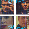
Minister SilverPOSITIVE VOTES
None.
BEST INTERPRETATION
None.
CONSTRUCTIVE VOTES
+ The texture overwhelms the subjects, making it hard to tell who is in the icon.
+ The idea in itself is great but the way it's executed is just unflattering. The lighting is a bit dim, the grid texture is overwhelming and the decorative ornaments do not compliment the established color scheme.
+ The composition is a bit too symmetrical and the use of texture is really distracting. The caps can also be lightened up a little.
+ The textures don't work well with the 4 squares composition, the white lines are a bit awkward as well. The icon also lacks light and contrast. I'd suggest working more on each cap individually before you work on the composition part, to make sure you have your light/contrast balance as you want it, and then add textures to the whole icon if need be.
+ I really don’t like the texture over their faces, and it looks like there’s something odd about the aspect ratios in the upper left corner.
+ The idea of putting the 4 screencaps together is great and works well, but the texture on top of then is rather distracting and doesn't add anything to improve the icon. Removing this and making the icon a bit brighter should improve it. :)
+ I think there is too much going in this icon. The grid texture over the four images is unnecessary, as well as the blue fancy texture. Leaving those two things out would already greatly improve this icon.
ADDITIONAL VOTES
+ I think the idea of the icon was cute but I think you were trying to do too much with too many textures? It made it look much too busy, maybe try to use fewer textures next time? It makes it hard to tell who some of the people are in the icon.
Updated Scoring Spreadsheet
1ST PLACE [5 points]:
Miss Violet with +8 votes (and more first place votes).
2ND PLACE [4 points]:
Lady Orange with +8 votes.
3RD PLACE [3 points]:
Miss Mimosa with +7 votes.
BEST INTERPRETATION [2 points]:
Countess Daffodil with +3 votes.
MOD'S CHOICE [1 point]:
Countess Capri
[The blending in this is done so seamlessly! The sense of motion is absolutely perfect for the theme you've chosen to interpret as well.]
TABLE KEY:
+++ = 1st Place Vote
++ = 2nd Place Vote
+ = 3rd Place Vote | Beginning of a new comment.
Note: Votes are not weighted in this round. Meaning a 1st, 2nd or 3rd vote will only give you 1 point when tallying the votes. Except in the case of a tie - then the icon with the most 1st place votes will be given first.
ICON VOTES
Mrs. OrangePOSITIVE VOTES
None.
BEST INTERPRETATION
+ I think this icon fits the them it represents perfectly.
CONSTRUCTIVE VOTES
+ It's a great crop but (at least on my screen) it looks a tad bit blurry and lacks something because it does.
ADDITIONAL VOTES
+ Lovely colouring, but the texture (?) you've used that adds all these light points to the icon is very distracting and draws the focus away from Simon and Alisha. The lighting works quite well on Simon's face, but on their hair and the bottom left-hand corner of the icon it looks awkward. You could try reducing the opacity of the texture/light blobs layers, layer mask parts of them or blur the most 'aggressive' parts for a softer-looking result.
Miss VioletPOSITIVE VOTES
+++ I love the composition of this icon.
+++ I really like the red color and use of a texture.
+++ the coloring the sharpness and contrast are all perfect here.
+++ Amazing composition, the red monochrome fits the cap. You've kept the left side of the icon interesting, while the piece as a whole doesn't look too busy either. Great job!
+++ Such a lovely composition, I love the texture use and the extreme negative space!
++ The cutout looks really clean and well made. The negative space looks really good.
+ The composition makes this icon really stands out from the rest. Very effective.
+ Your minimalist approach was a great choice here! The clean composition, along with the limited palette looks super clean and well thought out.
BEST INTERPRETATION
+ No reason provided.
+ No reason provided.
CONSTRUCTIVE VOTES
+ I love what you were trying to do with this, the idea, but I don't think the execution quite happened. I think the negative space idea was a good one but since the subject portion is so dark it's hard to make who/what it is, especially with the white space in contrast against it. Maybe if there had been a tad more of the subject or if it had been a bit brighter it might have worked better.
ADDITIONAL VOTES
+ Love the idea of this icon!
Countess DaffodilPOSITIVE VOTES
++ great use of the light and good coloring.
+ I really like the use of lighting.
+ This icon has just the right amount of lighting and great colours!
+ Lovely coloring, the lighting is really nice!
BEST INTERPRETATION
+ No reason provided.
+ No reason provided.
+ No reason provided.
CONSTRUCTIVE VOTES
+ The light is a bit too harsh and lowers the quality.
ADDITIONAL VOTES
+ Lovely gradient lighting, and the monochome colouring works well with the cap and crop! However I think the left part of the icon is a bit too bright, which alters the colouring and draws the eye away from her face.
+ I like a lot about this icon, but I don’t think the bright sunny yellow really matches the expression on her face.
Lady RosePOSITIVE VOTES
None.
BEST INTERPRETATION
None.
CONSTRUCTIVE VOTES
+ The icon looks too sharp and grainy but the cap was very low quality to begin with so adding that much light/vibrancy didn't help to make it look better.
+ Although the coloring looks really lovely, I find that areas of the icon look a bit grainy and maybe a little overly sharp in some areas. I like the effect in some areas, but in others it looks more like a mistake, so I would suggest the use of a mildly grainy texture to help give the icon a little more of a grungy look on purpose.
+ The icon is too over-saturated in places, and seems to be lacking in contrast. The best way I can explain it is that the dark parts of the icon (the background, side of his helmet) are too bright and slightly washed out.
+ It's a bit oversaturated, making it look pixely, especially on the side left side of his helmet. Some smoothing out with the blur tool should help with this. :)
+ I feel like the brightening on this icon (screen layers, maybe?) was overdone and effected the quality of the image negatively. My suggestion, looking at the original cap. would be to aim for something that worked with the darkness of the cap - maybe something more shadowy.
ADDITIONAL VOTES
None.
King WhitePOSITIVE VOTES
None.
BEST INTERPRETATION
None.
CONSTRUCTIVE VOTES
+ Once Upon a Time caps are difficult to work with! Rumple looks quite oversharpened from here. Maybe you could try slightly blurring your base before working on lighting it up, it would smooth the edges and help avoid this oversharpened effect. Sometimes OUAT caps don't need much, if any, sharpening. The colouring and lighting also fall a bit flat, like they could have used more adjustment layers to find something that would make the icon pop.
ADDITIONAL VOTES
+ Great lighting and colors!
+ I think you needed more lighting, or maybe a different crop. There’s nothing in the icon which attracts my attention; I don’t know where to look first, and nothing really stands out.
Miss GoldPOSITIVE VOTES
+++ Beautiful composition, blending and colouring.
++ I love the blending of the two images together.
+ great use of the textures.
+ Though I think it would have been better with less text on it (it looks a bit cluttered), the composition is really cool and interesting.
BEST INTERPRETATION
+ No reason provided.
CONSTRUCTIVE VOTES
+ I really like the use of color, but there is little too much going on. It is hard to read the text.
+ I feel like there's a little too much going on in this icon. It would look better without the white texture in the upper left corner, and also the coloring is a little too washed out in the right hand side.
ADDITIONAL VOTES
+ Love the idea of this icon and the blending is very well executed.
+ I really, really love the idea of this icon -- the colors, the font and so on but I think in the end it was too much. Between the bright colors, the fonts, more than one image, I think it ended up making the icon a bit too busy looking and made it hard to tell where to look. It looks like you have either multiple textures or color layers, maybe use less next time and it also looks like you used more than one font and maybe use only one so that the icon isn't so busy looking? Again, it's still a very pretty icon though.
Countess CapriPOSITIVE VOTES
+++ Excellent usage of negative space. It's hard to even tell it's two images, that's how seamless they look together. Even though they are both very dark caps you can still make out the subject very well.
BEST INTERPRETATION
+ The composition here is very original, and the greenish-yellow coloring makes a stunning contrast with the darker tones!
CONSTRUCTIVE VOTES
+ Interesting composition, however the background subject looks to dark (on my monitor) maybe making it lighter would have worked a bit better.
+ The colors are amazing; the yellow color really stand out on her hair. However you have to work a lot harder to see what's going on. The reason for this could be the blending on the background.
+ The icon is a bit too dim, it could be brightened up a bit by playing with the curves layer. The blending is also a bit off and the background image doesn't quite fit the composition.
+ It's a really nice icon, I love the lights and shadows of the main cap but the one used in the background does not work very well. It's hard to tell what's going on/who's pictured because it's too dark.
ADDITIONAL VOTES
None.
Major PurplePOSITIVE VOTES
+++ Fantastic crop, and great use of black-and-white.
++ Great use of black & white. Interesting crop too.
+ The interesting crop immediately drew my eye to this icon! It lacks contrast and looks a bit LQ to me, but the lighting and crop still make it stand out.
+ Great use of black and white.
BEST INTERPRETATION
+ No reason provided.
CONSTRUCTIVE VOTES
None.
ADDITIONAL VOTES
None.
Lady OrangePOSITIVE VOTES
+++ Great cropping!
++ I love the crop and the idea of tiny text.
++ I love the use of perspective blurring, and the clean contrasts. The darker colors adds a nice sense of mystery and drama, and I like the use of tiny text here... usually it feels unnecessary, but the way you've placed it, it looks classy and modern!
++ I love the crop, it's very unique and with the black & white, it conveys a strong emotion!
++ Everything about this icon is eye-catching yet elegant. The obsucre crop, B&W and tiny text work flawlessly together. My only remark would be that the text looks oversharpened and could have used some very light blurring.
++ Love the crop and the composition. So simple but very lovely.
+ Love the usage of b & w and softness. The tiny text is a great added touch though I will say, if you'd moved the lines down a smidge so the top line wasn't over Sherlock's jaw it would have been better but still, a great icon.
+ I love the crop and graininess with the tiny text.
BEST INTERPRETATION
+ The choice of cap combined with the crop and dark negative space fit the 'mystery' theme perfectly!
+ No reason provided.
CONSTRUCTIVE VOTES
+ I like the cut, but I think the noise (maybe because of a texture) over the backgrond and over Sherlock's face take away the focus from it.
ADDITIONAL VOTES
None.
Agent TurquoisePOSITIVE VOTES
None.
BEST INTERPRETATION
None.
CONSTRUCTIVE VOTES
+ I love the crop, but the icon ends up being kind of bland. I think you needed more coloring, or more intense lighting to match the expression on her face. Also, the image is a little blurry on my screen.
ADDITIONAL VOTES
None.
Miss MimosaPOSITIVE VOTES
+++ The simple background and use of color is flawless~ The bright colors, clean composition, and solid crop are what make this icon stand out for me.
+++ Lovely yellow tones and use of light.
+++ Great crop and beautiful colouring!
++ I love the crop and the lighting here.
++ Beautiful coloring!
++ The yellow coloring is really pretty.
+ I think the yellowish coloring fits the theme very well.
BEST INTERPRETATION
+ No reason provided.
+ No reason provided.
CONSTRUCTIVE VOTES
None.
ADDITIONAL VOTES
+ I really like your colouring and lighting, but the crop cuts off her chin and neck in an odd way, which makes the icon look awkward.
Sister SablePOSITIVE VOTES
+++ The contrast is great and the muted coloring looks really good.
++ Lovely use of texture and the pale tones work really well.
+ Love the subtle yet striking pastel tones.
BEST INTERPRETATION
+ No reason provided.
CONSTRUCTIVE VOTES
+ I like the coloring and the smoothness of it, but I think the icon ends being a bit dull lacking in contrast.
+ I really like the direction this icon is taking, but I feel that the icon needs a little more contrast, and that the smokey effect of the background would be more effective if the area around her face didn't have that dark shadowy portion. Just those few touchups would do wonders :3
ADDITIONAL VOTES
None.
Minister SilverPOSITIVE VOTES
None.
BEST INTERPRETATION
None.
CONSTRUCTIVE VOTES
+ The texture overwhelms the subjects, making it hard to tell who is in the icon.
+ The idea in itself is great but the way it's executed is just unflattering. The lighting is a bit dim, the grid texture is overwhelming and the decorative ornaments do not compliment the established color scheme.
+ The composition is a bit too symmetrical and the use of texture is really distracting. The caps can also be lightened up a little.
+ The textures don't work well with the 4 squares composition, the white lines are a bit awkward as well. The icon also lacks light and contrast. I'd suggest working more on each cap individually before you work on the composition part, to make sure you have your light/contrast balance as you want it, and then add textures to the whole icon if need be.
+ I really don’t like the texture over their faces, and it looks like there’s something odd about the aspect ratios in the upper left corner.
+ The idea of putting the 4 screencaps together is great and works well, but the texture on top of then is rather distracting and doesn't add anything to improve the icon. Removing this and making the icon a bit brighter should improve it. :)
+ I think there is too much going in this icon. The grid texture over the four images is unnecessary, as well as the blue fancy texture. Leaving those two things out would already greatly improve this icon.
ADDITIONAL VOTES
+ I think the idea of the icon was cute but I think you were trying to do too much with too many textures? It made it look much too busy, maybe try to use fewer textures next time? It makes it hard to tell who some of the people are in the icon.
Updated Scoring Spreadsheet