Round 12 - Challenge 05 - Results
ROUND 12 - CHALLENGE 05 - RESULTS
1ST PLACE [5 points]:

Miss Violet with +7 votes (and the most first place votes).
2ND PLACE [4 points]:

Countess Capri with +7 votes (and the second most first place votes).
3RD PLACE [3 points]:

Miss Mimosa with +7 votes.
BEST INTERPRETATION [2 points]:
Miss Violet with +4 votes.
MOD'S CHOICE [1 point]:

Lady Orange
[Gorgeous, unique composition that really utilizes the technical restrictions of the theme to their fullest potential.]
TABLE KEY:
+++ = 1st Place Vote
++ = 2nd Place Vote
+ = 3rd Place Vote | Beginning of a new comment.
Note: Votes are not weighted in this round. Meaning a 1st, 2nd or 3rd vote will only give you 1 point when tallying the votes. Except in the case of a tie - then the icon with the most 1st place votes will be given first.
ICON VOTES
Miss VioletPOSITIVE VOTES
+++ Wonderful composition! I love how the circles bring the attention right at the center where the character is! And the colors are very pretty!
+++ Fun and creative composition. Nicely coloring as well.
+++ Great composition and colouring!
+++ The circle is really beautiful and the balance between the lighting and the contrast are wonderful.
+++ the originality of it, and the coloring are awesome.
+++ Beautiful composition and colouring.
++ I love how creative this is. Very good idea to use the screencap of Walt for the circles around Gus.
BEST INTERPRETATION
+ No reason provided.
+ No reason provided.
+ No reason provided.
+ No reason provided.
CONSTRUCTIVE VOTES
+ I think the composition is very striking, but I can’t read the blue-background image at all.
ADDITIONAL VOTES
+ Eye-catching icon and lovely composition idea, but I wish we could see the fact of the subject from the 'blue' cap.

Mrs. OrangePOSITIVE VOTES
++ I love the crop and the coloring, though there is a little over-sharpening on their bodies.
BEST INTERPRETATION
None.
CONSTRUCTIVE VOTES
+ The icon is very sharp on my screen, especially on the front and back of Nathan. Also, the background could have been blurred at bit because as it is now, its a little grainy.
ADDITIONAL VOTES
None.

Countess DaffodilPOSITIVE VOTES
++ I love how you played with the composition~ The coloring and use of textures give it some wonderful depth as well.
BEST INTERPRETATION
+ No reason provided.
CONSTRUCTIVE VOTES
+ The composition is great but I am having a really hard time telling what/who the icon is supposed to be of due to how dark it is.
+ Interesting composition idea but the icon is too dark and busy and I can barely tell what is going on there! More light, especially on the top part of the icon, would have been useful, and perhaps the text is too much, as it draws the eye away from the subjects.
ADDITIONAL VOTES
None.

Lady RosePOSITIVE VOTES
++ great coloring.
BEST INTERPRETATION
None.
CONSTRUCTIVE VOTES
None.
ADDITIONAL VOTES
None.

King WhitePOSITIVE VOTES
+ Lovely colouring and shadows.
BEST INTERPRETATION
None.
CONSTRUCTIVE VOTES
+ The subject appears to be too sharp which gives it a grainy effect. It is also a bit too dark towards the left side of the icon.
ADDITIONAL VOTES
None.

Miss GoldPOSITIVE VOTES
++ The coloring is gorgeous and vibrant. And I'm amazed by how you managed to turn that rather LQ screencap into a HQ icon.
+ I like the creative use of negative space, and the brightness of the overall icon.
BEST INTERPRETATION
None.
CONSTRUCTIVE VOTES
None.
ADDITIONAL VOTES
+ I think the crop cuts her face off in an awkward spot, especially with how bright the light is on the left edge of the icon.
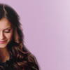
Countess CapriPOSITIVE VOTES
+++ The coloring is beautiful, and you've pulled off the extremely close crop very nicely!
+++ The coloring is really beautiful here, and I love the crop!
+++ Great close crop and lovely purple tones!
+++ Great cropping, it really captures the emotion of the screencap.
++ The crop is really eye-catching and the colors so pretty.
++ Nice coloring! I like how soft it is and lovely crop!
++ The crop here is really effective and the purple colouring works very well!
BEST INTERPRETATION
+ No reason provided.
CONSTRUCTIVE VOTES
None.
ADDITIONAL VOTES
+ Gorgeous close crop.

Major PurplePOSITIVE VOTES
+ Love the muted coloring here.
BEST INTERPRETATION
None.
CONSTRUCTIVE VOTES
+ The icon looks a bit blurred which makes it look low quality overall, the contrasting could also be increased slightly.
+ The colors are great ! However there could be more contrast on her face because is little too bright there.
+ I like the direction you're going in for this icon, but I think that the lack of contrast ends up making this icon seem slightly gray and washed out. I also think that the icon seems a bit blurry overall (which may or may not be the quality of your screencap?)
+ The crop is nice but the icon seems a bit flat. Maybe a bit of contrast would have helped.
ADDITIONAL VOTES
+ This is a little blurry on my screen.
Lady OrangePOSITIVE VOTES
+++ Great composition and coloring
++ Great coloring and nice use of negative space and texture.
+ Interesting composition, it fits the screencap very well.
+ Great use of target texture! It fits the cap so well and I like the off-center composition!
+ The composition is eye-catching and fits the theme. It looks oversharpened to me and lacks contrast, but lovely icon overall!
BEST INTERPRETATION
+ No reason provided.
+ No reason provided.
CONSTRUCTIVE VOTES
None.
ADDITIONAL VOTES
None.
Agent TurquoisePOSITIVE VOTES
None.
BEST INTERPRETATION
+ No reason provided.
CONSTRUCTIVE VOTES
+ The subject is a bit poorly cut out from the background. The border between the subject and the background is too smooth for it to look real. Cutting out hair is really difficult, but if you take your time with it, it can be done well. Perhaps using a more hard edged brush to remove the background could have worked better.
+ I think the cut-out could have been more subtle, I mean the choice of color for the background does not blend well with the coloring of the cap, something like the color of her lips might work better.
+ I like the smothness of the subject, but I think the blending should be a bit better, or maybe the use of more colorful texture would have helped it.
+ The coloring here is nice, however, the cutout effect looks a bit awkward (meaning some of the edges are a little too blurry, especially at the top of her head, and I think it could benefit from more of a central crop than the side crop used here).
+ This icon feels very unbalanced. I like the negative space, but having the figure looking down pulls my attention outside of the icon in a way that’s distracting.
ADDITIONAL VOTES
None.
Miss MimosaPOSITIVE VOTES
++ Very nice lighting and the muted colouring works well with the cap!
++ Lovely colouring.
+ I love the lighting and the muted tones.
+ The lighting and the shadow on her face really works and the character is cut out the background really well.
+ The use of lighting is perfect.
+ Nice muted coloring and use of light and shadows.
+ Great rendering of shadows and beautiful colouring.
BEST INTERPRETATION
+ No reason provided.
+ I like the subtlety of the coloration and crop, Having a dominant portion of the character be in shadow is very dramatic, and helps to make the face the focal point.
CONSTRUCTIVE VOTES
None.
ADDITIONAL VOTES
None.

Sister SablePOSITIVE VOTES
None.
BEST INTERPRETATION
None.
CONSTRUCTIVE VOTES
+ It's too bright, which I think is the reason it looks too sharpened, especially around the moon texture and in his face. The light texture at the bottom is also bit distracting from the subject and doesn't really add anything to the icon, it would have been better without.
+ The icon is way too bright making part of him almost white. And I think there's too many textures making it look really busy. I think removing the green light ones would be better.
+ Nice cut-out, but this icon is overly bright and oversharpened, which makes it look LQ. This could be toned down by a Multiply layer and you could lightly blur the edges of the subject and textures, but mostly I'd suggest being more careful with the opacity of the sharpened layer and the Brightness/Contrast layer (or whichever layer you've used to brighten the icon).
+ The moon background work really well, but the circular textures in front of the character cover a bit too much of him, he seems to get lost in them.
+ I love the idea behind this icon, and I like the style too, but I think the subject's face it's too light at the point it becomes distracting.
+ The icon seems a bit over-sharpened in areas to me, and also a bit washed out around the shoulder/chest area. I like the overall composition, but I feel that since the light texture you used is so large, they overwhelm the character a little bit. Making the texture smaller, or the character larger may help things feel more proportionate.
+ I like the concept of this icon a lot, however there's a few issues with it. The coloring of the subject is too bright and over-contrasted, and I feel like the circles at the bottom are a little distracting. Also, you can see a square of the background from the original screencap in main circle texture and it would look better if that square had been erased.
+ The texture seems to overwhelm the subject and the subject seems a little bit sharp.
ADDITIONAL VOTES
None.
Minister SilverPOSITIVE VOTES
None.
BEST INTERPRETATION
None.
CONSTRUCTIVE VOTES
None.
ADDITIONAL VOTES
None.
Updated Scoring Spreadsheet
1ST PLACE [5 points]:
Miss Violet with +7 votes (and the most first place votes).
2ND PLACE [4 points]:
Countess Capri with +7 votes (and the second most first place votes).
3RD PLACE [3 points]:
Miss Mimosa with +7 votes.
BEST INTERPRETATION [2 points]:
Miss Violet with +4 votes.
MOD'S CHOICE [1 point]:
Lady Orange
[Gorgeous, unique composition that really utilizes the technical restrictions of the theme to their fullest potential.]
TABLE KEY:
+++ = 1st Place Vote
++ = 2nd Place Vote
+ = 3rd Place Vote | Beginning of a new comment.
Note: Votes are not weighted in this round. Meaning a 1st, 2nd or 3rd vote will only give you 1 point when tallying the votes. Except in the case of a tie - then the icon with the most 1st place votes will be given first.
ICON VOTES
Miss VioletPOSITIVE VOTES
+++ Wonderful composition! I love how the circles bring the attention right at the center where the character is! And the colors are very pretty!
+++ Fun and creative composition. Nicely coloring as well.
+++ Great composition and colouring!
+++ The circle is really beautiful and the balance between the lighting and the contrast are wonderful.
+++ the originality of it, and the coloring are awesome.
+++ Beautiful composition and colouring.
++ I love how creative this is. Very good idea to use the screencap of Walt for the circles around Gus.
BEST INTERPRETATION
+ No reason provided.
+ No reason provided.
+ No reason provided.
+ No reason provided.
CONSTRUCTIVE VOTES
+ I think the composition is very striking, but I can’t read the blue-background image at all.
ADDITIONAL VOTES
+ Eye-catching icon and lovely composition idea, but I wish we could see the fact of the subject from the 'blue' cap.
Mrs. OrangePOSITIVE VOTES
++ I love the crop and the coloring, though there is a little over-sharpening on their bodies.
BEST INTERPRETATION
None.
CONSTRUCTIVE VOTES
+ The icon is very sharp on my screen, especially on the front and back of Nathan. Also, the background could have been blurred at bit because as it is now, its a little grainy.
ADDITIONAL VOTES
None.
Countess DaffodilPOSITIVE VOTES
++ I love how you played with the composition~ The coloring and use of textures give it some wonderful depth as well.
BEST INTERPRETATION
+ No reason provided.
CONSTRUCTIVE VOTES
+ The composition is great but I am having a really hard time telling what/who the icon is supposed to be of due to how dark it is.
+ Interesting composition idea but the icon is too dark and busy and I can barely tell what is going on there! More light, especially on the top part of the icon, would have been useful, and perhaps the text is too much, as it draws the eye away from the subjects.
ADDITIONAL VOTES
None.
Lady RosePOSITIVE VOTES
++ great coloring.
BEST INTERPRETATION
None.
CONSTRUCTIVE VOTES
None.
ADDITIONAL VOTES
None.
King WhitePOSITIVE VOTES
+ Lovely colouring and shadows.
BEST INTERPRETATION
None.
CONSTRUCTIVE VOTES
+ The subject appears to be too sharp which gives it a grainy effect. It is also a bit too dark towards the left side of the icon.
ADDITIONAL VOTES
None.
Miss GoldPOSITIVE VOTES
++ The coloring is gorgeous and vibrant. And I'm amazed by how you managed to turn that rather LQ screencap into a HQ icon.
+ I like the creative use of negative space, and the brightness of the overall icon.
BEST INTERPRETATION
None.
CONSTRUCTIVE VOTES
None.
ADDITIONAL VOTES
+ I think the crop cuts her face off in an awkward spot, especially with how bright the light is on the left edge of the icon.
Countess CapriPOSITIVE VOTES
+++ The coloring is beautiful, and you've pulled off the extremely close crop very nicely!
+++ The coloring is really beautiful here, and I love the crop!
+++ Great close crop and lovely purple tones!
+++ Great cropping, it really captures the emotion of the screencap.
++ The crop is really eye-catching and the colors so pretty.
++ Nice coloring! I like how soft it is and lovely crop!
++ The crop here is really effective and the purple colouring works very well!
BEST INTERPRETATION
+ No reason provided.
CONSTRUCTIVE VOTES
None.
ADDITIONAL VOTES
+ Gorgeous close crop.
Major PurplePOSITIVE VOTES
+ Love the muted coloring here.
BEST INTERPRETATION
None.
CONSTRUCTIVE VOTES
+ The icon looks a bit blurred which makes it look low quality overall, the contrasting could also be increased slightly.
+ The colors are great ! However there could be more contrast on her face because is little too bright there.
+ I like the direction you're going in for this icon, but I think that the lack of contrast ends up making this icon seem slightly gray and washed out. I also think that the icon seems a bit blurry overall (which may or may not be the quality of your screencap?)
+ The crop is nice but the icon seems a bit flat. Maybe a bit of contrast would have helped.
ADDITIONAL VOTES
+ This is a little blurry on my screen.
Lady OrangePOSITIVE VOTES
+++ Great composition and coloring
++ Great coloring and nice use of negative space and texture.
+ Interesting composition, it fits the screencap very well.
+ Great use of target texture! It fits the cap so well and I like the off-center composition!
+ The composition is eye-catching and fits the theme. It looks oversharpened to me and lacks contrast, but lovely icon overall!
BEST INTERPRETATION
+ No reason provided.
+ No reason provided.
CONSTRUCTIVE VOTES
None.
ADDITIONAL VOTES
None.
Agent TurquoisePOSITIVE VOTES
None.
BEST INTERPRETATION
+ No reason provided.
CONSTRUCTIVE VOTES
+ The subject is a bit poorly cut out from the background. The border between the subject and the background is too smooth for it to look real. Cutting out hair is really difficult, but if you take your time with it, it can be done well. Perhaps using a more hard edged brush to remove the background could have worked better.
+ I think the cut-out could have been more subtle, I mean the choice of color for the background does not blend well with the coloring of the cap, something like the color of her lips might work better.
+ I like the smothness of the subject, but I think the blending should be a bit better, or maybe the use of more colorful texture would have helped it.
+ The coloring here is nice, however, the cutout effect looks a bit awkward (meaning some of the edges are a little too blurry, especially at the top of her head, and I think it could benefit from more of a central crop than the side crop used here).
+ This icon feels very unbalanced. I like the negative space, but having the figure looking down pulls my attention outside of the icon in a way that’s distracting.
ADDITIONAL VOTES
None.
Miss MimosaPOSITIVE VOTES
++ Very nice lighting and the muted colouring works well with the cap!
++ Lovely colouring.
+ I love the lighting and the muted tones.
+ The lighting and the shadow on her face really works and the character is cut out the background really well.
+ The use of lighting is perfect.
+ Nice muted coloring and use of light and shadows.
+ Great rendering of shadows and beautiful colouring.
BEST INTERPRETATION
+ No reason provided.
+ I like the subtlety of the coloration and crop, Having a dominant portion of the character be in shadow is very dramatic, and helps to make the face the focal point.
CONSTRUCTIVE VOTES
None.
ADDITIONAL VOTES
None.
Sister SablePOSITIVE VOTES
None.
BEST INTERPRETATION
None.
CONSTRUCTIVE VOTES
+ It's too bright, which I think is the reason it looks too sharpened, especially around the moon texture and in his face. The light texture at the bottom is also bit distracting from the subject and doesn't really add anything to the icon, it would have been better without.
+ The icon is way too bright making part of him almost white. And I think there's too many textures making it look really busy. I think removing the green light ones would be better.
+ Nice cut-out, but this icon is overly bright and oversharpened, which makes it look LQ. This could be toned down by a Multiply layer and you could lightly blur the edges of the subject and textures, but mostly I'd suggest being more careful with the opacity of the sharpened layer and the Brightness/Contrast layer (or whichever layer you've used to brighten the icon).
+ The moon background work really well, but the circular textures in front of the character cover a bit too much of him, he seems to get lost in them.
+ I love the idea behind this icon, and I like the style too, but I think the subject's face it's too light at the point it becomes distracting.
+ The icon seems a bit over-sharpened in areas to me, and also a bit washed out around the shoulder/chest area. I like the overall composition, but I feel that since the light texture you used is so large, they overwhelm the character a little bit. Making the texture smaller, or the character larger may help things feel more proportionate.
+ I like the concept of this icon a lot, however there's a few issues with it. The coloring of the subject is too bright and over-contrasted, and I feel like the circles at the bottom are a little distracting. Also, you can see a square of the background from the original screencap in main circle texture and it would look better if that square had been erased.
+ The texture seems to overwhelm the subject and the subject seems a little bit sharp.
ADDITIONAL VOTES
None.
Minister SilverPOSITIVE VOTES
None.
BEST INTERPRETATION
None.
CONSTRUCTIVE VOTES
None.
ADDITIONAL VOTES
None.
Updated Scoring Spreadsheet