Round 12 - Challenge 04 - Results
ROUND 12 - CHALLENGE 04 - RESULTS
1ST PLACE [5 points]:

Countess Daffodil with +9 votes.
2ND PLACE [4 points]:

&
Lady Orange & Countess Capri with +8 votes (and an equal number of first place votes).
3RD PLACE [3 points]:

&
Minister Silver & King White with +5 votes.
BEST INTERPRETATION [2 points]:

&
Minister Silver & Lady Orange with +3 votes.
MOD'S CHOICE [1 point]:

Miss Gold
[The composition of this icon is extremely creative. All of the different crops create such an interesting atmosphere, as though he has multiple personalities at work or perhaps eyes everywhere. Knowing the character as I do, this adds such an intense level of meaning to the icon to match the equally as well executed and intense coloring. Great job!]
TABLE KEY:
+++ = 1st Place Vote
++ = 2nd Place Vote
+ = 3rd Place Vote | Beginning of a new comment.
Note: Votes are not weighted in this round. Meaning a 1st, 2nd or 3rd vote will only give you 1 point when tallying the votes. Except in the case of a SINGLE tie - then the icon with the most 1st place votes will be given first. In the case of multiple ties and ties that will result in the unfair disqualification of an icon that has accumulated enough votes to place, the ties will stand as is.
ICON VOTES

Miss GoldPOSITIVE VOTES
+++ Great use of colour, the purple stands out very nicely. That's also a very effective and interesting composition.
++ Nice composition and the coloring is really pretty, the contrast is perfect!
++ Wonderful use of layers! There's a nice sense of balance in your icon, and the monochromatic coloring is very well done because it doesn't feel one note, which is usually the case.
++ The creativity and different shades of purple used here are really great.
BEST INTERPRETATION
+ No reason provided.
+ No reason provided.
CONSTRUCTIVE VOTES
+ It's too bright and a bit too much topaz in it, it almost looks like it's from a comic book.
ADDITIONAL VOTES
+ I love the composition and the strong purple color.

Countess CapriPOSITIVE VOTES
+++ The crop and lighting work very well together, and the red tones are balanced and varied.
+++ The red hues in your icon are so nice~ The colors are well balanced and dramatic.
+++ Beautiful coloring and crop.
+ Lovely natural colouring and contrast.
+ I love all the different shades of red and how vibrant it is!
+ The red colors stand out really well and the contrast looks great.
+ Nice shadows rendered in the icon, I like how it moves from darker to lighter.
+ The balance between the shadows and lights is amazing and I like the subtle yet effective use of red!
BEST INTERPRETATION
+ No reason provided.
CONSTRUCTIVE VOTES
+ The grainy texture doesn't really add anything, and distracts from the lovely shadowing the icon has. Removing it should improve the icon.
ADDITIONAL VOTES
None.

Major PurplePOSITIVE VOTES
None.
BEST INTERPRETATION
None.
CONSTRUCTIVE VOTES
+ The crop is really interesting, however the green hues on her skin look a little unflattering.
+ I really like the idea of the 'no eyes' crop, but all the negative space on the right side of the icon makes it fall a bit off and draws the eye away from the subject.
+ You have a good sense of cropping, but I think the coloration is too dominantly green. The character seems to be glowing like a firefly as it is. I would suggest either erasing portions of the textures you use that overlap onto the character, or possibly extracting the image so that you can easily adjust the skin tones and background seperately.
+ The green tones are very overwhelming especially on her face. Toning them down and bringing out the natural colors of the subject will make for a very vibrant icon.
ADDITIONAL VOTES
None.

Lady OrangePOSITIVE VOTES
+++ Lovely colouring and shadows.
+++ The lighting is amazing and I absolutely love the coloring, too.
+++ Love the prominent shadows and soft green tones.
++ I love the contrast between the shadows and the light here, it really draws my attention to the figure's face.
++ The green color is really eye-catching and the contrast is amazing. I love how the lighting directs attention to the character's face.
++ I really love how this icon has the perfect balance of dark and light tones and it has just enough green to make the icon more vivid.
++ Great cap choice and the crop and coloring is great as is the contrast and light.
++ Lovely work on the shadows and green tones, the crop is interesting.
BEST INTERPRETATION
+ No reason provided.
+ No reason provided.
+ No reason provided.
CONSTRUCTIVE VOTES
None.
ADDITIONAL VOTES
None.
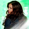
Agent TurquoisePOSITIVE VOTES
None.
BEST INTERPRETATION
None.
CONSTRUCTIVE VOTES
+ I think the cut is really good here but the subject isn't blending with the texture.
ADDITIONAL VOTES
None.

Lady RosePOSITIVE VOTES
None.
BEST INTERPRETATION
None.
CONSTRUCTIVE VOTES
+ The idea of the coloring is good, but the execution is a bit unnatural, the outlines of the yellow color of the hair are a bit rough and visible.
+ The colouring of Dany's hair looks a bit sloppy and doesn't quite blend in with the image. The overall lighting of the icon is also a bit dim. Perhaps setting the yellow layer of her hair to soft light would help the blending and rendering more light would help with the tones.
+ The way you've cropped the screencap feels slightly unbalanced to me. I would try moving her more to one side of the icon, or perhaps playing with some closer crops. Also, the way you lighten the coloration of the cap seems to be taking away some of the contrast in the face, making the icon feel a little one note. Maybe play around with contrast layers, or erasing portions of the layer you used to lighten the skintone so that the naturally darker areas of the face can provide that contrast.
+ The cap isn't the most flattering one out there, and her hair is a little TOO bright. The coloring of her skin is nice, but the shade of yellow used to highlight the hair would look a lot better if were toned down.
+ Dany's expression here is not very flattering and makes the icon look awkward. The pop art colouring was a good idea and could have been very interesting but there are weird grey lines around her face.
+ The crop is nice, but the natural colouring of the icon compared to the unnatural colouring of the hair, makes the icon seemed a bit unbalanced.
+ I don't like the vividness of the yellow hair against the more natural tones of her face, especially with the expression she has. If you had changed the color of her face, either more muted or to something less natural, it might have worked better.
+ When painting over the hair you missed some spots, so it looks messy.
ADDITIONAL VOTES
+ I think it would have been better with a cap where she isn't yelling, I'm just not sure if the icon is supposed to be a funny or serious icon. But the coloring is lovely.

King WhitePOSITIVE VOTES
+++ The center crop really emphasizes the strength in her expression, and the coloring and lighting are superb.
++ The 'no eyes' crop and soft yellow tones make for an eye-catching icon.
++ The colouring and the crop work really well.
+ Great crop and coloring.
+ the almost monotone coloring is fitting to the cut.
BEST INTERPRETATION
+ No reason provided.
CONSTRUCTIVE VOTES
None.
ADDITIONAL VOTES
+ Lovely soft yellow tones.

Miss MimosaPOSITIVE VOTES
None.
BEST INTERPRETATION
None.
CONSTRUCTIVE VOTES
+ I wish the center top of this icon weren't so washed out. Her face is only middling bright, so having that intense brightness at the top of the icon makes her face seem too dark.
ADDITIONAL VOTES
None.

Sister SablePOSITIVE VOTES
++ I really like the lighting you have on her face (or different shading, not sure which it is). The shades of green really look beautiful.
BEST INTERPRETATION
+ No reason provided.
CONSTRUCTIVE VOTES
+ The icon is a little splotch in spots of her face, like her forehead and it would have worked a little better without the green texture over her hair.
ADDITIONAL VOTES
None.

Minister SilverPOSITIVE VOTES
+++ Lovely negative space and the cut-out is very pretty!
+++ greatly sharpened and the coloring is really fitting there.
+++ Love the coloring of the subject and the extra you added to the top. It's just all perfect. It's simplistic and cute.
+ A simple, yet effective icon.
+ I love the way you kept things simple with your icon. The coloring is flawless, and the use of negative space is a nice touch.
BEST INTERPRETATION
+ No reason provided.
+ No reason provided.
+ No reason provided.
CONSTRUCTIVE VOTES
None.
ADDITIONAL VOTES
+ I really like the idea of this, and the work you've done from the original cap to this icon! The only thing I'd say is it looks oversharpened around him, and the icon looks a bit flat, like it lacks some light or texture work to really make it pop. But lovely icon overall!
+ Very creative use of decorative texture.

Mrs. OrangePOSITIVE VOTES
+++ The soft coloring is beautiful.
BEST INTERPRETATION
+ The softness of this icon is really pretty~ The simplicity of it allows for the expressions to really speak and be the prominant focus, which was an excellent move.
CONSTRUCTIVE VOTES
+ I really like your icon but I think it would have been better with a bit more contrast and maybe erasing the silhouette in the background to make a completely beige background because it's distracting the attention a bit from Nathan's face.
+ I think the icon could have used a bit (more if you used some) of contrast. It look a bit flat without it (or if you used some without more).
+ The monochrome makes the icon seem a bit flat. A little bit of contrast can go a long way here.
ADDITIONAL VOTES
None.

Miss VioletPOSITIVE VOTES
+ Interesting composition.
BEST INTERPRETATION
+ The composition works and the green coloring stands out well.
CONSTRUCTIVE VOTES
+ While I really like the texture and colours used in this icon it's very difficult to see the subject. The crop for the subject's face could be altered so we see more of it and lighter tones would also help with the contrasting.
+ The idea behind the composition is nice but the flower-y texture takes too much space here. We almost can't see the subject as her face is cut a lot and she's really dark, a bit of light would help to make her stand out more.
+ The texture is nice but it would have worked better with less of the texture as it overtakes the icon and it is hard to tell what it is supposed to be of.
+ I like the idea but the monotone coloring make almost impossible to tell the pic from the texture.
+ The texture is too overpowering. You can barely make out the subject of the icon. I think it also doesn't help that the texture is the same color as the coloring of your subject. Maybe if the two were different colors or shades? Still, though if there was less texture overlapping the subject part, I think it would have been better.
+ I feel like there's a little bit too much focus on the textures here. I like the concept behind it, but it would be a lot better if more of the actual screencap were shown.
+ The texture doesn't quite fit with the composition of the icon.
+ I love the mysterious feel achieved by cutting off her face with the repeated patterns! It's like she is hiding behind a wall. That said, it's very hard to make out the subject because there is not enough contrast between light and dark. Maybe playing with curves could work.
ADDITIONAL VOTES
None.

Countess DaffodilPOSITIVE VOTES
+++ The lighting looks really beautiful and the sharpening really works.
+++ Nice use of contrast and light.
++ Lovely lighting.
++ great use of the light.
++ Lovely use of light.
++ The way you worked with black and white and that lighting gives the icon perfect contrast.
+ I love the lighting of this icon.
+ The crop is perfect -- not dead center which makes it more interesting. The black and white coloring really makes it pop up, especially with the usage of contrast.
+ I love the crop here, and the way the lighting and shadows draw your eye to the figure and then to the direction she's looking.
BEST INTERPRETATION
+ No reason provided.
CONSTRUCTIVE VOTES
None.
ADDITIONAL VOTES
None.
Updated Scoring Spreadsheet
1ST PLACE [5 points]:

Countess Daffodil with +9 votes.
2ND PLACE [4 points]:

&

Lady Orange & Countess Capri with +8 votes (and an equal number of first place votes).
3RD PLACE [3 points]:

&

Minister Silver & King White with +5 votes.
BEST INTERPRETATION [2 points]:

&

Minister Silver & Lady Orange with +3 votes.
MOD'S CHOICE [1 point]:

Miss Gold
[The composition of this icon is extremely creative. All of the different crops create such an interesting atmosphere, as though he has multiple personalities at work or perhaps eyes everywhere. Knowing the character as I do, this adds such an intense level of meaning to the icon to match the equally as well executed and intense coloring. Great job!]
TABLE KEY:
+++ = 1st Place Vote
++ = 2nd Place Vote
+ = 3rd Place Vote | Beginning of a new comment.
Note: Votes are not weighted in this round. Meaning a 1st, 2nd or 3rd vote will only give you 1 point when tallying the votes. Except in the case of a SINGLE tie - then the icon with the most 1st place votes will be given first. In the case of multiple ties and ties that will result in the unfair disqualification of an icon that has accumulated enough votes to place, the ties will stand as is.
ICON VOTES

Miss GoldPOSITIVE VOTES
+++ Great use of colour, the purple stands out very nicely. That's also a very effective and interesting composition.
++ Nice composition and the coloring is really pretty, the contrast is perfect!
++ Wonderful use of layers! There's a nice sense of balance in your icon, and the monochromatic coloring is very well done because it doesn't feel one note, which is usually the case.
++ The creativity and different shades of purple used here are really great.
BEST INTERPRETATION
+ No reason provided.
+ No reason provided.
CONSTRUCTIVE VOTES
+ It's too bright and a bit too much topaz in it, it almost looks like it's from a comic book.
ADDITIONAL VOTES
+ I love the composition and the strong purple color.

Countess CapriPOSITIVE VOTES
+++ The crop and lighting work very well together, and the red tones are balanced and varied.
+++ The red hues in your icon are so nice~ The colors are well balanced and dramatic.
+++ Beautiful coloring and crop.
+ Lovely natural colouring and contrast.
+ I love all the different shades of red and how vibrant it is!
+ The red colors stand out really well and the contrast looks great.
+ Nice shadows rendered in the icon, I like how it moves from darker to lighter.
+ The balance between the shadows and lights is amazing and I like the subtle yet effective use of red!
BEST INTERPRETATION
+ No reason provided.
CONSTRUCTIVE VOTES
+ The grainy texture doesn't really add anything, and distracts from the lovely shadowing the icon has. Removing it should improve the icon.
ADDITIONAL VOTES
None.

Major PurplePOSITIVE VOTES
None.
BEST INTERPRETATION
None.
CONSTRUCTIVE VOTES
+ The crop is really interesting, however the green hues on her skin look a little unflattering.
+ I really like the idea of the 'no eyes' crop, but all the negative space on the right side of the icon makes it fall a bit off and draws the eye away from the subject.
+ You have a good sense of cropping, but I think the coloration is too dominantly green. The character seems to be glowing like a firefly as it is. I would suggest either erasing portions of the textures you use that overlap onto the character, or possibly extracting the image so that you can easily adjust the skin tones and background seperately.
+ The green tones are very overwhelming especially on her face. Toning them down and bringing out the natural colors of the subject will make for a very vibrant icon.
ADDITIONAL VOTES
None.

Lady OrangePOSITIVE VOTES
+++ Lovely colouring and shadows.
+++ The lighting is amazing and I absolutely love the coloring, too.
+++ Love the prominent shadows and soft green tones.
++ I love the contrast between the shadows and the light here, it really draws my attention to the figure's face.
++ The green color is really eye-catching and the contrast is amazing. I love how the lighting directs attention to the character's face.
++ I really love how this icon has the perfect balance of dark and light tones and it has just enough green to make the icon more vivid.
++ Great cap choice and the crop and coloring is great as is the contrast and light.
++ Lovely work on the shadows and green tones, the crop is interesting.
BEST INTERPRETATION
+ No reason provided.
+ No reason provided.
+ No reason provided.
CONSTRUCTIVE VOTES
None.
ADDITIONAL VOTES
None.

Agent TurquoisePOSITIVE VOTES
None.
BEST INTERPRETATION
None.
CONSTRUCTIVE VOTES
+ I think the cut is really good here but the subject isn't blending with the texture.
ADDITIONAL VOTES
None.
Lady RosePOSITIVE VOTES
None.
BEST INTERPRETATION
None.
CONSTRUCTIVE VOTES
+ The idea of the coloring is good, but the execution is a bit unnatural, the outlines of the yellow color of the hair are a bit rough and visible.
+ The colouring of Dany's hair looks a bit sloppy and doesn't quite blend in with the image. The overall lighting of the icon is also a bit dim. Perhaps setting the yellow layer of her hair to soft light would help the blending and rendering more light would help with the tones.
+ The way you've cropped the screencap feels slightly unbalanced to me. I would try moving her more to one side of the icon, or perhaps playing with some closer crops. Also, the way you lighten the coloration of the cap seems to be taking away some of the contrast in the face, making the icon feel a little one note. Maybe play around with contrast layers, or erasing portions of the layer you used to lighten the skintone so that the naturally darker areas of the face can provide that contrast.
+ The cap isn't the most flattering one out there, and her hair is a little TOO bright. The coloring of her skin is nice, but the shade of yellow used to highlight the hair would look a lot better if were toned down.
+ Dany's expression here is not very flattering and makes the icon look awkward. The pop art colouring was a good idea and could have been very interesting but there are weird grey lines around her face.
+ The crop is nice, but the natural colouring of the icon compared to the unnatural colouring of the hair, makes the icon seemed a bit unbalanced.
+ I don't like the vividness of the yellow hair against the more natural tones of her face, especially with the expression she has. If you had changed the color of her face, either more muted or to something less natural, it might have worked better.
+ When painting over the hair you missed some spots, so it looks messy.
ADDITIONAL VOTES
+ I think it would have been better with a cap where she isn't yelling, I'm just not sure if the icon is supposed to be a funny or serious icon. But the coloring is lovely.

King WhitePOSITIVE VOTES
+++ The center crop really emphasizes the strength in her expression, and the coloring and lighting are superb.
++ The 'no eyes' crop and soft yellow tones make for an eye-catching icon.
++ The colouring and the crop work really well.
+ Great crop and coloring.
+ the almost monotone coloring is fitting to the cut.
BEST INTERPRETATION
+ No reason provided.
CONSTRUCTIVE VOTES
None.
ADDITIONAL VOTES
+ Lovely soft yellow tones.

Miss MimosaPOSITIVE VOTES
None.
BEST INTERPRETATION
None.
CONSTRUCTIVE VOTES
+ I wish the center top of this icon weren't so washed out. Her face is only middling bright, so having that intense brightness at the top of the icon makes her face seem too dark.
ADDITIONAL VOTES
None.
Sister SablePOSITIVE VOTES
++ I really like the lighting you have on her face (or different shading, not sure which it is). The shades of green really look beautiful.
BEST INTERPRETATION
+ No reason provided.
CONSTRUCTIVE VOTES
+ The icon is a little splotch in spots of her face, like her forehead and it would have worked a little better without the green texture over her hair.
ADDITIONAL VOTES
None.

Minister SilverPOSITIVE VOTES
+++ Lovely negative space and the cut-out is very pretty!
+++ greatly sharpened and the coloring is really fitting there.
+++ Love the coloring of the subject and the extra you added to the top. It's just all perfect. It's simplistic and cute.
+ A simple, yet effective icon.
+ I love the way you kept things simple with your icon. The coloring is flawless, and the use of negative space is a nice touch.
BEST INTERPRETATION
+ No reason provided.
+ No reason provided.
+ No reason provided.
CONSTRUCTIVE VOTES
None.
ADDITIONAL VOTES
+ I really like the idea of this, and the work you've done from the original cap to this icon! The only thing I'd say is it looks oversharpened around him, and the icon looks a bit flat, like it lacks some light or texture work to really make it pop. But lovely icon overall!
+ Very creative use of decorative texture.

Mrs. OrangePOSITIVE VOTES
+++ The soft coloring is beautiful.
BEST INTERPRETATION
+ The softness of this icon is really pretty~ The simplicity of it allows for the expressions to really speak and be the prominant focus, which was an excellent move.
CONSTRUCTIVE VOTES
+ I really like your icon but I think it would have been better with a bit more contrast and maybe erasing the silhouette in the background to make a completely beige background because it's distracting the attention a bit from Nathan's face.
+ I think the icon could have used a bit (more if you used some) of contrast. It look a bit flat without it (or if you used some without more).
+ The monochrome makes the icon seem a bit flat. A little bit of contrast can go a long way here.
ADDITIONAL VOTES
None.

Miss VioletPOSITIVE VOTES
+ Interesting composition.
BEST INTERPRETATION
+ The composition works and the green coloring stands out well.
CONSTRUCTIVE VOTES
+ While I really like the texture and colours used in this icon it's very difficult to see the subject. The crop for the subject's face could be altered so we see more of it and lighter tones would also help with the contrasting.
+ The idea behind the composition is nice but the flower-y texture takes too much space here. We almost can't see the subject as her face is cut a lot and she's really dark, a bit of light would help to make her stand out more.
+ The texture is nice but it would have worked better with less of the texture as it overtakes the icon and it is hard to tell what it is supposed to be of.
+ I like the idea but the monotone coloring make almost impossible to tell the pic from the texture.
+ The texture is too overpowering. You can barely make out the subject of the icon. I think it also doesn't help that the texture is the same color as the coloring of your subject. Maybe if the two were different colors or shades? Still, though if there was less texture overlapping the subject part, I think it would have been better.
+ I feel like there's a little bit too much focus on the textures here. I like the concept behind it, but it would be a lot better if more of the actual screencap were shown.
+ The texture doesn't quite fit with the composition of the icon.
+ I love the mysterious feel achieved by cutting off her face with the repeated patterns! It's like she is hiding behind a wall. That said, it's very hard to make out the subject because there is not enough contrast between light and dark. Maybe playing with curves could work.
ADDITIONAL VOTES
None.

Countess DaffodilPOSITIVE VOTES
+++ The lighting looks really beautiful and the sharpening really works.
+++ Nice use of contrast and light.
++ Lovely lighting.
++ great use of the light.
++ Lovely use of light.
++ The way you worked with black and white and that lighting gives the icon perfect contrast.
+ I love the lighting of this icon.
+ The crop is perfect -- not dead center which makes it more interesting. The black and white coloring really makes it pop up, especially with the usage of contrast.
+ I love the crop here, and the way the lighting and shadows draw your eye to the figure and then to the direction she's looking.
BEST INTERPRETATION
+ No reason provided.
CONSTRUCTIVE VOTES
None.
ADDITIONAL VOTES
None.
Updated Scoring Spreadsheet