Round 12 - Challenge 03 - Results
ROUND 12 - CHALLENGE 03 - RESULTS
1ST PLACE [5 points]:

Major Purple with +7 votes.
2ND PLACE [4 points]:

Lady Orange with +5 votes (and more first place votes).
3RD PLACE [3 points]:

Miss Gold with +5 votes.
BEST INTERPRETATION [2 points]:

&
miss Violet & Minister Silver with +3 votes.
MOD'S CHOICE [1 point]:

Countess Daffodil
[The coloring is so bright and vivid. A Perfect interpretation of the theme! Like other voters, I just couldn't help but be drawn to it.]
TABLE KEY:
+++ = 1st Place Vote
++ = 2nd Place Vote
+ = 3rd Place Vote | Beginning of a new comment.
Note: Votes are not weighted in this round. Meaning a 1st, 2nd or 3rd vote will only give you 1 point when tallying the votes. Except in the case of a tie - then the icon with the most 1st place votes will be given first.
ICON VOTES
Agent TurquoisePOSITIVE VOTES
+ I love the simplicity of this icon.
BEST INTERPRETATION
None.
CONSTRUCTIVE VOTES
+ The coloring is nice but I think the crop is a bit off. I mean it feels like it's in between, like there's not a clear choice to make it either close or far. It feels a bit "empty", maybe by putting Margaery more clearly on the right, cutting a part of her face and creating a more obvious negative space on the left would work better.
+ While I like the coloration, I think there's a slightly blurry quality to the subject in your icon. I'd also love to see some more color in the background, because the icon feels a bit off balance with all of that white space.
ADDITIONAL VOTES
None.
Lady OrangePOSITIVE VOTES
+++ I love the composition and the brightness of the colors.
+++ I really like the creative use of blocking in your icon. It adds a sense of storytelling to the icon which is lovely~
+++ perfect match between contrast, coloring and lights.
+++ The blocking in this icon is perfect, and the more muted coloring gives it a really moody atmosphere.
++ Nice composition, I really like both crop, they work very well put together and the coloring is gorgeous!
BEST INTERPRETATION
+ No reason provided.
CONSTRUCTIVE VOTES
None.
ADDITIONAL VOTES
None.
Major PurplePOSITIVE VOTES
++ The yellow coloring is stunning.
++ great blending and I love the way the coloring works on it
++ I really love how you changed the image from its original form. Adding in the blindfold was really fun and unique.
++ The light and the texture of the background are both so lovely.
+ I love how you used the screencap so creatively, but also how you gave it an emotional spin. The scarlet band you painted over the eyes is a nice touch, and breaks up the golden hues nicely.
+ Great coloring and use of light at the top left.
+ The cutout looks really clean and well made and the colors are brilliant.
BEST INTERPRETATION
None.
CONSTRUCTIVE VOTES
None.
ADDITIONAL VOTES
None.

Countess CapriPOSITIVE VOTES
+ Good use of text and composition
+ I love the depth of the shadows and the way the text fades in.
BEST INTERPRETATION
None.
CONSTRUCTIVE VOTES
+ The crop is nice but the icon is a little dark and the text is hard to read, especially toward the crop.
+ I think that the crop really work this. But 'on my screen the icon seems a bit too dark or contrasted, especially the shadows on her face which overwhelm her features and text doesn't really work because it's hard to read.
+ The shadows are a little bit too overwhelming here. I like the idea of the text, but I think it would look better if the middle section of text stood out more as opposed to the bottom section.
ADDITIONAL VOTES
None.
Miss GoldPOSITIVE VOTES
+++ The colors work really well and the balance between blue/yellow are amazing
+++ The work on the lighting is fantastic and I love the vibrant yet soft colors!
+++ Stunning coloring and light use!
++ The overall colouring and lighting works really well together.
++ Nice vibrant coloring and the bit of white at the bottom gives it the 'open' feel of the 'hall'
BEST INTERPRETATION
None.
CONSTRUCTIVE VOTES
+ there is a lot I love in this icon, but I think it results a bit too light to make the subject stick out.
+ The light at the bottom of the icon washes everything out overwhelms the figure.
ADDITIONAL VOTES
None.
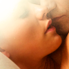
Minister SilverPOSITIVE VOTES
+ Though the lighting might be a bit over the top, it is a lovely dramatic icon.
BEST INTERPRETATION
+ No reason provided.
+ No reason provided.
+ I really like how you used the light texture to bring focus to the lips. The cropping is perfection, but that added detail puts it over the top for me!
CONSTRUCTIVE VOTES
+ I think the crop along with the light you have in the top left, which happens to also be where the majority of the subject is, doesn't work well. It might work better without the light but even then I'm not sure. From the original picture, if you'd cropped a little more of the couple, we'd be able to see a bit more. Again though, I think without the light at the top/left, it would have been much better even still.
ADDITIONAL VOTES
+ I really like the crop and the softness here, but the light washes out most of the upper-left quadrant of the icon.

Sister SablePOSITIVE VOTES
+++ Great close crop and nice natural coloring.
BEST INTERPRETATION
None.
CONSTRUCTIVE VOTES
+ I think if you'd have cropped up a bit more, allowing for more of the subject to have been seen it would have been better overall for the icon. Also, the coloring makes it so the couple blends into the background because the colors are the same or very similar (at least on my screen).
+ I like the smoothnes and the coloring here, but I think the use of lighting would have improved a lot of the icon result.
ADDITIONAL VOTES
None.

Miss MimosaPOSITIVE VOTES
None.
BEST INTERPRETATION
None.
CONSTRUCTIVE VOTES
None.
ADDITIONAL VOTES
+ I have a hard time picking out the figure here, with the black shadows in the background.

King WhitePOSITIVE VOTES
+++ A simple, clear and crisp icon. Really pretty!
+ It might just be my monitor but he looks very sharpened, but it really works to make him look more gruff and rough looking.
BEST INTERPRETATION
None.
CONSTRUCTIVE VOTES
+ While the crop is ok, cutting off the side of the subject's face makes the icon seem a bit unbalanced. Maybe a center crop would have worked better.
ADDITIONAL VOTES
None.

Lady RosePOSITIVE VOTES
+ I love the coloring and the the use of topaz enlight the icon here.
BEST INTERPRETATION
None.
CONSTRUCTIVE VOTES
+ It's a bit too dark, and there's too much topaz, making it look very unnatural.
+ The crop is nice but there is too much topaz in use, which makes her face look a little too cartoon like.
+ The coloring is pretty put the Topaz effect is overwhelming making her features strange.
+ I really love the colors here, and the contrast of the darkness of the hair with the pale background. But the face looks really flat, and the shadows around the lower lip and chin look distorted.
ADDITIONAL VOTES
None.
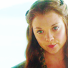
Countess DaffodilPOSITIVE VOTES
++ The vibrant colors really work here and the contrast is really good.
++ Loving the bright colors in this! I think the subjects face feels slightly washed out due to the use of light textures, but overall I find myself gravitating to this icon anyway XD
++ Beautiful coloring.
BEST INTERPRETATION
+ No reason provided.
+ No reason provided.
CONSTRUCTIVE VOTES
None.
ADDITIONAL VOTES
None.
Miss VioletPOSITIVE VOTES
+++ I think the crop you chose was great. The color and texture usage really brought out the subject and makes him look even more menacing.
+++ The coloring and cropping here is stunning.
+++ Lovely colouring and texture use
+ Nice coloring, the colors chosen are really fitting and the texture adds a beautiful light.
BEST INTERPRETATION
+ No reason provided.
+ No reason provided.
+ No reason provided.
CONSTRUCTIVE VOTES
None.
ADDITIONAL VOTES
+ I like the monochrome and the crop, but the light in the upper left-hand corner is too bright.

Mrs. OrangePOSITIVE VOTES
BEST INTERPRETATION
+ No reason provided.
CONSTRUCTIVE VOTES
+ It's too bright, especially over his arms. A multiply layer could help with this.
+ I think a wider crop would have worked better with this. At the moment your crop is cutting off part of the subject's arm, and part of his hair. The colour also looks a little washed out (on monitor), and too bright up near his arms.
+ The crop is really nice, but I would suggest adding some more sharpening of him face and vibrance to help make the colors more eye-catching.
+ I like the crop you chose, but I think that the subject comes off a bit too washed out, especially the arms. I would also suggest playing with darker colors in the future, because dramatic caps lend themselves well to a darker palette that helps set the tone. Think of it as mood lighting~
+ The natural coloring is a step in the right direction, however, parts of it are way overcontrasted. Areas of his face, and especially his arms are way too bright and washed out.
ADDITIONAL VOTES
None.
Updated Scoring Spreadsheet
1ST PLACE [5 points]:
Major Purple with +7 votes.
2ND PLACE [4 points]:
Lady Orange with +5 votes (and more first place votes).
3RD PLACE [3 points]:
Miss Gold with +5 votes.
BEST INTERPRETATION [2 points]:
&
miss Violet & Minister Silver with +3 votes.
MOD'S CHOICE [1 point]:
Countess Daffodil
[The coloring is so bright and vivid. A Perfect interpretation of the theme! Like other voters, I just couldn't help but be drawn to it.]
TABLE KEY:
+++ = 1st Place Vote
++ = 2nd Place Vote
+ = 3rd Place Vote | Beginning of a new comment.
Note: Votes are not weighted in this round. Meaning a 1st, 2nd or 3rd vote will only give you 1 point when tallying the votes. Except in the case of a tie - then the icon with the most 1st place votes will be given first.
ICON VOTES
Agent TurquoisePOSITIVE VOTES
+ I love the simplicity of this icon.
BEST INTERPRETATION
None.
CONSTRUCTIVE VOTES
+ The coloring is nice but I think the crop is a bit off. I mean it feels like it's in between, like there's not a clear choice to make it either close or far. It feels a bit "empty", maybe by putting Margaery more clearly on the right, cutting a part of her face and creating a more obvious negative space on the left would work better.
+ While I like the coloration, I think there's a slightly blurry quality to the subject in your icon. I'd also love to see some more color in the background, because the icon feels a bit off balance with all of that white space.
ADDITIONAL VOTES
None.
Lady OrangePOSITIVE VOTES
+++ I love the composition and the brightness of the colors.
+++ I really like the creative use of blocking in your icon. It adds a sense of storytelling to the icon which is lovely~
+++ perfect match between contrast, coloring and lights.
+++ The blocking in this icon is perfect, and the more muted coloring gives it a really moody atmosphere.
++ Nice composition, I really like both crop, they work very well put together and the coloring is gorgeous!
BEST INTERPRETATION
+ No reason provided.
CONSTRUCTIVE VOTES
None.
ADDITIONAL VOTES
None.
Major PurplePOSITIVE VOTES
++ The yellow coloring is stunning.
++ great blending and I love the way the coloring works on it
++ I really love how you changed the image from its original form. Adding in the blindfold was really fun and unique.
++ The light and the texture of the background are both so lovely.
+ I love how you used the screencap so creatively, but also how you gave it an emotional spin. The scarlet band you painted over the eyes is a nice touch, and breaks up the golden hues nicely.
+ Great coloring and use of light at the top left.
+ The cutout looks really clean and well made and the colors are brilliant.
BEST INTERPRETATION
None.
CONSTRUCTIVE VOTES
None.
ADDITIONAL VOTES
None.
Countess CapriPOSITIVE VOTES
+ Good use of text and composition
+ I love the depth of the shadows and the way the text fades in.
BEST INTERPRETATION
None.
CONSTRUCTIVE VOTES
+ The crop is nice but the icon is a little dark and the text is hard to read, especially toward the crop.
+ I think that the crop really work this. But 'on my screen the icon seems a bit too dark or contrasted, especially the shadows on her face which overwhelm her features and text doesn't really work because it's hard to read.
+ The shadows are a little bit too overwhelming here. I like the idea of the text, but I think it would look better if the middle section of text stood out more as opposed to the bottom section.
ADDITIONAL VOTES
None.
Miss GoldPOSITIVE VOTES
+++ The colors work really well and the balance between blue/yellow are amazing
+++ The work on the lighting is fantastic and I love the vibrant yet soft colors!
+++ Stunning coloring and light use!
++ The overall colouring and lighting works really well together.
++ Nice vibrant coloring and the bit of white at the bottom gives it the 'open' feel of the 'hall'
BEST INTERPRETATION
None.
CONSTRUCTIVE VOTES
+ there is a lot I love in this icon, but I think it results a bit too light to make the subject stick out.
+ The light at the bottom of the icon washes everything out overwhelms the figure.
ADDITIONAL VOTES
None.
Minister SilverPOSITIVE VOTES
+ Though the lighting might be a bit over the top, it is a lovely dramatic icon.
BEST INTERPRETATION
+ No reason provided.
+ No reason provided.
+ I really like how you used the light texture to bring focus to the lips. The cropping is perfection, but that added detail puts it over the top for me!
CONSTRUCTIVE VOTES
+ I think the crop along with the light you have in the top left, which happens to also be where the majority of the subject is, doesn't work well. It might work better without the light but even then I'm not sure. From the original picture, if you'd cropped a little more of the couple, we'd be able to see a bit more. Again though, I think without the light at the top/left, it would have been much better even still.
ADDITIONAL VOTES
+ I really like the crop and the softness here, but the light washes out most of the upper-left quadrant of the icon.
Sister SablePOSITIVE VOTES
+++ Great close crop and nice natural coloring.
BEST INTERPRETATION
None.
CONSTRUCTIVE VOTES
+ I think if you'd have cropped up a bit more, allowing for more of the subject to have been seen it would have been better overall for the icon. Also, the coloring makes it so the couple blends into the background because the colors are the same or very similar (at least on my screen).
+ I like the smoothnes and the coloring here, but I think the use of lighting would have improved a lot of the icon result.
ADDITIONAL VOTES
None.
Miss MimosaPOSITIVE VOTES
None.
BEST INTERPRETATION
None.
CONSTRUCTIVE VOTES
None.
ADDITIONAL VOTES
+ I have a hard time picking out the figure here, with the black shadows in the background.
King WhitePOSITIVE VOTES
+++ A simple, clear and crisp icon. Really pretty!
+ It might just be my monitor but he looks very sharpened, but it really works to make him look more gruff and rough looking.
BEST INTERPRETATION
None.
CONSTRUCTIVE VOTES
+ While the crop is ok, cutting off the side of the subject's face makes the icon seem a bit unbalanced. Maybe a center crop would have worked better.
ADDITIONAL VOTES
None.
Lady RosePOSITIVE VOTES
+ I love the coloring and the the use of topaz enlight the icon here.
BEST INTERPRETATION
None.
CONSTRUCTIVE VOTES
+ It's a bit too dark, and there's too much topaz, making it look very unnatural.
+ The crop is nice but there is too much topaz in use, which makes her face look a little too cartoon like.
+ The coloring is pretty put the Topaz effect is overwhelming making her features strange.
+ I really love the colors here, and the contrast of the darkness of the hair with the pale background. But the face looks really flat, and the shadows around the lower lip and chin look distorted.
ADDITIONAL VOTES
None.
Countess DaffodilPOSITIVE VOTES
++ The vibrant colors really work here and the contrast is really good.
++ Loving the bright colors in this! I think the subjects face feels slightly washed out due to the use of light textures, but overall I find myself gravitating to this icon anyway XD
++ Beautiful coloring.
BEST INTERPRETATION
+ No reason provided.
+ No reason provided.
CONSTRUCTIVE VOTES
None.
ADDITIONAL VOTES
None.
Miss VioletPOSITIVE VOTES
+++ I think the crop you chose was great. The color and texture usage really brought out the subject and makes him look even more menacing.
+++ The coloring and cropping here is stunning.
+++ Lovely colouring and texture use
+ Nice coloring, the colors chosen are really fitting and the texture adds a beautiful light.
BEST INTERPRETATION
+ No reason provided.
+ No reason provided.
+ No reason provided.
CONSTRUCTIVE VOTES
None.
ADDITIONAL VOTES
+ I like the monochrome and the crop, but the light in the upper left-hand corner is too bright.
Mrs. OrangePOSITIVE VOTES
BEST INTERPRETATION
+ No reason provided.
CONSTRUCTIVE VOTES
+ It's too bright, especially over his arms. A multiply layer could help with this.
+ I think a wider crop would have worked better with this. At the moment your crop is cutting off part of the subject's arm, and part of his hair. The colour also looks a little washed out (on monitor), and too bright up near his arms.
+ The crop is really nice, but I would suggest adding some more sharpening of him face and vibrance to help make the colors more eye-catching.
+ I like the crop you chose, but I think that the subject comes off a bit too washed out, especially the arms. I would also suggest playing with darker colors in the future, because dramatic caps lend themselves well to a darker palette that helps set the tone. Think of it as mood lighting~
+ The natural coloring is a step in the right direction, however, parts of it are way overcontrasted. Areas of his face, and especially his arms are way too bright and washed out.
ADDITIONAL VOTES
None.
Updated Scoring Spreadsheet