Round 1 - Challenge 12 - Results
ROUND 1 - CHALLENGE 12 - RESULTS
1ST PLACE [5 points]:

leire_pj with +8 votes.
2ND PLACE [4 points]:

everythingshiny with +7 votes.
3RD PLACE [3 points]:

regularamanda with +6 votes.
BEST INTERPRETATION OF THEME [2 points]:
regularamanda with +5 votes.
MODS CHOICE [1 point]:
[absolutelybatty]
relaxjolene
[I love how stark and clean this icon is, and the blending is flawless.]
[raiindust]
spud66cat
[Love the use of colour and black and white here, they really help to contrast the characters. The texture also really helps to frame the image.]
TABLE KEY:
+++ = 1st Place Vote
++ = 2nd Place Vote
+ = 3rd Place Vote | Beginning of a new comment.
Note: Votes are not weighted in this round. Meaning a 1st, 2nd or 3rd vote will only give you 1 point when tallying the votes. Except in the case of a tie - then the icon with the most 1st place votes will be given first.
ICON VOTES
lumsxPOSITIVE VOTES
+++ Gorgeous use of the space and duplicate images, and I love the darkness and the representation of the theme. Great colours too, very unusual icon.
++ The crop makes it a bit hard to tell who's the one on the right side, but I think the composition is great. It's original, it makes the icon interesting yet it keeps it simple and well focused.
+ There's not a lot to this icon but the image that is created is really powerful, I find. It's simplicity is it's strength, as is the lighting of the characters faces. It's interesting to see how you used them, they're really affective.
+ The negative space is great, and I like the contrast between Sam and evil!Sam.
BEST INTERPRETATION OF THEME
+ No reasons given.
CONSTRUCTIVE VOTES
+ I like the idea behind this but the images are so small and blurred that it makes it hard to see.
+ The image is very blurry and the crop feels awkward making it look a bit like he has 2 heads.
+ Composition is creative, but it's difficult to figure out the concept behind it for those who aren't familiar with the fandom: pictures are tiny and a little blurry, maybe a tad bigger version of them could have worked better.
+ I like the concept, but the images are so small that it's hard to tell what it is or what's going on.
+ The multiplied image is a cool style but on this one the faces are somewhat obscured and blurred and it's unclear who they actually are. It might be Dean & Sam from SPN? With icons that are all about faces it's perhaps better to have at least one of images larger so we can see focus on at least one of the person's facial expressions.
ADDITIONAL VOTES
+ This is such an interesting idea, but I feel as though the impact is a little lost, because of the repeated images. Perhaps if there had been one central image, the impact would have been stronger, as the focus would have been clearer and more direct. Brilliant use of light and shade though.
+ It's a nice composition and the coloring is very nice too. Maybe the picture is a bit too small and a little blurry so it's difficult to understand what's going on the icon. I think the icon is about Sam Winchester and it's a very good character for this theme, but maybe a different choice of picture could help the ones who don't know the fandom to understand why this man fits to the theme.

scifi_tv_addictPOSITIVE VOTES
+++ Good choice for a subject in accordance to the theme. The composition is intriguing too, as are the textures used, and the colour tones used in this ion all work really well together. The chosen image and all those things together really capture the moment in that film as well.
++ I like the way the duplicates look. And the crop on the top one is awesome.
BEST INTERPRETATION OF THEME
+ No reasons given.
CONSTRUCTIVE VOTES
+ Composition is nice, and the coloring is lovely too, but a bit unsure about the striped texture you used: you might have slightly blurred it, so that lines would have been softer.
ADDITIONAL VOTES
+ Amazing image choice, it is so fitting for the theme. I really love the multiple image use as well, but I feel the grungy texture takes away a little too much of the focus from the image.

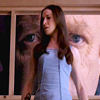
marcasitePOSITIVE VOTES
++ I'm really not sure what the fandom is here, but this icon is lovely. I really like how the crop kind of creates negative space, and how the door in the background helps draw focus to the subject of the icon. I also really really adore the coloring of this icon.
BEST INTERPRETATION OF THEME
NONE.
CONSTRUCTIVE VOTES
+ The image is very grainy and blurry, and the coloring a bit dull. But I do really love the crop of this though.
+ It could be my monitor, but this icon looks grainy and pixelly: you might have blurred the background to even it out a little, in my opinion. Plus, I can't figure out how this subject fits the theme: maybe a word or two of text could have helped here.
+ This icon is a hard to understand when you're not familiar with the fandom, there's not much in the image that is telling of the good versus evil theme.
ADDITIONAL VOTES
+ I have a feeling the impact of this icon will be lost on anyone who isn't in the fandom. It's lovely composition however, and the negative space is great - but I don't understand what's happening in the image to give me a sense of good vs. evil. Some indicator (text, another image) may have been useful.

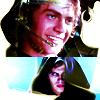
juanxyoPOSITIVE VOTES
++ Great use of blocking and texture, great use of colour too. Does look a little low on quality, but a very clever icon.
BEST INTERPRETATION OF THEME
+ No reasons given.
CONSTRUCTIVE VOTES
+ I love the contrast between the orange background and Darth Vader as it makes him stand right out of the icon. But I think the left half is distracting and even a bit confusing as you can hardly see Luke at the top or tell what's going on.
ADDITIONAL VOTES
+ Lovely composition and colors! Maybe the white texture on the lower right is a bit distracting, though.
+ I love this composition, and the colours are amazing, but the icon itself seems quite cluttered. I think it would have been a lot stronger without the white texture, which takes away from the beautiful colours of the images.
+ I really love the coloring. The blues and reds work well together. However, the texture used in the bottom right corner is very distracting and draws attention away from the rest of the icon. The images of Luke are so small that they are hardly noticeable at first glance, but I think they would have been more recognizable and easier to pick out if the texture weren't obscuring the ones on the right and the bottom.
memonechanPOSITIVE VOTES
+++ Great blending and use of neutral space. Everything seems to fit together as if they were part of the same image.
+++ Good combination of images and I like the way you have certain parts of the image blend in with the background.
++ Great use of texture and negative space. The composition is also nice, though I think it would be even better if Gandalf was shown in bit a more prominence.
+ The composition of this icon is very clever: Gandalf (the good one) is placed on a black background, while Saruman (the evil one) stands on a white background. Great work :)
BEST INTERPRETATION OF THEME
+ No reasons given.
+ No reasons given.
CONSTRUCTIVE VOTES
+ I like the coloring here a lot, it really works well with the black and white texture in the background. My main issue is that Gandalf's head is cropped off, so he looks like he's kind of under the texture in parts. This seems to create an unbalanced composition, especially because he's supposed to be one of the focal points in the image. I think this would work much better if Gandalf's full head was there, it would just feel less lopsided. Also be careful of the "over sharpened" effect, you've got some really pixelly bits around the outside of the subjects.
ADDITIONAL VOTES
+ Lovely blending here, and great use of texture to compliment the images chosen.
+ Love the composition, and the background texture looks really good.
relaxjolenePOSITIVE VOTES
++ I really like the composition; the way the two Walters overlap. I also like the cropping. Well done.
++ The use of negative space, the lighting, and the seamless blending of the icon is amazing.
BEST INTERPRETATION OF THEME
NONE.
CONSTRUCTIVE VOTES
+ Composition is nice as well as the blending, but the light texture is a little distracting and the left crop looks a bit awkward because of his forehead.
ADDITIONAL VOTES
+ Good blending!
+ I love, love, love the idea of this icon, with Walter and Walternate who depict good vs evil so well. I think the top texture is a little redundant and does more to detract from the icon than add to it. perhaps on a different setting it would be more effective. Otherwise, great work.
+ I really love the use of images here, and how one is slightly larger than the other. I think the texture use is great as well, and actually think it would have benefited from having the same texture duplicated and covering the lower half of the icon as well.
regularamandaPOSITIVE VOTES
+++ stunning visual, great crop and coloring.
+++ The vibrancy of the colors in this is beautiful.
+++ The coloring really makes the light saber beams pop and the cropping and minimal style fit well with the iconic scene.
+++ I love the crop and the coloring. Very vivid and powerful. Well done.
++ I really like the bright vivid colors.
+ The intense colouring makes Luke look a bit too orange, but it's great the way the colour seems to splash right out of the lightsabers. The icon looks a bit like an explosion, which makes the cap a lot more dramatic.
BEST INTERPRETATION OF THEME
+ No reasons given.
+ No reasons given.
+ It really illustrates "verses" part and not just the good & evil part of the theme.
+ I like very much the image you choose for the icon: it really gives the idea of Good vs Evil. The crop is very good as the coloring, but I think that the icon is quite ruined (I can see some grained stripes near the swords) like it was oversharpened or the quality of the image was not very good.
+ This is about as quintessentially good vs evil as you can get. It's also a gorgeous icon! :) I love how much the blue pops and that the lightsabers are the focus of the crop.
CONSTRUCTIVE VOTES
+ The composition is amazing, the hue appears a bit bright on my monitor.
ADDITIONAL VOTES
+ It's a tad over-sharpened and the saturation of reds is a little too strong (especially on Luke), but this icon is very impressive.
defyxgravityxPOSITIVE VOTES
NONE.
BEST INTERPRETATION OF THEME
NONE.
CONSTRUCTIVE VOTES
+ Lovely idea, but I think the blend looks a little awkward, and it needs sharpening as it appears blurry. Try using different levels when blending, say one higher and slightly larger in the image, another lower and smaller, rather than side by side. Or do a slip image, with each side different colours. Basically just mix it up and experiment to make it more interesting and appealing.
+ the idea is fabulous but the execution of the blend is not quite there; the coloring between the two faces too similar.
+ The blending here looks a bit awkward. The edge between the images, while soft and blurred, is irregular, jutting into the hair of the right most image. I think this may benefit from erasing some of the details in the surroundings below them, so the focus is more on the faces.
+ Crop is interesting. Coloring is nice too, but maybe a little too plain.
+ Blending is a little bit awkward, especially in the lower part of the icon: it looks like it was highlighted, somehow, and it draws the attention away from the focal point of the icon.
ADDITIONAL VOTES
+ I love the images chosen here, and the light colouring is lovely. A little bit of contrast and vibrance would really have helped to make the icon pop though.

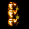
mer_moonchildPOSITIVE VOTES
NONE.
BEST INTERPRETATION OF THEME
NONE.
CONSTRUCTIVE VOTES
+ It's a tad over-sharpened, and the coloring is a little too bland against the bright textures you used on both sides. Nice composition, though.
+ I think this is an interesting composition, however the vibrant texture use and neutral tones of the images clash a little too much for me, so the focal point is a little lost. The icon also seems a little oversharpened, especially around the edges.
+ This is such an interesting use of texture that is so creative. Love the double images too, but they seem a bit over sharpened on my monitor.
ADDITIONAL VOTES
NONE.
everythingshinyPOSITIVE VOTES
+++ The blending of the images is flawless on this icon, the colouring is gorgeous, I love the use of lightness on the right side & darkness on the left side too.
+++ Great colouring and composition here, and absolutely flawless blending. I love the way the background character has a slightly murkier colour to him, it's a wonderfully subtle nod to the theme.
++ Simple and beautiful: the dark background draws the attention to the subjects in the foreground, and the coloring is bright and natural.
++ It's a simple icon but very effective. It's a lovely negative space and the coloring is very good. The blending is also well made.
+ Nice contrast and blending.
+ A very nice blend, though the coloring could of been a bit more pronounced.
+ Really lovely composition with Alpha and Echo overlapping each other here. Fantastic job with coloring and using the black background here was a really smart choice. I like how simple and uncluttered this icon is, it draws your focus right to the focal point!
BEST INTERPRETATION OF THEME
NONE.
CONSTRUCTIVE VOTES
NONE.
ADDITIONAL VOTES
NONE.
spud66catPOSITIVE VOTES
+++ Love everything about this icon. The composition, texture use, color contrast, everything.
+ It's a lovely composition and the coloring you choose gave the idea of the contrast between good vs evil. Maybe I would choose a different cap of the man (with a eviler facial expression) to underline that contrast.
+ The one has an interesting shape and the red & white coloring highlights the good & evil side.
+ Great use of textures here to really help highlight the theme. The black and white has such an amazing contrast against the reds, and the blending is great.
BEST INTERPRETATION OF THEME
+ It took me some time to appreciate this icon. The images you chose are both very emotive and it's difficult to figure out who's the evil one: there's only the coloring as a hint, and this is very, very creative and subtle.
CONSTRUCTIVE VOTES
NONE.
ADDITIONAL VOTES
+ The crop and texture use are amazing.
crazed_delusionPOSITIVE VOTES
NONE.
BEST INTERPRETATION OF THEME
NONE.
CONSTRUCTIVE VOTES
+ Coloring a little plain, and the icon lacks some contrast. Great image choice, thought, and good crop!
ADDITIONAL VOTES
+ Very clever use of image here, however I feel as though it's very bare. It could have used some more colour, and perhaps a texture or two to create some contrast between the characters.

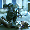
ofourdreamsPOSITIVE VOTES
NONE.
BEST INTERPRETATION OF THEME
NONE.
CONSTRUCTIVE VOTES
+ There is so much going on it's hard to tell what this icon is about.
+ The colouring here is impressive, but it's very hard for me to understand what's going on in the picture.
+ The icon has a lovely coloring and the composition is lovely too but I have some difficult to understand what is the icon about, maybe for the picture you choose or for a contrast that is a bit too strong.
+ Coloring is great as well as contrast, but the composition is a little confusing, in my opinion.
+ I cannot tell what is happening here, if it's a space battle or a weapon of some kind firing. Maybe the icon is a bit to dark in spots for me to see or perhaps a scene like this would be much better illustrated with some additional text perhaps so we could know what's happening in the images. The colors look great though!
+ I like the coloring (the blues and orange complement each other well). However, between the busy composition and high contrast, its difficult to tell what's going on in the icon. When making complex icons with multiple images, its a good idea to try and preserve as much of the detail in the original images as possible, since they are usually scaled down to such a small size in order to fit them on the icon. Here, a lot of the details are lost because some of the highlights are blown out and the shadows are completely black. I can tell that its a person on the left, but the images of the right are just a jumble of colors and lines. I think toning down the contrast would help here.
ADDITIONAL VOTES
+ I think this icon is very pretty, but there's so much going on it's hard to tell what the subject matter is. The colours and lights are really nice to look at, just needs a little more clarity of subject.
+ I really love the colours of the icon, however I feel the use of multiple images here has overwhelmed the icon a little. Perhaps this is a case of less is more, so the focus could have been clearer as to the good vs. evil theme.

vividcuriosityPOSITIVE VOTES
+ I like the way the texture separates the two images. I also like the cropping of both images.
BEST INTERPRETATION OF THEME
NONE.
CONSTRUCTIVE VOTES
+ I love the idea of this icon, but the blending is awkward. The head of Olivia(the one in the right) seems to be floating.
+ The crop on the left side is great, while the one on the right side looks a little bit awkward: the light texture you used covers her a little too much, and I think it's a little bit distracting.
ADDITIONAL VOTES
+ Really interesting use of contrasting images, and love the opposing crops. The light on the lower half of the icon is a touch distracting though. If it had been masked away, or lowered in opacity, it really could have helped to highlight the characters.
tinebrellaPOSITIVE VOTES
++ The bright coloring and dark contrast looks really make the images pop.
BEST INTERPRETATION OF THEME
+ No reasons given.
+ Star Wars is the quintessence of of good vs evil and how a single person can battle both sides inside themselves, showing all the shades of grey between them. Iconing both sides of Anakin is a great interpretation of this theme.
CONSTRUCTIVE VOTES
+ Nice composition. Maybe the icon is just a little over-sharpened.
ADDITIONAL VOTES
+ Brilliant image use, and I really like the colours. The magenta's are a touch heavy and could have been lowered in opacity, but beyond that, a lovely icon.
+ The contrast between the good and the evil is very understandable and the icon has a lovely coloring. Perhaps the icon is just a bit oversharpened especially on the white tones and that's a pity.

bam_87POSITIVE VOTES
++ Amazing use of blue here. I love the varying shades, and especially love how the darker blue doesn't overwhelm the image. The text use is flawless as well.
+ Love that stark contrast of dark and light on this icon and I think the blue tones are beautiful.
+ Interesting design and the choice to make one side light blue and the other dark makes the icon stand out.
BEST INTERPRETATION OF THEME
NONE.
CONSTRUCTIVE VOTES
+ The right part is a bit dark. The text placement is good, maybe just with two diferent font types would've been better though.
+ Coloring is nice, but the icon is a tad over-sharpened and picture on the right side is barely visible: maybe you might have brighten it up a little.
ADDITIONAL VOTES
NONE.
sgflutegirlPOSITIVE VOTES
NONE.
BEST INTERPRETATION OF THEME
NONE.
CONSTRUCTIVE VOTES
+ It's a touch over-sharpened and it lacks contrast: you could have worked more on the coloring to enhance the nice shades of blue of the picture and to increase the contrast between lights and shadows, in my opinion.
+ Really interesting image choice, but there is a lack of contrast so the characters are pulled into the background, rather than being highlighted in the foreground. I think the icon could have benefited from some colour, vibrance or lightness to the icon, and some depth to the shadows, to really help the characters pop.
+ great crop but the coloring is very monochromatic blue and the icon is very dark.
ADDITIONAL VOTES
NONE.
leire_pjPOSITIVE VOTES
+++ Great crop and use of negative space.
+++ GORGEOUS coloring and crop. I think maybe a teeny tiny bit more contrast could have been used here, but it's so very lovely as is.
+++ Gorgeous use of negative space. The coloring is really good too.
+++ It's a lovely icon with a beautiful coloring and negative space.
+++ Utterly gorgeous: lovely coloring, great negative space use and perfect crop.
++ Amazing choice of screencap. The colouring is amazing, lights & darks shades of blue working well to highlight the icon, and the use of negative space is perfect.
+ Stunning use of blue, really works with the image. Perfectly level of sharpening and vibrancy, quite simple overall but effective.
+ wonderful coloring and cropping.
BEST INTERPRETATION OF THEME
+ The two images convey good vs evil perfectly, and the texture and colours work brilliantly.
CONSTRUCTIVE VOTES
+ The image seems a little grainy and that sadly takes away from the impact of it. The idea is nice though and the blue tones are very atmospheric, though with just a tiny bit of contrast (like, a tiny tiny bit) they could have been a little sharper.
ADDITIONAL VOTES
+ The negative space and/or framing on this one looks great.
+ Such a great image to choose, and great colouring. I think the shadows could have been a touch darker though, to really help the characters contrast against the background.
_puchula_POSITIVE VOTES
++ The background texture is really cool and really draws the eye. The colours of the figures and other textures blend really well together with the background and the icon comes across as really harmonious.
++ great use of negative space and textures.
+ I love the soft coloring. The texture use in the negative space is also nice.
BEST INTERPRETATION OF THEME
+ No reasons given.
+ Brilliant twist on the theme, the good vs. the evil side of Anakin Skywalker. I think the texture overlaid on top obscures them though, especially young Anakin. At first glance, I thought it was an image of Luke from A New Hope. I think maybe increasing the contrast some would make him stand out better, so he's more identifiable.
CONSTRUCTIVE VOTES
+ The composition of this feel odd - the darkness of Vader(?) is muted by the background and lighting to the point where it's hard to make out what's going on in the icon.
+ It's a lovely negative space and the use of textures is really good but I honestly can't recognize very well the lighter figure (Luke, I suppose). Maybe a darker background and a stronger contrast could help :)
+ I really like the texture and the crop, but I feel like Luke and Darth get kind of lost here. I can't tell if you used a light texture on top of them (it looks like maybe you did), but if so, I think that might be a large part of the problem.
+ Great idea, although the pictures, particularly anakin, look too bright. They images also don't quite seem to gel with the background.
ADDITIONAL VOTES
+ Composition is very pretty, but at first I saw Vader and didn't notice Anakin on the left side :D I'm not even sure if it's Anakin or Luke, to be honest. It could be due to the texture you chose as background, or maybe you should have highlighted him in some way, perhaps. Too bad, because it could have been a great icon, in my opinion.
+ I love the symbolism of this icon, a snapshot of how innocence can become evil. I think the texture in the background is a little distracting however, and perhaps if it was more yellow or tan, it would have helped blend the image together.
Overall Points Tally
The MVP and Overall Winners posts will be up momentarily.
1ST PLACE [5 points]:
leire_pj with +8 votes.
2ND PLACE [4 points]:
everythingshiny with +7 votes.
3RD PLACE [3 points]:
regularamanda with +6 votes.
BEST INTERPRETATION OF THEME [2 points]:
regularamanda with +5 votes.
MODS CHOICE [1 point]:
[absolutelybatty]
relaxjolene
[I love how stark and clean this icon is, and the blending is flawless.]
[raiindust]
spud66cat
[Love the use of colour and black and white here, they really help to contrast the characters. The texture also really helps to frame the image.]
TABLE KEY:
+++ = 1st Place Vote
++ = 2nd Place Vote
+ = 3rd Place Vote | Beginning of a new comment.
Note: Votes are not weighted in this round. Meaning a 1st, 2nd or 3rd vote will only give you 1 point when tallying the votes. Except in the case of a tie - then the icon with the most 1st place votes will be given first.
ICON VOTES
lumsxPOSITIVE VOTES
+++ Gorgeous use of the space and duplicate images, and I love the darkness and the representation of the theme. Great colours too, very unusual icon.
++ The crop makes it a bit hard to tell who's the one on the right side, but I think the composition is great. It's original, it makes the icon interesting yet it keeps it simple and well focused.
+ There's not a lot to this icon but the image that is created is really powerful, I find. It's simplicity is it's strength, as is the lighting of the characters faces. It's interesting to see how you used them, they're really affective.
+ The negative space is great, and I like the contrast between Sam and evil!Sam.
BEST INTERPRETATION OF THEME
+ No reasons given.
CONSTRUCTIVE VOTES
+ I like the idea behind this but the images are so small and blurred that it makes it hard to see.
+ The image is very blurry and the crop feels awkward making it look a bit like he has 2 heads.
+ Composition is creative, but it's difficult to figure out the concept behind it for those who aren't familiar with the fandom: pictures are tiny and a little blurry, maybe a tad bigger version of them could have worked better.
+ I like the concept, but the images are so small that it's hard to tell what it is or what's going on.
+ The multiplied image is a cool style but on this one the faces are somewhat obscured and blurred and it's unclear who they actually are. It might be Dean & Sam from SPN? With icons that are all about faces it's perhaps better to have at least one of images larger so we can see focus on at least one of the person's facial expressions.
ADDITIONAL VOTES
+ This is such an interesting idea, but I feel as though the impact is a little lost, because of the repeated images. Perhaps if there had been one central image, the impact would have been stronger, as the focus would have been clearer and more direct. Brilliant use of light and shade though.
+ It's a nice composition and the coloring is very nice too. Maybe the picture is a bit too small and a little blurry so it's difficult to understand what's going on the icon. I think the icon is about Sam Winchester and it's a very good character for this theme, but maybe a different choice of picture could help the ones who don't know the fandom to understand why this man fits to the theme.
scifi_tv_addictPOSITIVE VOTES
+++ Good choice for a subject in accordance to the theme. The composition is intriguing too, as are the textures used, and the colour tones used in this ion all work really well together. The chosen image and all those things together really capture the moment in that film as well.
++ I like the way the duplicates look. And the crop on the top one is awesome.
BEST INTERPRETATION OF THEME
+ No reasons given.
CONSTRUCTIVE VOTES
+ Composition is nice, and the coloring is lovely too, but a bit unsure about the striped texture you used: you might have slightly blurred it, so that lines would have been softer.
ADDITIONAL VOTES
+ Amazing image choice, it is so fitting for the theme. I really love the multiple image use as well, but I feel the grungy texture takes away a little too much of the focus from the image.
marcasitePOSITIVE VOTES
++ I'm really not sure what the fandom is here, but this icon is lovely. I really like how the crop kind of creates negative space, and how the door in the background helps draw focus to the subject of the icon. I also really really adore the coloring of this icon.
BEST INTERPRETATION OF THEME
NONE.
CONSTRUCTIVE VOTES
+ The image is very grainy and blurry, and the coloring a bit dull. But I do really love the crop of this though.
+ It could be my monitor, but this icon looks grainy and pixelly: you might have blurred the background to even it out a little, in my opinion. Plus, I can't figure out how this subject fits the theme: maybe a word or two of text could have helped here.
+ This icon is a hard to understand when you're not familiar with the fandom, there's not much in the image that is telling of the good versus evil theme.
ADDITIONAL VOTES
+ I have a feeling the impact of this icon will be lost on anyone who isn't in the fandom. It's lovely composition however, and the negative space is great - but I don't understand what's happening in the image to give me a sense of good vs. evil. Some indicator (text, another image) may have been useful.
juanxyoPOSITIVE VOTES
++ Great use of blocking and texture, great use of colour too. Does look a little low on quality, but a very clever icon.
BEST INTERPRETATION OF THEME
+ No reasons given.
CONSTRUCTIVE VOTES
+ I love the contrast between the orange background and Darth Vader as it makes him stand right out of the icon. But I think the left half is distracting and even a bit confusing as you can hardly see Luke at the top or tell what's going on.
ADDITIONAL VOTES
+ Lovely composition and colors! Maybe the white texture on the lower right is a bit distracting, though.
+ I love this composition, and the colours are amazing, but the icon itself seems quite cluttered. I think it would have been a lot stronger without the white texture, which takes away from the beautiful colours of the images.
+ I really love the coloring. The blues and reds work well together. However, the texture used in the bottom right corner is very distracting and draws attention away from the rest of the icon. The images of Luke are so small that they are hardly noticeable at first glance, but I think they would have been more recognizable and easier to pick out if the texture weren't obscuring the ones on the right and the bottom.
memonechanPOSITIVE VOTES
+++ Great blending and use of neutral space. Everything seems to fit together as if they were part of the same image.
+++ Good combination of images and I like the way you have certain parts of the image blend in with the background.
++ Great use of texture and negative space. The composition is also nice, though I think it would be even better if Gandalf was shown in bit a more prominence.
+ The composition of this icon is very clever: Gandalf (the good one) is placed on a black background, while Saruman (the evil one) stands on a white background. Great work :)
BEST INTERPRETATION OF THEME
+ No reasons given.
+ No reasons given.
CONSTRUCTIVE VOTES
+ I like the coloring here a lot, it really works well with the black and white texture in the background. My main issue is that Gandalf's head is cropped off, so he looks like he's kind of under the texture in parts. This seems to create an unbalanced composition, especially because he's supposed to be one of the focal points in the image. I think this would work much better if Gandalf's full head was there, it would just feel less lopsided. Also be careful of the "over sharpened" effect, you've got some really pixelly bits around the outside of the subjects.
ADDITIONAL VOTES
+ Lovely blending here, and great use of texture to compliment the images chosen.
+ Love the composition, and the background texture looks really good.
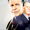
relaxjolenePOSITIVE VOTES
++ I really like the composition; the way the two Walters overlap. I also like the cropping. Well done.
++ The use of negative space, the lighting, and the seamless blending of the icon is amazing.
BEST INTERPRETATION OF THEME
NONE.
CONSTRUCTIVE VOTES
+ Composition is nice as well as the blending, but the light texture is a little distracting and the left crop looks a bit awkward because of his forehead.
ADDITIONAL VOTES
+ Good blending!
+ I love, love, love the idea of this icon, with Walter and Walternate who depict good vs evil so well. I think the top texture is a little redundant and does more to detract from the icon than add to it. perhaps on a different setting it would be more effective. Otherwise, great work.
+ I really love the use of images here, and how one is slightly larger than the other. I think the texture use is great as well, and actually think it would have benefited from having the same texture duplicated and covering the lower half of the icon as well.
regularamandaPOSITIVE VOTES
+++ stunning visual, great crop and coloring.
+++ The vibrancy of the colors in this is beautiful.
+++ The coloring really makes the light saber beams pop and the cropping and minimal style fit well with the iconic scene.
+++ I love the crop and the coloring. Very vivid and powerful. Well done.
++ I really like the bright vivid colors.
+ The intense colouring makes Luke look a bit too orange, but it's great the way the colour seems to splash right out of the lightsabers. The icon looks a bit like an explosion, which makes the cap a lot more dramatic.
BEST INTERPRETATION OF THEME
+ No reasons given.
+ No reasons given.
+ It really illustrates "verses" part and not just the good & evil part of the theme.
+ I like very much the image you choose for the icon: it really gives the idea of Good vs Evil. The crop is very good as the coloring, but I think that the icon is quite ruined (I can see some grained stripes near the swords) like it was oversharpened or the quality of the image was not very good.
+ This is about as quintessentially good vs evil as you can get. It's also a gorgeous icon! :) I love how much the blue pops and that the lightsabers are the focus of the crop.
CONSTRUCTIVE VOTES
+ The composition is amazing, the hue appears a bit bright on my monitor.
ADDITIONAL VOTES
+ It's a tad over-sharpened and the saturation of reds is a little too strong (especially on Luke), but this icon is very impressive.
defyxgravityxPOSITIVE VOTES
NONE.
BEST INTERPRETATION OF THEME
NONE.
CONSTRUCTIVE VOTES
+ Lovely idea, but I think the blend looks a little awkward, and it needs sharpening as it appears blurry. Try using different levels when blending, say one higher and slightly larger in the image, another lower and smaller, rather than side by side. Or do a slip image, with each side different colours. Basically just mix it up and experiment to make it more interesting and appealing.
+ the idea is fabulous but the execution of the blend is not quite there; the coloring between the two faces too similar.
+ The blending here looks a bit awkward. The edge between the images, while soft and blurred, is irregular, jutting into the hair of the right most image. I think this may benefit from erasing some of the details in the surroundings below them, so the focus is more on the faces.
+ Crop is interesting. Coloring is nice too, but maybe a little too plain.
+ Blending is a little bit awkward, especially in the lower part of the icon: it looks like it was highlighted, somehow, and it draws the attention away from the focal point of the icon.
ADDITIONAL VOTES
+ I love the images chosen here, and the light colouring is lovely. A little bit of contrast and vibrance would really have helped to make the icon pop though.
mer_moonchildPOSITIVE VOTES
NONE.
BEST INTERPRETATION OF THEME
NONE.
CONSTRUCTIVE VOTES
+ It's a tad over-sharpened, and the coloring is a little too bland against the bright textures you used on both sides. Nice composition, though.
+ I think this is an interesting composition, however the vibrant texture use and neutral tones of the images clash a little too much for me, so the focal point is a little lost. The icon also seems a little oversharpened, especially around the edges.
+ This is such an interesting use of texture that is so creative. Love the double images too, but they seem a bit over sharpened on my monitor.
ADDITIONAL VOTES
NONE.
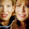
everythingshinyPOSITIVE VOTES
+++ The blending of the images is flawless on this icon, the colouring is gorgeous, I love the use of lightness on the right side & darkness on the left side too.
+++ Great colouring and composition here, and absolutely flawless blending. I love the way the background character has a slightly murkier colour to him, it's a wonderfully subtle nod to the theme.
++ Simple and beautiful: the dark background draws the attention to the subjects in the foreground, and the coloring is bright and natural.
++ It's a simple icon but very effective. It's a lovely negative space and the coloring is very good. The blending is also well made.
+ Nice contrast and blending.
+ A very nice blend, though the coloring could of been a bit more pronounced.
+ Really lovely composition with Alpha and Echo overlapping each other here. Fantastic job with coloring and using the black background here was a really smart choice. I like how simple and uncluttered this icon is, it draws your focus right to the focal point!
BEST INTERPRETATION OF THEME
NONE.
CONSTRUCTIVE VOTES
NONE.
ADDITIONAL VOTES
NONE.
spud66catPOSITIVE VOTES
+++ Love everything about this icon. The composition, texture use, color contrast, everything.
+ It's a lovely composition and the coloring you choose gave the idea of the contrast between good vs evil. Maybe I would choose a different cap of the man (with a eviler facial expression) to underline that contrast.
+ The one has an interesting shape and the red & white coloring highlights the good & evil side.
+ Great use of textures here to really help highlight the theme. The black and white has such an amazing contrast against the reds, and the blending is great.
BEST INTERPRETATION OF THEME
+ It took me some time to appreciate this icon. The images you chose are both very emotive and it's difficult to figure out who's the evil one: there's only the coloring as a hint, and this is very, very creative and subtle.
CONSTRUCTIVE VOTES
NONE.
ADDITIONAL VOTES
+ The crop and texture use are amazing.
crazed_delusionPOSITIVE VOTES
NONE.
BEST INTERPRETATION OF THEME
NONE.
CONSTRUCTIVE VOTES
+ Coloring a little plain, and the icon lacks some contrast. Great image choice, thought, and good crop!
ADDITIONAL VOTES
+ Very clever use of image here, however I feel as though it's very bare. It could have used some more colour, and perhaps a texture or two to create some contrast between the characters.
ofourdreamsPOSITIVE VOTES
NONE.
BEST INTERPRETATION OF THEME
NONE.
CONSTRUCTIVE VOTES
+ There is so much going on it's hard to tell what this icon is about.
+ The colouring here is impressive, but it's very hard for me to understand what's going on in the picture.
+ The icon has a lovely coloring and the composition is lovely too but I have some difficult to understand what is the icon about, maybe for the picture you choose or for a contrast that is a bit too strong.
+ Coloring is great as well as contrast, but the composition is a little confusing, in my opinion.
+ I cannot tell what is happening here, if it's a space battle or a weapon of some kind firing. Maybe the icon is a bit to dark in spots for me to see or perhaps a scene like this would be much better illustrated with some additional text perhaps so we could know what's happening in the images. The colors look great though!
+ I like the coloring (the blues and orange complement each other well). However, between the busy composition and high contrast, its difficult to tell what's going on in the icon. When making complex icons with multiple images, its a good idea to try and preserve as much of the detail in the original images as possible, since they are usually scaled down to such a small size in order to fit them on the icon. Here, a lot of the details are lost because some of the highlights are blown out and the shadows are completely black. I can tell that its a person on the left, but the images of the right are just a jumble of colors and lines. I think toning down the contrast would help here.
ADDITIONAL VOTES
+ I think this icon is very pretty, but there's so much going on it's hard to tell what the subject matter is. The colours and lights are really nice to look at, just needs a little more clarity of subject.
+ I really love the colours of the icon, however I feel the use of multiple images here has overwhelmed the icon a little. Perhaps this is a case of less is more, so the focus could have been clearer as to the good vs. evil theme.
vividcuriosityPOSITIVE VOTES
+ I like the way the texture separates the two images. I also like the cropping of both images.
BEST INTERPRETATION OF THEME
NONE.
CONSTRUCTIVE VOTES
+ I love the idea of this icon, but the blending is awkward. The head of Olivia(the one in the right) seems to be floating.
+ The crop on the left side is great, while the one on the right side looks a little bit awkward: the light texture you used covers her a little too much, and I think it's a little bit distracting.
ADDITIONAL VOTES
+ Really interesting use of contrasting images, and love the opposing crops. The light on the lower half of the icon is a touch distracting though. If it had been masked away, or lowered in opacity, it really could have helped to highlight the characters.
tinebrellaPOSITIVE VOTES
++ The bright coloring and dark contrast looks really make the images pop.
BEST INTERPRETATION OF THEME
+ No reasons given.
+ Star Wars is the quintessence of of good vs evil and how a single person can battle both sides inside themselves, showing all the shades of grey between them. Iconing both sides of Anakin is a great interpretation of this theme.
CONSTRUCTIVE VOTES
+ Nice composition. Maybe the icon is just a little over-sharpened.
ADDITIONAL VOTES
+ Brilliant image use, and I really like the colours. The magenta's are a touch heavy and could have been lowered in opacity, but beyond that, a lovely icon.
+ The contrast between the good and the evil is very understandable and the icon has a lovely coloring. Perhaps the icon is just a bit oversharpened especially on the white tones and that's a pity.
bam_87POSITIVE VOTES
++ Amazing use of blue here. I love the varying shades, and especially love how the darker blue doesn't overwhelm the image. The text use is flawless as well.
+ Love that stark contrast of dark and light on this icon and I think the blue tones are beautiful.
+ Interesting design and the choice to make one side light blue and the other dark makes the icon stand out.
BEST INTERPRETATION OF THEME
NONE.
CONSTRUCTIVE VOTES
+ The right part is a bit dark. The text placement is good, maybe just with two diferent font types would've been better though.
+ Coloring is nice, but the icon is a tad over-sharpened and picture on the right side is barely visible: maybe you might have brighten it up a little.
ADDITIONAL VOTES
NONE.
sgflutegirlPOSITIVE VOTES
NONE.
BEST INTERPRETATION OF THEME
NONE.
CONSTRUCTIVE VOTES
+ It's a touch over-sharpened and it lacks contrast: you could have worked more on the coloring to enhance the nice shades of blue of the picture and to increase the contrast between lights and shadows, in my opinion.
+ Really interesting image choice, but there is a lack of contrast so the characters are pulled into the background, rather than being highlighted in the foreground. I think the icon could have benefited from some colour, vibrance or lightness to the icon, and some depth to the shadows, to really help the characters pop.
+ great crop but the coloring is very monochromatic blue and the icon is very dark.
ADDITIONAL VOTES
NONE.
leire_pjPOSITIVE VOTES
+++ Great crop and use of negative space.
+++ GORGEOUS coloring and crop. I think maybe a teeny tiny bit more contrast could have been used here, but it's so very lovely as is.
+++ Gorgeous use of negative space. The coloring is really good too.
+++ It's a lovely icon with a beautiful coloring and negative space.
+++ Utterly gorgeous: lovely coloring, great negative space use and perfect crop.
++ Amazing choice of screencap. The colouring is amazing, lights & darks shades of blue working well to highlight the icon, and the use of negative space is perfect.
+ Stunning use of blue, really works with the image. Perfectly level of sharpening and vibrancy, quite simple overall but effective.
+ wonderful coloring and cropping.
BEST INTERPRETATION OF THEME
+ The two images convey good vs evil perfectly, and the texture and colours work brilliantly.
CONSTRUCTIVE VOTES
+ The image seems a little grainy and that sadly takes away from the impact of it. The idea is nice though and the blue tones are very atmospheric, though with just a tiny bit of contrast (like, a tiny tiny bit) they could have been a little sharper.
ADDITIONAL VOTES
+ The negative space and/or framing on this one looks great.
+ Such a great image to choose, and great colouring. I think the shadows could have been a touch darker though, to really help the characters contrast against the background.
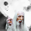
_puchula_POSITIVE VOTES
++ The background texture is really cool and really draws the eye. The colours of the figures and other textures blend really well together with the background and the icon comes across as really harmonious.
++ great use of negative space and textures.
+ I love the soft coloring. The texture use in the negative space is also nice.
BEST INTERPRETATION OF THEME
+ No reasons given.
+ Brilliant twist on the theme, the good vs. the evil side of Anakin Skywalker. I think the texture overlaid on top obscures them though, especially young Anakin. At first glance, I thought it was an image of Luke from A New Hope. I think maybe increasing the contrast some would make him stand out better, so he's more identifiable.
CONSTRUCTIVE VOTES
+ The composition of this feel odd - the darkness of Vader(?) is muted by the background and lighting to the point where it's hard to make out what's going on in the icon.
+ It's a lovely negative space and the use of textures is really good but I honestly can't recognize very well the lighter figure (Luke, I suppose). Maybe a darker background and a stronger contrast could help :)
+ I really like the texture and the crop, but I feel like Luke and Darth get kind of lost here. I can't tell if you used a light texture on top of them (it looks like maybe you did), but if so, I think that might be a large part of the problem.
+ Great idea, although the pictures, particularly anakin, look too bright. They images also don't quite seem to gel with the background.
ADDITIONAL VOTES
+ Composition is very pretty, but at first I saw Vader and didn't notice Anakin on the left side :D I'm not even sure if it's Anakin or Luke, to be honest. It could be due to the texture you chose as background, or maybe you should have highlighted him in some way, perhaps. Too bad, because it could have been a great icon, in my opinion.
+ I love the symbolism of this icon, a snapshot of how innocence can become evil. I think the texture in the background is a little distracting however, and perhaps if it was more yellow or tan, it would have helped blend the image together.
Overall Points Tally
The MVP and Overall Winners posts will be up momentarily.